Olivier | CRO Profile picture
Design & CRO for Supplements & Wellness Ecommerce Brands. Emerging Markets (Latam) and Health Optimisation enthusiast
Hemang Budhdeo Profile picture 1 subscribed
Jun 1, 2023 13 tweets 5 min read
I've helped dozens of Supplements/Wellness brands increase their conversions.

Hundreds of thousands of extra revenue generated.

Here are 10 strategies I've used to increase their AOV & CRO :

(with visuals & examples) 1/ Optimize product images gallery

You shouldn't have only beautiful pictures of your product in your image gallery but also ones that highlight :

- Product benefits
- ingredients info
- Testimonials
- How to use
- Badges / social proof Image
Mar 1, 2023 8 tweets 2 min read
+80% of your visitors leave your products page just after a few seconds and 2/3 scrolls maximum

That's why optimizing these 2 sections is crucial for conversions :

➡️Above the fold (top of the page/First screen)
➡️The Buy Box (variations/ATC section)

1 bad & 1 Good example 🧵: Image Umbo vs Mojo

1/ The Header

❌Text on the top bar is not visible enough. the background color doesn't make the text stand out

✅Takes 10-20% of the screen. For the top bar, fire mojis and the gradient background color make the text more visible
Feb 28, 2023 12 tweets 4 min read
#3 Landing page example - Solave

This page is one of the top landing pages used by Solave for paid FB ads (probably generated hundreds of thousands $)

Let's break down each section ⬇️🧵: Image 1/ Above the fold (top of the page)

No mention of price and no ATC button.

Before trying to sell, Solawe warms up the visitor.

-Strong Headline/subheadline
-Trust elements (review stars, trust badges)
-no menu/navigation. less distractions Image
Jan 19, 2023 9 tweets 3 min read
Your Ads could be much more profitable.

We average an increase of +18% in Revenue per session by using custom Landing pages over classic product pages.

Here are 6 types of landing pages to test for your paid traffic Now (with examples) : Image Disclaimer! : these types of landing pages don't work for fashion or aesthetic products.

Only for problem-solving products, beauty, health, etc...
Oct 24, 2022 11 tweets 4 min read
9 ways to increase your average order value by at least 25% (Most Ecommerces don't use 1/3 of these)

// Thread 🧵 //

1/ Bundle and "Package" offers Image 
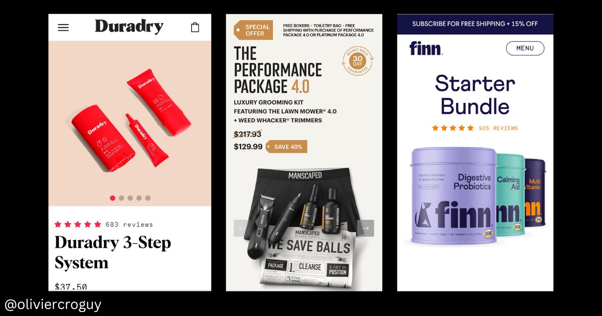
2/ the Upsell next to ATC button

>Must have a link with the main product
>Better if cheaper than the main product
>use with "Complete the look" or "Complete the routine" or "Frequently bought with..." Image
Oct 10, 2022 9 tweets 4 min read
Blissy generated +$100M in revenue in less than 3 years of existence. With no external funding.

A big part of their success comes from their Landing page/CRO strategy. They're one of the best out there

Here are 5 of their top landing pages (for paid traffic): First of all, it's important to note that they don't use any classic product page for paid traffic.

They're always testing presales pages but the product LDP and Checkout stay the same.

Here is what it looks like:
Sep 19, 2022 11 tweets 4 min read
If you send paid traffic to simple product pages or Landing pages, you are leaving a lot of money on the table.

Your ads could be much more profitable.

Here are 7 types of Landing pages/Funnels you can test to boost your conversions (with examples) : Note: Don’t plug these new landing pages on your existing ads.

For each funnel type, you must create a new custom ad.

For example, if you’re sending traffic to a quiz funnel, your ad creative should push people to take the quiz, not to buy the product.
Sep 20, 2021 11 tweets 4 min read
@kettleandfire has one of the best websites I've seen in terms of CRO (for consummables)

-Great and very personalized UX
-CRO optimized LDP & very low frictions
-Super AOV & LTV opti
-Great design, Branding &copy

Let's study their CRO strategy 👇 1 - Quiz product recommendations

The first thing they want people to do when they get to the website is taking the Quiz.

Quiz = Personalized offer = More value

1- the quiz CTA
2- Questions + email capture
3- Unique LDP/offer responding to visitors needs
Aug 2, 2021 7 tweets 3 min read
If you are sending cold traffic from Ads to classic product pages, you are throwing money out the window

People that already know you
Organic Traffic -> Home -> Product page

People who don't know you / retargeting
Cold Traffic Ad -> LDP made to sell, nothing else

/ Thread / Classic Product page:

-Classic product page structure
-Easy navigation & menu
-Above the fold with Product images and CTA
-Classic review section at the bottom of the page
Mar 15, 2021 8 tweets 2 min read
Mantasleep UX Design Case Study -Before/After

Mantasleep has recently made some changes on their main Product page

Let's analyze them

/ / Thread / / For me, all the changes have 3 goals:

>Make the user experience smoother
>Focus the visitor's attention on what matters
>Make every section of the page easily scannable
>Make the text more readable

There are no big changes but it does make a difference in term of UX
Mar 10, 2021 7 tweets 2 min read
The behavior of people coming for Paid traffic and Organic (search) is completely different

That's why you should create unique product pages for Paid traffic

Sales pages

That's what Petlabco does

Let's analyze how they do it

// Thread // The differences

People coming from organic:
>Are looking for you/product you sell
>Take their time
>Compare
>Naviguate
>Purchase based on logic (more than paid)

People coming from Paid:
>just saw your ad and clicked
>very short attention span
>Purchase based on emotions
Feb 25, 2021 9 tweets 4 min read
Here are some examples of amazing Ecommerce UI/UX I found on Dibbble.com

A great source of inspiration

First example: by Ariel Jedrzejczak

// Thread // Image dribbble.com/shots/7706981-… Image
Jan 20, 2021 9 tweets 2 min read
What to AB test on your Ecommerce store?

If you think changing the color of buttons is going to increase your conversion rate by 40%, you're wrong

Here are the things you can test to get a big increase in CR:

// Mini Thread // Ab tests with Big Potential impact (+20-120% CR):

• Changing the offer/Price
• Changing to copy completely (using different persona)
• Add New sections
• Reduce the content by half or opposite
• Changing ATF content (Headline, Main product image)
• with/without cart page
Jan 13, 2021 9 tweets 3 min read
7 ways you can improve your Average Order Value (with visual examples)

Could literally x2 your revenue

// THREAD // 1. Add upsells on your cart page.

Upsells MUST have a link with the product you're selling :

phone -> phone charger
shoe -> socks
coffee -> mug

Offering a discount at the same time can work even better.
Dec 16, 2020 9 tweets 3 min read
I increased the conversion rate of a 6 fig ecom Brand by 22% just by making a few changes on their product page.

+22% in CR meant an extra +24,000$ in revenue for them every month (without any additional ad spend)

Here is what I did

/ / THREAD // First of all, you have to understand that spending more on ads is not the only way to make more money as an Ecom brand.

By optimizing well your CR and AOV you can literally x3 your revenue (depending on where you are right now) with the same traffic that you're getting now.
Nov 10, 2020 25 tweets 8 min read
🟠 Ritual - Case study: From 0 to 20m$ per year in 4 years selling vitamins.

This Ecom brand achieved this in a market know to be "saturated" dominated by Amazon.

If you are in Marketing & Ecommerce, read this thread.

This brand is really a golden gem

/ / Mega Thread / / Image 
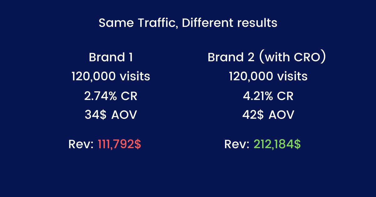
In this case study, we will take a deep dive into every aspect of their marketing strategy and analyze their success

>The Brand & Competitors
>Marketing & Social media Strategy
>Acquisition and traffic
>Facebook ads
>The website & Conversion rate/AOV Optimization

👇
Oct 22, 2020 11 tweets 5 min read
Organifi: CRO case study

Why Organifi?

>Well know for having a crazy conversion rate (around 10%)
>Made billions of tests to get the best CR
>+50m$ in Rev per year
>Fitness/health Supplements Brand

Here are 10 techniques Organifi uses to get crazy CR% and AOV
*/Thread/* Image 1. Ultra Optimized "Above the fold" section

The goal is to grab attention and make people scroll

How they do it:
>Problem solved(benefits list + testimonial)
>Discount(in red)
>Social proof (mini testimonial
>Obvious CTA (Enormous + color contrast)
>Money back guarantee Image
Oct 7, 2020 9 tweets 2 min read
If you think a brand is just a name and a logo, you're making a big mistake.

Don't do like 90% of Ecom brands

So, What's a real brand?

>A Personality/voice
>Values
>Logo/Imagery
>Colors
>Typographies

👉Here are 7 examples of Ecom Brands with strong Identities

*// Thread //* Image Deathwish Coffee Image
Sep 22, 2020 9 tweets 4 min read
[Ecom CRO case study #2 - Dropbottle]

7 techniques Dropbottle uses to increase conversion rate & average order value :

If you're into ecom, take notes.

Thread👇 
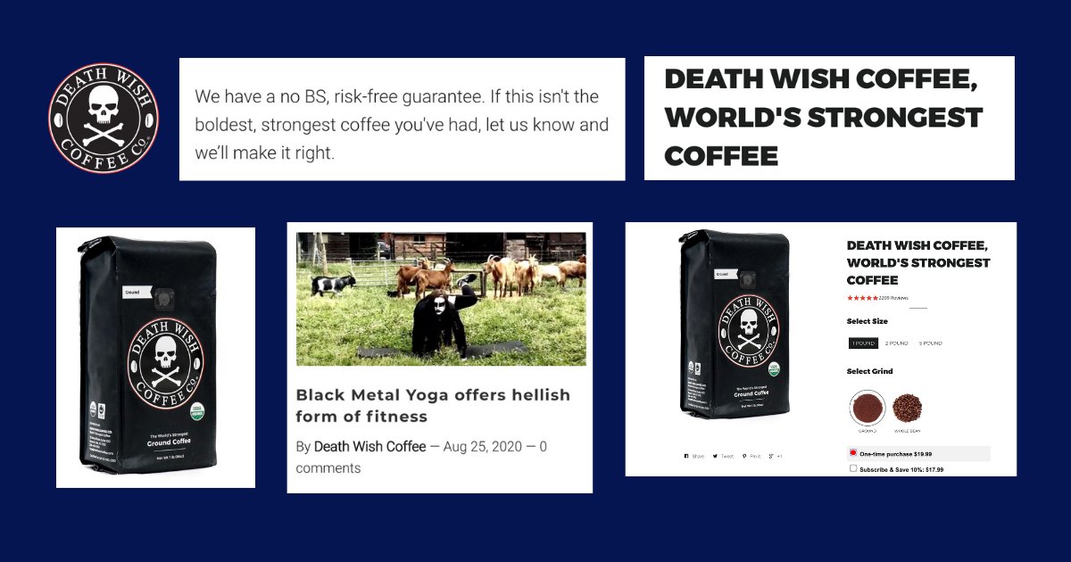
1. Clear call to action with buying intent

Instead of a simple "Add to cart" button, it's always better to have a clear call to action like "Buy it now" "Grab it now" "Get mine now".

It just converts more.

The CTA is the most visible element of the page. As it should be.
Sep 2, 2020 9 tweets 4 min read
Let's analyze a product page that converts like Crazy

Overview:
-benefit-oriented product name
-Amazing "Above the fold" section
-Benefits details + illustrations
-How to use section with 3 easy steps
-UCG photos (with faces) with testimonials
-Us vs Them

👇Thread Image 
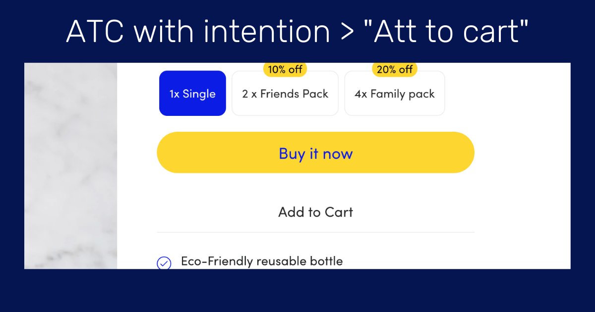
1. Above the fold (the most important part of the page)

You can find all the most valuable information :

- The attention-grabbing product name "super youth"
-Benefits list + color contrast
-Great CTA in green
-secure badge+guarantee
-Social proof with reviews
-small description Image
Jun 25, 2020 26 tweets 8 min read
🔃Case Study Thread- Nuggs

How Nuggs went from 0$ to m$ in just a year selling vegan nuggets with an INSANE branding & Marketing strategy.

Let's study their Brand, marketing strategy, Website/CRO, and their ad creatives.

👇Mega Thread👇 Image Some facts about Nuggs:

- The brand was created just a year ago and already has a great success.
- Their marketing strategy and branding are incredible.
- CEO is a 20 years guy who sold a company at 18.
- The product is far from being perfect
- 100% DTC & going on stores soon.