
I see many non-experts misinterpret COVID-19 hospitalization figures
Here's the thing: raw figures for the last 1-2 weeks almost always show a PERMANENT DIP even when hospitalizations are INCREASING
Case in point, my county, San Diego (charts by @SDCountyHHSA):
1/N
Here's the thing: raw figures for the last 1-2 weeks almost always show a PERMANENT DIP even when hospitalizations are INCREASING
Case in point, my county, San Diego (charts by @SDCountyHHSA):
1/N
The animation above shows how the hospitalization chart from the San Diego County Health & Human Services Agency changes over time (current chart: sandiegocounty.gov/content/dam/sd…)
I didn't modify the charts except by adding the red text "Peak hospitalizations"
2/N
I didn't modify the charts except by adding the red text "Peak hospitalizations"
2/N
The animation shows the chart produced as of 5/8, 5/11, 5/12, 5/17, 5/20, & 5/23
We know that, in May, peak hospitalizations occurred on 5/5 but this day isn't the highest peak until the chart of 5/20, 15 days later!
It is because data for the last 1-2 weeks is incomplete
3/N
We know that, in May, peak hospitalizations occurred on 5/5 but this day isn't the highest peak until the chart of 5/20, 15 days later!
It is because data for the last 1-2 weeks is incomplete
3/N
See the note that @SDCountyHHSA put in the upper right corner of the chart:
"Illnesses that began during this time may not yet be reported"
Why is the data incomplete?
4/N
"Illnesses that began during this time may not yet be reported"
Why is the data incomplete?
4/N
When a patient is admitted, the hospital may suspect it is a probable case, but they won't count it as such until a diagnosis is issued, a test is ordered, and results are received.
The county's systems take days to process admission records from 100+ hospitals.
5/N
The county's systems take days to process admission records from 100+ hospitals.
5/N
And if the data is further aggregated from counties to states, there are more delays for the information to pass through. (Believe it or not, a lot of these processes are ad-hoc and only semi-automated by IT staff.)
6/N
6/N
Bottom line, when you see news reports that hospitalizations are increasing, it's often information that journalists get directly from hospitals, BEFORE the county or state official hospitalization figures actually show an increase.
7/N
7/N
In the case of San Diego, our peak was on 5/5, but it took 15 days, 2 full weeks, for the data to be complete and finally reflected in the county charts.
So keep that in mind. There is almost always a 1-2 week delay until hospitalization figures are complete.
8/N
So keep that in mind. There is almost always a 1-2 week delay until hospitalization figures are complete.
8/N
In fact, in San Diego, based on the present COVID-19 hospital admissions trend being FLAT in last 1-2 weeks, we know with near certainty that hospitalizations are actually INCREASING (because more recent days are more incomplete)
This is my #prediction
Check in 3 weeks 😀
9/N
This is my #prediction
Check in 3 weeks 😀
9/N
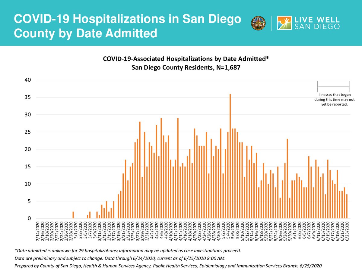
4 weeks later... my #PredictionWasCorrect, hospitalizations were up in the 1-2 weeks preceding June 25.
See the current PDF (sandiegocounty.gov/content/dam/sd…), annotated with a big fat red arrow by yours truly:
See the current PDF (sandiegocounty.gov/content/dam/sd…), annotated with a big fat red arrow by yours truly:

• • •
Missing some Tweet in this thread? You can try to
force a refresh


