A brief flag thread 🧵
nava.org/good-flag-bad-…
It lists 5 simple rules
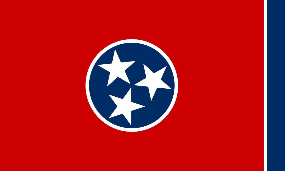
1. Keep It Simple
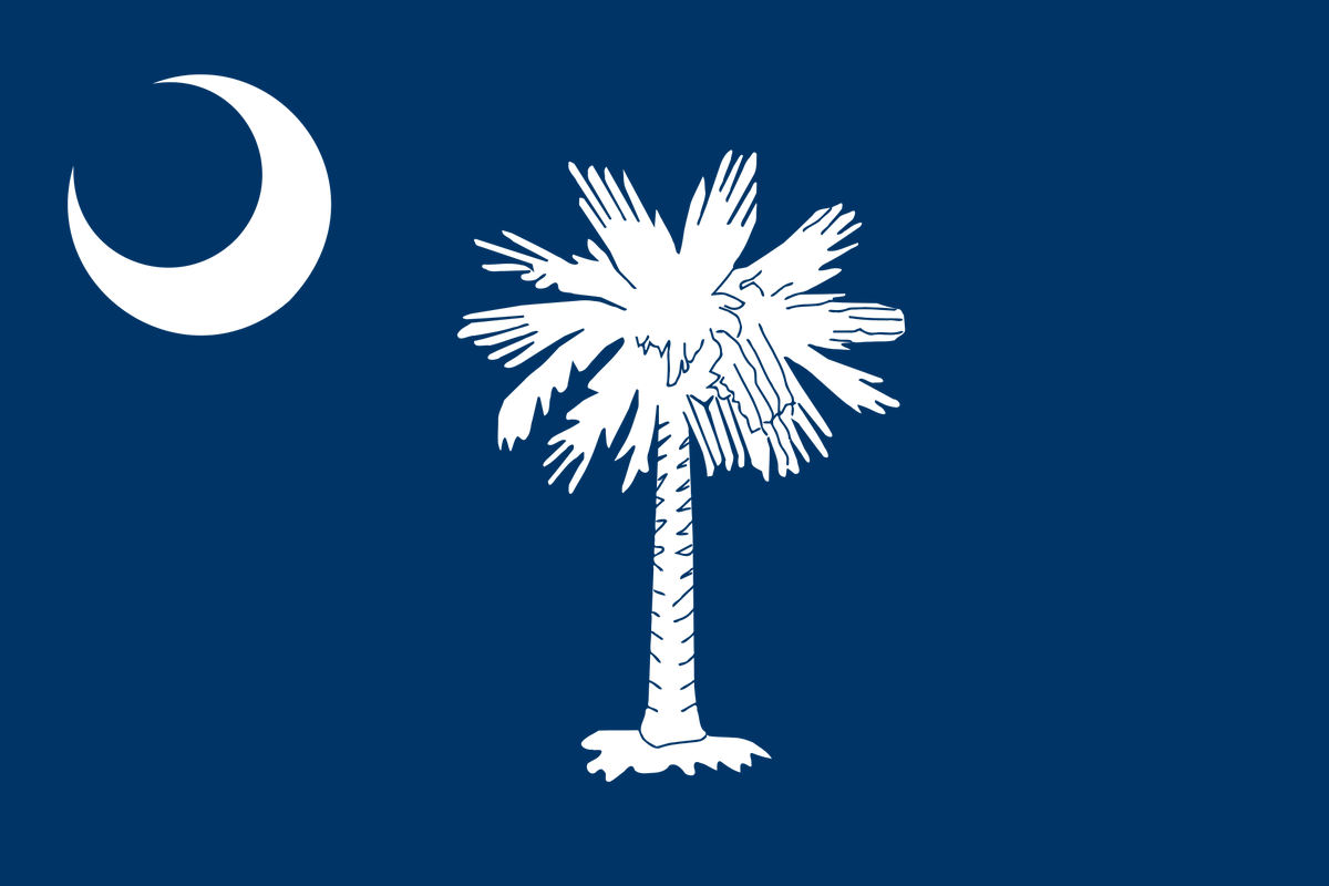
2. Use Meaningful Symbolism.
3. Use 2 or 3 Basic Colors.
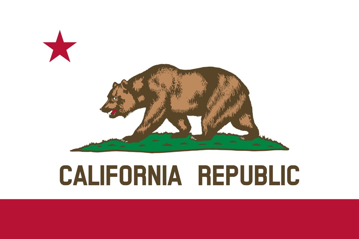
4. No Lettering or Seals.
5. Be Distinctive or Be Related.
🧵
I'll go first.
🧵(3 of ?)
Let's move on to Rule 2
🧵 7 of ?
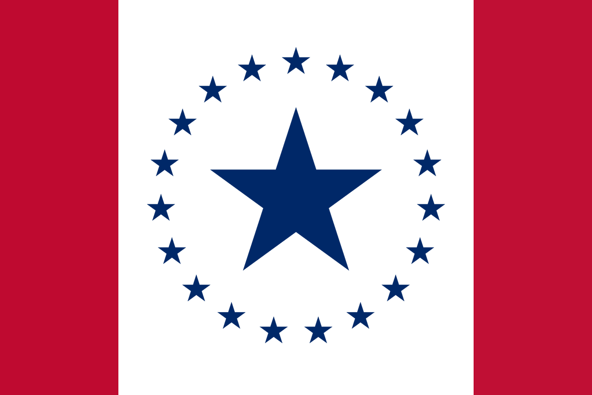
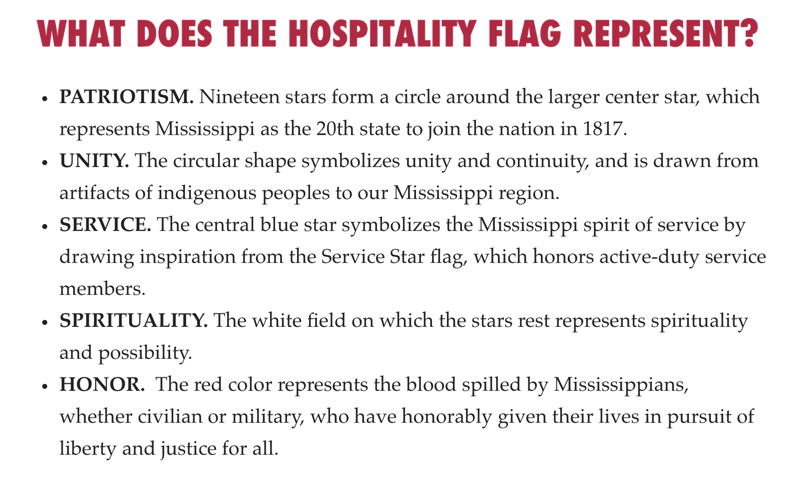
@HospitalityFlag. This text from the official website (declaremississippi.com) explains the symbolism of the flag.
🧵 11
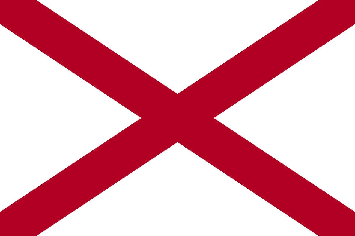
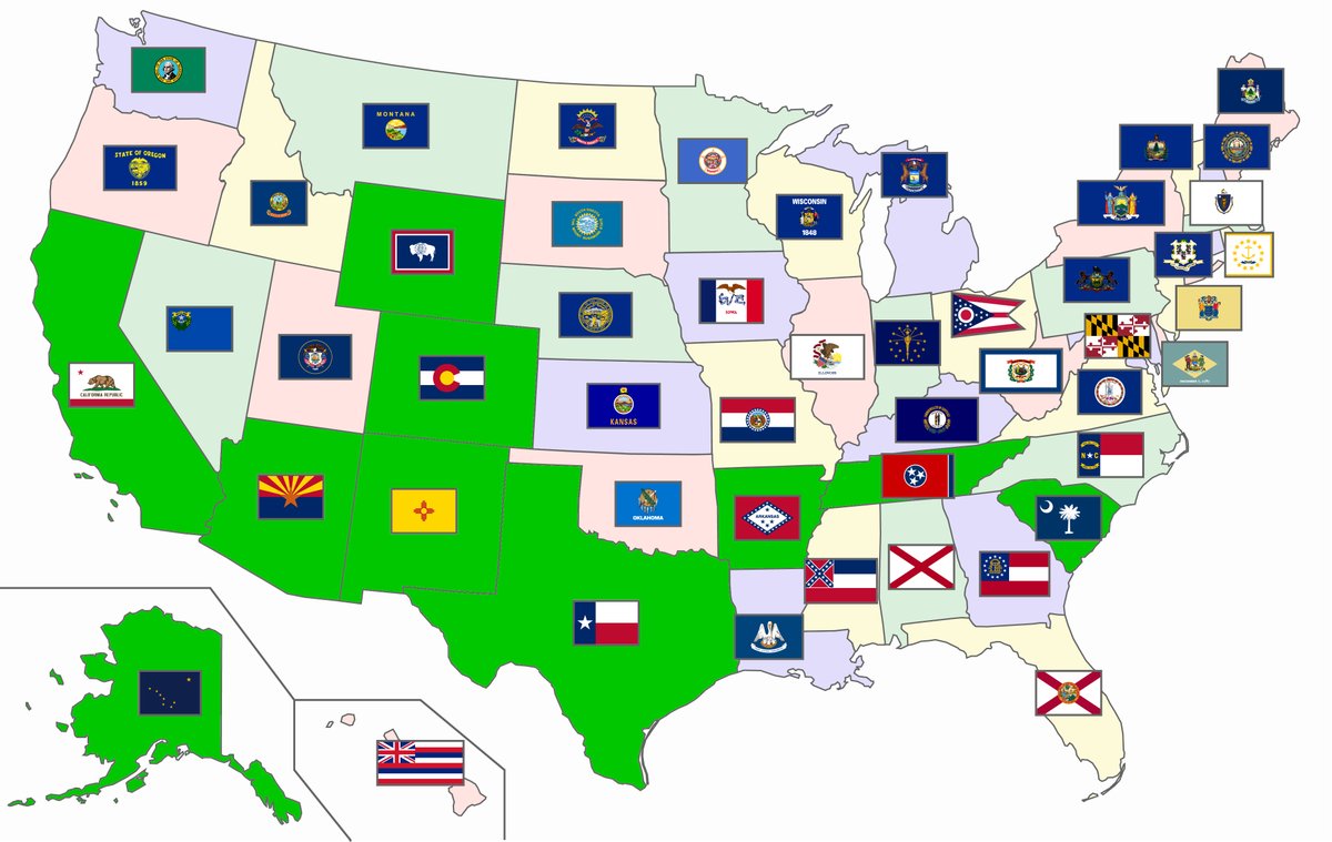
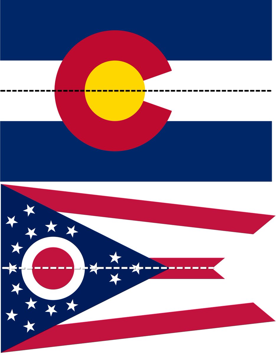
Man how I love symmetry in a flag! Symmetry can be found in 5 Existing State flags.
Alabama
Arizona
Colorado
New Mexico
Ohio
The fact that by adopting the @hospitalityflag as-is Mississippi could join this elite symmetry club immediately is very compelling.
🧵 15
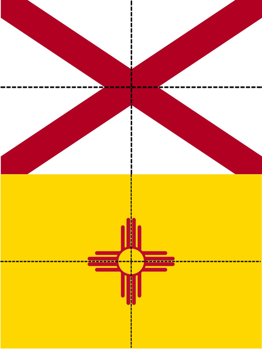
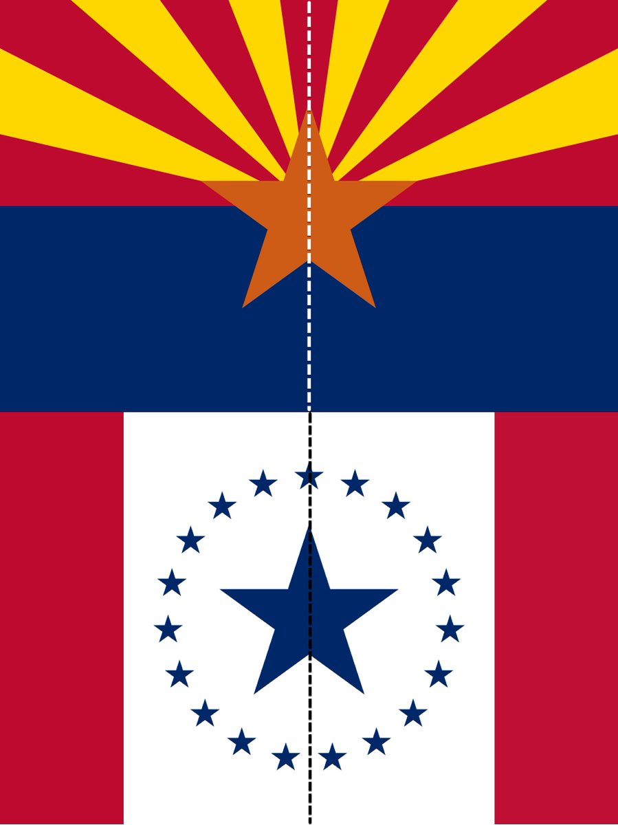
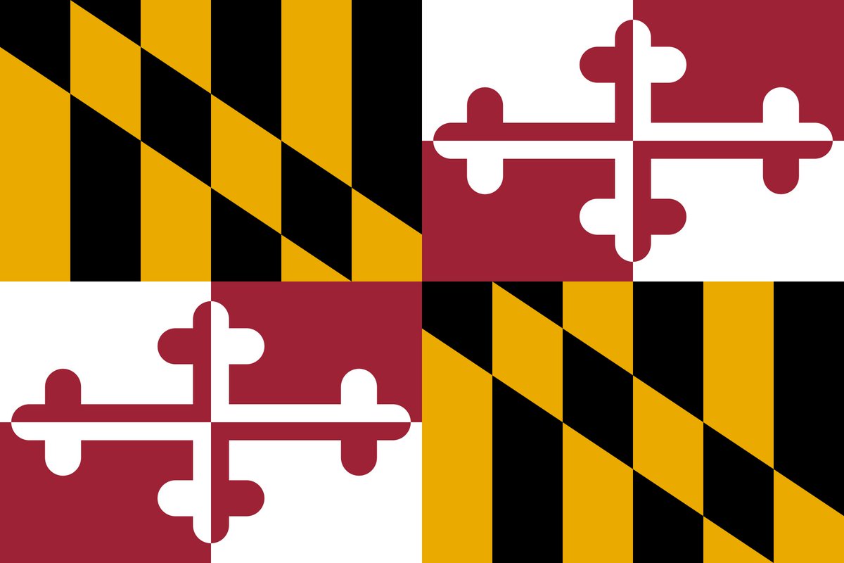
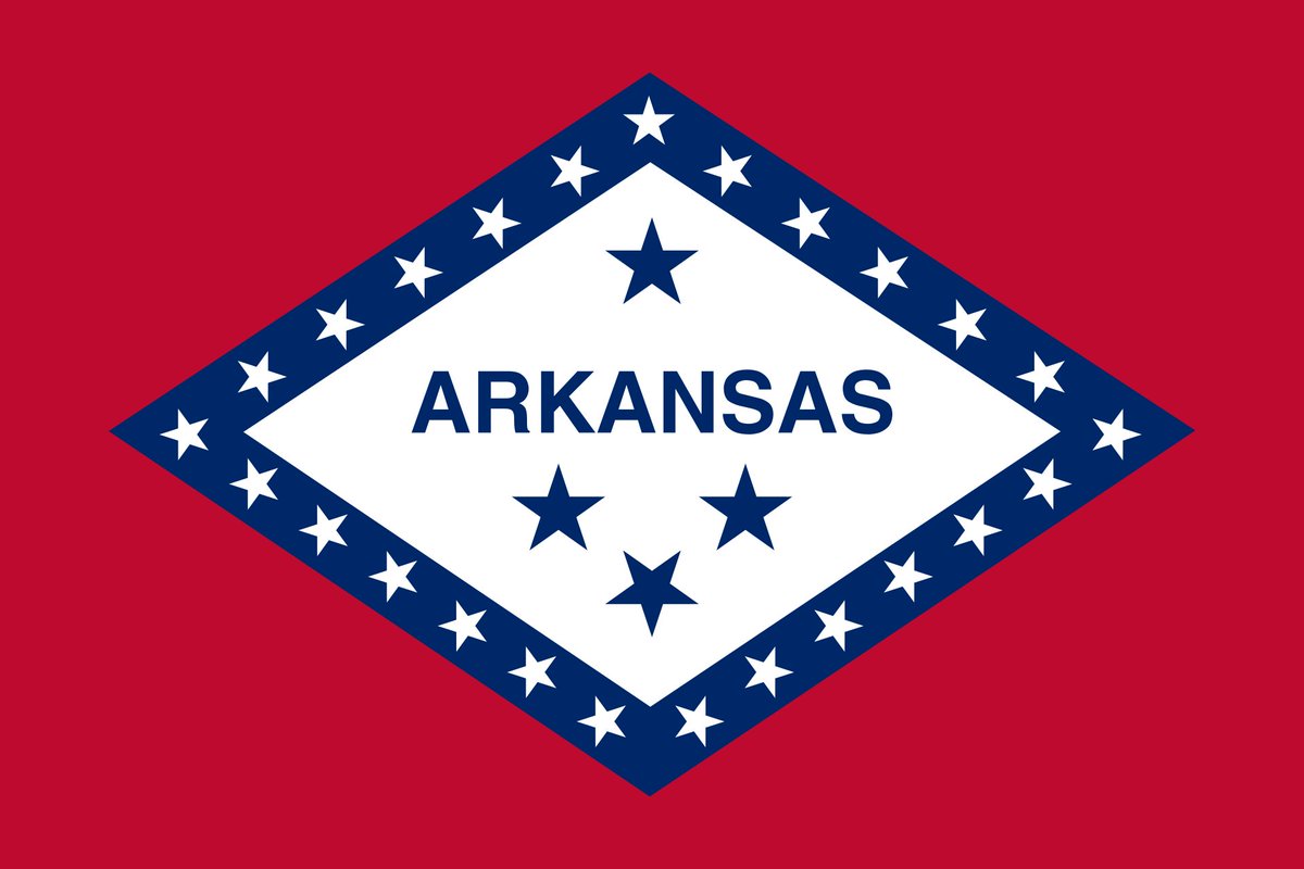
This is critical. There are several reasons why words are bad on a flag... some practical (what font?), some silly (it messes up symmetry!) But most importantly, I think you maximize unity when the flag is left more general
🧵 16
1. Separation of Church and State is awesome.
2. It doesn't represent unbelievers
That being said, Mississippi gets to chose whatever they want.
🧵 17
The flag is pretty distinctive. A bit of Canada vibes, but it's far enough away that I don't think it's too big of a deal. The blue stars differentiate it enough for me personally.
🧵 18
Dear Mississippi,
1. I think the @HospitalityFlag looks nice and I hope it is considered.
2. I hope you join the symmetry club.
3. Please no seals or text on the flag.
4. I love you Mississippi, and am excited for the State's unity.
Warm Regards,
A guy in Alabama
Thanks @romanmars for your tweet that apparently sparked a sleeping flag dragon within my soul.
