Nr of tweets circulate claiming Finland has higher excess mortality than Sweden.
This seemed very strange so I took a closer look at long-term mortality in Sweden, Finland and Norway.
Thread.
TL;DR: The claims are misleading. 1/7 + extras.
This seemed very strange so I took a closer look at long-term mortality in Sweden, Finland and Norway.
Thread.
TL;DR: The claims are misleading. 1/7 + extras.
Adjusting for age differences and population sizes, total mortality rates declined in all countries. Highest rates Finland but the gap narrowed over time; Sweden lowest (reflecting highest life-expectancy) + declining.
But, this year so far they have lost this advantage. 2/7
But, this year so far they have lost this advantage. 2/7
If Sweden returns to their "normal" mortality levels for rest of 2020 (and could actually be clearly below normal), this will reduce the rate for 2020 overall. Difficult to say how much (but I do expect 2020 will deviate from the trend when all data for 2020 is in). 3/7
But even if the rest of the year exceptionally low, those who died due to Covid-19 early on 2020 will have "lost" living time when compared to the situation without Covid-19.
Can't be seen in yearly rates on total mortality (as here), need to analyse ”life-years lost". 4/7
Can't be seen in yearly rates on total mortality (as here), need to analyse ”life-years lost". 4/7
The second point tweets were saying: “compared to long term historical levels, Sweden is doing quite ok".
But is it really? No. Such a comparison neglects all the considerable improvements in public health in the past, which have contributed to increased life-expectancy.
5/7
But is it really? No. Such a comparison neglects all the considerable improvements in public health in the past, which have contributed to increased life-expectancy.
5/7
The presented claims are based on simple analyses of mortality which do not take into account population demographics or erroneous interpretation, and are therefore misleading.
(For the technically interested, I will illustrate why misleading here below; long thread). 6/7
(For the technically interested, I will illustrate why misleading here below; long thread). 6/7
I have no intention/desire to make this a competition between countries, just wanted to point out that the results and analyses stating “excess higher somewhere” or “compared to historical levels, everything seems to be ok” are not correct interpretation. 7/7
Extras: Many comments with special focus on Norway and Finland on differences and comparisons between countries + calculation of age-standardized rates. Illustrates why the claims misleading.
A bit technical; might not be very interesting for the most, hopefully for some! 8x/
A bit technical; might not be very interesting for the most, hopefully for some! 8x/
Starting with Fig 1 the absolute numbers of deaths per year in Sweden, Norway and Finland.
Sweden as the largest country has naturally most deaths.
But Finland and Norway: almost the same population size; why Norway fewer deaths + the trends diverging? x9/
Sweden as the largest country has naturally most deaths.
But Finland and Norway: almost the same population size; why Norway fewer deaths + the trends diverging? x9/

Population sizes generally growing over time in the nordics.
Despite this, the total number of deaths been rather stable in Fig 1, Sweden actually has a decrease despite more people.
(Sidenote: Finland unfortunately an outlier in population growth.) x10/
Despite this, the total number of deaths been rather stable in Fig 1, Sweden actually has a decrease despite more people.
(Sidenote: Finland unfortunately an outlier in population growth.) x10/

To make it easier to compare over time and between countries, we can express the nr of deaths per some fixed number; for example “per million”, Fig 2.
Need to know pop. sizes for every year, in addition to the number of deaths.
The measure is now a “rate”. x11/
Need to know pop. sizes for every year, in addition to the number of deaths.
The measure is now a “rate”. x11/
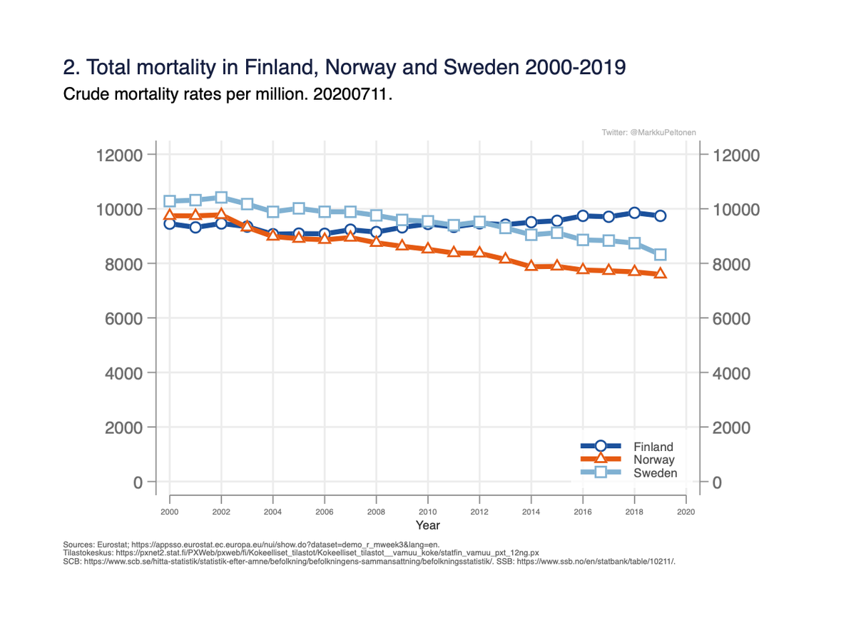
The rate describes how many deaths occur per some fixed population (here million) and time unit (here per year).
This rate is also called “crude rate” in epidemiology, as it only takes into account the population sizes over years, nothing else. x12/
This rate is also called “crude rate” in epidemiology, as it only takes into account the population sizes over years, nothing else. x12/
The analyses stating “Finland highest excess” when compared to long-term historical average were based on these crude rates in Fig 2.
But, Finland has more excess than Sweden already in 2018 when compared to 2000. Does this tell us anything?
No. We will see why not. x13/
But, Finland has more excess than Sweden already in 2018 when compared to 2000. Does this tell us anything?
No. We will see why not. x13/
Measured this way, we can compare deaths in the countries even though the population sizes differ:
- Norway has lowest rate and decreasing.
- Sweden had highest, but has decreased.
- Finland has actually a slight increase.
Why these differences?
x14/
- Norway has lowest rate and decreasing.
- Sweden had highest, but has decreased.
- Finland has actually a slight increase.
Why these differences?
x14/
Age is strongly associated with mortality so the next step is to figure out if there are any differences in how old people in different countries are.
Median ages 1990 -> 2015:
- Finland 36.4 -> 42.5
- Sweden 38.4 -> 40.9
- Norway 35.4 -> 39.2
x15/
(ourworldindata.org/age-structure)
Median ages 1990 -> 2015:
- Finland 36.4 -> 42.5
- Sweden 38.4 -> 40.9
- Norway 35.4 -> 39.2
x15/
(ourworldindata.org/age-structure)
Norway with lowest median age has lowest crude mortality rate in Fig 2, as would be expected.
Sweden used to be oldest, but ageing has been slower than in Finland/Norway.
Finland now oldest, ageing has been more rapid. x16/
Sweden used to be oldest, but ageing has been slower than in Finland/Norway.
Finland now oldest, ageing has been more rapid. x16/
Number of things affect pop. age-structure eg:
- differences/changes in public health (mortality due to disease burden, lifestyle eg smoking, etc)
- fertility (number of children per woman)
- immigration (I assume immigrants on average younger than general population).
x17/
- differences/changes in public health (mortality due to disease burden, lifestyle eg smoking, etc)
- fertility (number of children per woman)
- immigration (I assume immigrants on average younger than general population).
x17/
Fertility rates not favouring Finland: 1.77 vs Norway 1.82 vs Sweden 1.91 births/woman.
So we are not getting as many young into the population as the others.
Immigration is more common in Sweden, also Norway more than twice as many foreign-borns. x18/
ourworldindata.org/fertility-rate:
So we are not getting as many young into the population as the others.
Immigration is more common in Sweden, also Norway more than twice as many foreign-borns. x18/
ourworldindata.org/fertility-rate:
One can take into account the differences in age by calculating the rates expressed per a *common age distribution*.
Need data on pop. size in all age groups and all years, as well as nr of deaths in all age groups for all the years. x19/
Need data on pop. size in all age groups and all years, as well as nr of deaths in all age groups for all the years. x19/
This corresponds to the “per million” calculation above (sort of), "per common nr people" to account for differences in population sizes; same principle.
Calculation is quite simple, see for example (or google “direct standardisation”): x20/
healthknowledge.org.uk/e-learning/epi…
Calculation is quite simple, see for example (or google “direct standardisation”): x20/
healthknowledge.org.uk/e-learning/epi…
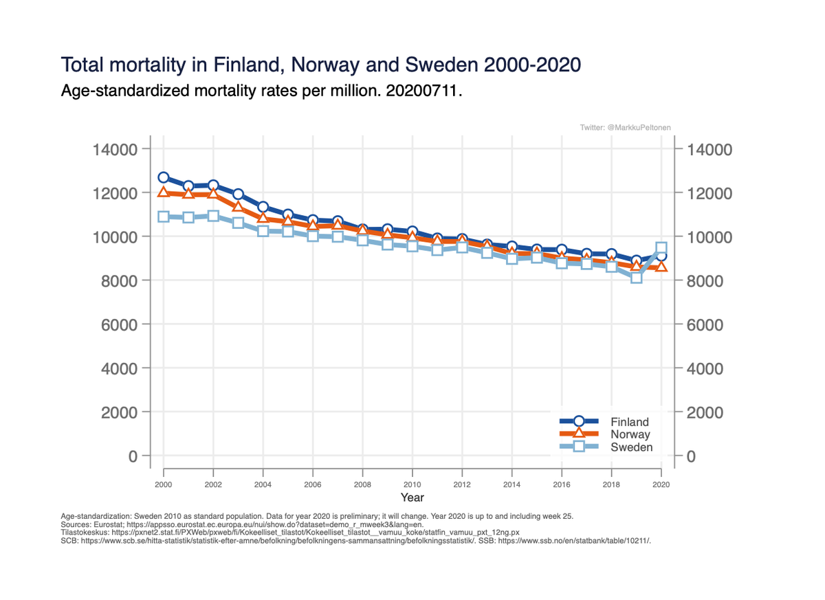
This is called age-standardization (or age adjustment): the rates tell the mortality as if the age-structure was the same in different years & populations. I chose to use Swedens age dist. year 2010 (choise does not matter).
The rates have been declining everywhere, Fig 3. x21/
The rates have been declining everywhere, Fig 3. x21/
Fig 3:

There is still a small difference between Norway and Finland in Fig 3, not explained by differences in age nor population size.
Next step could be check common diseases, lifestyle factors associated w mortality (smoking, obesity etc) in the countries. (Will not go there.) x22/
Next step could be check common diseases, lifestyle factors associated w mortality (smoking, obesity etc) in the countries. (Will not go there.) x22/
These remaining differences seen in Fig 3 are also reflected in life-expectancy at birth:
Finland: 81.7 years
Norway: 82.3
Sweden: 82.7
x23/
Finland: 81.7 years
Norway: 82.3
Sweden: 82.7
x23/
It is possible to standardise for other background factors which might differ between countries/change over time, the principle is the same.
(In fact the “age-standardised rates” here are also standardised for diffs. in nr of men and women in different countries/years). x24/
(In fact the “age-standardised rates” here are also standardised for diffs. in nr of men and women in different countries/years). x24/
It remains to be seen how Covid-19 affects the rates for the whole year 2020. The rates so far, including week 25 in year 2020 are shown here in Fig 4:
x25/
x25/

Summary:
- Sweden has lowest mortality rates but this year so far lost this advantage.
- In comparisons to long term historical levels, one has to consider changes in population demographics.
- Comparing to historical levels neglects improvements in public health.
x26/x26
- Sweden has lowest mortality rates but this year so far lost this advantage.
- In comparisons to long term historical levels, one has to consider changes in population demographics.
- Comparing to historical levels neglects improvements in public health.
x26/x26