I do not have a ProductHunt account to go add the link to my own post, ask questions.
The astro-turfing is underway.
Which score matters? Probably neither if a user has hit a genuine barrier. But the 88 from Lighthouse is far different than a perfect score from #accessiBe’s aCe (which runs before #accessiBe’s overlay is turned on?).
Anyway, if #accessiBe’s demonstrated dishonesty is any clue, its aCe product (clearly a play on Deque’s original aXe spelling) is also delivering lies based on (at best) misunderstandings of WCAG.
I added some details about #accessiBe’s aCe checker after some quick tests, and boy do I not trust it as far as I can download it to a 1997-era eMachine and throw it. adrianroselli.com/2020/06/access…
• • •
Missing some Tweet in this thread? You can try to
force a refresh
WPTavern argues for OSS first to shame, though WP as a whole is not completely OSS (Slack over IRC / MatterMost?).
More importantly, Automattic drove Gutenberg as a business decision, not community decision — Wix / etc. as revenue threats, Automattic assignees as proof.
[3/7]
Automattic already signaled accessibility is not a priority — look at Gutenberg’s history (and need to crowdsource an audit). It did not bring its $3 billion bulk to bear to address it, relying on volunteers to drive accessibility efforts.
A standard, unstyled <dl> is now exposed to VoiceOver users as they swipe through a page.
Note the qualifiers I added there.
If you add list styles, iOS’s ongoing refusal to convey lists properly once you style them rears its head here.
Using display: list-item or list-style-type: disc shows CSS still affects semantics for VO in iOS 14 (and presumably iPadOS 14, though I did not update).
Finally, if you just have the page read to you (read-from-top or read-from-current-position) then the <dl> is read as a run of plain text without pauses. So that is kind of annoying for comprehension.
As always with iOS and VoiceOver, attenuate your approach based on its bugs.
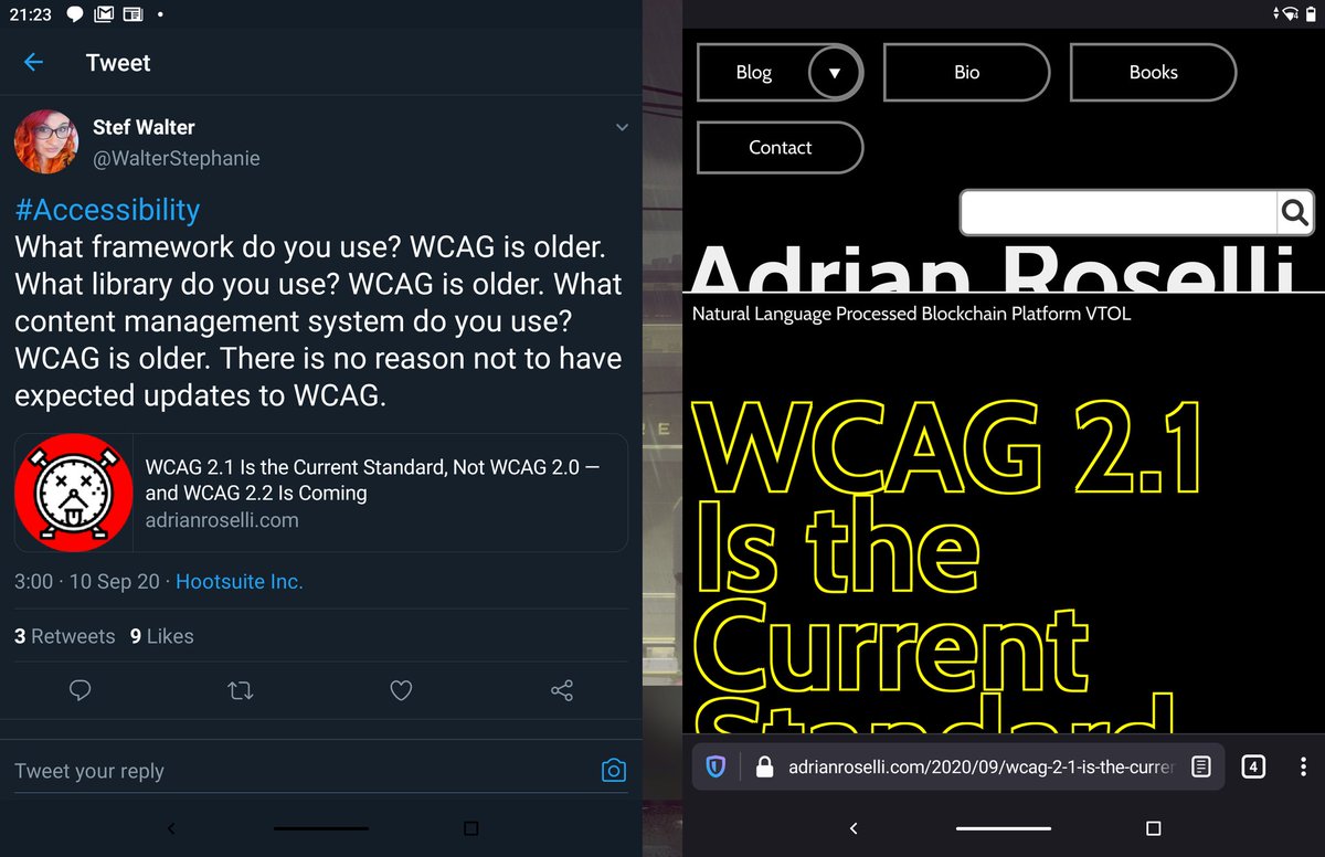
After 24 hours with the Surface Duo I can say that I like the hardware feel and form factor (even if taking screen shots is a pain).
Also really like side-by-side apps (which you can already do on Android), though not yet a fan of the overall Microsoft UI. More time needed.
Two images with the Surface Duo in portrait mode. That word “Renraku” is my wallpaper peeking out through the gap between screens. IRL I just see bezel.
I like the massive keyboard that appears, even though I was trying to do this one-handed and it is *just* different enough.
Oof, was hoping the Surface Duo would not be such a black box for hardware fixes: ifixit.com/Teardown/Micro…
After the Surface updates to make them more serviceable I was hoping some of that would carry over to this device.