With a surge in new coronavirus cases in Pennsylvania, I wanted to delve into the data a bit more to see how the state went from approaching a new normal to trying to stem a new surge in cases bit.ly/2CK7Zib 1/
First, let's take a brief look at where we're at now in PA, and I'm using data pulled from the Johns Hopkins GitHub Repository. Philadelphia's numbers tend to be a bout 20% higher than on the state's website. As of Sunday, there were 111,115 cases and 7,124 deaths since March 2/ 

The state Department of Health estimates nearly 75% of cases have recovered, and there's been an increase in cases among younger adults in the weeks since moving to the green phase of the state's reopening plan. Story on that from @JoCiavaglia
here bit.ly/2ZSpfdG 3/
here bit.ly/2ZSpfdG 3/
Because there appeared to be a surge in places like bars and nightclubs, the state implemented some new businesses rules. The changes are probably best summarized as "No Meal, No beer" bit.ly/2BpiIOi 4/
Looking at case totals doesn't really give us a clear picture of how the virus has spread, recently or overall. Let's start with the first 90 days of the virus in PA, when we saw nearly 75,000 cases and about 5,400 deaths 5/
We see here the virus hit its peak around the middle of April when the daily number of new cases hit is largest spike. That came after nearly a month after near exponential growth. Deaths ebbed and flowed, but never seemed to follow the declining trend new infections 6/

Daily new cases don't really paint a clear picture either because of a lag in testing results that often followed weekends. These charts show the 7-day and 14-day averages for new cases and deaths, showing the trends more clearly 7/


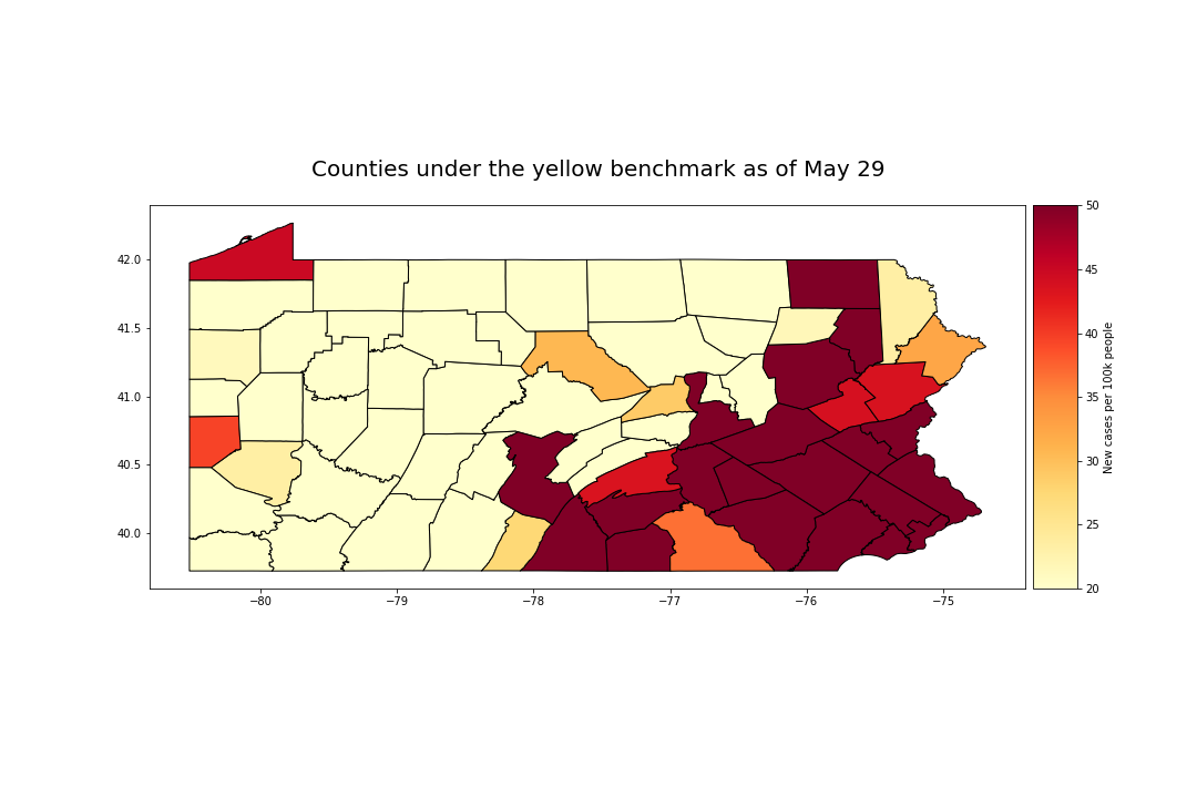
These charts take us from March 1 to May 29, when several weeks of school closures, business shutdowns and stay-at-home orders had ended for about 10 counties moved into the state's yellow reopening phase. bit.ly/2z6Mhms 8/
The yellow benchmark was fewer than 50 new cases per 100k people over 14 days for a county to go to yellow. It wasn't the sole deciding factor, but it was one of the few benchmarks you could track bit.ly/3eTc3dY This is what the state looked like then 9/
Now, before we go any further, lets talk about something I liked to call the viral velocity. It will help explain how we got to this trend: 10/

The first is known as the basic reproductive rate, or R-Naught, and the second the serial interval. Here's a couple of articles on those two variables published through the CDC and some medical journals: bit.ly/2CxNCor bit.ly/2OQiTFx 11/
The R-Naught, or R0, for the coronavirus in March was estimated at about 2.5, meaning up to three people were being infected for every new case. The virus could take up to two weeks to incubate, but usually caused symptoms to appear after several days. bit.ly/2UEPxwi 12/
The R0 is not set in stone. The overall goal in an epidemic is to bring the R0 down to less than 1, where the spread will cease growing exponentially. bit.ly/2P0dawZ 13/
With all that in mind, let's turn our attention to Allegheny County, where cases soared in recent weeks. This is the 7-day average for new cases in the first 90 days in Allegheny (Blue), MontCo (orange) and Bucks (green) 14/

Allegheny went to the green phase on May 15, and all three counties saw a downward trend in new cases two weeks prior. That continued through June 5, when Allegheny County went to the green phase. So far, so good for the yellow phase in Allegheny 15/

16/ Allegheny saw cases more or less remain even over the next two weeks, while Bucks and MontCo saw a continued decline in its 7-day average of new cases. Bucks and MontCo had been moved to yellow on June 5 and then to green on June 26

17/ At some point between June 19 and June 26, people began getting infected again. Allegheny took the biggest hit in that surge, which came a little over 14 days after going green. Bucks and MontCo, however, saw the beginnings of a surge in the days before it went green.

18/ For greater context, Here's Allegheny compared to most counties in southeastern PA, including Philly, Bucks, Chester, Delaware and MontCo. For a time, Allegheny surpassed even MontCo and Philly - counties that led in new cases early on.

19/ Only a handful of counties would meet that 50 new cases per 100K people yellow benchmark as of this week. Keep in mind, that metric was specifically for moving from red to yellow, and wasn't the sole factor. I'm using it here just as a comparison.
20/ As of July 25, about half the counties in the state have ~48 new cases per 100K people over a 14-day period. About 75% of counties have just under 80 new cases. Allegheny, Beaver and Delaware counties have the highest rate at 195, 166 and 130 cases

21/ Pennsylvania is doing better in keeping its new cases down than about 20 other states so far, with Florida, Texas and California. It's not doing quite as well as New York or New Jersey now, two states which saw the highest numbers in the continental U.S. in mid April

22/ The @JohnsHopkins GitHub can be found here bit.ly/39vtbEs. It looks like Philly's numbers are pulled directly from the city's own estimates, while the rest of the counties are pulled from the @PAHealthDept website here bit.ly/3f4gK3y
@BucksCountyGovt and @MontCoPA has had a COVID-19 information dashboard up for just about the length of the epidemic. Bucks here: bit.ly/2WYnuKq. MontCo Here: bit.ly/2EmhfcO
The general guideline here is that the county's individual pages probably have the most updated and accurate information, and tend to be lower than the state numbers. That's guideance from the state and county health departments.
The Johns Hopkin's data was the easiest source to pull together the numbers over a long period of time for both the state and national numbers. Analysis was done with the Python programming language in a @ProjectJupyter notebook, with @matplotlib @pandas_dev and others
@threadreaderapp
unroll
unroll