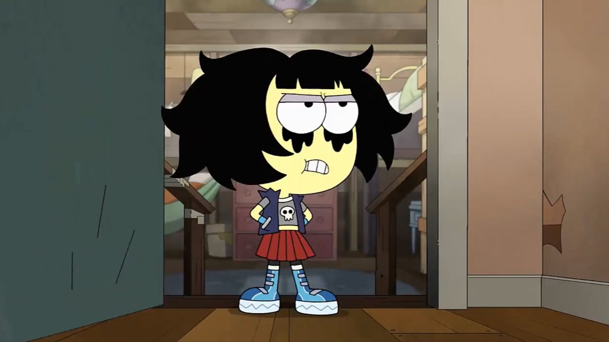
Let's look closely at another trailer park background from #BigCityGreens designed by me, painted by @spookybri.
A process thread:
A process thread:

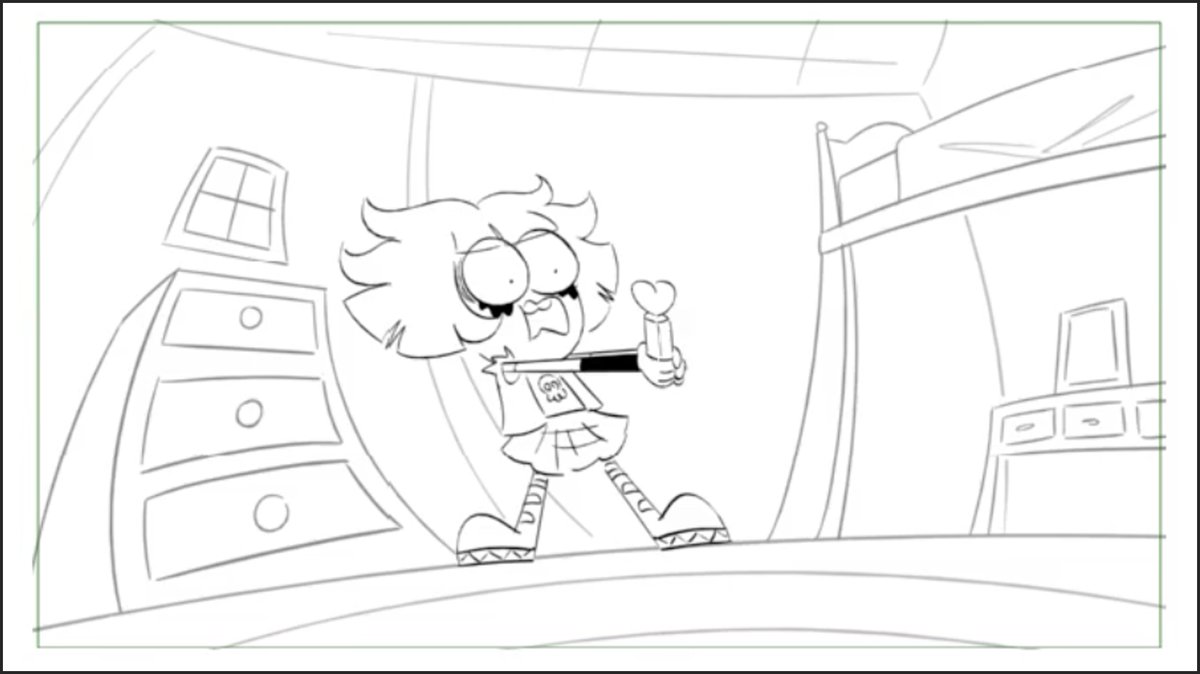
Again, starting with the storyboard.
This panel is about staging the action for the characters and giving a basic composition.
This panel is about staging the action for the characters and giving a basic composition.

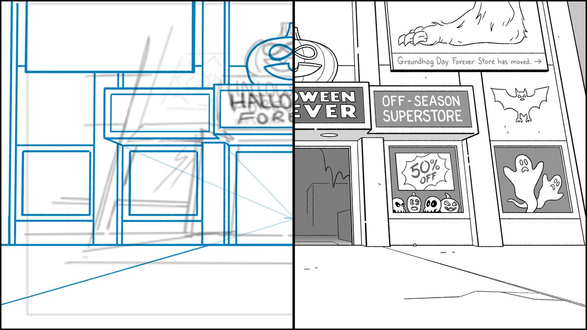
I threw down a grid to lay out the perspective.
This is a quick way to find perspective without dealing in vanishing points that would be so far away.
This is a quick way to find perspective without dealing in vanishing points that would be so far away.

Roughing details is where the story of the location starts to come alive.
You can see how I adhere to the perspective grid.
You can see how I adhere to the perspective grid.
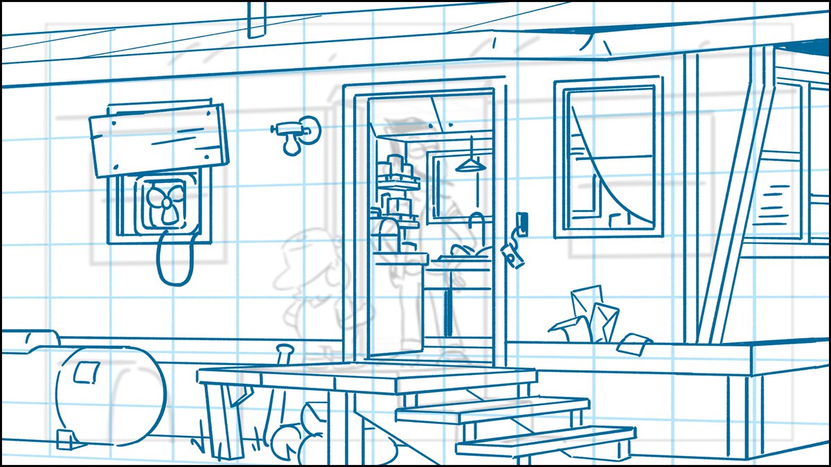
Mailboxes in trailer parks are typically at a central location. But I think there is some mail (bills, letters from an ex) this guy won't even open and bring inside.
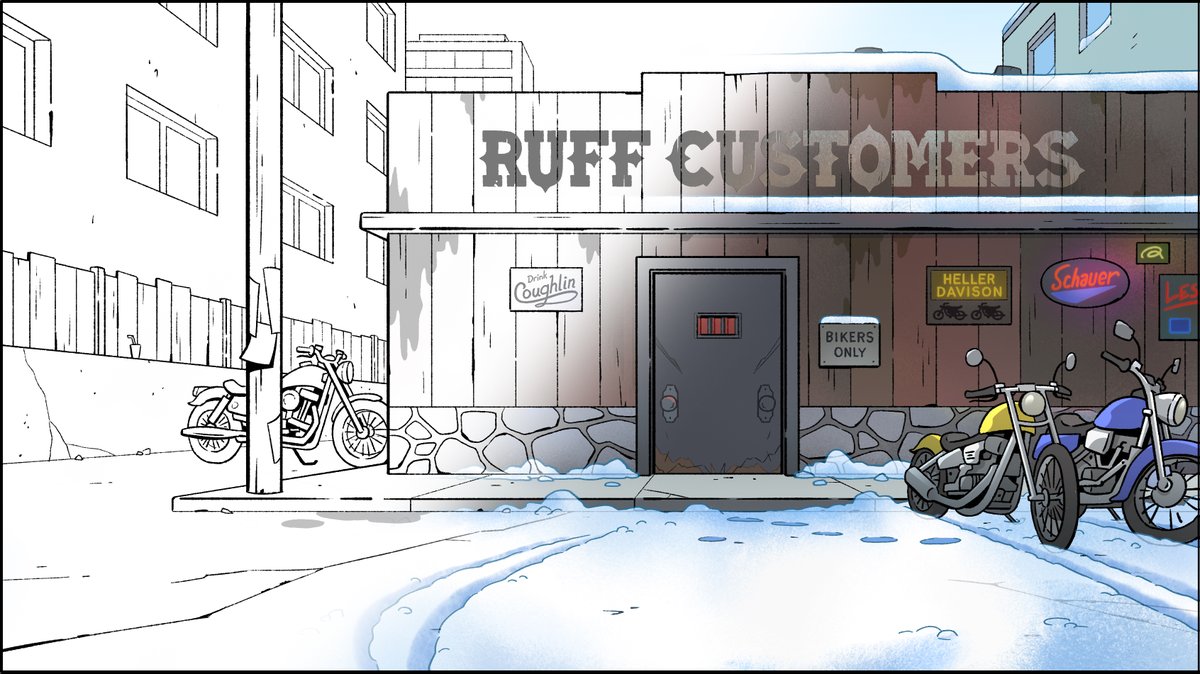
Here's the final design with all its details of a rugged history to support the introduction of a character.
Here's the final design with all its details of a rugged history to support the introduction of a character.

• • •
Missing some Tweet in this thread? You can try to
force a refresh


