Mike Shell Profile picture
Aug 26, 2020 9 tweets 4 min read Read on X
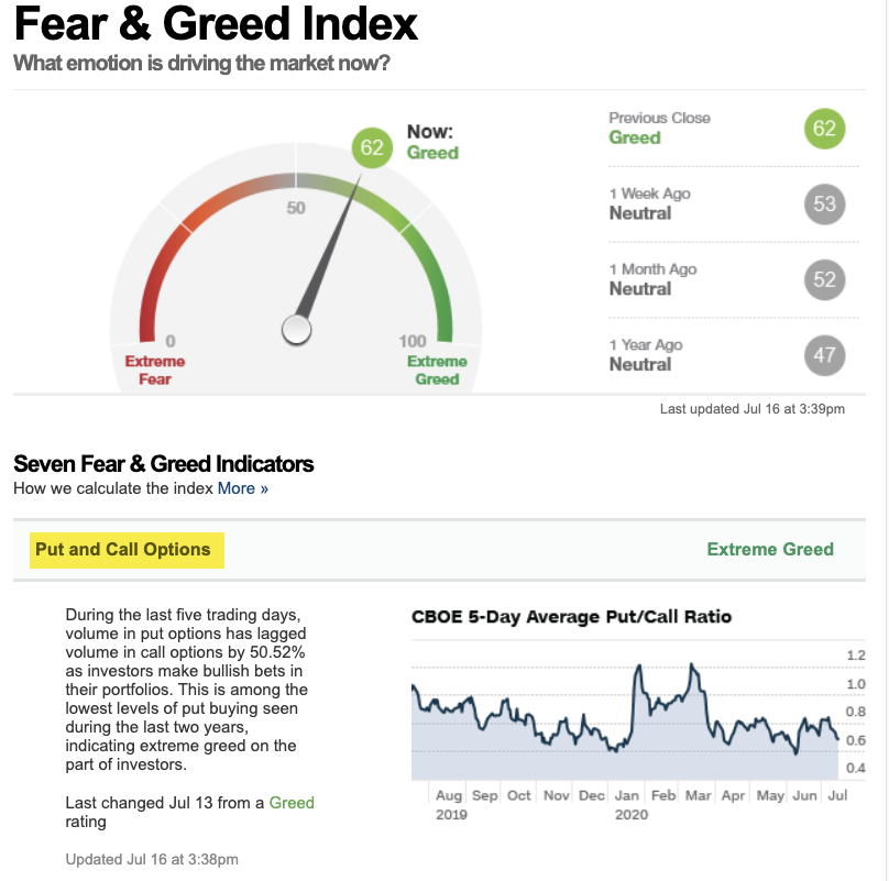
Fear & Greed Index tracks seven indicators of investor sentiment. It's gradually dialing back up to Greed, but not yet Extreme Greed. Image
But when we take a look inside, and understand how it works, I see the main holdout is the . At around 22, the VIX still indicates a moderate level of FEAR, but we have to consider #VIX is fading from its highest level, ever, so its absolute level may not be as indicative. Image
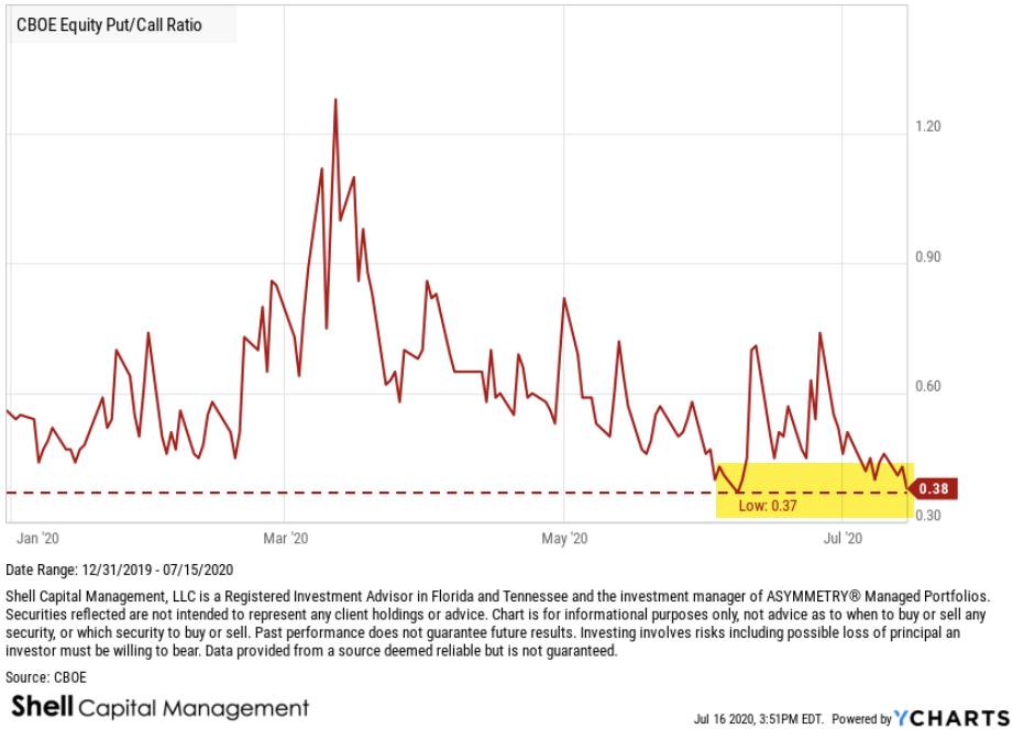
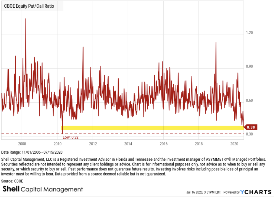
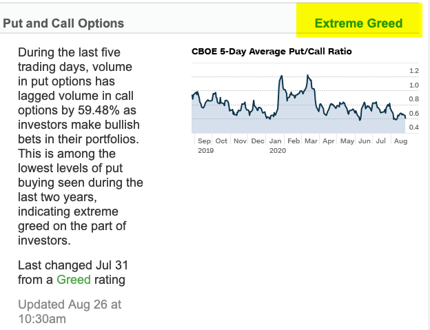
On the other hand, the level of the Put/Call Ratio is among the lowest levels of put buying seen during the last two years, indicating EXTREME GREED on the part of investors. Image
Junk Bond Demand @ EXTREME GREED. Investors in junk bonds are accepting 2.05% in additional yield over safer investment grade bonds. This spread is much lower than what has been typical during the last two years and indicates that investors are pursuing higher risk strategies. Image
The 3rd EXTREME GREED indicator is the S&P 500 is 15.28% above its 125-day average. This is further above the average than has been typical during the last two years and rapid increases like this often indicate extreme greed, according to the Fear & Greed Indicator. Image
Aside from neutral , some other moderate hold outs of the 7 indicators include breadth. The Fear & Greed Indicator uses the McClellan Volume Summation Index, which measures advancing and declining volume on the NYSE. It has fallen from EXTREME GREED just over a week ago. Image
Stock Price Strength is another moderate GREED level. It says the number of stocks hitting 52-week highs exceeds the number hitting lows and is at the upper end of its range, indicating greed. Image
Safe Haven Demand is at a bullish investor sentiment level. Stocks have outperformed bonds by 6.87% during the last 20 trading days, close to the strongest performance for stocks/bonds in the past 2 years - investors are rotating into stocks from the relative safety of bonds. Image
THE BOTTOM LINE IS: The seven indications of investor sentiment are dialing up to a very optimistic level, signaling investors are bullish on stocks. Though some of it isn't yet extreme, when we put it in context, anything can happen from here, but its now @ a high risk zone. Image

• • •

Missing some Tweet in this thread? You can try to force a refresh
 

Keep Current with Mike Shell

Mike Shell Profile picture

Stay in touch and get notified when new unrolls are available from this author!

Read all threads

This Thread may be Removed Anytime!

PDF

Twitter may remove this content at anytime! Save it as PDF for later use!

Try unrolling a thread yourself!

how to unroll video
  1. Follow @ThreadReaderApp to mention us!

  2. From a Twitter thread mention us with a keyword "unroll"
@threadreaderapp unroll

Practice here first or read more on our help page!

More from @MikeWShell

May 20, 2023
Do you see what I see? When short-dated U.S. treasuries are elevated, what's the market telling us? Image
Here's the chart of short-dated U.S. treasuries with the S&P 500 overlay indicating short-term peak rates coincide with a stock market top. twitter.com/i/web/status/1… Image
I just wrote this for context:

shell-capital.com/asymmetric-inv…
Read 4 tweets
Jun 1, 2022
Breadth can be useful as a risk measure indicator, and that's usually how I show it. For example, this is the % of financial sector stocks trending above the 50-day average. When most stocks are already in uptrends/downtrends, it becomes more likely the trend will reverse.
2) but you may consider the % in an uptrend may also be used for alpha seeking asymmetric risk-reward. Ie., when only a few stocks in a sector are in uptrends, maybe instead of investing in the index ETF you'd instead invest just in those stocks.
3) one way to think of it is when 50% or more stocks are in uptrends, may as well invest in the index. But when 50% or more of stocks are in downtrends, maybe invest only in those trending stocks in pursuit of alpha. You can probably see how it's all testable and quantifiable.
Read 4 tweets
Jul 17, 2020
1) Does hedging market risk with options work on stocks?

We have several ways to direct and control the risk of loss and drawdown. We can:

Sell to reduce exposure in uptrends
Apply trend following to sell after a trend reverses
Hedge dynamically when risk is high
Hedge always
2) The Cboe S&P 500 5% Put Protection Index is designed to track the performance of a hypothetical strategy that holds a long position indexed to the S&P 500® Index and buys a monthly 5% out-of-the-money S&P 500 Index (SPX) put option as a hedge, and rolls on a monthly basis.
3) So, the index is an example of "always hedged", so let's see how it's going since it started in 2015. Over the past 5 years, it had some lag due to the cost of 5% OTM put options for protection. Here, I left out 2020 to show how it looked.
Read 9 tweets
Jul 17, 2020
1) A Bollinger Band is an observation of historical REALIZED VOLATILITY above/below a simple moving average of the price trend. It's an adaptive trading band as it adjusts to volatility swings in price. We can see volatility is dynamic, not static, over time. THREAD: Image
2) Placing a channel of volatility above/below the price trend allows us to see if prices are high/low on a relative basis. By definition, the price is HIGH at the UPPER band and the price is LOW at the LOWER band. The odds are best when the price trends outside the range. Image
3) Here I used Netflix as an example. Euphoria drove its price WAY above its *normal* range, suggesting the outlier move was likely to retract back to a normal range. That is, the "price was high" and while momentum is good, when it's too good it's prone to fail. Image
Read 9 tweets
Jul 16, 2020
1) Lot's of talk about the CBOE Equity Put/Call Ratio reaching an extreme low, but...
2) Yes, indeed, the CBOE Equity Put/Call Ratio reaching an extremely low level. In fact, it's as low as it has ever been going back to 2006.
3) Normally, we consider such a low level to be an example of extreme complacency and GREED DRIVING THE MARKET. For example, the CBOE Equity Put/Call Ratio is the first of seven indicators used in the Fear & Greed Index.
Read 9 tweets
Feb 4, 2020
@AndrewMcCurdy2 I like trends and drawing charts, so here is a few before I get in my pool heated with natural gas and solar :) and I'll add you here, too @jdouglaslittle Fossil Production and Renewable.
@AndrewMcCurdy2 @jdouglaslittle different perspective:
@AndrewMcCurdy2 @jdouglaslittle Coal production in a downtrend
Read 10 tweets

Did Thread Reader help you today?

Support us! We are indie developers!


This site is made by just two indie developers on a laptop doing marketing, support and development! Read more about the story.

Become a Premium Member ($3/month or $30/year) and get exclusive features!

Become Premium

Don't want to be a Premium member but still want to support us?

Make a small donation by buying us coffee ($5) or help with server cost ($10)

Donate via Paypal

Or Donate anonymously using crypto!

Ethereum

0xfe58350B80634f60Fa6Dc149a72b4DFbc17D341E copy

Bitcoin

3ATGMxNzCUFzxpMCHL5sWSt4DVtS8UqXpi copy

Thank you for your support!

Follow Us!

:(