Glen Peters Profile picture
Sep 2, 2020 16 tweets 6 min read Read on X
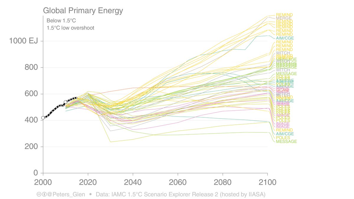
1. Do Integrated Assessment Models (IAMs) show similar pathways to below 1.5°C?

Robust: All have less fossils, more non-fossils.

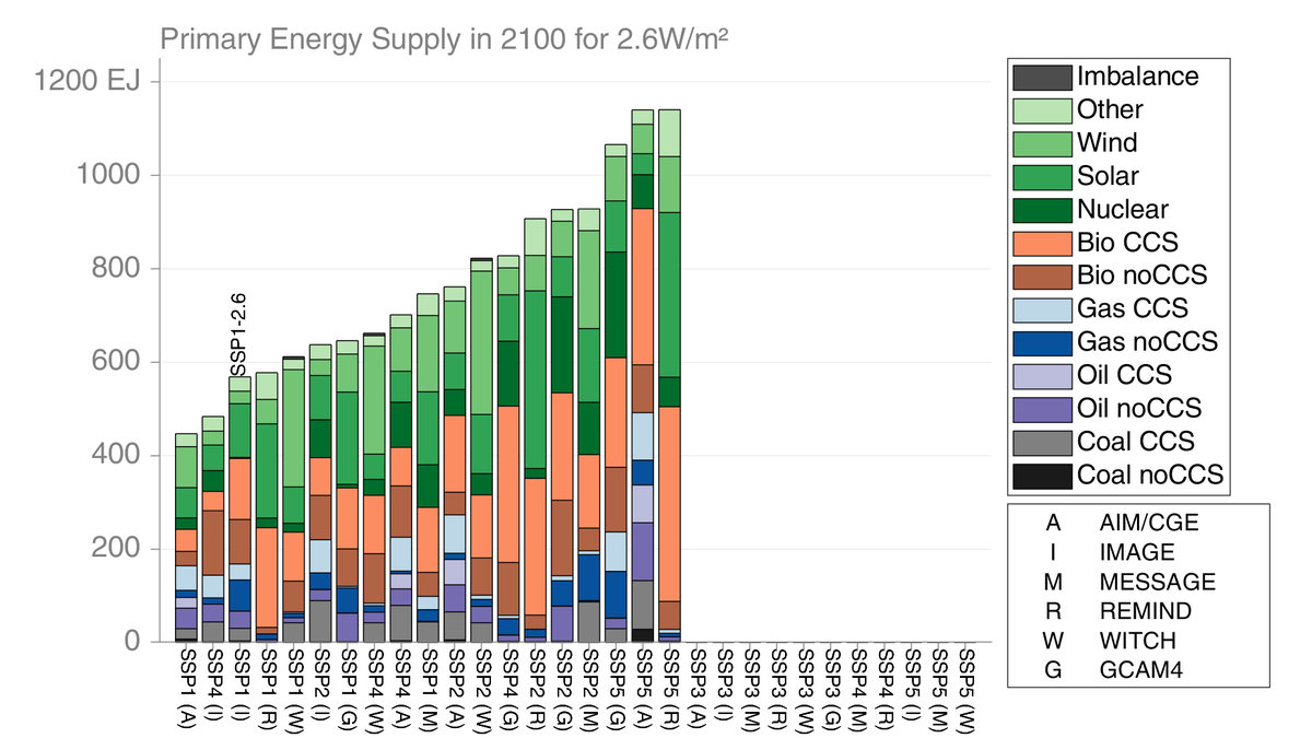
Details (a thread): The range of primary energy in 2100 is from 300EJ to 1200EJ (300-700 in 2050). Different IAMs (colours) show different outcomes. Image
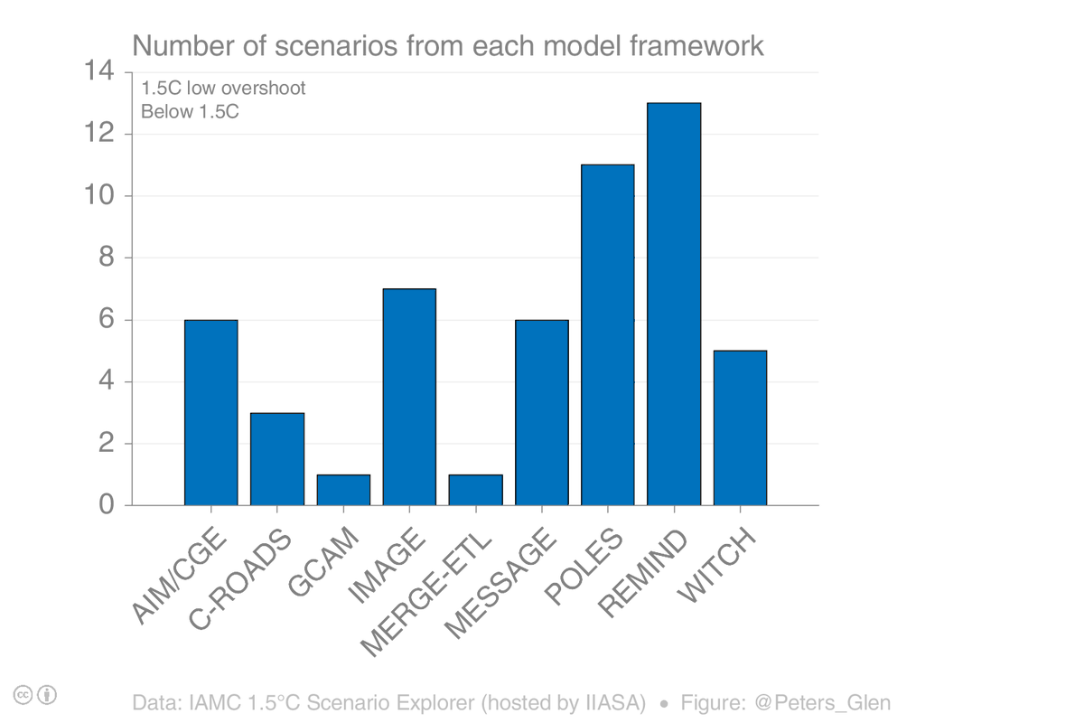
2. I am going to show different scenarios from the IPCC 1.5°C Scenario Database (#SR15). There are 53 scenarios with no or low overshoot of 1.5°C, but only 9 model "families" (grouping versions of the same model).

Important: the distribution of models in SR15 is not uniform. Image
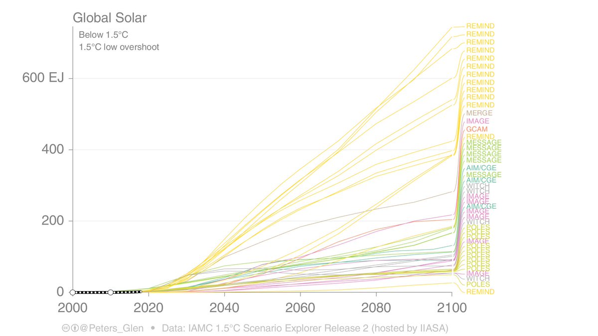
3. Some IAMs prefer certain technologies over others (in the respective IAM frameworks & assumptions). REMIND has consistently has more solar than other IAMs, POLES is at the other end of the scale. Image
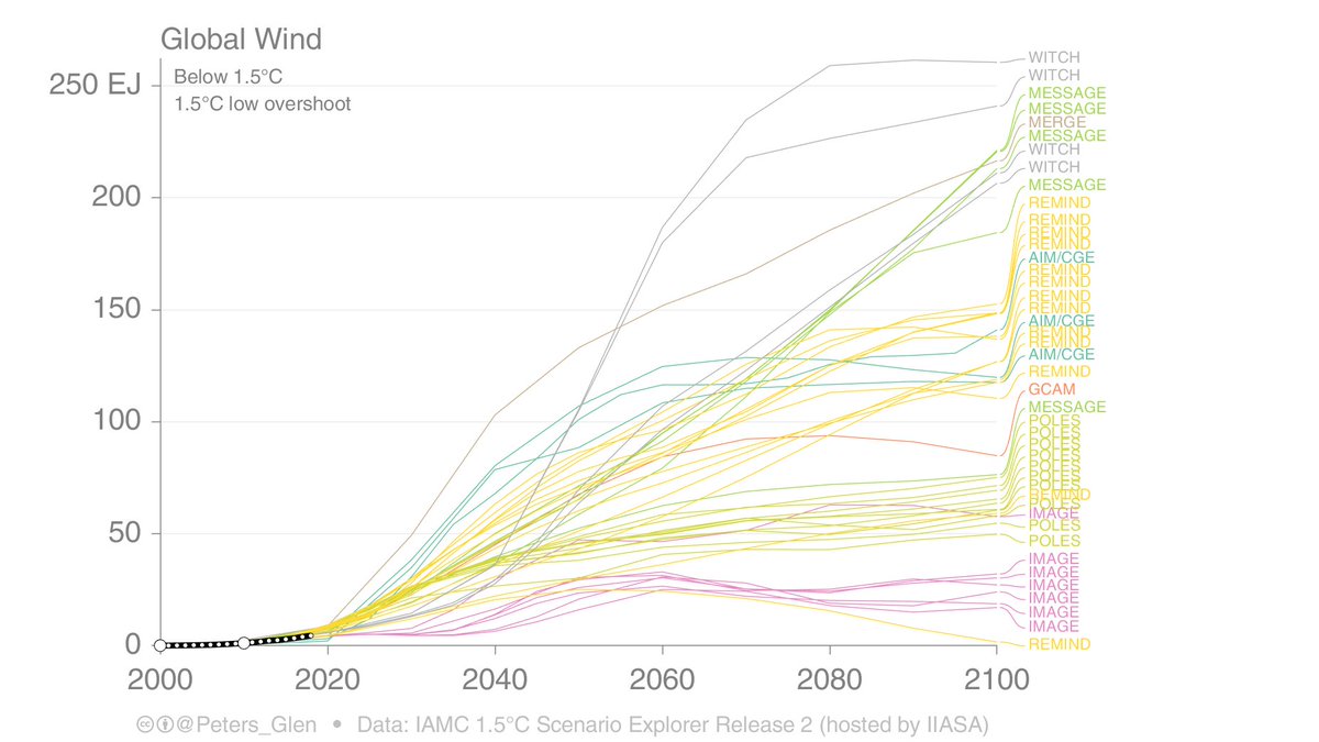
4. WITCH & MESSAGE find higher shares wind, IMAGE low. REMIND & POLES are in the middle.

[Note many scenarios are sensitivity studies, egs, run with constraints on particular technologies] Image
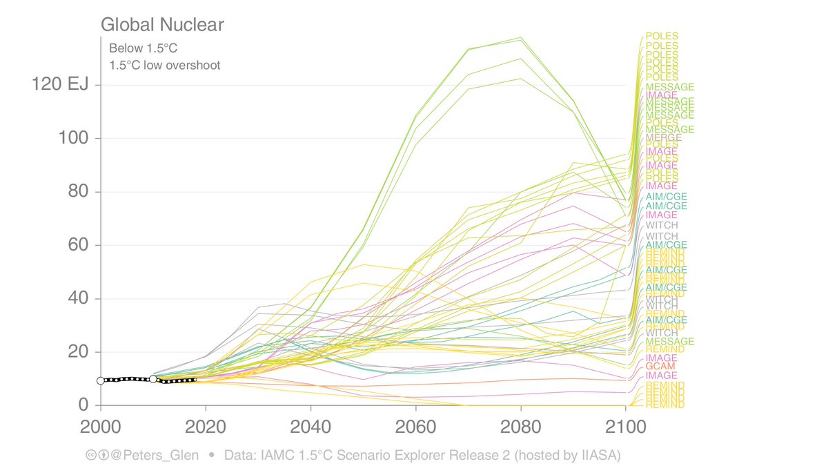
5. POLES and MESSAGE are much higher on nuclear (& GCAM if available), while REMIND is quite low.

You may see a pattern now. REMIND, for example, can be low on nuclear as it is high on wind & solar. If an IAM is low on something, it usually means it is high on something else. Image
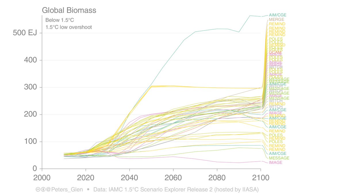
6. Many IAMs use high levels of bioenergy, and many studies apply a constraint of 300EJ/yr. REMIND, for example, is limited by that constraint. REMIND ran a variety of sensitivity studies on bioenergy, which explains is wide variation. No constraints, higher bioenergy. Image
7. As people have heard endless now, IAMs seem to like BECCS! Some models/scenarios don't use BECCS. C-ROAD has no BECCS (not shown), others ran sensitivity studies that effectively limited BECCS (eg, lower bioenergy).

Either way, there is a lot of BECCS in these scenarios... Image
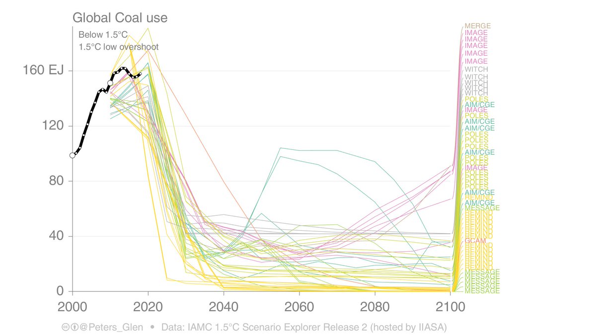
8. All IAMs have big drops in coal, but some have a coal resurgence post-2050. Some IAMs go to zero coal, som maintain levels at about 25% of today's level.

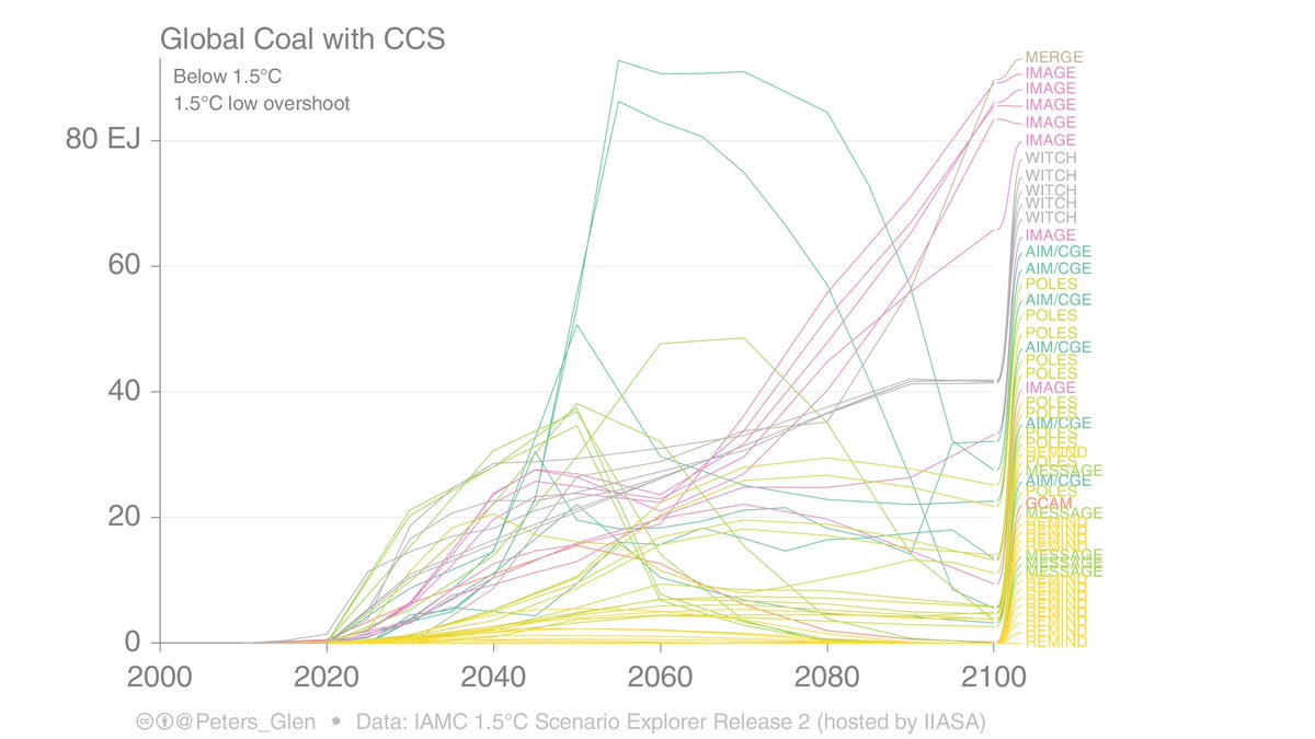
Coal is out, but not necessarily completely (eg, with CCS). Image
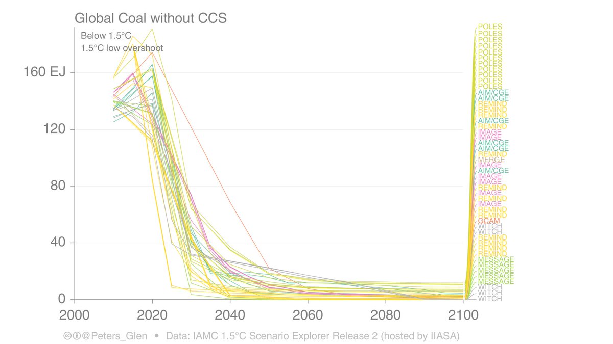
9. Coal without CCS basically goes in all models, so when you see coal in 1.5°C scenarios, it all has CCS...

So, how much CCS is feasible, & would it happen on coal? ImageImage
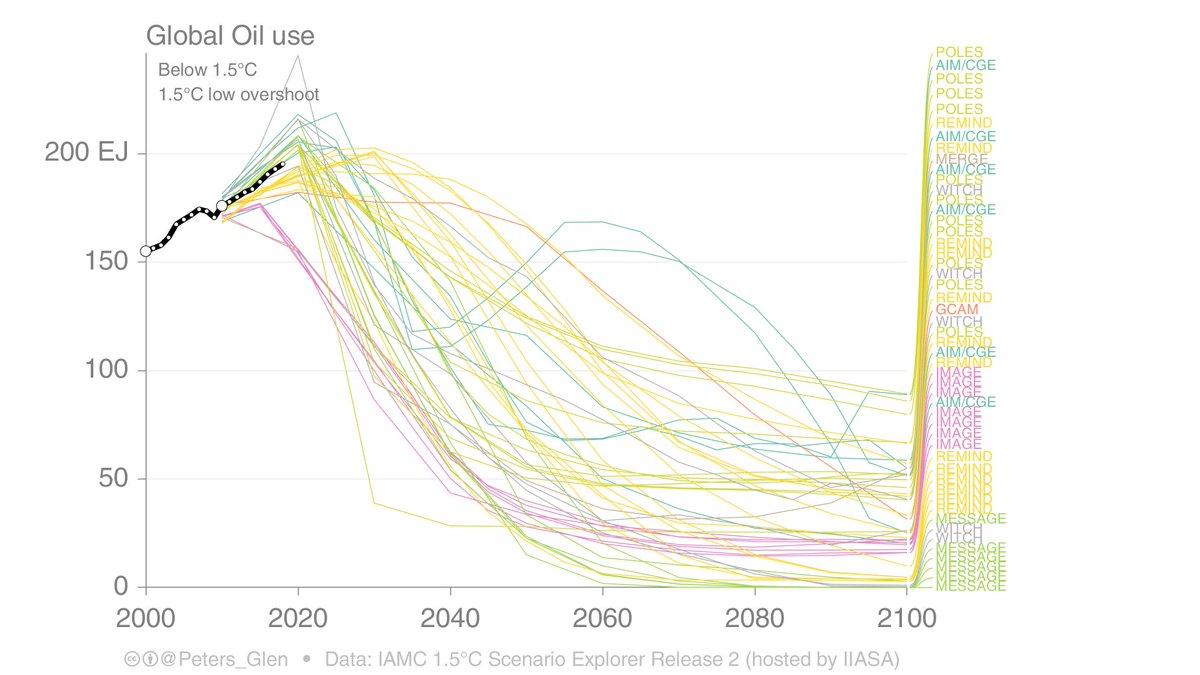
10. Oil drops away in most IAMs, but it is slow and not complete. Many scenarios have oil drop at about the same as the decline rate of existing fields. But it lingers until 2100 in many IAMs.

No BECCS scenarios have less oil. Image
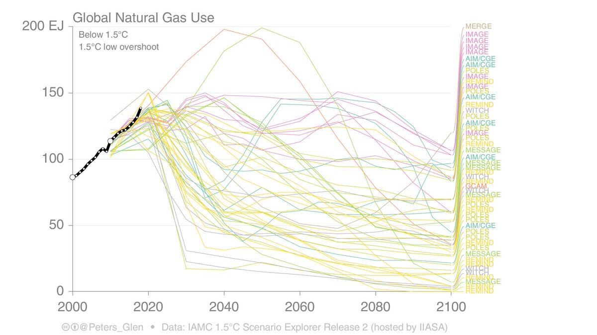
11. Gas varies widely across IAMs and scenarios, you could probably say gas will be less than today in a 1.5°C world, but how much is model and scenario dependent... Image
12. Here is a different style of figure, only using the SSPs, that shows the energy mix in 2°C scenarios across six IAMs. It is clear, each IAM has a different energy mix, over and above the SSP (IAM often more important than SSP). Image
13. There is lots we don't know.

For example, why do IAMs use so much oil & gas in particular? How does this relate to the high use of Carbon Dioxide Removal? Are IAMs too rigid in hard-to-mitigate sectors (eg aviation, steel)? What about demand? Etc.
14. There are potentially many pathways to 1.5°C that have quite different energy mixes then we see in current scenario databases.

Can these pathways come out of the existing IAMs or are they structurally bound in ways that limit diversity?
15. IAMs play a quite pivotal role in framing the climate debate. They use a lot of BECCS, which means we endless discuss BECCS & other CDR, have journals, special issues, conferences. What an influence!

Imagine if no one ever joined BE with CCS...
16. After those thoughts, back to work...

/end

• • •

Missing some Tweet in this thread? You can try to force a refresh
 

Keep Current with Glen Peters

Glen Peters Profile picture

Stay in touch and get notified when new unrolls are available from this author!

Read all threads

This Thread may be Removed Anytime!

PDF

Twitter may remove this content at anytime! Save it as PDF for later use!

Try unrolling a thread yourself!

how to unroll video
  1. Follow @ThreadReaderApp to mention us!

  2. From a Twitter thread mention us with a keyword "unroll"
@threadreaderapp unroll

Practice here first or read more on our help page!

More from @Peters_Glen

Jun 12
Nitrous Oxide (N2O) is no laughing matter, atmospheric N2O has increased 25% due to human activities.

Today @gcarbonproject updates the Global Nitrous Oxide Budget, which helps us understand where the N2O comes from and where it goes.


1/ essd.copernicus.org/articles/16/25…
Image
According to IPCC AR6, N2O caused 0.1°C of the current warming of 1.1°C (not this figure is now higher).

This may sound small, but since N2O is long-lived (like CO2) & primarily comes from agriculture, that 0.1°C will only go up in the future.

2/ Image
There are many sources of N2O, over half of which are natural (soils).

Anthropogenic sources are dominated by agriculture (soils & manure management) & industry (chemicals).

The sink is due to photolysis & oxidation in the atmosphere.

3/ Image
Read 8 tweets
Jun 5
Greenhouse gas emissions are at record highs, again.

The only good news is that Ozone Depleting Substances (ODS) regulating under the Montreal Protocol have declined substantially in the last decades.

But what does all this mean for climate?


1/ 🧵 essd.copernicus.org/articles/16/26…
Image
Record high emissions means record high radiative forcing.

We have you covered, we also include aerosols (SO2, etc) & have done so for decades. Also shipping!

Short-lived aerosols are important, but should not distract from the drivers of change: greenhouse gas emissions!

2/ Image
Most of the energy put into the system ends in the ocean (90%), so the Ocean Heat Content (OHC) has been increasing along with emissions and radiative forcing.

This also means the Earth Energy Imbalance is also increasing.

3/ Image
Read 8 tweets
May 9
"Implemented policies result in projected emissions that lead to warming of 3.2°C, with a range of 2.2°C to 3.5°C (medium confidence)"

According to the landmark, widely reported IPCC Synthesis Report published in 2023.


1/ ipcc.ch/report/ar6/syr/
Image
If you are surprised by this figure, where the median is 2.5°C (not 3.2°C), then I am curious why you think scientists are so optimistic...

The survey reflects more or less what scientists have been saying for years?


2/ theguardian.com/environment/ar…
Image
This question is ambiguous: "How high above pre-industrial levels do you think average global temperature will rise between now and 2100?"
* ...pre-industrial... between "now and 2100"?
* Where we are currently heading or where we could head? This is largely a policy question?
3/
Read 10 tweets
Apr 12
There is a very strong linear relationship between atmospheric CO2 (concentration) and cumulative CO2 emissions.

In the last days, quite a few have been commenting there are feedbacks kicking in.

A thread...

1/ Image
If atmospheric CO2 is proportional to cumulative CO2 emissions, then the annual change in atmospheric CO2 is proportional to annual CO2 emissions.

The ratio of the two is the 'airborne fraction', which is rather constant. Maybe a slight increase in trend lately, maybe...

2/ Image
Since emissions have leveled out in the last decade, one would expect therefore that the atmospheric increase has leveled out.

The concentration data is noisy, and it has leveled out or not depending on how it is smoothed! (look at last 10 years).

3/ Image
Read 8 tweets
Apr 9
Is the atmospheric growth rate of CO2 slowing down?

Total CO2 emissions have gone from 2%/yr growth (2000s) to 0%/yr (2010s).

Do we see that change in the atmosphere?

It is hard to answer 🧵


1/ rdcu.be/buifD
Image
I can make this figure incredibly complex by adjusting for ENSO (red dots and line).

We know the response of atmospheric CO2 to El Niño is lagged. This figure shows a 9 month lag, as used by Betts & Jones in their projection

But, 2023 is a La Niña?

2/ metoffice.gov.uk/research/clima…
Image
The same figure with a three month lag says 2023 is a El Niño.

In either case, adjusting the growth rate for ENSO makes it look like the atmospheric CO2 growth rate is maintained, and not slowing down.

This is worrying. It should be slowing down...

3/ Image
Read 8 tweets
Dec 15, 2023
One of the key arguments that Norway uses to continue oil & gas developments, is that under BAU it is expected that oil & gas production will decline in line with <2°C scenarios, even with continued investment.

Let's look closer at these projections & reality...

1/ Image
Here is the projections from the 2003 report from the petroleum agency.

In reality (tweet 1) there was a dip around 2010, but production is now up around 250 million cubic again.

The forecast was totally & utterly WRONG!

2/ Image
In 2011 there was a forecast for an increase in production to 2020, but then a decline. This is probably since they started to put the Johan Sverdrup field on the books.

The increase in production was way too low, again, they got it wrong.

3/ Image
Read 9 tweets

Did Thread Reader help you today?

Support us! We are indie developers!


This site is made by just two indie developers on a laptop doing marketing, support and development! Read more about the story.

Become a Premium Member ($3/month or $30/year) and get exclusive features!

Become Premium

Don't want to be a Premium member but still want to support us?

Make a small donation by buying us coffee ($5) or help with server cost ($10)

Donate via Paypal

Or Donate anonymously using crypto!

Ethereum

0xfe58350B80634f60Fa6Dc149a72b4DFbc17D341E copy

Bitcoin

3ATGMxNzCUFzxpMCHL5sWSt4DVtS8UqXpi copy

Thank you for your support!

Follow Us!

:(