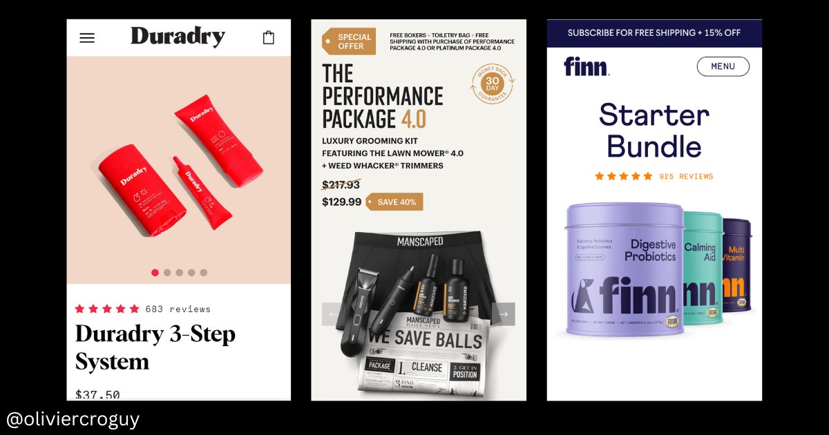
Let's analyze a product page that converts like Crazy
Overview:
-benefit-oriented product name
-Amazing "Above the fold" section
-Benefits details + illustrations
-How to use section with 3 easy steps
-UCG photos (with faces) with testimonials
-Us vs Them
👇Thread
Overview:
-benefit-oriented product name
-Amazing "Above the fold" section
-Benefits details + illustrations
-How to use section with 3 easy steps
-UCG photos (with faces) with testimonials
-Us vs Them
👇Thread

1. Above the fold (the most important part of the page)
You can find all the most valuable information :
- The attention-grabbing product name "super youth"
-Benefits list + color contrast
-Great CTA in green
-secure badge+guarantee
-Social proof with reviews
-small description
You can find all the most valuable information :
- The attention-grabbing product name "super youth"
-Benefits list + color contrast
-Great CTA in green
-secure badge+guarantee
-Social proof with reviews
-small description

2. List of benefits
Just under the fold, you find the benefits of the product.
-Great illustrations with relevant design & colors
-Goal-oriented benefit names with good contrast
Just under the fold, you find the benefits of the product.
-Great illustrations with relevant design & colors
-Goal-oriented benefit names with good contrast

3. Why use it / Who is it for section
After claiming something, you have to explain why it works.
Benefits section triggers emotions
This part triggers reason and logic
It explains "scientifically" how the product works.
makes people feel better about buying your product
After claiming something, you have to explain why it works.
Benefits section triggers emotions
This part triggers reason and logic
It explains "scientifically" how the product works.
makes people feel better about buying your product

3. How to use it section
Not a lot of brands add a "how to use it" section on their product pages (or put it in FAQ) but they really should do it
With the "3 steps'", It shows how easy it is to use your product (theoretically) and it can reduce frictions.
Underrated section
Not a lot of brands add a "how to use it" section on their product pages (or put it in FAQ) but they really should do it
With the "3 steps'", It shows how easy it is to use your product (theoretically) and it can reduce frictions.
Underrated section

4. Testimonials/social proof section
No better to get social proof than simply showing real people using your product with testimonials
It feels real and people can identify themself
Even better with video testimonials
Real people = Authenticity
No better to get social proof than simply showing real people using your product with testimonials
It feels real and people can identify themself
Even better with video testimonials
Real people = Authenticity

5. Reviews
You guys probably already use this section.
Review section is a non-negociable
Don't expect to make any sales without a proper review section
You guys probably already use this section.
Review section is a non-negociable
Don't expect to make any sales without a proper review section

6. Us vs them section.
This is one of the best "US vs Them" section I've seen so far
-Amazing color contrasts (blue/pink vs grey)
-Great headline (See why 513 657 women...)
-Testimonial explaining why it is better than the competition
-Testimonial explaining why it's better
This is one of the best "US vs Them" section I've seen so far
-Amazing color contrasts (blue/pink vs grey)
-Great headline (See why 513 657 women...)
-Testimonial explaining why it is better than the competition
-Testimonial explaining why it's better

If you are into ecom you should really bookmark this website
One of the best conversion page optimized product page I've ever seen 👍
skinnyfit.com/products/super…
One of the best conversion page optimized product page I've ever seen 👍
skinnyfit.com/products/super…
• • •
Missing some Tweet in this thread? You can try to
force a refresh