More tips about using perspective to reimagine the impact of a scene in animation environment design.
A step-by-step thread:
A step-by-step thread:

(Twitter aggressively crops these tall pans so click on them to see all.)
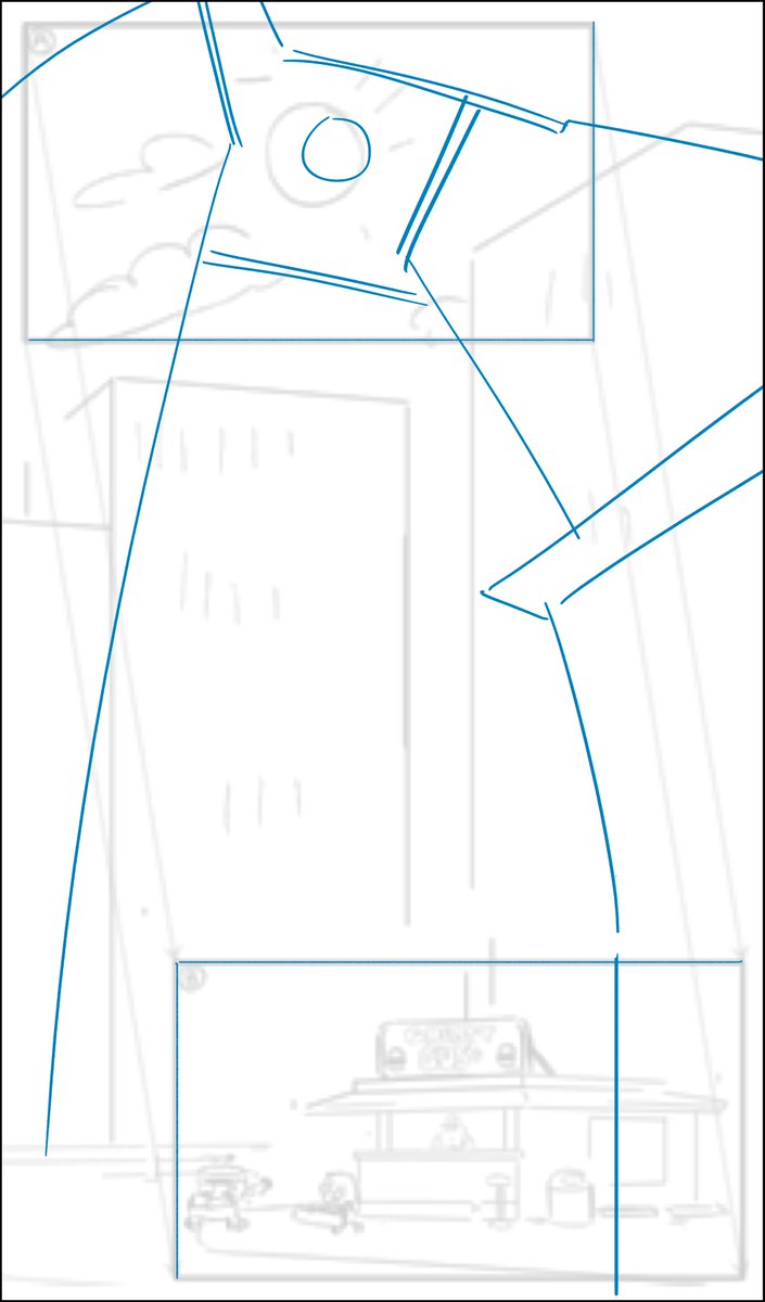
First, the story of this storyboard panel is we start on a midday sun and pan down to a little burger shack surrounded by skyscrapers.
Always ask yourself how you can tell the story better with design.
First, the story of this storyboard panel is we start on a midday sun and pan down to a little burger shack surrounded by skyscrapers.
Always ask yourself how you can tell the story better with design.
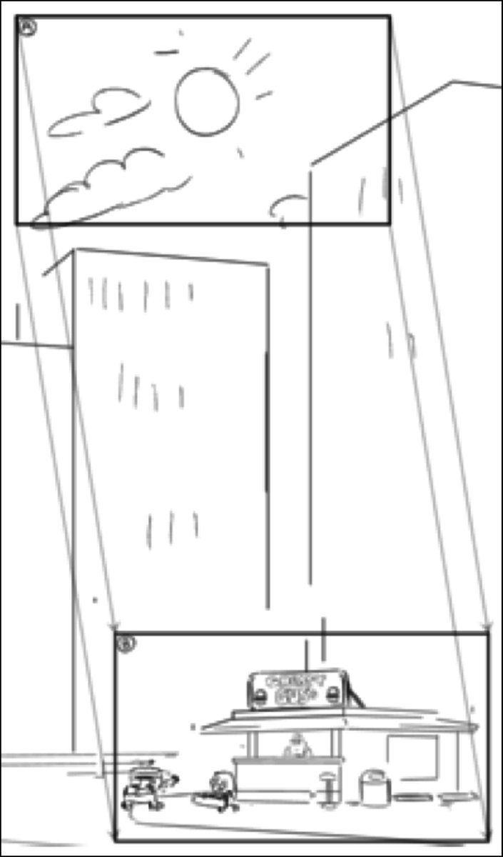
I looked to the start of the pan to help tell the story of the shack surrounded by architecture. I wrapped our view of the sun in buildings.
This establishes the feeling of the location earlier than later in the pan.
In this quick concept, I redesigned the composition.
This establishes the feeling of the location earlier than later in the pan.
In this quick concept, I redesigned the composition.
Then came the challenge of perspective.
To make it feel like the camera is looking skyward and tilting down, the buildings must distort in perspective with the movement.
Define the beginning and end first, then connect them.
To make it feel like the camera is looking skyward and tilting down, the buildings must distort in perspective with the movement.
Define the beginning and end first, then connect them.

In the cleanup stage, I add more detail sticking to the complex perspective I already established.

The burger shack I had established earlier in the episode in a flashback in the country before the city grew up around it.
I took that drawing and aged it. Now it really feels like it has history.
I took that drawing and aged it. Now it really feels like it has history.


Here's the finished background design in its entirety.
The skyscraper windows remain relatively simple because they don't need to have a lot of depth and detail to do their job of capturing the surrounding feeling.
We move quickly past them anyway.
The skyscraper windows remain relatively simple because they don't need to have a lot of depth and detail to do their job of capturing the surrounding feeling.
We move quickly past them anyway.

Now look at this sweet baby in color.
I use this old trick all the time when doing these kind of drawings:
- Click to view.
- Make your hands into a "frame".
- Pan down to test the effect.
If you're on a phone, you can do it with zooming and scrolling.
I use this old trick all the time when doing these kind of drawings:
- Click to view.
- Make your hands into a "frame".
- Pan down to test the effect.
If you're on a phone, you can do it with zooming and scrolling.

As usual, I didn't paint the background.
Check out the circular clouds that were added in paint. What an awesome enhancement to the scene!
Check out the circular clouds that were added in paint. What an awesome enhancement to the scene!
Another detail to note is that the direction that the negative space (the sky) points (down, slight right) is the direction that the camera itself moves across the background.

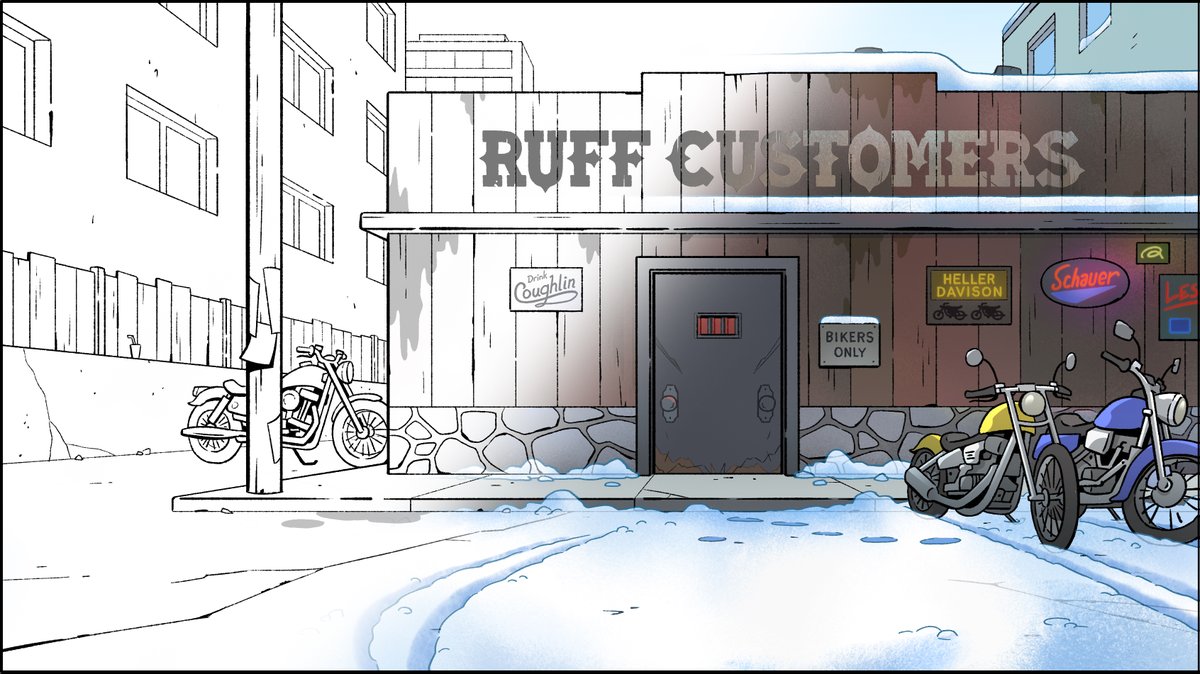
I barely got into the design of Greasy Gus's itself.
I really love mid 20th century Americana design. We don't have much of it in #BigCityGreens but I add it wherever appropriate.
I really love mid 20th century Americana design. We don't have much of it in #BigCityGreens but I add it wherever appropriate.

History I imagined when drawing Gus's:
- The overhanging lights were installed when the neon was removed.
- A truck backed into the roof.
- Original seats were hard to find so mismatched ones were fitted.
- Updated vent systems meant more junk on top.
#story
- The overhanging lights were installed when the neon was removed.
- A truck backed into the roof.
- Original seats were hard to find so mismatched ones were fitted.
- Updated vent systems meant more junk on top.
#story
• • •
Missing some Tweet in this thread? You can try to
force a refresh