A thread explaining why the bond market is asleep and what wakes it up.
---
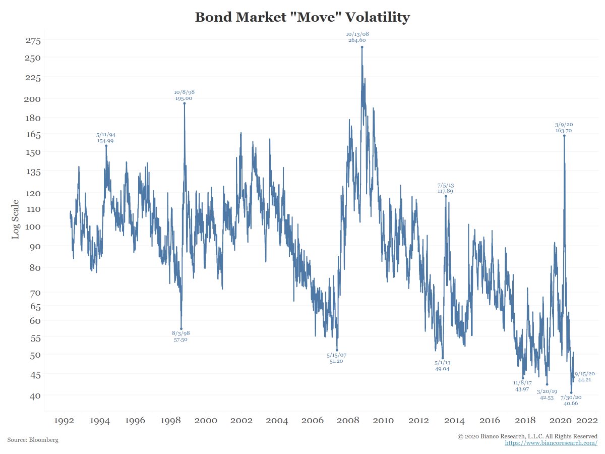
The next chart shows the MOVE Index (Merrill Options Volatility Estimate). It is the “VIX of the bond market” and is near its lowest reading in history (which was set on July 30).
(1/10)
---
The next chart shows the MOVE Index (Merrill Options Volatility Estimate). It is the “VIX of the bond market” and is near its lowest reading in history (which was set on July 30).
(1/10)
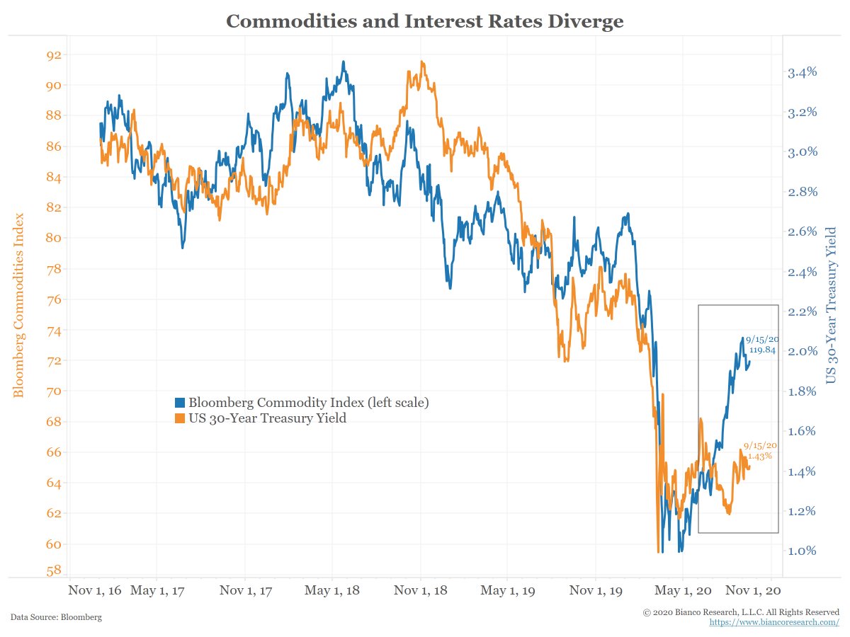
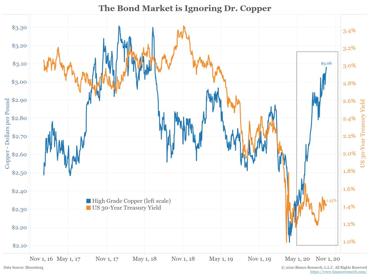
Should interest rates be this low? Consider these 2 charts.
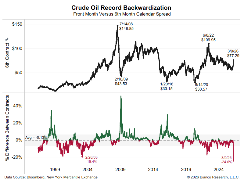
The bond market often moves in tandem with commodities. But as the boxes show, that has not been the case recently.
Commodities are suggesting interest rates should be moving higher, but they are not.
(2/10)
The bond market often moves in tandem with commodities. But as the boxes show, that has not been the case recently.
Commodities are suggesting interest rates should be moving higher, but they are not.
(2/10)
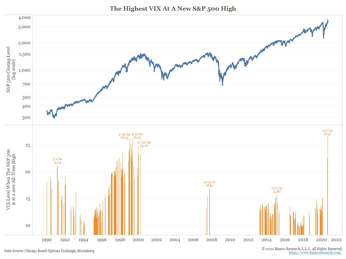
* Top panel shows the SPX (log)
* Orange bars show the VIX’s close on days the SPX hit an all-time high (ATH).
VIX hit 26.57 when the SPX hit an all-time high on Sep-2. The VIX has never been higher with SPX at ATH.
Stocks are not exhibiting low levels of volatility.
(3/10)
* Orange bars show the VIX’s close on days the SPX hit an all-time high (ATH).
VIX hit 26.57 when the SPX hit an all-time high on Sep-2. The VIX has never been higher with SPX at ATH.
Stocks are not exhibiting low levels of volatility.
(3/10)
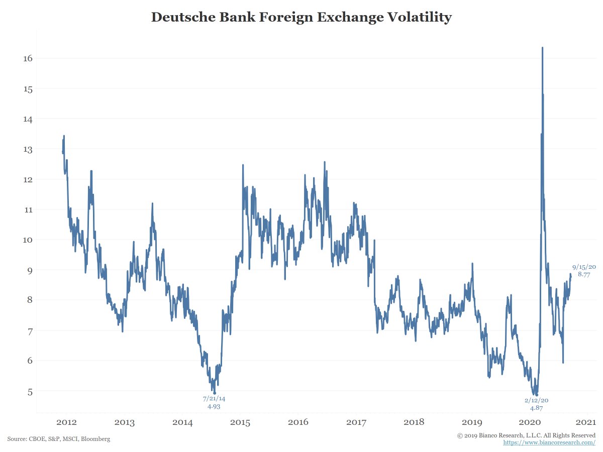
Foreign exchange volatility hit a new low BEFORE the pandemic. But currency volatility has been on the rise lately and well off the pre-pandemic low.
No other markets are have low volatility levels like the bond markets.
(4/10)
No other markets are have low volatility levels like the bond markets.
(4/10)
So why is the bond market asleep?
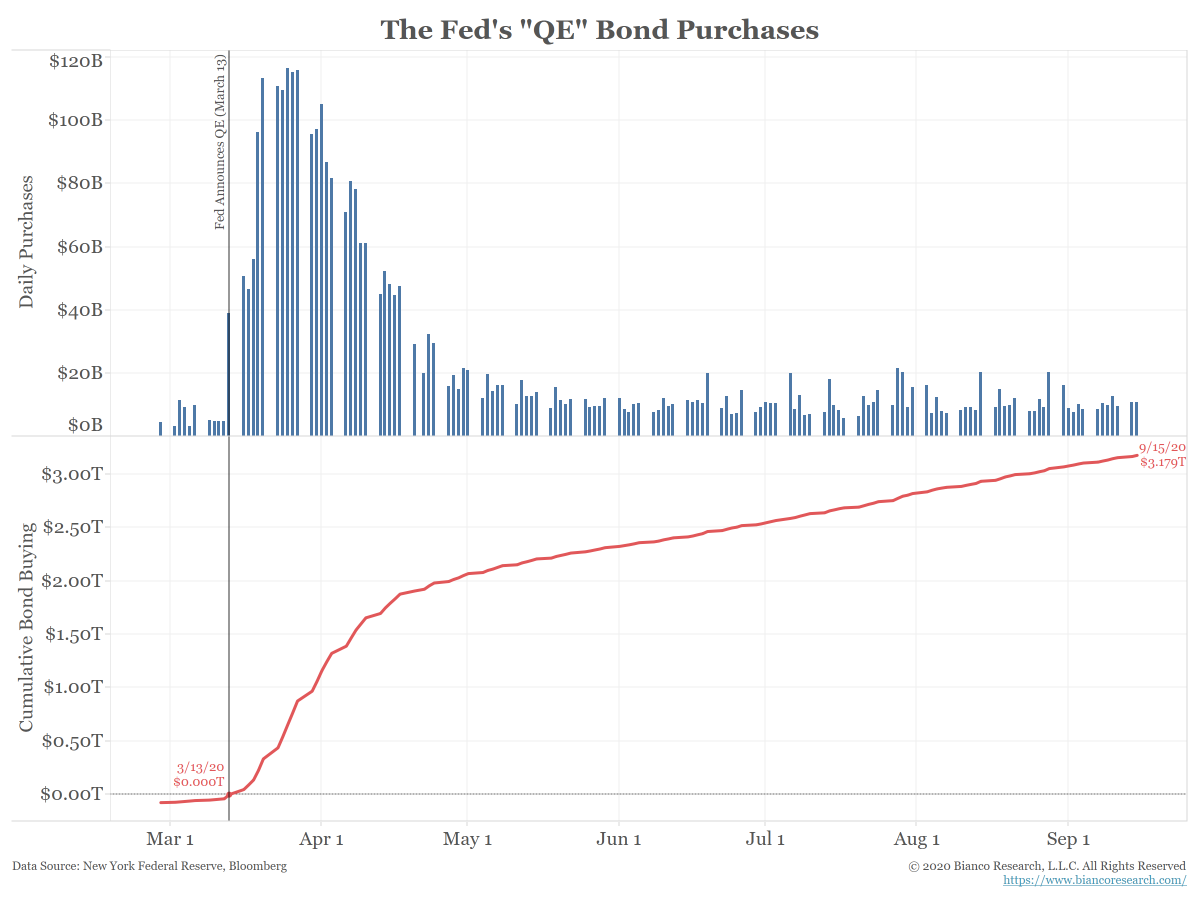
The Fed, via Quantitative Easing (QE), has bought over $3.1 trillion of bonds since mid-March (bottom panel).
(5/10)
The Fed, via Quantitative Easing (QE), has bought over $3.1 trillion of bonds since mid-March (bottom panel).
(5/10)
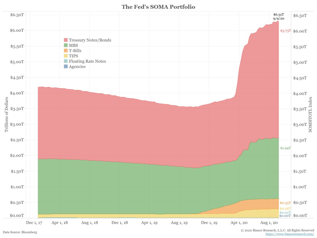
These purchases have rocketed the Fed’s holdings of fixed income securities to $6.3 trillion.
(6/10)
(6/10)
In a Nov 2010 Washington Post op-ed, Ben Bernanke explained the purpose of QE:
Easier financial conditions will promote economic growth. For example, lower mortgage rates will make housing more affordable and allow more homeowners to refinance. Lower corp bond rates ...
(7/10)
Easier financial conditions will promote economic growth. For example, lower mortgage rates will make housing more affordable and allow more homeowners to refinance. Lower corp bond rates ...
(7/10)
... will encourage investment. And higher stocks will boost consumer wealth and help increase confidence, which can also spur spending. Increased spending will lead to higher incomes and profits that, in a virtuous circle, will further support economic expansion.
(8/10)
(8/10)
By buying massive amounts of bonds, the Fed is suppressing interest rates and encouraging investors to seek riskier investments. And by signaling that they “have investors’ backs” they are promoting speculation (as can be seen in the options market lately).
(9/10)
(9/10)
We argue a significant rise in rates would be a big negative for all markets.
What would causes this rise? Inflation. The one thing bigger than the Fed is the collective of the bond mkt. Inflation returning chases bond investors out faster than the Fed can "print."
(10/10)
What would causes this rise? Inflation. The one thing bigger than the Fed is the collective of the bond mkt. Inflation returning chases bond investors out faster than the Fed can "print."
(10/10)
• • •
Missing some Tweet in this thread? You can try to
force a refresh