
Macro investment research at https://t.co/hQqAza8GGP
Our total return index is at https://t.co/vta9eqevnU
The ETF WTBN tracks our Index.
biancoresearch.eth
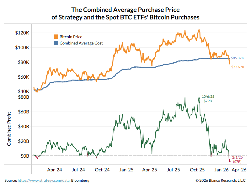
 2/5
2/5

 2/6
2/6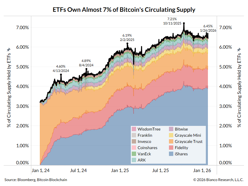
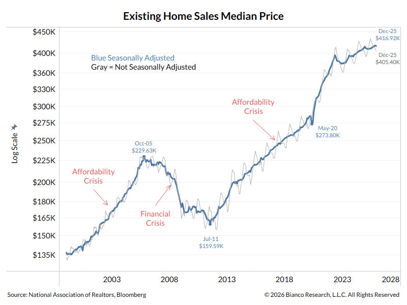 2/11
2/11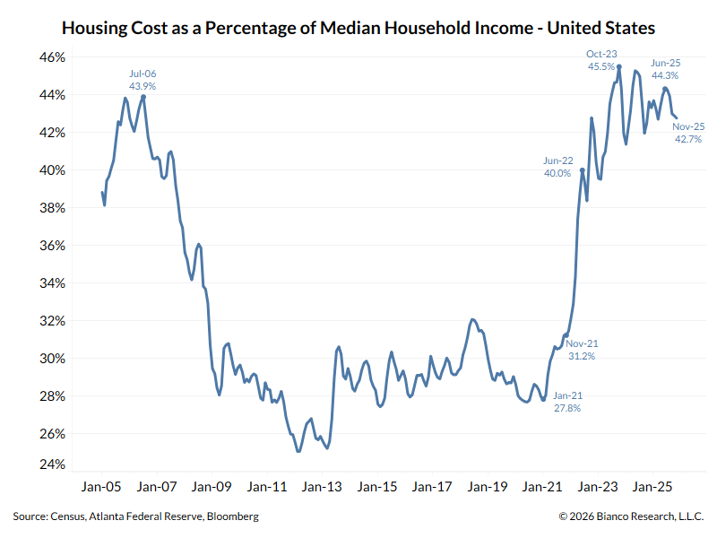

 2/4
2/4
 2/6
2/6
 2/13
2/13
 2/5
2/5
 2/6
2/6
 2/4
2/4


 The Atlanta Federal Reserve calculates a Housing Affordability Monitor.