One of the weirdest things about this pandemic are the crazy claims that some people make about Sweden.
This guy is getting back to me with a claim that very obviously contradicts the very tweet that he is replying to.🤦♂️
This guy is getting back to me with a claim that very obviously contradicts the very tweet that he is replying to.🤦♂️

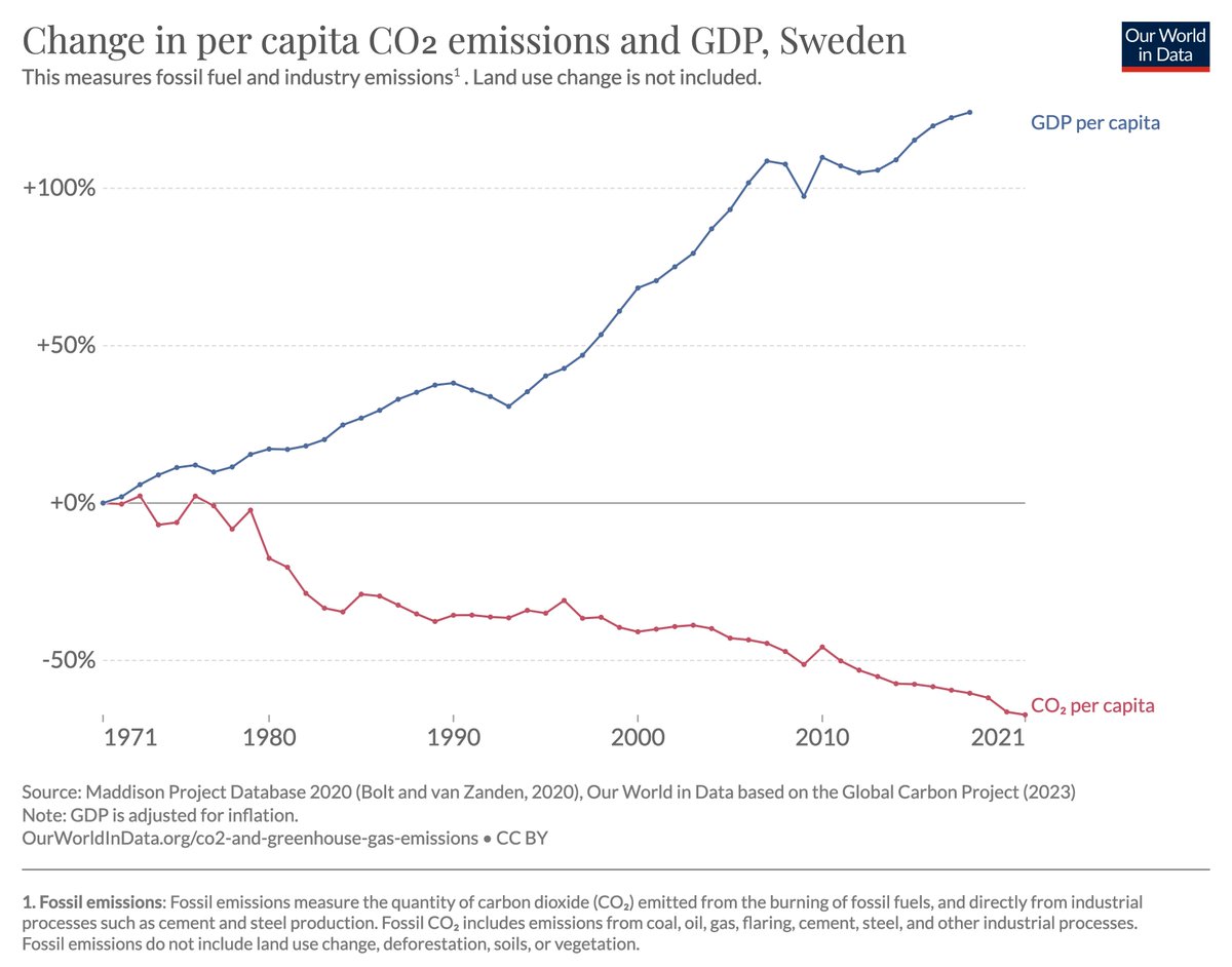
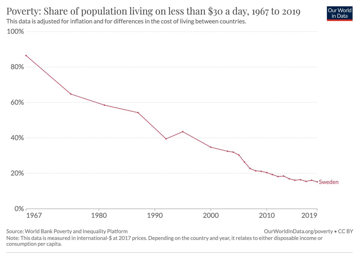
I expect that Sweden will do well in the longer run –– it is one of the richest countries with one of the best health systems on the planet.
But to say that Sweden has done well in the first months of this pandemic is absurd (8.3% econ decline and one of the worst death rates).
But to say that Sweden has done well in the first months of this pandemic is absurd (8.3% econ decline and one of the worst death rates).

If you are looking for a country to praise (and learn from) my suggestions are Korea, Germany, or Vietnam.
[Here is the research on they managed to do so well:
[Here is the research on they managed to do so well:
https://twitter.com/MaxCRoser/status/1278056024654610434]
Here is how the death rate that Sweden suffered compares with the death rate in these three counties.
(And as I said, GDP declined by 8.3% in Sweden. In Korea it declined by only 3%.)
(And as I said, GDP declined by 8.3% in Sweden. In Korea it declined by only 3%.)

• • •
Missing some Tweet in this thread? You can try to
force a refresh


