Ed Conway Profile picture
Sep 21, 2020 10 tweets 7 min read Read on X
You’ll probably see this chart a lot today. It’s the one @uksciencechief just showed at the @10DowningStreet briefing today. It’s v v scary & implies if the current growth rate of #COVID19 continues we'll face 49k cases a day by mid October. So. Is this really plausible...?
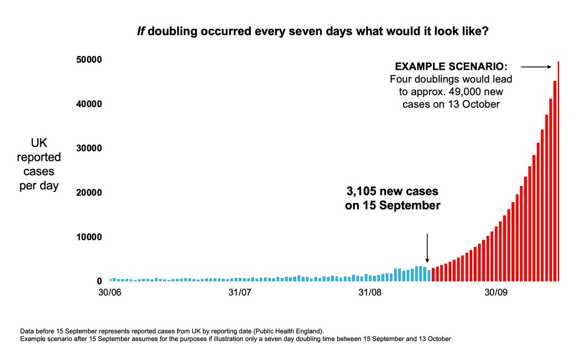
Well in strict mathematical terms, yes it is. Exponential growth rates are scary. This is precisely the problem with diseases like #COVID19. In the first wave deaths were for a time doubling every 3/4 days. Here's what that chart might look like if we followed last wave. Scarier!
But here's the big problem with @uksciencechief's scary illustrative chart: it's predicated on two presumptions. 1) that we are indeed seeing the disease double every 7 days. 2) it presumes that growth rate will continue. There are quite important challenges to both assumptions.
Let's take 1. first.
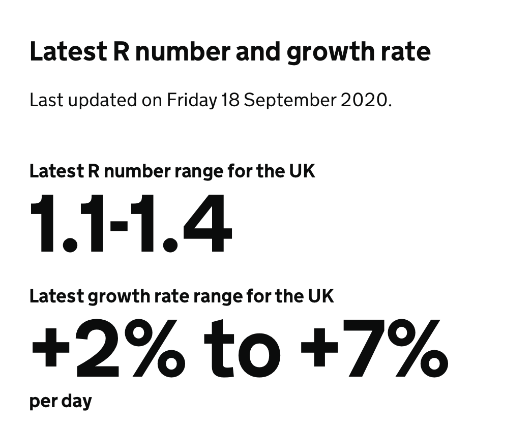
Doubling every 7 days works out at about 10.4% daily growth on average. Yet the govt's own estimate of the disease's growth rate, as per the latest R number release on fri, is 2-7%. Odd. Do they have data they're not telling us about? gov.uk/guidance/the-r…
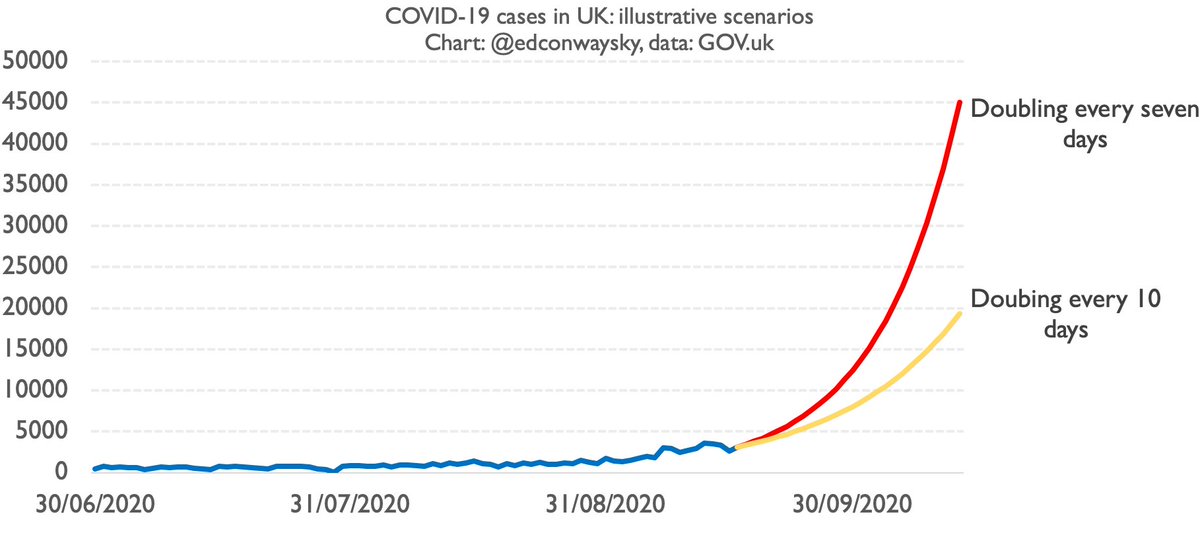
In an exponential world, smallish differences between % growth rates can make a big difference. Here's doubling every 10 days (yellow) vs doubling every 7 days, as per @uksciencechief's line (red).
Still grim. Up to 20k cases a day by mid Oct. But that's barely HALF the level.
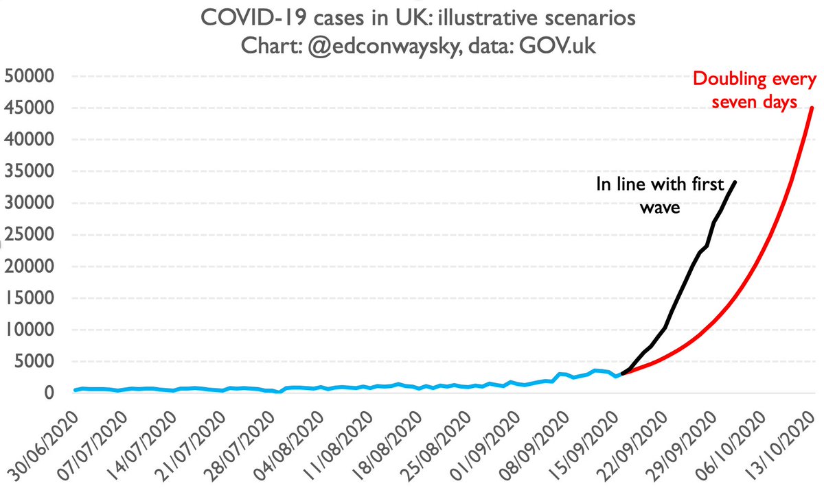
But just as important as q1 (the growth rate) is q2: the assumption the rate will not change over time. As @uksciencechief mentioned in his presentation, the UK is not the only country in Europe facing a rise in #COVID19 cases. There's also France and Spain...
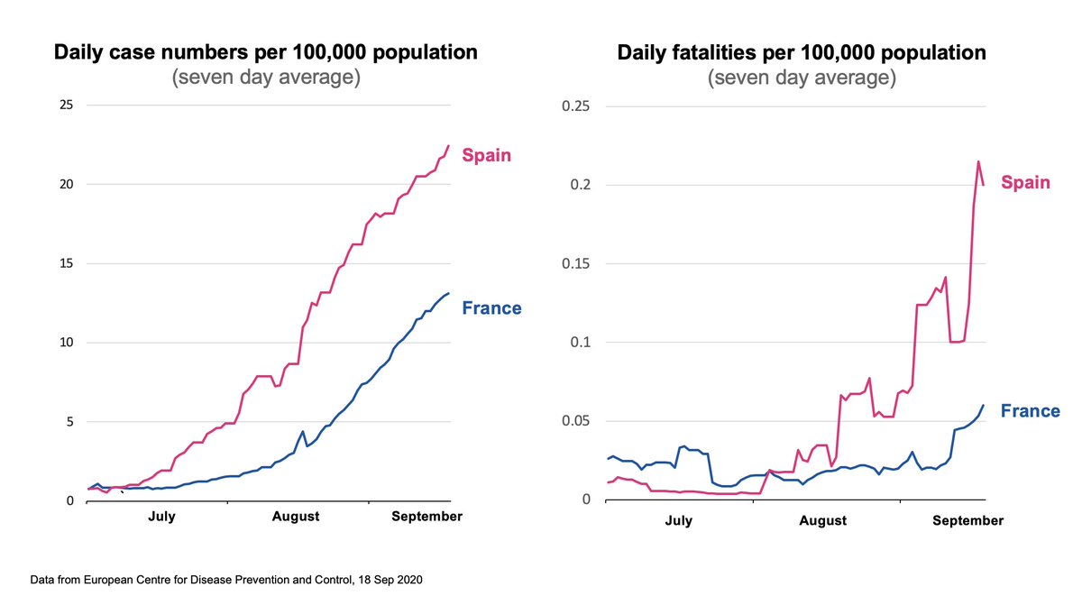
In fact, as I've pointed out a fair few times now, Britain's #COVID19 trajectory this time around is eerily similar so far to what we've seen in both France and Spain. Here's where we are now: about 2/3 weeks behind France/Spain. What happens if that continued?
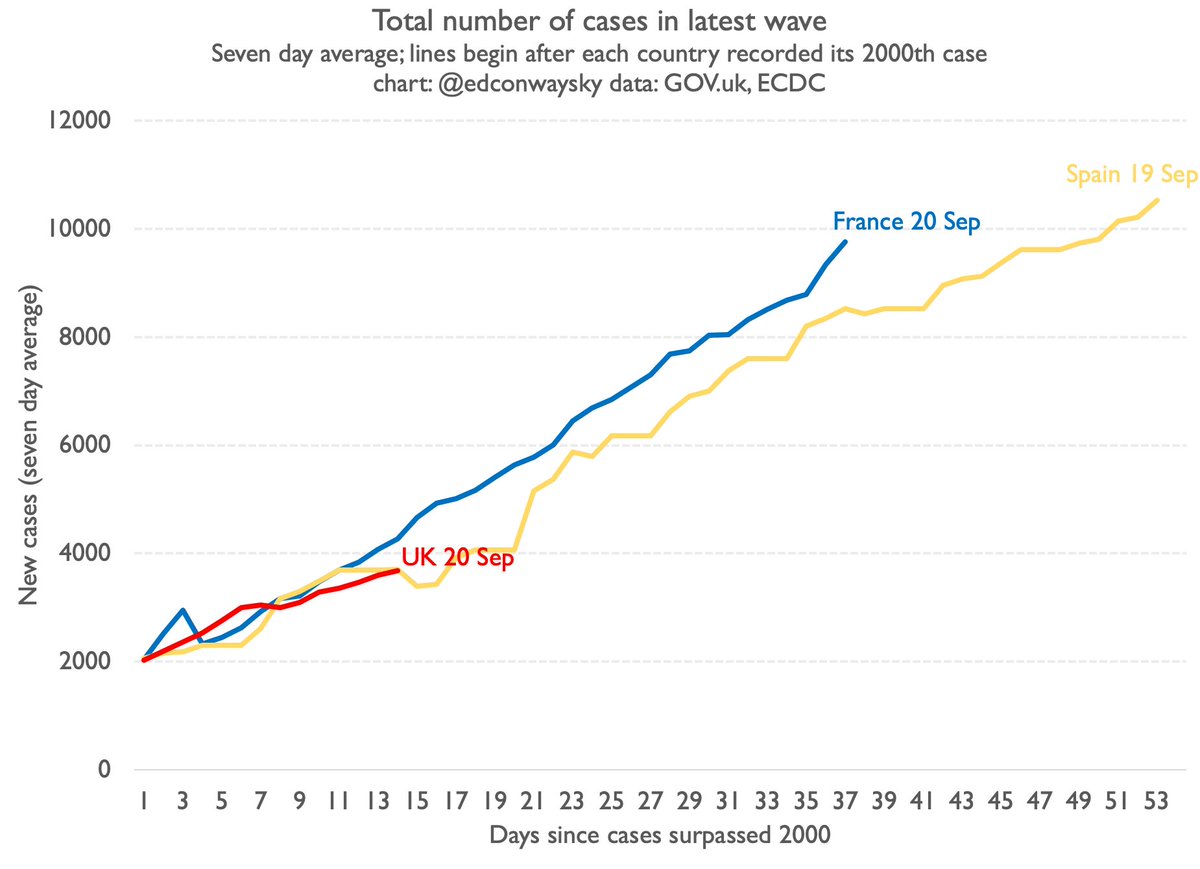
If our #COVID19 growth followed France or Spain (as it has been so far) we'd be at around 10k cases a day by mid October. Not 45k or so.
This is an enormous difference.
10k cases is scary enough. It implies many more deaths & hospitalisations. But 45k cases is way, way worse.
Clearly it's not impossible our case trajectory suddenly leaps as per @uksciencechief's chart. Perhaps he has data we don't have. Though so far there's no sign our trajectory is dramatically different from the ones in France and Spain. If that changes I will of course 🚨
UPDATE: another 4,368 positive #COVID19 cases in the UK in the past 24 hours.
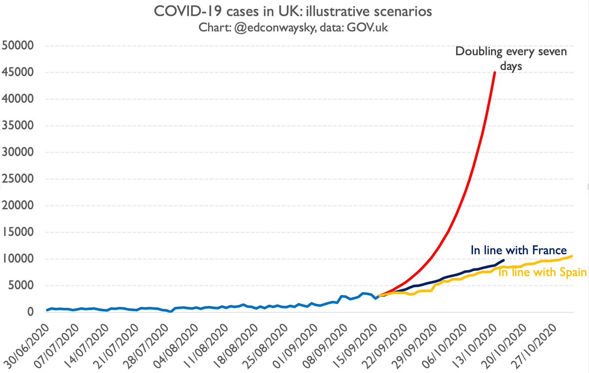
Does that change the overarching picture - that the UK’s cases are following the French/Spanish trajectory - rather than the much steeper illustration from @uksciencechief?
No. Updated chart:

• • •

Missing some Tweet in this thread? You can try to force a refresh
 

Keep Current with Ed Conway

Ed Conway Profile picture

Stay in touch and get notified when new unrolls are available from this author!

Read all threads

This Thread may be Removed Anytime!

PDF

Twitter may remove this content at anytime! Save it as PDF for later use!

Try unrolling a thread yourself!

how to unroll video
  1. Follow @ThreadReaderApp to mention us!

  2. From a Twitter thread mention us with a keyword "unroll"
@threadreaderapp unroll

Practice here first or read more on our help page!

More from @EdConwaySky

Aug 13
🧵Here’s the extraordinary story of a Frenchman who came up with an invention that changed the world, before events took a twist.
It’s a rollercoaster story that just might help us solve one of the biggest challenges facing humanity.
Sounds far-fetched, I know, but read on… Image
The man in question was Nicolas Leblanc.
Born in 1742, he trained as a doctor but was always short of cash. He became the physician to Louis Philippe II, Duke of Orléans - a minor French royal. Like many enlightened intellectuals, his hobby was scientific experimentation. Image
And when he heard about a scientific competition, launched by the French Academy of Sciences and backed by none other than King Louis XVI, he jumped at the chance. The prize of 2,400 livres (quite a lot - a few years of earnings) would go to whoever could turn salt into soda ash Image
Read 29 tweets
Aug 9
🧵Want to understand why weaning ourselves off fossil fuels like oil is such a tricky challenge?
Best place to start is with this ubiquitous toy👇
This is a thread about what I call the LEGO conundrum.
It begins when you ponder what a LEGO brick is actually made of... Image
Standard Lego bricks are made of something called Acrylonitrile Butadiene Styrene.
ABS is a tough thermoplastic you often find in the handles of scissors or the frames of hard carry-on baggage cases.
But Lego bricks are prob the most iconic application.
en.wikipedia.org/wiki/Acrylonit…
Image
It's worth saying btw not all Lego pieces are made out of ABS.
Baseplates are moulded from high impact polystyrene. Gearwheels are polyamide.
The small, flexible green pieces that look like plant stalks or flags are polyethylene, and so on and so on.
lego.com/en-us/sustaina…
Read 22 tweets
Jul 31
🧵
It might look like something from space, but some folks think lumps of rock like this could help us solve one of the biggest problems facing the planet.
Others fear they could trigger ecological catastrophe.
Presenting the weird, unsettling story of polymetallic nodules Image
These potato-sized mineral lumps form over millions of yrs on the ocean floor as metals accrete around organic fragments.
Up until 150 years ago no-one knew polymetallic nodules even existed. Today they're a very big deal.
So. Here are the 2 main things you need to know abt them Image
1. These nodules contain ASTOUNDING concentrations of certain metals - esp nickel, manganese, cobalt and copper. The grades of metals are multiples better than anything you can find on land (esp now we've mined out most of the easy stuff). Image
Read 17 tweets
Jul 20
🧵
80 years ago today, newspapers in Europe carried news of the unexpected death of a very important man, in a hotel miles from the nearest city.
A man who, said some, was helping the Allies win the war.
But there was a twist to the tale. The man in question wasn't actually dead Image
That man was John Maynard Keynes. The 61 year old economist was at the Mount Washington Hotel in New Hampshire for what became known as the Bretton Woods conference. And the day earlier he had indeed collapsed, following a heart attack. It was a moment of high drama. Image
The conference had already overrun.
It was supposed to be done in two weeks and there was talk that the delegates would soon be kicked out of the hotel. This was, to put it lightly, a problem.
After all, in the absence of an agreement there was a chance of yet another world war Image
Read 29 tweets
Jul 10
It says something about how confusing Labour's green investment policies are that seemingly even the Treasury has misunderstood them.
Contrary to what the picture in this press release👇 suggests, the National Wealth Fund has nothing to do with wind power or indeed green energy
Instead it's very specifically designed to focus on all the low or zero carbon technologies that AREN'T really to do with generating power.
- Green steel
- Hydrogen
- Clusters
- Gigafactories
Here's the sectors the institution will focus on 👇 Image
Simple way to think abt this:
Pretty much ALL heavy industry today emits carbon, directly or indirectly. The techniques we use to make stuff mostly date back to the industrial revolution. Getting to net zero involves redoing the industrial revolution! edconway.substack.com/p/yet-another-…
Read 7 tweets
Jul 5
🧵
How did Keir Starmer manage to win a landslide majority even though fewer people voted for him than for Jeremy Corbyn in either of his election bids?
A quick thread looking beneath the numbers.
Let’s start with swing…
Election nerds like to focus on two-party swing - essentially showing how voters shifted between the main parties.
And on this metric, Labour enjoyed a MASSIVE swing. 11%. Slightly more than Blair in 1997.
But there’s more to this chart than meets the eye… Image
Let’s take the same data, two-party swing, & break it down. Red bits of bars show change in Labour vote, blue bits show Tory change.
Now look again at that 2024 bar (on the far right).
The vast, vast majority of swing to Labour is in fact swing AWAY from the Conservatives. Image
Read 10 tweets

Did Thread Reader help you today?

Support us! We are indie developers!


This site is made by just two indie developers on a laptop doing marketing, support and development! Read more about the story.

Become a Premium Member ($3/month or $30/year) and get exclusive features!

Become Premium

Don't want to be a Premium member but still want to support us?

Make a small donation by buying us coffee ($5) or help with server cost ($10)

Donate via Paypal

Or Donate anonymously using crypto!

Ethereum

0xfe58350B80634f60Fa6Dc149a72b4DFbc17D341E copy

Bitcoin

3ATGMxNzCUFzxpMCHL5sWSt4DVtS8UqXpi copy

Thank you for your support!

Follow Us!

:(