Brian Feroldi Profile picture
Sep 25, 2020 7 tweets 3 min read Read on X
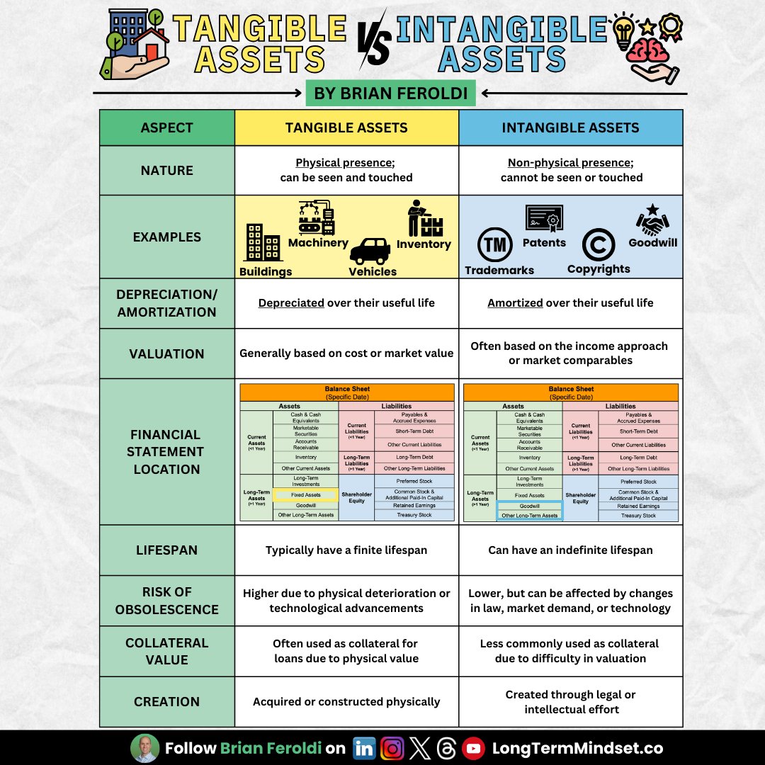
The 5 "Technical Analysis" Charts I use every day

⬇️⬇️⬇️⬇️⬇️⬇️⬇️⬇️⬇️⬇️⬇️⬇️⬇️⬇️⬇️⬇️
1) 5-Year Performance vs. $SPY

Winners keep on winning

It's a great sign if a stock has beaten the market over the last 5 years

It's a warning sign if it has lost badly

$MKTX ✅
$MNKD 🚫
2) Long-term Revenue Growth

Recurring revenue is the gift that keeps on giving

Consistent revenue growth -- especially through recessions -- indicates greatness

Inconsistent revenue growth = avoid

$MA ✅
$XOM 🚫
3) Margins

Ideal: Gross / Operating / Net Margin all consistent/expanding over time

Avoid: Gross / Operating / Net Margin all declining over time

$VEEV ✅
$GME 🚫
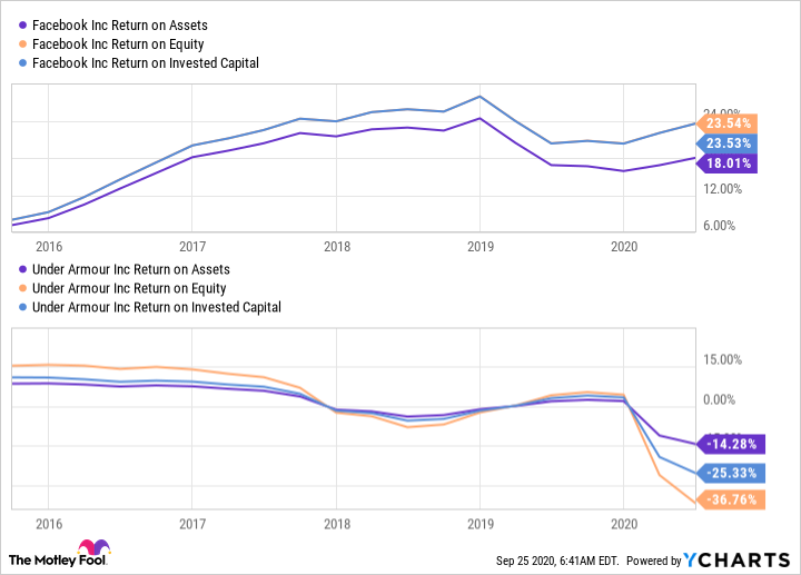
4) Returns on capital

Great businesses create value by investing at high rates of return

Bad businesses destroy value by investing at low or negative rates of return

I check ROE, ROA, ROIC

Ideal: Double-digit and expanding

Bad: Negative and declining

$FB ✅
$UA 🚫
5) Dilution

Shares outstanding rising through stock-based comp = bad

Shares declining because of stock-buybacks = good

I'm OK with <3% dilution per year if growth is high

>5%/year is bad

$VRSN ✅
$CRM 🚫
Bad performance in any of these categories doesn't exclude investment

Lots of great companies have negative returns on capital and high share dilution in the beginning

Still, always worth looking at

All data from @ycharts

• • •

Missing some Tweet in this thread? You can try to force a refresh
 

Keep Current with Brian Feroldi

Brian Feroldi Profile picture

Stay in touch and get notified when new unrolls are available from this author!

Read all threads

This Thread may be Removed Anytime!

PDF

Twitter may remove this content at anytime! Save it as PDF for later use!

Try unrolling a thread yourself!

how to unroll video
  1. Follow @ThreadReaderApp to mention us!

  2. From a Twitter thread mention us with a keyword "unroll"
@threadreaderapp unroll

Practice here first or read more on our help page!

More from @BrianFeroldi

Sep 6
Tangible vs Intangible Assets.

What's the difference?

Here's everything you need to know: Image
They confused me until I discovered an easy way to distinguish them:

𝗧𝗮𝗻𝗴𝗶𝗯𝗹𝗲 𝗔𝘀𝘀𝗲𝘁𝘀 𝗖𝗮𝗻 𝗕𝗲 𝗧𝗼𝘂𝗰𝗵𝗲𝗱

𝗜𝗻𝘁𝗮𝗻𝗴𝗶𝗯𝗹𝗲 𝗔𝘀𝘀𝗲𝘁𝘀 𝗖𝗮𝗻'𝘁 Image
Another major difference.

- Tangible assets are depreciated

- Intangible assets are amortized Image
Read 6 tweets
Aug 31
How to analyze an Income Statement, FAST.

Warren Buffett’s 8 Income Statement 'Rules of Thumb': Image
1: Gross Margin

🧮 Equation: Gross Profit / Revenue

👍 Rule of Thumb: 40% or higher

🤔 Buffett's Logic: A consistently high gross margin signals that the company isn’t competing exclusively on price. Image
2: SG&A Margin

🧮 Equation: SG&A Expense / Gross Profit

👍 Rule of Thumb: 30% or lower

🤔 Buffett's Logic: Wide-moat companies don’t need to spend a lot on overhead to operate & convince consumers to buy. Image
Read 11 tweets
Aug 30
Some stocks are STRONG BUYS when they fall

Other stocks are SELLS when they fall

How can you tell the difference?

Watch for these 5 financial yellow flags: Image
1) GOODWILL WRITEDOWN

This represents the premium a company pays for an acquisition above its fair market value.

If there’s a major goodwill write-down on the Income Statement, it means management has wasted a TON of capital. Image
2) GROSS MARGIN DECLINING

1: The competition is forcing me to lower prices
2: Demand is weak
3: My suppliers are raising prices

Either way, it can be a thesis-busting development Image
Read 9 tweets
Aug 29
Capitalism is brutal.

If you invest, you MUST know how to identify a moat.

Here are 9 financial “rules of thumb” that Warren Buffett uses to tell if a company has one: Image
1: Gross Margin

Found: Income Statement

Formula: Gross Profit / Revenue

Moat: Consistently above 40%

No Moat: Under 40% & volatile Image
Buffett’s logic:

A consistently high gross margin signals that the company isn’t competing exclusively on price.

A high gross margin also provides ample gross profit to pay expenses and leaves money for shareholders.
Read 22 tweets
Aug 27
How to analyze an income statement in less than 2 minutes: Image
The income sheet is one of the three major financial statements.

It shows a company’s:
▪️Revenue (Sales)
▪️Expenditures (Costs / Expenses)
▪️Net Income (Earnings, Profits)

Over a period of time. Image
Management teams have leeway in categorizing their income statement.

This means that not all income statements look the same.

Here is a typical layout and the meaning of the most commonly used terms: Image
Read 11 tweets
Aug 26
Financial Statements For Beginners

Want to learn accounting?

Study these 9 simple infographics (a visual thread) ↓ Image
Image
Financial Statements DO NOT have a universal layout

Here are some other balance sheet terms you might see: Image
Read 9 tweets

Did Thread Reader help you today?

Support us! We are indie developers!


This site is made by just two indie developers on a laptop doing marketing, support and development! Read more about the story.

Become a Premium Member ($3/month or $30/year) and get exclusive features!

Become Premium

Don't want to be a Premium member but still want to support us?

Make a small donation by buying us coffee ($5) or help with server cost ($10)

Donate via Paypal

Or Donate anonymously using crypto!

Ethereum

0xfe58350B80634f60Fa6Dc149a72b4DFbc17D341E copy

Bitcoin

3ATGMxNzCUFzxpMCHL5sWSt4DVtS8UqXpi copy

Thank you for your support!

Follow Us!

:(