Today in pulp... a rather elusive artist, the brilliant Gene Szafran! #SaturdayVibes
Gene Szafran was born in Michigan in 1941 and studied at The Society of Arts and Crafts in Detroit. He later became an art teacher there.
Szafran moved to New York City in 1967, where his work featured in Playboy and Cosmopolitan. He also worked on a number of album covers, winning the 1969 Grammy for his Rhinoceros album cover.
This led him into the world of book cover design, particularly science fiction where his stylized kaleidoscopic images brought him to the attention of Signet Publications.
Gene Szafran produced an incredible set of covers for Signet's range of Robert A Heinlein novels between 1971 and 1974. As a collection they're stunning and unique.
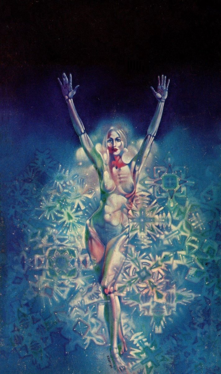
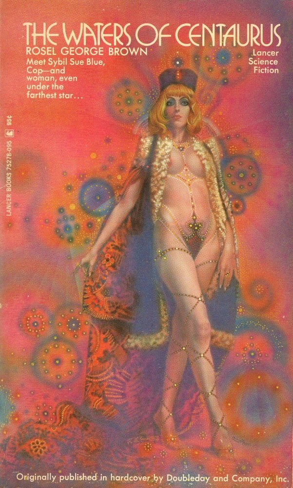
It certainly wasn't what you might expect a Heinlein book to look like: bold colours and exquisite geometry, often coming together around a central human form.
The Heinlein covers led to a number of contracts for other work. Szafran's amazing use of colour and symmetry seemed a perfect match for the early 1970s scene.
Although Szafran did more traditional cover art - notably for Daphne Du Maurier titles - it's his science fiction work that really stands out as unique. It set an esoteric, somewhat erotic note. Whether the books themselves warranted it is a moot point.
In 1972 Szafran won the Locus Award for best paperback cover artist; his career in the industry seemed assured...
And then... tragically he was diagnosed with multiple sclerosis, which severely affected his ability to paint and draw. His last covers were completed in 1977 before he returned to Detroit with his family.
Gene Szafran's work is a time capsule of 1970s psychedelic Americana: complex, dazzling and rich. He was an exceptionally gifted artist with a keen sense of colour and composition.
Sadly Gene Szafran passed away in 2011, but his legacy is a fantastic collection of artwork that's well worth collecting. Keep an eye out when you next visit your local book market.
More artists another time...
• • •
Missing some Tweet in this thread? You can try to
force a refresh
Between 1960 and 1970 Penguin Books underwent several revolutions in cover layout, at a time when public tastes were rapidly changing.
Today in pulp I look back at 10 years that shook the Penguin!
Allen Lane founded Penguin Books in 1935, aiming to bring high-quality paperbacks to the masses for the same price as a packet of cigarettes. Lane began by snapping up publishing rights for inexpensive mid-market novels and packaging them expertly for book lovers.
From the start Penguins were consciously designed; Lane wanted to distinguish his paperbacks from pulp novels. Edward Young created the first cover grid, using three horizontal bands and the new-ish Gill Sans typeface for the text.
Today in pulp: a tale of an unintentionally radical publisher. It only produced 42 books between 1968-9, but it caught the hedonistic, solipsistic, free love mood of the West Coast freakout scene like no other.
This is the story of Essex House...
Essex House was an offshoot of Parliament Press, a California publishing company set up by pulp artist Milton Luros after the market for pulp magazines began to decline. It specialised in stag magazines sold through liquor stores, to skirt around US obscenity publishing laws.
By the 1960s Parliament Press was already selling pornographic novels through its Brandon House imprint, though these were mostly reprints or translations of existing work. Luros was interested in publishing new erotic authors, and set up Essex House to do just that.
Today in pulp... one of my favourite SF authors: Harry Harrison!
Harry Harrison was born Stamford, Connecticut, in 1925. He served in the US Army Air Corps during WWII, but became disheartened with military life. In his spare time he learned Esperanto.
Harrison started his sci-fi career as an illustrator, working with Wally Wood on Weird Fantasy and Weird Science up until 1950. He also wrote for syndicated comic strips, including Flash Gordon and Rick Random.
Today in pulp... Blade Runner! Let's look back at the classic 1982 movie and see how it compares to original novel.
"It's not an easy thing to meet your maker..."
Blade Runner is based on Philip K. Dick's 1968 novel Do Androids Dream Of Electric Sheep? However 'inspired' may be a better word, as the film is very different to the book.
In the novel Deckard is a bounty hunter for the San Francisco police. The year is 1992; Earth has been ravaged by war and humans are moving to off-world colonies to protect their genetic integrity. They are given organic robots to help them, created by the Rosen Association.
In the 1970s a fascinating engineering battle took place between America and Japan for control of the future. The prize was the world we live in now. And one of the key battles took place on your wrist.
This is the story of the digital watch...
'Digital' is a magical marketing word. Like 'laser' or 'turbo' it suggests progress, mastery and the future. People like those ideas. They like them enough to spend a lot of money on products that have them, especially if they can be a first adopter.
And so it was with the wristwatch. Electronic quartz watches were already a thing by the 1960s: an analogue movement driven by a quartz crystal resonator, powered by a small button battery.
But one American company was setting out on a new timekeeping odyssey...
Today in pulp... let's look back at a Shōjo manga artist whose work celebrated friendships between women: Jun'ichi Nakahara.
Jun'ichi Nakahara was born in Higashikagawa in 1913 and worked as an illustrator, a fashion designer and a doll maker. His work is highly regarded in Japan and he was a significant influence on modern manga art.
In the '20s and '30s Nakahara often drew for Shōjo no Tomo ("Girl's Friend") magazine. The style at the time was for demure, dreamlike imagery, but Nakahara added to this large expressive eyes, often reflecting the light.