
They’re back! The intensive care national audit & research centre (@ICNARC to its friends) has resumed weekly reporting in response to rapidly rising ICU admissions.
A short thread follows in which I’ll draw out key content and add some comments. 1/n
A short thread follows in which I’ll draw out key content and add some comments. 1/n
https://twitter.com/icnarc/status/1309925257227186176
Déjà vu? Newer followers might be unaware that I used this data six months ago to challenge the myth that COVID-19 is only a risk to those who were already “at death’s door”. That thread went a bit viral, with all manner of interesting consequences! 2/n
https://twitter.com/actuarybyday/status/1246866119597621248
One positive outcome was an improved relationship between actuaries and the intensive care community. A tangible example is the commitment to @ICS_updates from @COVID19actuary that we would continue to highlight the impact the COVID-19 on intensive care units. 3/14
The latest report covers admissions to Thur 24 Sept.
ICNARC have done precisely what I hoped they might do, and are reporting admissions from 1 Sept separately from the first wave. This will give us an opportunity to see how much treatment and outcomes have improved. 4/14
ICNARC have done precisely what I hoped they might do, and are reporting admissions from 1 Sept separately from the first wave. This will give us an opportunity to see how much treatment and outcomes have improved. 4/14
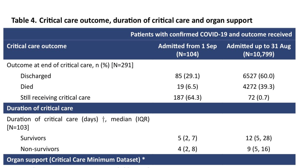
So far, numbers are small, with 291 patients included in the new cohort. Of these, 104 have outcomes reported and 187 are still receiving critical care.
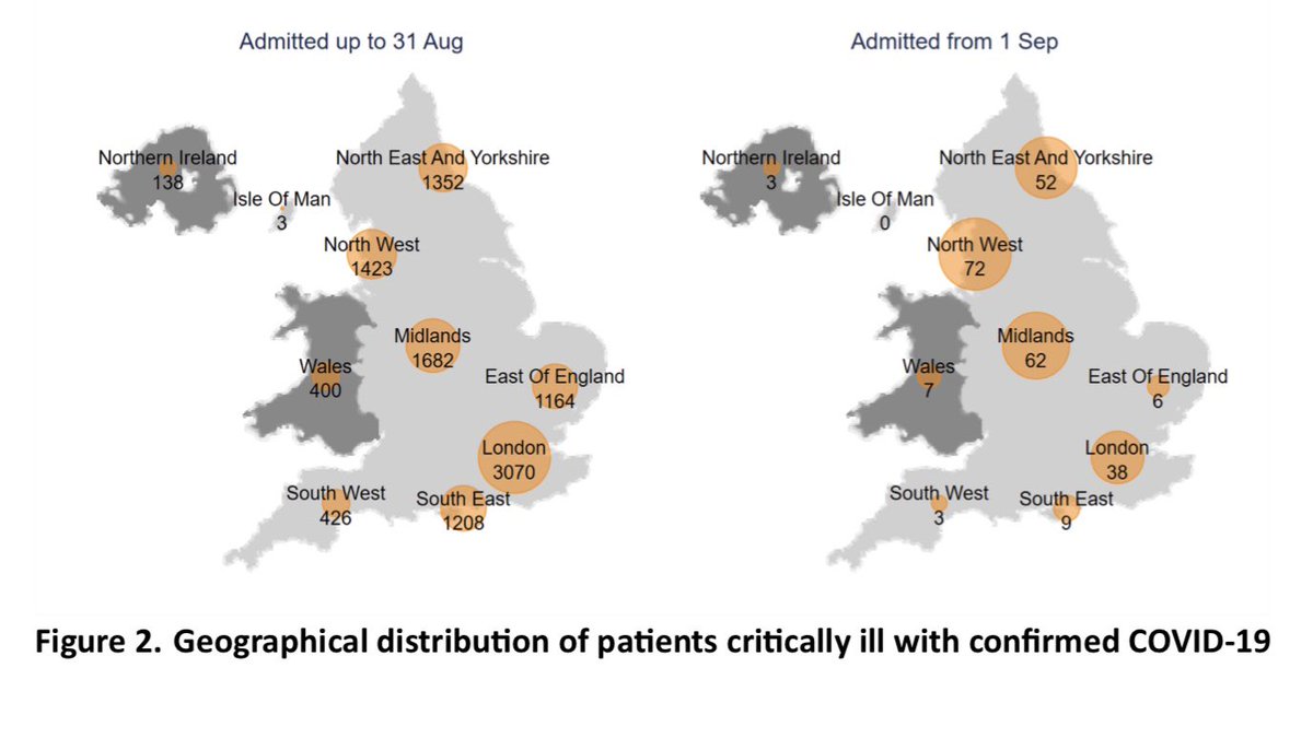
The majority of recent admissions are in the North of England and the Midlands. Contrast to first wave shown below. 5/14
The majority of recent admissions are in the North of England and the Midlands. Contrast to first wave shown below. 5/14
These charts show the daily and cumulative admissions numbers since 1 Sept. The rapid rise is clear, noting that admissions logged against the last couple of days in particular remain incomplete. 6/14
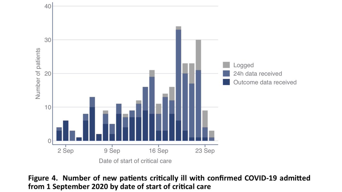
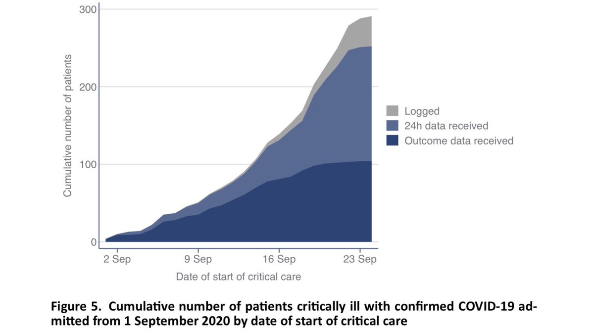
Table 1 shows us the patient characteristics, and how these compare with the first wave (previous reports used a cohort of viral pneumonia patients from previous years as the comparator).
As before, seven out of ten ICU admissions are males, and they are age 60 on average. 7/14
As before, seven out of ten ICU admissions are males, and they are age 60 on average. 7/14
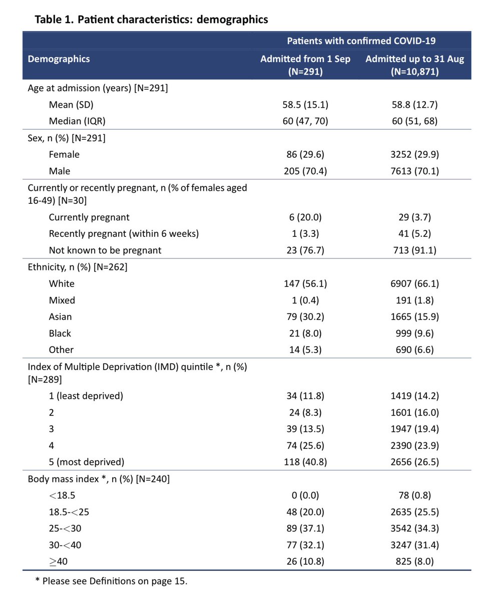
Compared to the first wave, Asians are even more over-represented, making up a remarkable three out of ten ICU admissions in September. This is only partly explained by the geographical location of admissions. 8/14
There has always been a socioeconomic gradient to ICU admissions, but that is even more stark here than was seen in the first wave. Four out of ten admissions in September are from the most deprived fifth of the country. 9/14
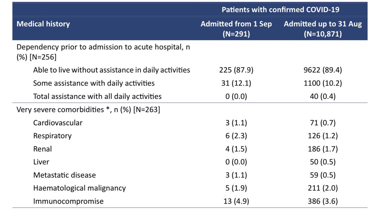
As before, the vast majority of intensive care admissions were able to live without assistance in daily activities, prior to admission, and only a small minority (one in eight) were living with very severe comorbidities. 10/14
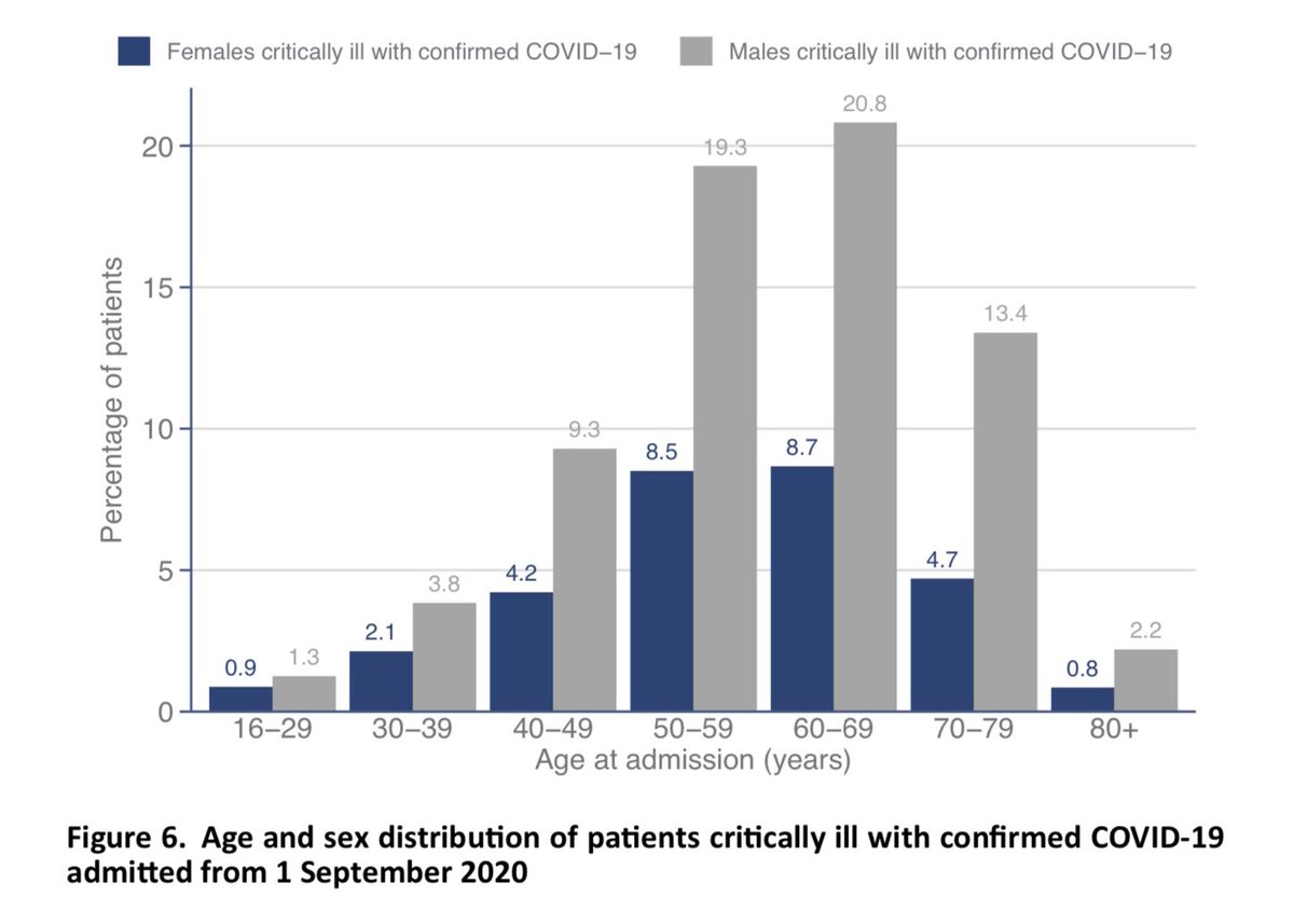
The full distribution of age and sex is per below. This looks pretty familiar to those who were following these reports earlier in the year, with nearly two thirds of ICU admissions being males aged 50-79. 11/14
I won’t comment on the ethnicity or BMI charts tonight, as I think these are accidentally showing the data from the first wave. I’ll update the thread tomorrow if the chart is updated. It’s clear from above though that Asians are over represented. 12/14
Some positive news in the outcomes table! Of those no longer receiving critical care, four out of five have been discharged, and only one out of five has died. That is much better survival than the first wave, when two out of five died in ICU. It’s early days though. 13/14
I hope you found this useful. Of course it’s a shame that we’re back where we are, but the clarity and transparency of these reports is helpful, so it’s good to have them back now we need them.
Please take a moment to read this short, hopeful letter from an ICU consultant. /end
Please take a moment to read this short, hopeful letter from an ICU consultant. /end
https://twitter.com/dr_mattmorgan/status/1308249427002433538
CONTINUED...
The report has been updated overnight so charts now show admissions from 1 Sep - so a few further comments.
I said the age/sex chart looked familiar. Maybe too familiar as that WAS the older data. Main difference now is more admissions are people under 50. 15/18
The report has been updated overnight so charts now show admissions from 1 Sep - so a few further comments.
I said the age/sex chart looked familiar. Maybe too familiar as that WAS the older data. Main difference now is more admissions are people under 50. 15/18

The ethnicity chart brings out very clearly the extent to which the over-representation of ethnic minorities goes beyond what can be explained by local demographics. Whites are significantly underrepresented. Asian, Black and Other ethnicities significantly over. 16/18

This chart brings out the socioeconomic gradient very clearly. The most deprived groups are four times as likely to have needed ICU admission for COVID-19 than the two least deprived groups. 17/18

And finally... this chart of BMI shows us that there are fewer COVID-19 ICU admissions that we’d expect among people of “healthy weight” (18-25) or who are overweight but not obese (25-30).
Obese people are more likely to need ICU admission, especially those with BMI>40. 18/18
Obese people are more likely to need ICU admission, especially those with BMI>40. 18/18

• • •
Missing some Tweet in this thread? You can try to
force a refresh


