One problem with using #COVID19 trajectories to work out where we may be heading is question marks over the data - something illustrated brilliantly by this chart via @AlexSelbyB. Official case numbers look v v high now, but we weren't measuring cases v well back in spring.
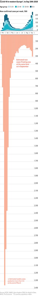
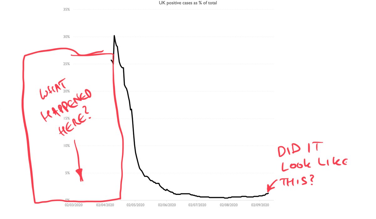
Upshot is charts of cases alone are of limited use - and this is before you get to questions about whether the testing figs are reliable. We could look at positive tests as % of total (chart 2). It adjusts for fact we're doing more testing. But is that early data reliable?
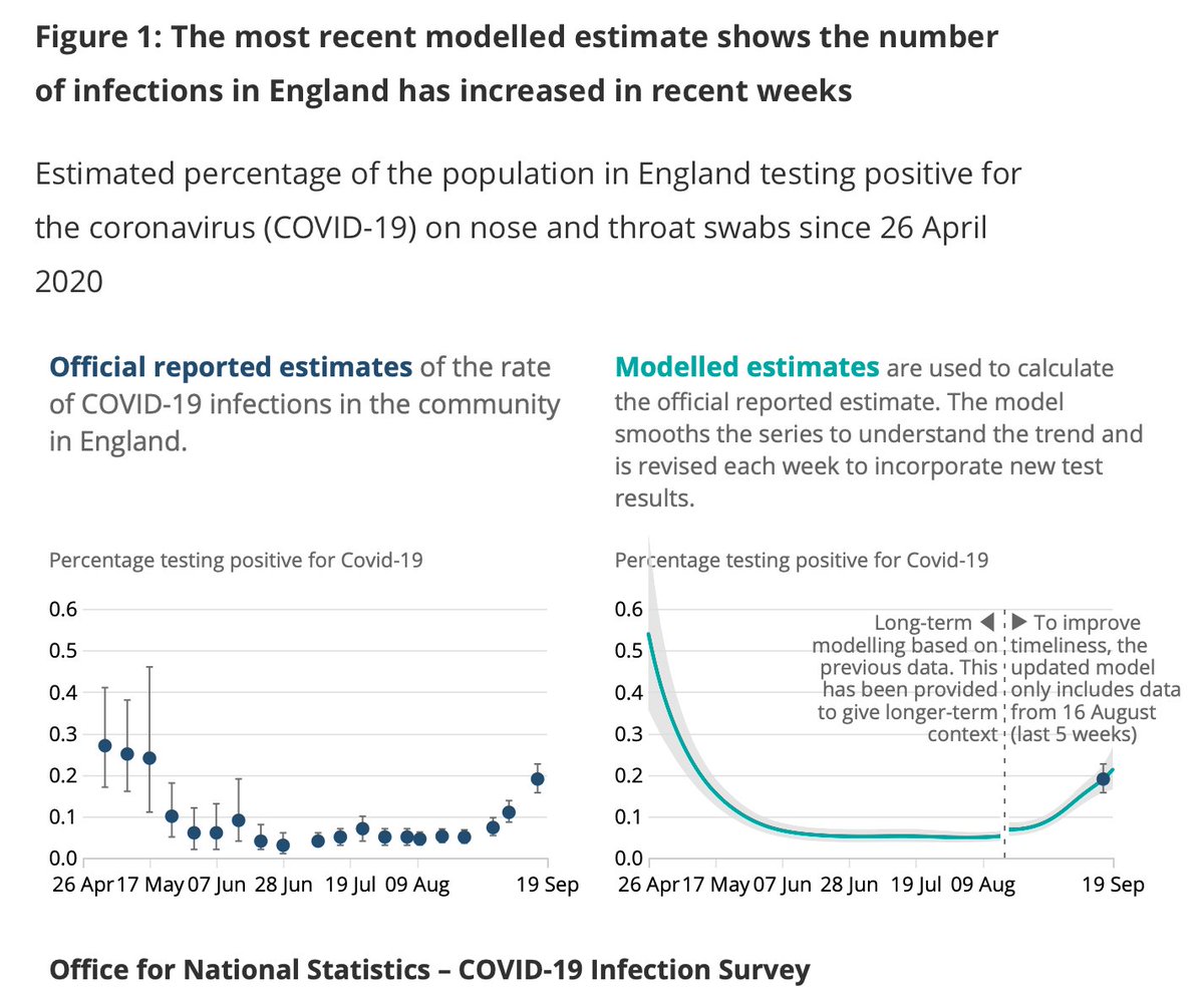
The best measure of #COVID19 prevalence in England is prob the @ONS infection survey but again: it started after the peak. And right now what we REALLY need to gauge is not post peak but the run up to the peak
The great unknown (and there are theories abt this but not much data) is whether the bit BEFORE the data we have on cases/positivity looked anything like what we are going through NOW. To me - someone watching this purely through a data prism - this seems really, really important
Now, eventually we will know because the early data on deaths are far more reliable (for all their faults) than the case data. The problem is by the time we notice we're on the same path it will almost certainly be too late. So we certainly shouldn't just focus on deaths.
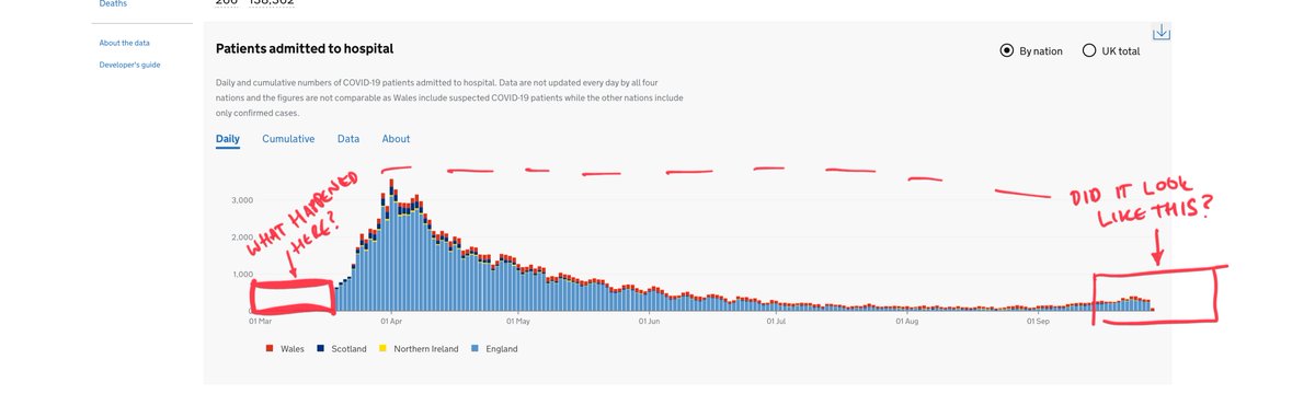
What about hospitalisations data? Again, a bit patchy since there's a big gap at that start which begs the same question again: what was happening in those early weeks? Is it similar to what we're going through now or v different?
All of these unsettling gaps are why it's also worth looking not just at our own past but at our plausible future. This is why we focused so much on Spanish/Italian trajectories last time around. The disease seems to spread in the same way in most medium-sized countries.
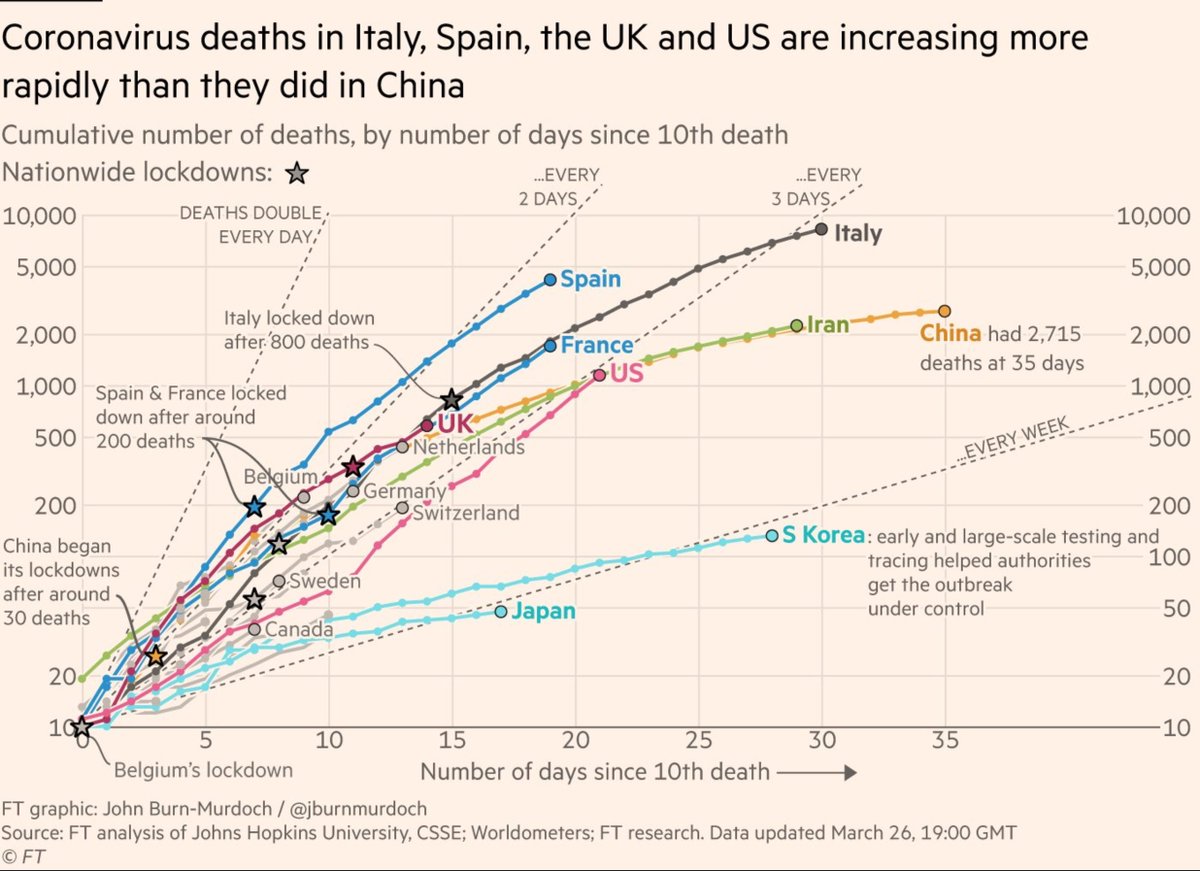
Sadly last time around the most reliable cross-country comparisons were of deaths because of those 👆data gaps. This time around the case data is better (not brilliant, but better), so we can compare our trajectory to other countries going through similar outbreaks.
All of which is a long winded way of explaining why I keep updating this chart. And why I was a bit sceptical about @uksciencechief's chart last week suggesting the UK outbreak could go in a v different direction. From early on in this outbreak we've been following France/Spain
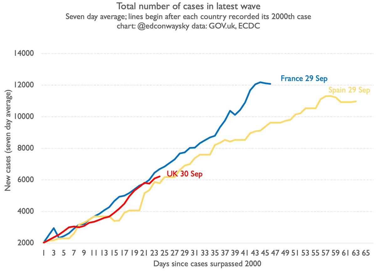
If this continues - and it's a big if, but it is what happened in the last outbreak and seems to be happening thus far this time too - we can potentially look at other data from France/Spain to try to fill in those gaps in the cases/hospitalisations charts above...
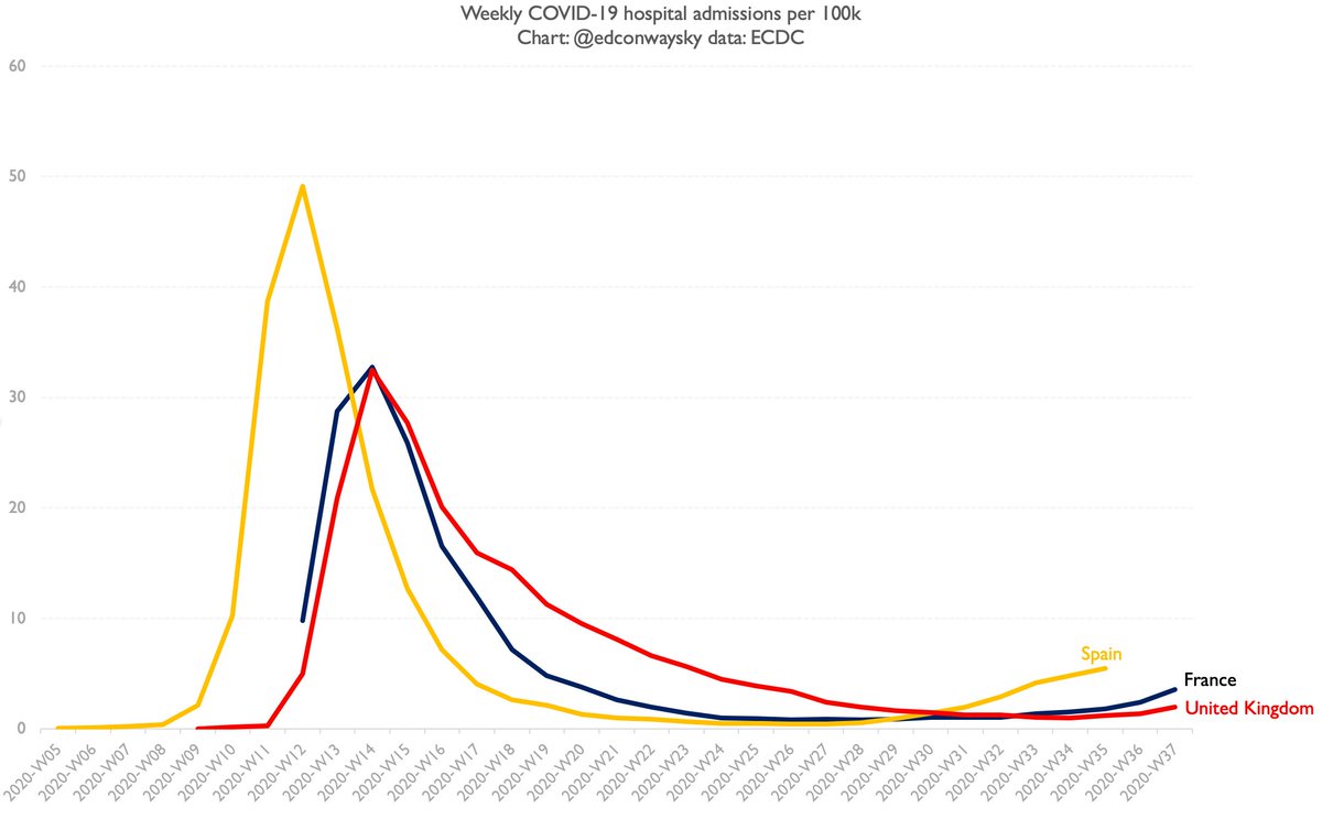
So far the paths they're following in France/Spain look different to spring. Look at hospitalisations. Crucially, these data should be more reliable at depicting those intense spring months than case data. And the increase in recent weeks is more gradual than Feb/March
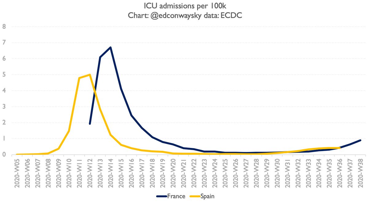
Here's ICU admissions. Similar picture. Now I don't think these charts alone fill in the gaps we have in that early data yet. But in a few weeks they might have. If they start to spike then it looks probable UK will too. If they don't then UK may not.
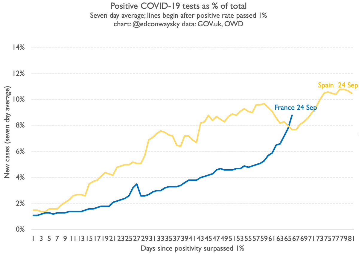
Early signs are broadly promising: the 7day average daily new cases in France and Spain is no longer rising and has actually fallen a bit in the past day or two. In Spain the % of positive tests also seems to have peaked. Then again it's still rising fast in France
It's too early to be certain this is not a repeat of the first wave. But much of the data thus far seems to be consistent with that. Why? Restrictions? Mask wearing? Better treatments? Better shielding? Or way too early to say? My vote is def for the latter...
Most striking thing from today's press conference? @CMO_England admitting the govt underestimated the doubling time of #COVID19 in the first wave. It's true. And I'd argue it was in part because they paid too little attention to what was happening in Italy/Spain/France.
The next question is whether the response to having messed up last time is to swing entirely in the other direction (assume cases are heading through the roof) or to pay more attention to European epidemiology. I'd argue the latter - as I lay out in the thread above. 👆
• • •
Missing some Tweet in this thread? You can try to
force a refresh
The PM keeps repeating the figure £16bn in relation to the OBR's latest forecasts - giving the impression that this would have left a big hole in the public finances. What he fails to acknowledge is that that this is LITERALLY ONLY ONE PART OF THE STORY.
Here's why...
Yes: the OBR downgraded the fiscal numbers by £16bn (actually £15.6bn) due to weaker productivity (red bar below).
But it also simultaneously UPGRADED them by a whopping £32bn (blue bars).
This chart from @TheIFS shows it pretty clearly👇
Banging on about the £16bn productivity - as the PM did repeatedly in his press conference today - without also mentioning the £14bn inflation UPGRADE and the £17bn of other UPGRADES seems... pretty misleading to me.
It's simply NOT the full picture...
NEW
UK abolishes its "de minimis" rules which exclude cheap imports below £135 from paying tariffs.
A massive deal for the fast fashion/cheap Chinese imports sector: this is the so-called loophole used to great effect by SHEIN and Temu.
Should also bring in some tariff revenue
For more background on this, here's our investigation from earlier this year on de minimis and what it means in practice - including a glimpse inside the planes carrying these imports into the UK 👇
The flip side to this policy is:
a) stuff (yes, a lot of it is tat but even so) will get more expensive
b) it primarily hits lower income households
c) as you'll see from my thread, de minimis was a lifesaver for small regional airports. Its demise is v bad news for them...
NEW
"Data center alley" in North Virginia.
Home to the biggest cluster of server centres in the world.
Here, more than anywhere else, is the global epicentre of AI.
It's where the recent AWS outage happened.
And we've secured rare access INSIDE one of the data centres...
The inside of one of the centres, run by Digital Realty, one of the biggest datacenter companies in the world.
Extremely high security. Long, long corridors, flanked by rooms in which those servers are operating.
This is the very heart of the biggest economic story right now
And inside one of those rooms, here is one of the supercomputers powering the AI boom. This Nvidia DGX H100 is the physical infrastructure making AI a reality.
🚨EXCLUSIVE
The firm at the heart of Britain's critical minerals strategy has ditched plans for a rare earths refinery in the UK, and will build it in the US instead.
It's a serious blow to the Chancellor and her plans for "securonomics" ahead of next month's Budget👇
Not long ago Pensana was being hailed as key to Britain's industrial future.
It had plans to ship rare earth ores to the UK and refine them in a plant just outside Hull, creating 126 jobs and bringing in hundreds of millions of pounds of investment...
Its Saltend site was where the then Biz sec Kwasi Kwarteng launched the govt's official critical minerals strategy a few years ago, saying: "This incredible facility will be the only of its kind in Europe and will help secure the resilience of Britain's supplies into the future"
📽️Is Britain REALLY facing a 1970s-style fiscal crisis?
Why are investors so freaked out about UK debt?
Is this REALLY worse than under Liz Truss?
Who's to blame? Rachel Reeves? The Bank of England?
And would a bit of productivity really solve everything?
📈 Your 6 min primer👇
OK, so let's break it down.
Start with the chart everyone (well, everyone in Whitehall) is talking about.
The 30yr UK government bond yield. Up to the highest level since 1998. And it's still rising.
Does this mean the UK is facing a fiscal crisis? Let's look at the evidence
First let's compare the UK to other G7 countries.
There's two ways to do this.
First, look at absolute levels👇
And it looks pretty awkward for the UK.
Pre-mini Budget we were middle of the pack. That changed post-Truss. And now, under Labour, the UK is even more of an outlier.
👗Billions of pounds of imports...
↗️Rising by more than 50% a year...
🛬Planes stuffed with cheap clothes...
🇨🇳And a loophole saving Chinese companies from £billions of UK taxes.
Behind the scenes of one of the biggest stories in the modern economy: e-commerce
👇
We've spent months investigating this phenomenon.
- We've got the first official estimate of the scale of cheap untaxed imports into the UK.
- We've seen inside the planes carrying these goods here.
- A whole logistics industry is growing around it.
This is a v big deal!
The story begins with a MASSIVE rise in orders from Chinese e-commerce giants like SHEIN and Temu.
Now, most coverage of these brands focuses on labour standards. An important issue.
But there's something else going on here - something deeper.
A shift in how trade works...