Let's combine 2 drawing tricks I recently covered:
- Drawing half a scene for symmetrical design.
- Applying dynamic perspective in Photoshop.
Another step-by-step thread:
- Drawing half a scene for symmetrical design.
- Applying dynamic perspective in Photoshop.
Another step-by-step thread:

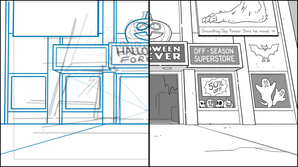
Since it's October, I chose this shot of a Halloween superstore from #BigCityGreens.
I drew a vertical line through the exact center of the canvas as a guide.
Placing my vanishing point low in the scene will create the perspective of looking upward.
I drew a vertical line through the exact center of the canvas as a guide.
Placing my vanishing point low in the scene will create the perspective of looking upward.

Because this is a symmetrical scene, I only needed to draw half the rough up to my vertical centerline.
This is my first trick.
Even the pumpkin with its clever infinity symbol eyes are symmetrical.
This is my first trick.
Even the pumpkin with its clever infinity symbol eyes are symmetrical.

My second trick, you might have noticed, is that I drew the building in 1-point perspective instead of 2-point as indicated in the storyboard.
That means the building was drawn flat like we're looking straight at it instead of upward.
I'll get to the 2-point perspective later.
That means the building was drawn flat like we're looking straight at it instead of upward.
I'll get to the 2-point perspective later.

Copy, paste, flip.
Sometimes I have to do this a couple times during the rough stage to make sure I'm not doing something like making the doorway too narrow.
After I had an entire building, I started to plan where lettering will go.
Sometimes I have to do this a couple times during the rough stage to make sure I'm not doing something like making the doorway too narrow.
After I had an entire building, I started to plan where lettering will go.

See, lettering.
I typically favor hand drawn type in my designs but sometimes use fonts. This background combines both.
Still just roughing it in.
I typically favor hand drawn type in my designs but sometimes use fonts. This background combines both.
Still just roughing it in.

And now we have 2-point perspective looking up at the building.
I used Photoshop's 'Transform Perspective' tool to simply pinch in the sides at the top, pull out a little at the bottom.
Now the scene is looking much more dynamic as intended in the storyboard.
I used Photoshop's 'Transform Perspective' tool to simply pinch in the sides at the top, pull out a little at the bottom.
Now the scene is looking much more dynamic as intended in the storyboard.

I began cleaning up the design, adding details and depth where appropriate.
At this stage, I once again only drew elements that are symmetrical and can be mirrored on the other half.
At this stage, I once again only drew elements that are symmetrical and can be mirrored on the other half.

Copy, paste, flip again.
By the way, the doors animate in this scene so I purposely left them out. (Missing doors are common in animation backgrounds.)
By the way, the doors animate in this scene so I purposely left them out. (Missing doors are common in animation backgrounds.)

After the symmetrical elements were solidified, I drew everything that couldn't be copied and flipped.
Sometimes I rough out the smaller details but in this one, I just went for it in the black cleanup line.
Sometimes I rough out the smaller details but in this one, I just went for it in the black cleanup line.

And here's my final background design.
I only drew half of parts of it and only worked with one vanishing point. Yet here we are.
I only drew half of parts of it and only worked with one vanishing point. Yet here we are.

In the final paint, it's got a great Halloween palette.
Orange, black, purple, and green contrast nicely against a warm neutral building.
It's an easy, quick read what this place is all about.
Orange, black, purple, and green contrast nicely against a warm neutral building.
It's an easy, quick read what this place is all about.

Let me point out a detail in my process.
In the rough, there's no depth where the side pillars connect with the ground. In the cleanup, there is.
Once you have a good understanding of perspective, you don't have to rough out every tiny angle.
In the rough, there's no depth where the side pillars connect with the ground. In the cleanup, there is.
Once you have a good understanding of perspective, you don't have to rough out every tiny angle.

This is one of the dumbest best jokes I came up with.
I get a big kick out of imagining a year-round Groundhog Day superstore.
The foot is unrelated, just funny imagery to go with the Halloween store.
I get a big kick out of imagining a year-round Groundhog Day superstore.
The foot is unrelated, just funny imagery to go with the Halloween store.

I got sidetracked tonight by the political news. I meant to add something to this thread but forgot. Thanks, distraction.
• • •
Missing some Tweet in this thread? You can try to
force a refresh


