Ed Conway Profile picture
Oct 2, 2020 12 tweets 8 min read Read on X
Belatedly catching up with Test & Trace data from yday. Good news is on most metrics the performance of Pillar 2 tests (the private bit of the testing network) have improved from the previous week.
⬇️Time taken to get a test result
⬇️Distance travelled to get a test
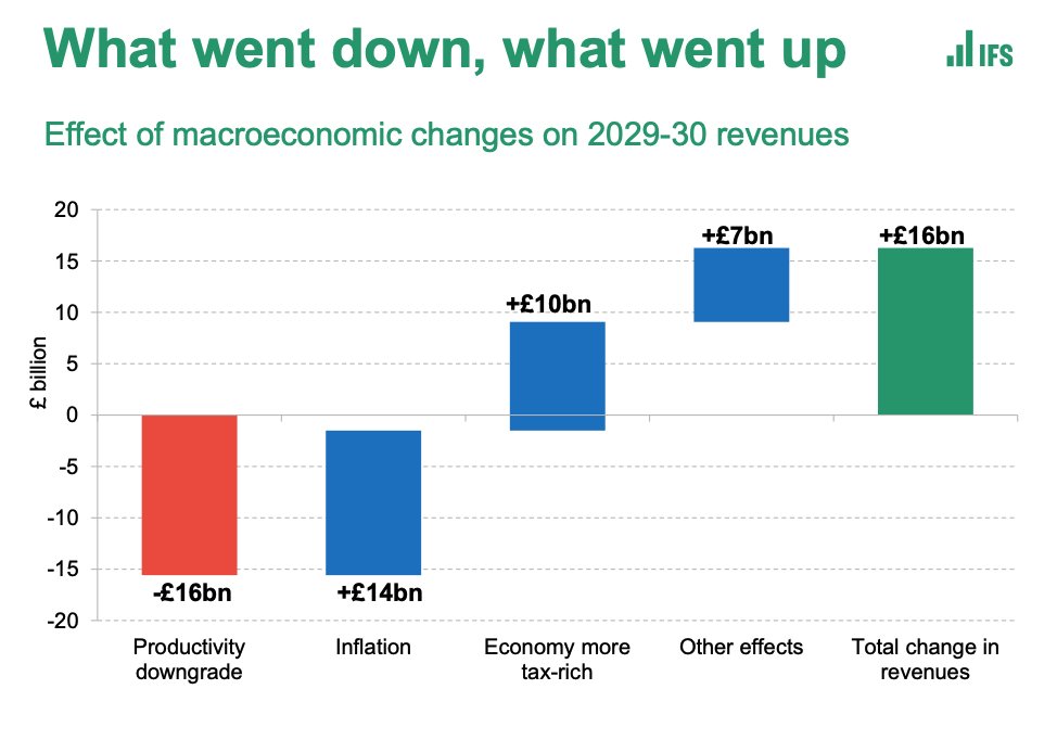
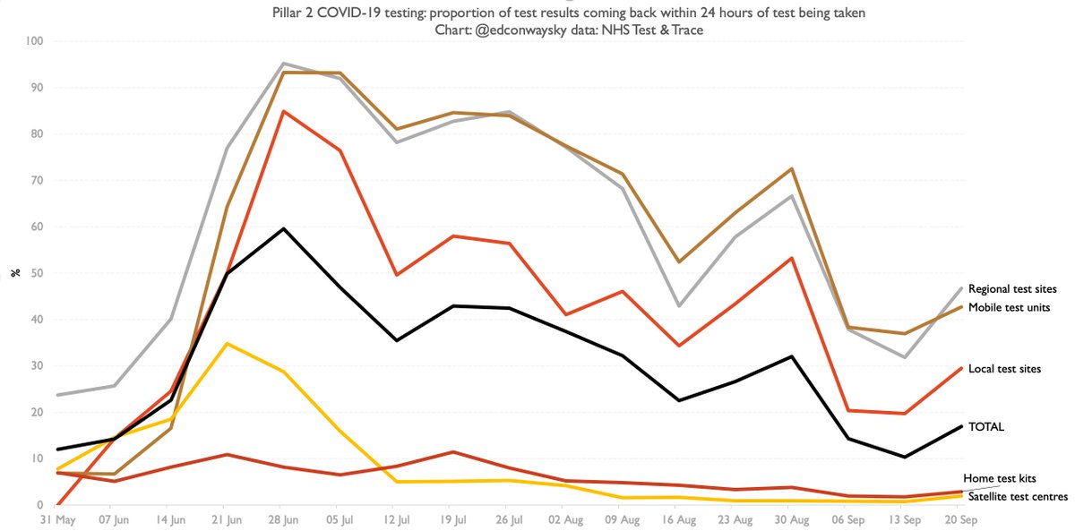
That said, across the whole of pillar 2 in England the percentage of people getting test results within 24 hours of taking a test is still just 17% as of 17-23 Sep (eg last week). That's still a lot lower than earlier this summer as you can see from this chart:
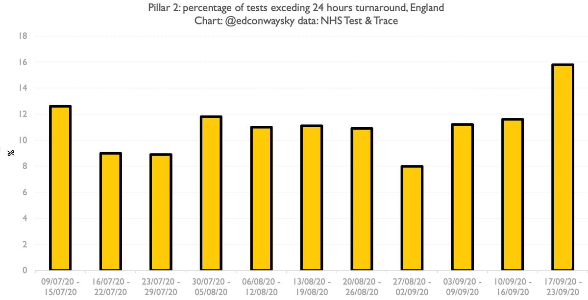
Actually when it comes to test turnaround the one area where test processing/delivery seems to be slowing down is pillar 1, which is primarily hospital labs - the bit of the system that had held up best thus far
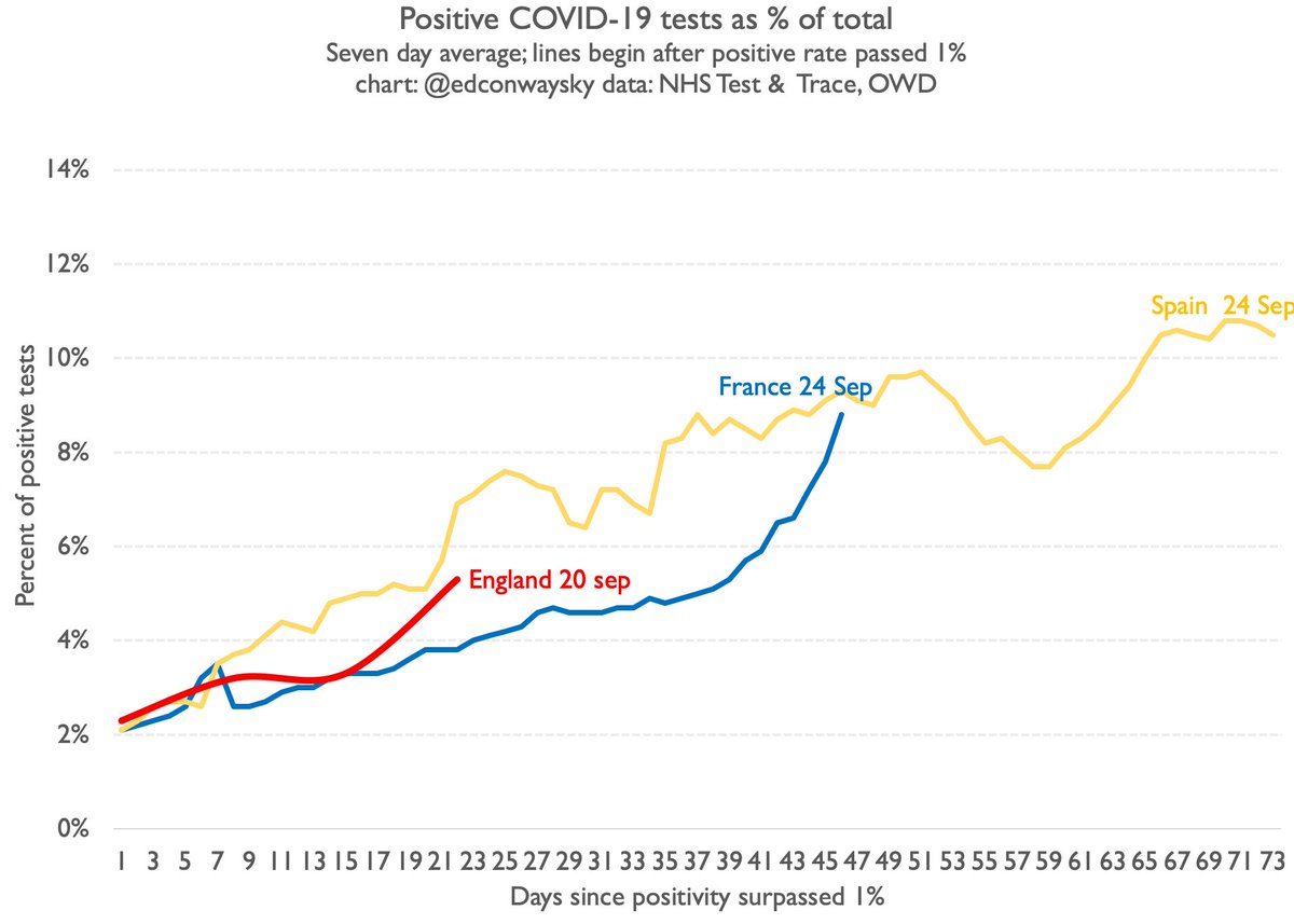
The Test & Trace stats also provide us with a more reliable measure of the percentage of positive #COVID19 tests. A useful sense check of the case data we get each day. Consistent with UK continuing to follow French/Spanish trajectory. Let's also see what @ONS data says shortly
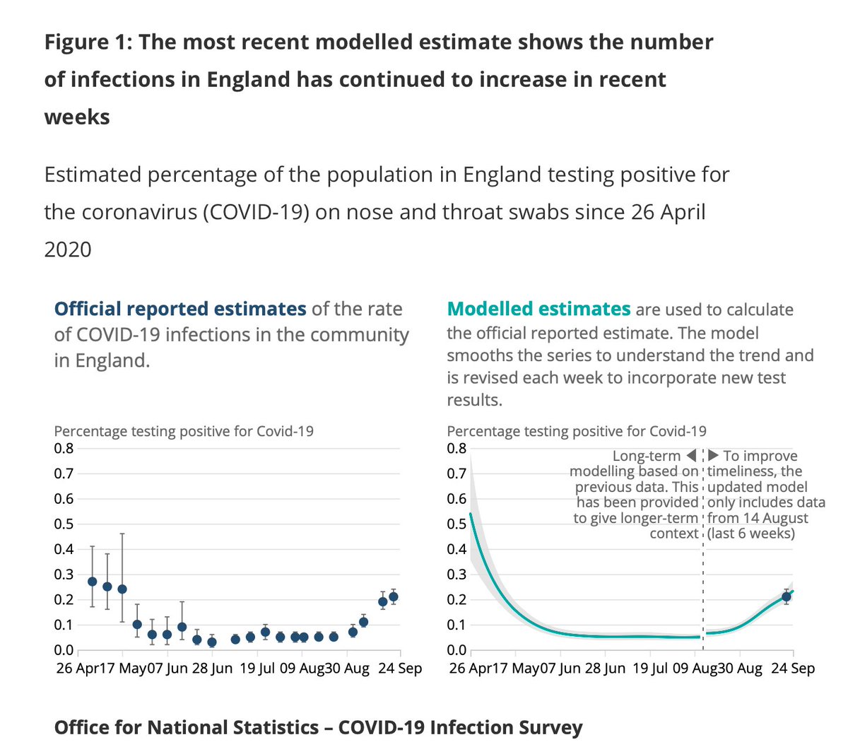
Breaking: @ONS survey of #COVID19 infections in England has been released.
This is the best measure we have of the prevalence of the disease.
And the good news is it seems the growth rate has slowed since last week.
Ties in with what we're seeing elsewhere in the case numbers
Important to provisos about the @ONS survey.
It's based on modelling; it can change a lot from week to week.
Even so, the picture painted by today's survey is tentatively reassuring.
The disease is still spreading.
But the rate at which cases are multiplying seems to be slowing
Poss the most reassuring #COVID19 chart in months.
This is @ONS’s measure of daily new #COVID19 cases in England - the best measure of its spread, unaffected by testing shortages.
Look: it’s still spreading but the growth rate has flattened.
Early days, but this is promising…
Few reasons to remain cautious despite slowing in @ONS new cases rate:
1. Data can be choppy from week to week
2. #COVID19 still growing; NB we’re talking about the RATE of growth.
3. On basis of what we’re seeing in France/Spain actually getting new cases to FALL takes time…
Finally, it’s clear from the @ONS survey as well as plenty of other sources (eg @PHE_uk data today) that there are hotspots of the disease where, unlike the national picture, it is still spreading.
This is a dangerous disease.
No cause for complacency.
Keep focusing on the data.
Update: 6,968 new #COVID19 cases in UK in past 24 hours, acc to Gov.uk dashboard.
UK case trajectory remains in line with France/Spain.
Rising - but at a slower rate than previous weeks.
Doubling time for cases currently about 30 days on basis of past week
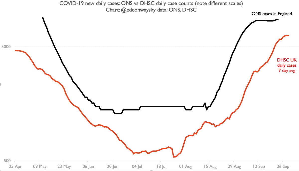
Some people have asked me whether the daily #COVID19 case figs are reliable. Aren’t they distorted by test availability? Here’s one way of gauging that - comparing them (the red line) to the v reliable @ONS survey (black). Key thing is shape - if it’s similar that’s a good sign.
Key thing in this chart is not the difference in levels but the relative similarity in steepness of the recent rise.
The growth in cases we’ve been hearing abt each day isn’t that different from the @ONS one.
Yes that’s a log scale.
Yes it’s England vs UK.
This is a sense check.

• • •

Missing some Tweet in this thread? You can try to force a refresh
 

Keep Current with Ed Conway

Ed Conway Profile picture

Stay in touch and get notified when new unrolls are available from this author!

Read all threads

This Thread may be Removed Anytime!

PDF

Twitter may remove this content at anytime! Save it as PDF for later use!

Try unrolling a thread yourself!

how to unroll video
  1. Follow @ThreadReaderApp to mention us!

  2. From a Twitter thread mention us with a keyword "unroll"
@threadreaderapp unroll

Practice here first or read more on our help page!

More from @EdConwaySky

Jan 17
🧵THE STRANGE CASE OF THE ONE MILLION POUND FINE
The story of an obscure press release on an obscure website which begs intriguing questions about Britain's "unprecedentedly tough" sanctions regime & why perhaps it's not quite as tough as it looks.
You may find it unsettling
👇
Back in Aug 2023, HMRC published this notice in the bowels of its website. Don't worry if it doesn't ring a bell - it didn't get any publicity.
But it's a big deal. A £1m fine for breaking Russian sanctions rules.
The single biggest fine in relation to trade sanctions. Image
But there are some gaping questions about this fine.
First: who paid it? Is this a firm we've heard of? Second: what did they actually do wrong? And what did they do to deserve to pay such a large sum?
There are no answers on the website. That's it. Here's why this matters. Image
Read 17 tweets
Jan 10
🇨🇳I was rather hoping to be writing this from China, where the Chancellor has just landed for the most significant economic mission in ages - restarting Britain's formal economic relationship with China.
Alas I'm still in London.
But make no mistake; this visit is a BIG deal.
🧵
Why?
Because this is the first such trip since 2017.
UK econ relations with China have been getting frostier for 6 yrs or more.
Huawei have been thrown out; rules imposed on Chinese businesspeople; accusations of spying.
& around the world nations are imposing tariffs on China.
But the UK is doing something different.
While nearly every other G7 nation has imposed tariffs on Chinese electric cars, the UK hasn't. While most countries are going colder on China (most notably the US), the UK is now cosying up to China. Why?
Read 19 tweets
Jan 7
🔥GAS PRICES🔥
Why are they on the rise again?
Why is Europe (and the UK) deindustrialising at a rapid pace?
Why have we failed (contrary to the conventional wisdom) to increase the amount of non-Russian gas in our system?
Lots of questions. Some answers in my five min primer 👇
This is a big deal - and not widely understood:
The volume of non-Russian gas in the European system is FLAT vs before the Ukraine war.
That's not the conventional wisdom.
Back in 2022 many assumed imported LNG would help make up the lost gas from Russia.
That didn't happen... Image
Instead what happened is subtly, but importantly, different.
Yes, the amount of LNG coming in from the US rose quite sharply - albeit from a low base.
But that rise was only enough to compensate for the fact that domestic production in the UK/EU was FALLING at the same time Image
Read 13 tweets
Jan 5
🌾 VERTICAL FARMING🌾
Could it save the world?
I used to be sceptical. There are MANY challenges.
But then I visited one. & I'm no longer so sure.
So with the world facing future food crises here's a thread on the most interesting thing to happen to farming in a long time...
🧵 Image
Let's start with a chart.
A few weeks ago I did a deep data dive into the state of farming in the UK.
It culminated with a v long-run chart suggesting our ability to grow ever more crops in a given hectare is slowing. Possibly stalling.
This is a really big deal
What if we could send the line in that chart 👇into the stratosphere?
It would have massive consequences. We'd be able to get ever more food from a relatively small section of land. Meaning more land for housing/rewilding or whatever else we'd want to use it for. But how? Image
Read 22 tweets
Dec 30, 2024
If you're interested in energy/climate you've probably heard the nugget that "kerosene/crude oil helped save the whales", by reducing demand for whale oil in lanterns.
I've even trotted it out myself🤦‍♂️
But there's a problem with it. A BIG problem...
🧵
The backstory here begins 200 years ago, before the age of crude oil & electricity, when the best way to light a room was a lantern, and the best oil to burn in that lantern was oil from a sperm whale.
It burnt brighter and with less smoke or stink than other oils Image
The oil itself is found in the head of the sperm whale. It comes from a totally unique organ whose function remains a matter of debate - the spermaceti organ.
Whale oil is a long chain molecule unlike nearly anything else in the natural world, giving it unique qualities Image
Read 15 tweets
Dec 19, 2024
If you're even half interested in energy, I bet you've seen this chart. I call it The Most Hopeful Chart in the World.
The point? We're embracing renewable power MUCH faster than expected.
Hurrah!
Only problem is, this chart has an evil twin. A chart we really need to discuss
🧵 Image
The Most Hopeful Chart in the World shows how each year the @IEA predicted that the amount of solar output around the world would plateau or rise v slowly in the following years. But instead solar output defied all expectations, rising exponentially.
That's great news.
But making solar panels is an energy-intensive exercise.
You need a lot of coal to smelt down the silicon and a lot of power to turn metallurgical silicon into polysilicon, let alone the monocrystalline boules you really need for a decent solar module (read my book for more 📖)
Read 11 tweets

Did Thread Reader help you today?

Support us! We are indie developers!


This site is made by just two indie developers on a laptop doing marketing, support and development! Read more about the story.

Become a Premium Member ($3/month or $30/year) and get exclusive features!

Become Premium

Don't want to be a Premium member but still want to support us?

Make a small donation by buying us coffee ($5) or help with server cost ($10)

Donate via Paypal

Or Donate anonymously using crypto!

Ethereum

0xfe58350B80634f60Fa6Dc149a72b4DFbc17D341E copy

Bitcoin

3ATGMxNzCUFzxpMCHL5sWSt4DVtS8UqXpi copy

Thank you for your support!

Follow Us!

:(