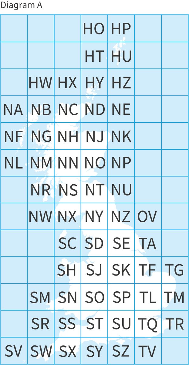
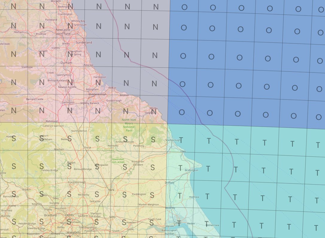
Short map thread, inspired @ScienceAndMaps earlier this week. Many people are familiar with @OrdnanceSurvey grid references (e.g. summit of Ben Nevis is NN 166 712) - those two letters you can see on the map of Great Britain below (2 letters = 100km x 100km - known as a 'myriad')
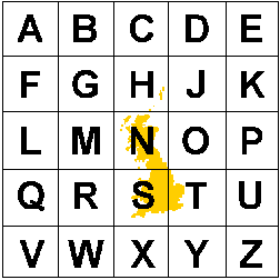
baffling combination of letters, no? Well, to crack that code you need to zoom out and see the 500km x 500km tiles this is based on (there's no letter I, so we have 25 squares) - image is from @EDINA_Digimap
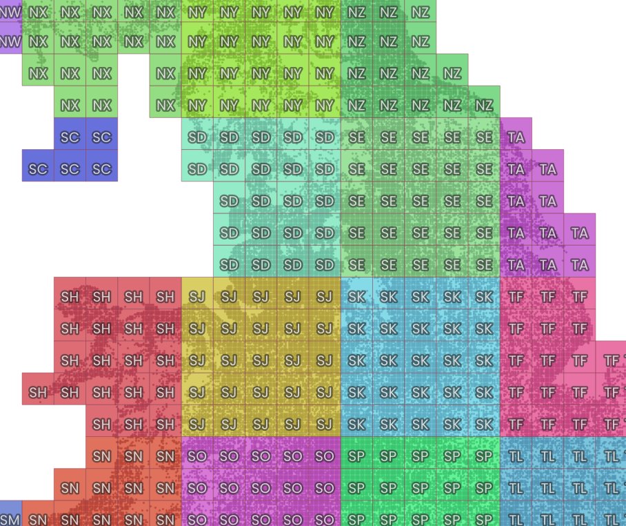
isn't it nice that the N and the S align roughly with north and south? Ordnance Survey is the mapping agency for GB rather than the whole UK, hence no Northern Ireland on the grid. So, first letter from the 500km part, second letter from the 100km part (then we have 20km squares)
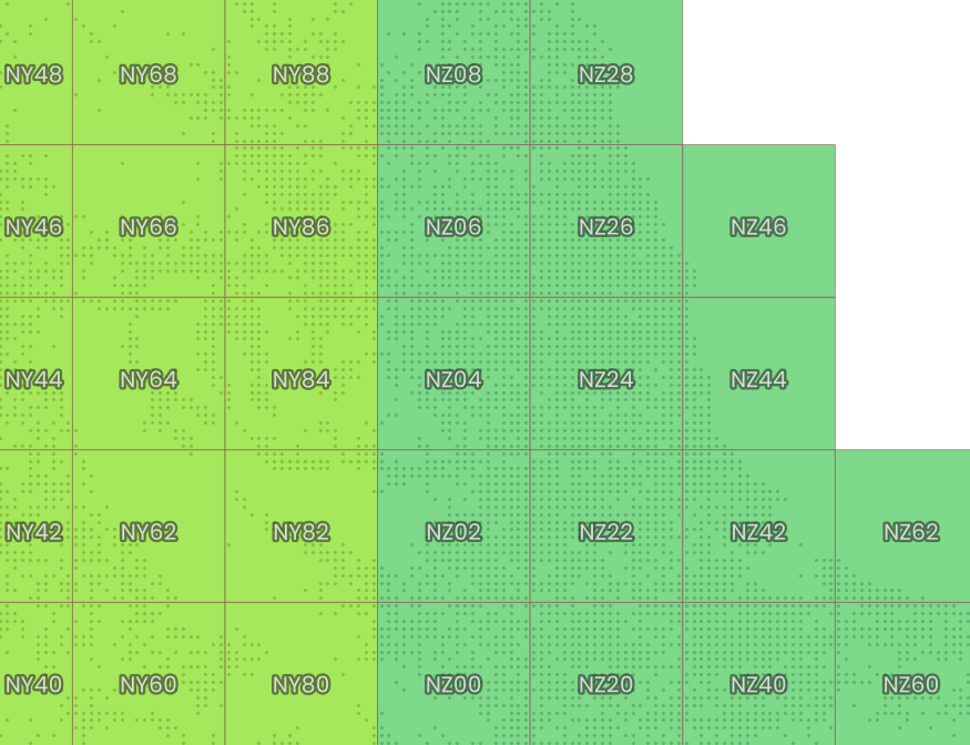
here are some 20km tiles - see, I told you it was exciting - in and about the NZ area - but what about the big O tile? Is there anything in that?
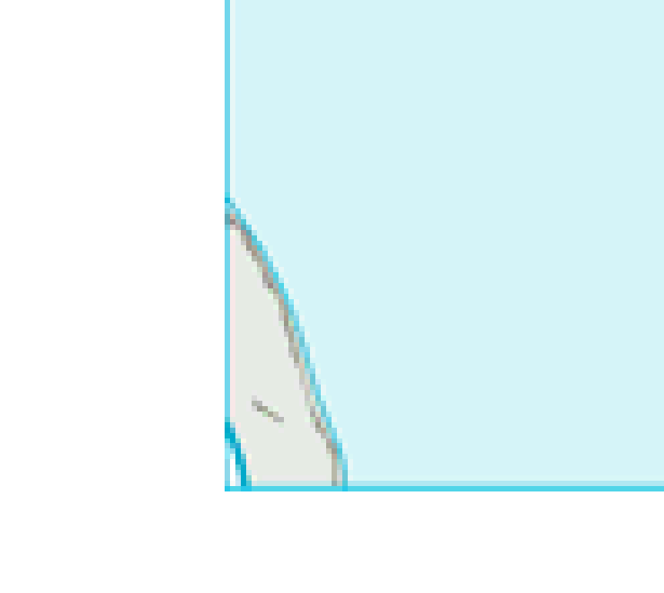
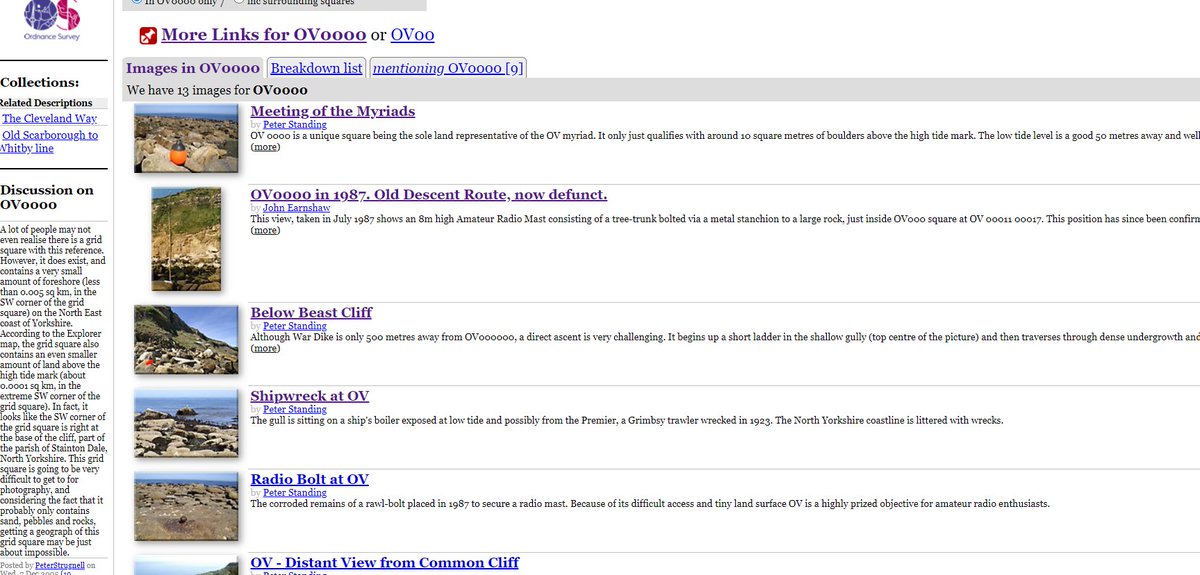
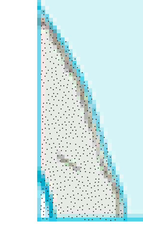
this is where the 500km tiles of N, O, S and T meet and despite it being nearly all sea, there is a tiny slither of coast at OV0000 (tiny)
at low tide I think you may get about 50 metres max width and 130m length and fit in 589 socially distanced humans, but I certainly wouldn't recommend it
anyway, back to all those 100km x 100km tiles (remember, these are known as 'myriads'). 'How many people live in NZ?', I hear you say. (about 2.6 million) What about TQ? About 13 million I reckon. HT? About 38 people.
So now we know. Incredibly important stuff.
/end
(no 'maps without NZ' here)
*BONUS FEATURE* quite a few 100km squares double up as US state abbreviations, and it turns out that I am from New Hampshire (in this version SD has more people than SD)
• • •
Missing some Tweet in this thread? You can try to
force a refresh
I saw this Met Office 'UK climate districts map' online so naturally I decided to try and figure out the population of each area whilst eating my lunch and these are the incredibly interesting results
there is also the Met Office "climate regions" map but that's a can of worms that I don't want to open, not least because of the unwavering England N / England S line
Okay, some European population density stuff now - starting with the top 100 1km grid squares by population across Europe, based on the most recent Eurostat data - more to follow
these are the top 3 by density, but I've shared a web folder with all 1km grid squares with more than 30,000 people living in them, as well as the top square in each of the 38 countries in the dataset
Topical retweet because I've been watching The Rig but also the news - I remember first seeing these when I was about 10 when playing football in Invergordon and we couldn't believe the size of them
Another very interesting recent England and Wales Census 2021 release is the passport data, so here's a map of % with no passport at MSOA level, will add a couple more below
these are all the different columns in the dataset (TS005Passports held) and the patterns are quite interesting, although I've only done a few maps as a way to explore the data
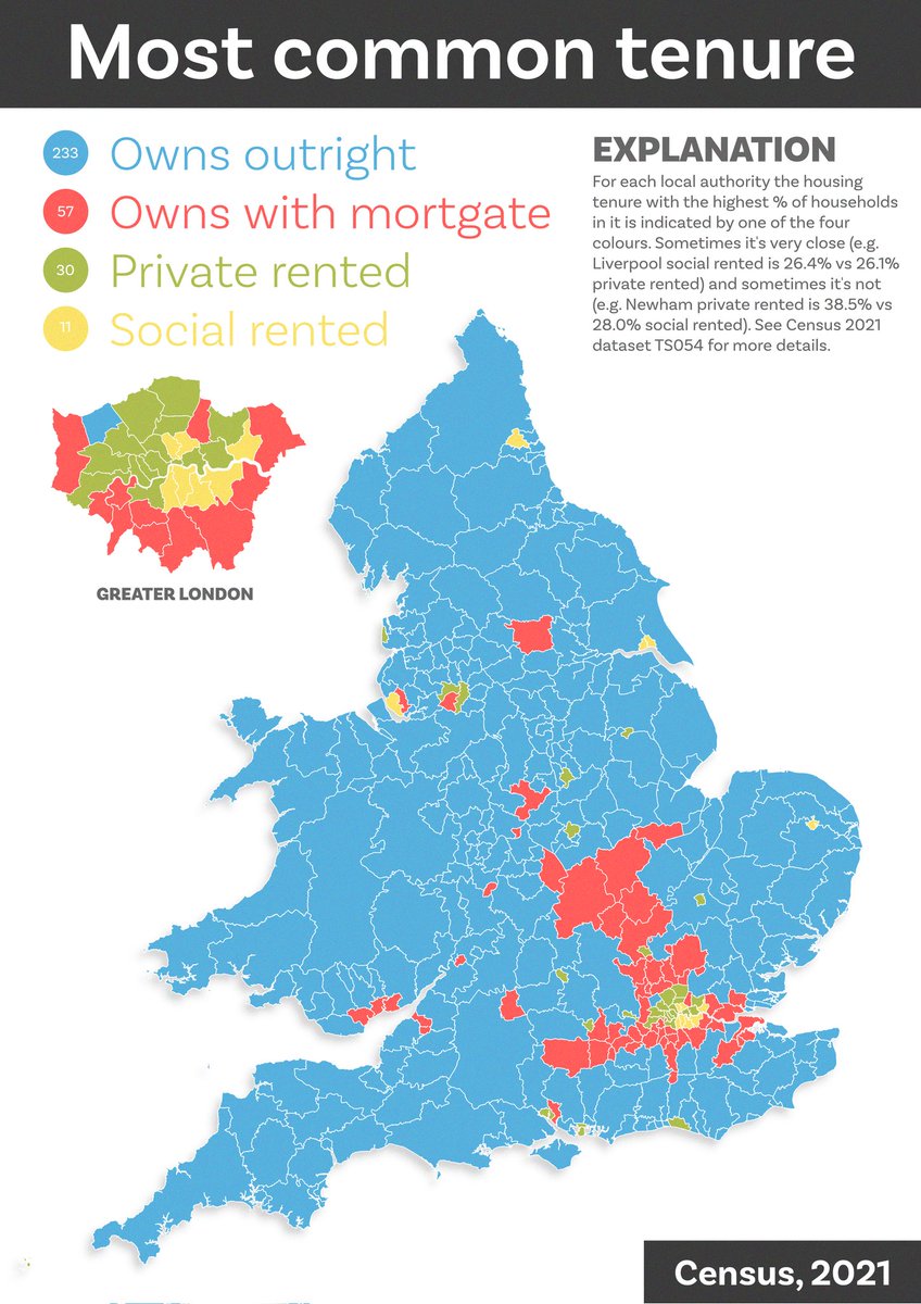
Today's census map shows the most common housing tenure in each local authority in England and Wales 🏡
I'm working on my spelling of mortgage, probably due to the shock of seeing how many households own without a mortgage!
most common by area is of course a very first-past-the-posty representation of things but I'm interested in the pattern precisely because of this - will fix typo later, perhaps I should do by constituency too
More Census age data today - a little animation of % by single year of age in each local authority. Probably needs a few watches to sink in - lots in here - but the final 10 seconds I find quite sombre, and you'll NEVER guess when lots of people leave home
and, just to go all dataviz retro, here are all the frames as small multiples
nerd note: lots of ways to make small multiples from image sets but I tend to use ImageMagick, and the image above was created using this command: