(1/n) To ans questions raised in comments to my earlier post, let me explain y I hav a serious issue with this graph. Note that the graph DEFINES that anyone earning more than $300 per month belongs to middle class. This is exactly wat is wrong with it. Y?
(2/n) In short, bec purchasing power of $ has continued to change over time. Let's start frm 2014. Recall that while exchange rate remained almost fixed between 2014-18, domestic prices kept increasing by more than increase in world prices. Result: real exchange rate appreciated.
(3/n) Now the graph. A person earning $300 in 2014 does not hav same purchasing power as one earning $300 in 2017. In fact, one earning $300 in 2017 is poorer than one earning $300 in 2014. Y? Bec, due to overvaluation in exch rate, $1 buys u less in 2017 than wat it did in 2014.
(4/n) We can now appreciate the problem with this graph. By focussing on $ income instead of real income, it exaggerates the increase in middle class btw 2014-17. Many still earning $300 or so in 2017 r actually worse off than before & shud be excluded frm middle class definition
(5/n) The opposite happens during latter part of the graph. Real exchange rate devalued by 25% between Jun-17 & Jun-19 (SBP data). Meaning, $1 buys u more in 2019 than wat it did in 2017. In other words, someone earning $300 in 2019 is better off than someone earning $300 in 2017
(6/n) So, if the point of reference is 2017/18, then many who r earning even less than $300 in 2019 shud be part of the middle class. In short, the graph exaggerates both the increase in middle classes between 2014-17 & also the decrease between 2018-19. I hope it is clear now.
(7/n) To get a much better picture one shud look at real income (actual income adjusted for infl) rather than nominal income. Let's look at HIES surveys which provide data for year 2015-16 & 2018-19. First thing to note is wages only account for less than half of total HH income.
(8/n) It turns out nominal income of HHs in 2nd, 3rd & 4th quintile increased by 21%, 11% & 11%, respectively. Price level over this period also increased by 16% (SBP). This implies an increase in real income of 5% for HHs in 2nd quintile but a decrease of 5% for HHs in 3rd & 4th
(9/n) The numbers r quite far away frm the exaggerated picture presented in the original graph. And the reason for this is the focus on $ income rather than real income. Note, we still dont hav data for FY20 & I am sure things wont look pretty. But HIES surveys also hav problems.
(10/n) If you look at tables in (7/n), you'll find out that the average HH real income has not changed at all between 2016-19. But we know that the GDP per capital has increased between this period. Average HH income should reflect this unless ...
(11/n) ... a 'significant' part of annual income belonged to foreign companies which sent it back to their home countries in the form of profit repatriation. Can this explain the difference between HIES surveys and aggregate macro data? I dont know!
(n/n) To conclude, the mistake I am trying to highlight is the same mistake which people make when saying that GDP has decreased bec it is now worth less in $ terms. Please dont make this mistake of analysing economic activity in nominal terms. In most cases, do so in real terms!
• • •
Missing some Tweet in this thread? You can try to
force a refresh
With the Army Chief now part of SIFC Apex Committee, we may see the biggest regulatory capture of our history. The military, which already runs 50 commercial entities, is now effectively in a position to bypass any law which collides with its interests. dawn.com/news/1272211
According to the new law, the SIFC, which includes army chief, has the powers to "recommend, where appropriate, additional incentives or relaxation in the regulatory and policy framework" for any 'individual' investment proposal it deems fit.
This is the first step towards undoing any transparency that was left in the system. Any individual investment can be treated in a special way for whatever reason. There is no level playing field anymore.
🧵 Here is one way to understanding why taxing 'reserves' may be a bad idea. To understand this, lets consider Lucky Cement as an example. Note that its balance sheet shows 132bn in 'reserves' (see at the very end). But what r these 'reserves'? That is where it gets interesting.
In simple terms, these were profits that were not paid out in dividends but were held back. But held back as what? Note, Lucky Cement has only close to 1bn in cash and deposits. This only means these profits were invested in different types of assets - both short and long-term.
We see the same for Indus Motor. It has 57b in reserves on its balance sheet. However, on the asset side, it only has 3.5bn in cash & deposits. Meaning, much of the profits have been invested in other assets. For Indus Motor, it largely takes the form of short-term investments.
🧵 Debt restructuring of 1999-2001: Pak external debt servicing burden back in 1998 was 41% of its foreign income (same as today). In the following year, Pak went on to seek debt relief from Paris Club. As a result, $3.3bn of its debt was rescheduled over 20 yrs with 10 yr grace.
$610million worth of Eurobonds were also restructured in Dec 1999 to comply with the requirements of Paris Club that Pak should secure similar treatment from other private creditors. Another $415million which was owed to commercial banks was also restructured in the same month.
In January 2001, Pak had another round of debt restructuring with the Paris Club, amounting to $1.8bn. In all this, the domestic debt was left as it is. The result was that even though Pak total debt stock remained the same, the external debt servicing burden reduced by 50%.
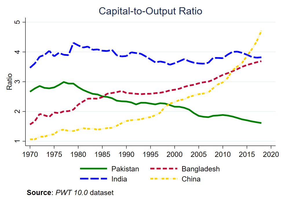
🧵on Growth: As of 2018, Pakistan had one of the lowest capital-to-output ratio across the world. This has decreased from the peak of 3 in 1977 to 1.6 in 2018. This 🧵 explains why it matters and what we can do to reverse this.
Let's first put this in perspective. The decline in capital-to-output ratio we see for Pak is the exact opposite of what we see in the region. The ratio has remained stable for India. However, both Bangladesh and China have accumulated much more capital over the same time period.
Why do we care? Because it matters for growth. As Jones (2016) notes, growth of output per worker (y/l) depends on the growth rate of capital-to-output ratio (k/y), growth in human capital (h/l), and growth in productivity (z).
🧵 Understanding DAR's Folly:
Imagine, u think rupee will loose its value by a significant amount in near future. It will then make sense for u to convert whatever rupees u hold to $. If everyone believes so and starts doing the same, rupee will indeed end up loosing its value.
Govt will then be forced to increase both fuel and electricity prices. Inflation will increase, growth will slowdown, and the electorate will complain a lot more. Now here comes a tricky problem: should govt let it happen? or, prevent it with administrative measures?
An ideal answer will be that the government should stay away from the administrative measures and take measures to restore people's faith in the stability of the currency. That way, people wont have any reason to convert rupees to dollars and the crisis will be over.
1/5: Let's be a bit more careful here. Bloomberg's model estimates the probability of default to be only around 17% just a month before default. So, if the model is to be trusted, 10% is pretty bad.
2/5: As far as CDS is concerned, the paper assessing Bloomberg's model clearly suggests that CDS is a better indicator than whatever the Bloomberg model is telling us. Hard to disagree when the model only throws out a default probability of 17% one month before it happens.
3/5: This is bec CDS r more forward looking than the model. As the paper notes, "Argentina also gives an example of how CDS spreads can increase years before a default actually happens, thus reflecting current long term market sentiment rather than actual, one year default risk."