Our planet has just experienced its hottest September on record.

The climate has changed and continues to change.

🔴 = warmer than normal
🔵 = colder than normal

Hotspots: Siberia, Middle East, western USA, parts of South America and Australia.

Data: @CopernicusECMWF

[1/3]
A closer look at the Southern Hemisphere.

Remarkable. ImageImageImage
The world in one map...

Really not much blue (colder than normal going on).

Greenland is more like blueland and La Nina becoming evident.
Let me know if you want a zoomed map for another part of the world...
Nobody asked for it but wow.

Russian Arctic...
Not even sorry.

Inspired by @physicsJ and @MikePenceFly___

• • •

Missing some Tweet in this thread? You can try to force a refresh
 

Keep Current with Scott From Scotland

Scott From Scotland Profile picture

Stay in touch and get notified when new unrolls are available from this author!

Read all threads

This Thread may be Removed Anytime!

PDF

Twitter may remove this content at anytime! Save it as PDF for later use!

Try unrolling a thread yourself!

how to unroll video
  1. Follow @ThreadReaderApp to mention us!

  2. From a Twitter thread mention us with a keyword "unroll"
@threadreaderapp unroll

Practice here first or read more on our help page!

More from @ScottDuncanWX

9 Oct
Southern Turkey 🇹🇷 and parts of Syria 🇸🇾 are on fire right now.

This is footage from the forests of Turkish Hatay province today.

The recent exceptional heatwave and dry conditions have played a crucial role in exacerbating the situation.

Syria 🇸🇾 From Latakia on the west coast.

More from Latakia 🇸🇾

Read 6 tweets
31 Aug
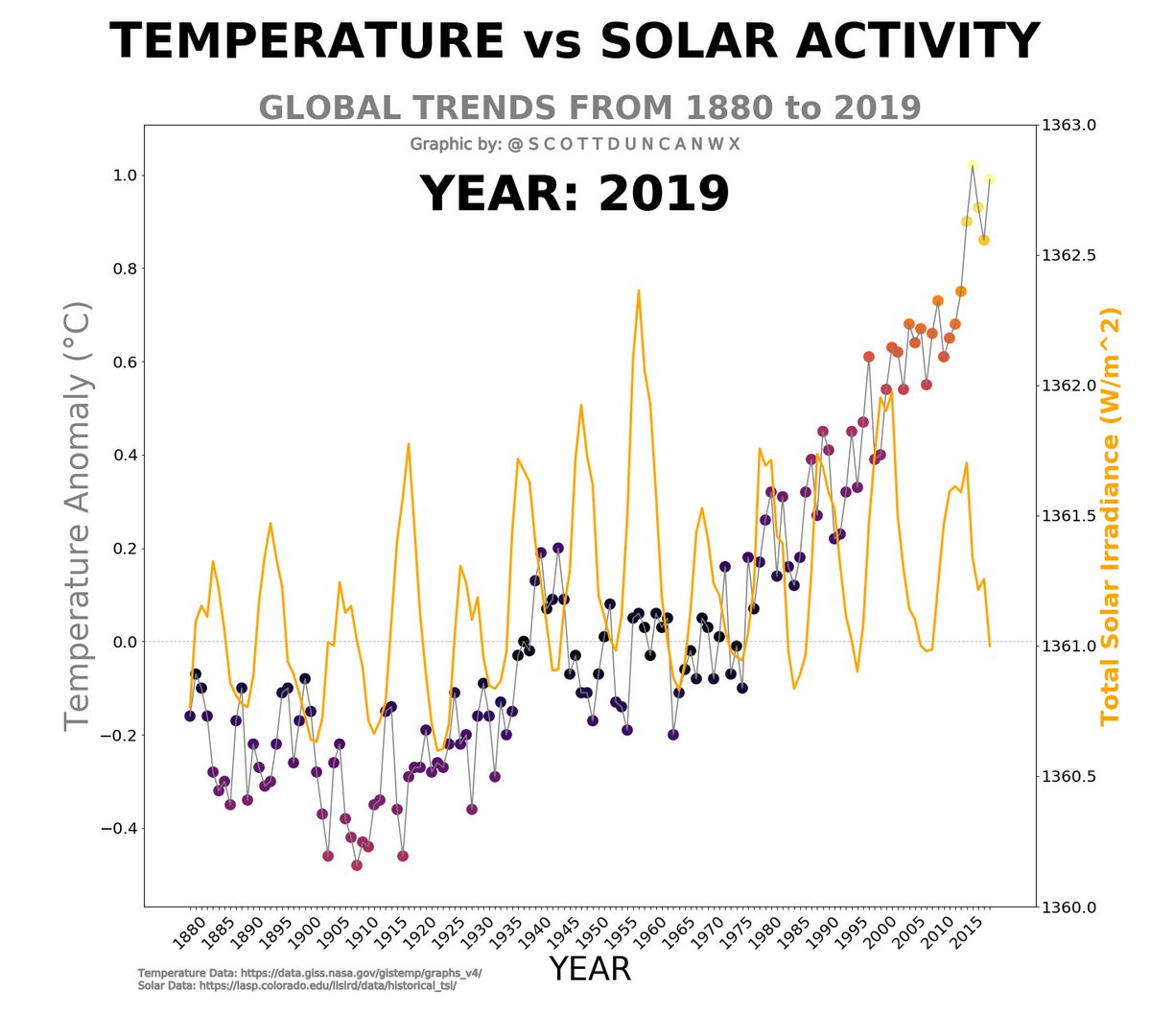
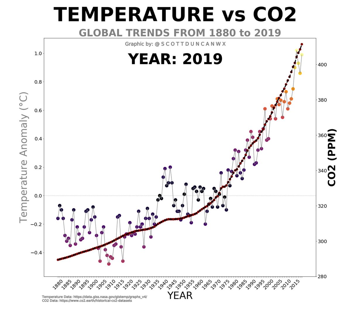
Wait for it... 140 years of global temperature compared to carbon dioxide trends in 6 seconds.

We cannot blame the sun for our abruptly changing climate.

THREAD [1/7]

Here we go...
To quote @NASA: "The amount of solar energy received by the Earth has followed the Sun’s natural 11-year cycle of small ups and downs with no net increase since the 1950s. Over the same period, global temperature has risen markedly...

[2/7]
... It is therefore extremely unlikely that the Sun has caused the observed global temperature warming trend over the past half-century."

@NASA comment source: climate.nasa.gov/climate_resour…

The data speaks for itself. It is not rocket science (no pun intended).

[3/7]
Read 7 tweets
4 Aug
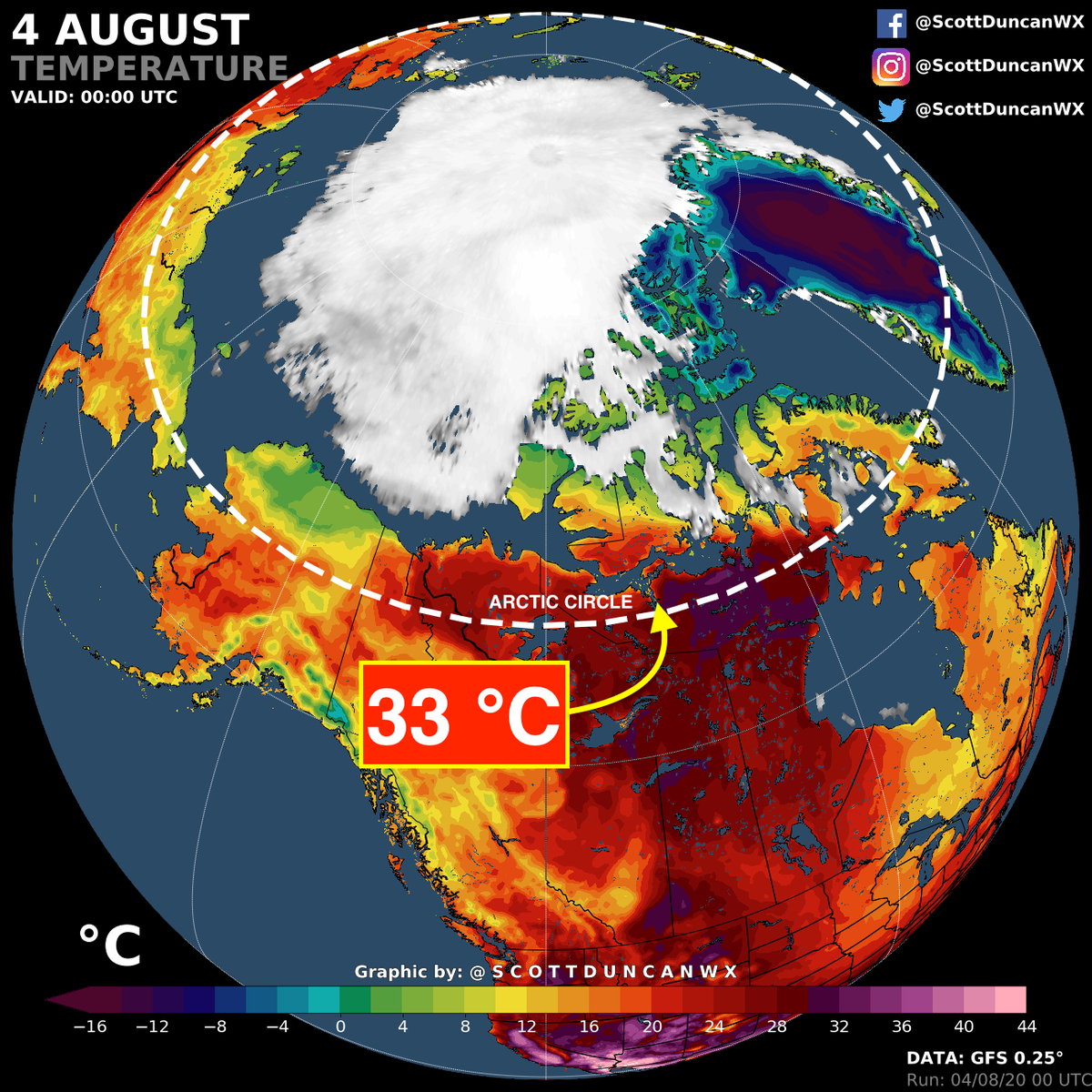
Extreme heat again on the fringe of Arctic.

We are looking at temperatures 15-20 °C warmer than normal in Northern Siberia for consecutive days.

Wildfires continue to rage and sea ice continues to deplete.

[1/5]
Not just Siberia with a heatwave right now.

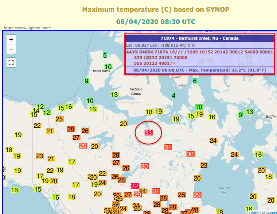
Some of the hottest parts of Canada right now are within the Arctic Circle. Recently + 33 °C was recorded at Bathurst Inlet (Nu) at latitude 66.8 ° N.
Here are the observations from the weather stations. Likely hotter just to the east of this reading. This is about 20-23 °C above normal for this area.
Read 5 tweets
14 Jul
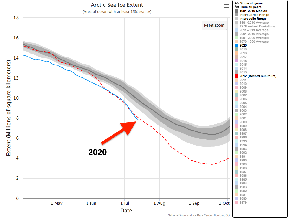
Strong high pressure is just sitting over the Arctic and this is far from ideal.

24 hours of daylight combined with anomalous warmth on top of mostly clear skies is optimal for depleting the already record low Arctic Sea Ice coverage...
As of 13 July 2020, we were about nearly 2 *Million* km² below the long term average. You could pretty much fit France 🇫🇷, Germany 🇩🇪, Spain 🇪🇸, Italy 🇮🇹 and UK 🇬🇧 in this gaping hole.

Play with the data here:nsidc.org/arcticseaicene…
This is the temperature simulated over the next 5 days in the lower part of the atmosphere. Very few areas within the Arctic will be below freezing.

We will be seeing quite eye-opening drops in ice coverage as the melt season continues. Locally huge losses.
Read 4 tweets
5 Jul
All-time Arctic heat record, unprecedented wild fires, thawing permafrost, retreating ice sheets...

It would be impressive if it wasn't so harrowing.

We are half way through 2020 and June is yet another month where excessive heat is smashing records.

[THREAD]
This is how the whole month looks in 6 hour steps. Siberia, Scandinavia and northern Canada all stand out as hot spots (literally).

But how does this look when comparing against a 30 year average?
I think this speaks for itself.

Pay attention to the colour scale. The golds emerging from the hot red colours indicate temperatures around + 20 °C warmer than normal.

Yes, there are some cold blobs. These are locally significant but can't compete with the alarming warmth.
Read 8 tweets
27 Jun
This is critical.

Sea surface temperatures have entered a realm of truly exceptional warmth.

The Arctic has been hammered by extreme warmth for months. The ongoing #heatwaves are adding to the growing problems.

[Yep, another thread]
Maybe things are balanced by colder seas if we look at the other side of northern hemisphere?

Nope.

Just watch this until the end.
This comes at a time where emerging trends show us the Arctic is warming 3.8 times faster than the rest of the globe.

Check out this mesmerising, yet harrowing, representation of reality...


Great work on the visuals by: @anttilip
Read 8 tweets

Did Thread Reader help you today?

Support us! We are indie developers!


This site is made by just two indie developers on a laptop doing marketing, support and development! Read more about the story.

Become a Premium Member ($3/month or $30/year) and get exclusive features!

Become Premium

Too expensive? Make a small donation by buying us coffee ($5) or help with server cost ($10)

Donate via Paypal Become our Patreon

Thank you for your support!

Follow Us on Twitter!