
COVID deaths & hospitalizations always lag cases. The lag has been demonstrated, is often 𝗺𝗼𝗿𝗲 than a month, and its timing can be predicted accurately (I have done it.) The #casedemic folks are just, well, wrong.
A thread explaining the lag with real-world examples.
1/n
A thread explaining the lag with real-world examples.
1/n
I will show what causes the lag, and how I can predict it accurately. First, there are multiple causes behind it:
#1 clinical
#2 reporting
#3 age prevalence
I will explain these causes one by one
2/n
#1 clinical
#2 reporting
#3 age prevalence
I will explain these causes one by one
2/n
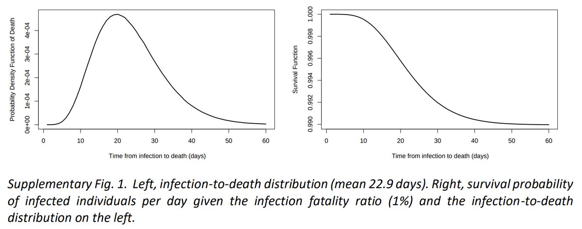
Lag #1 is the most obvious: clinically the mean infection-to-death time is 22.9 days (see pg 4: static-content.springer.com/esm/art%3A10.1…)
So at minimum deaths will lag cases by a little over 3 weeks
Similarly, infection-to-hospitalization is 1-2 weeks
3/n
So at minimum deaths will lag cases by a little over 3 weeks
Similarly, infection-to-hospitalization is 1-2 weeks
3/n
Lag #2 is reporting delays. Deaths may take 4 weeks or more to be reported.
For example in Florida the average lag from the date of death to the date the death is reported on the state's covid dashboard is currently 28.4 days:
4/n
For example in Florida the average lag from the date of death to the date the death is reported on the state's covid dashboard is currently 28.4 days:
https://twitter.com/scottdavidherr/status/1319305713823481856
4/n
Reporting delays affect hospital admissions as well. My locality—San Diego—warns hospital statistics are incomplete in the last 2 weeks. Indeed, the May 5th hospitalization peak took 15 days to be reported as the highest peak on the chart:
5/n
https://twitter.com/zorinaq/status/1276380162125205505
5/n
Lag #3 is caused by age prevalence
We know a 70-year-old is 100× more likely to die or be hospitalized due to COVID, compared to a 20-year-old:
6/n
We know a 70-year-old is 100× more likely to die or be hospitalized due to COVID, compared to a 20-year-old:
https://twitter.com/zorinaq/status/1311764842160644096Keep this in mind. I will come back to it.
6/n
And we observe a surprisingly universal trend around the world: COVID outbreaks often start among the young, before propagating to older age groups
7/n
7/n
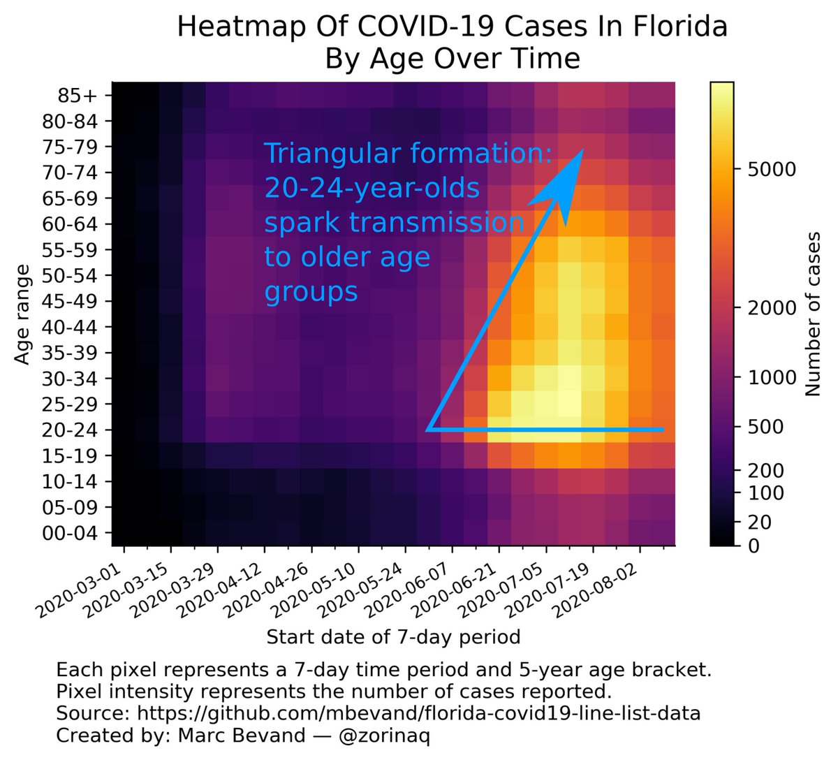
More examples of the propagation of COVID from the young to the elderly can be seen in my heatmaps thread:
8/n
https://twitter.com/zorinaq/status/1285218803157094403
8/n
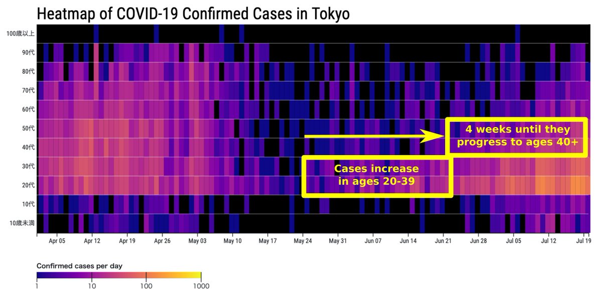
When an outbreak starts among the young it will initially have a near-zero impact on hospitalizations & deaths (remember: 20 y.o. are 100× less likely to die/be hospitalized) until it propagates to older age groups
The propagation delay can be 4 weeks or more eg. see Tokyo:
9/n
The propagation delay can be 4 weeks or more eg. see Tokyo:
9/n
The sum of all these lags is:
#1) 3 weeks infection-to-death
#2) 4 weeks deaths reporting
#3) 4 weeks propagation to older age groups
Total = it can take 11 weeks from increasing infections to increasing deaths.
10/n
#1) 3 weeks infection-to-death
#2) 4 weeks deaths reporting
#3) 4 weeks propagation to older age groups
Total = it can take 11 weeks from increasing infections to increasing deaths.
10/n
However rising *infections* to rising deaths isn't exactly what we want to estimate. We want to estimate rising *cases* to rising deaths. So how long does it take for an infection to be reported as a case?
11/n
11/n
An infection occurs, symptoms appear days later, the patient is tested, and the lab or hospital reports the test result to public health authorities. Conservatively we could (over)estimate this delay to about 2 weeks.
12/n
12/n
So the lag from rising *cases* to risings deaths would be 9 weeks in this example (11 minus 2.)
And of course, to confirm retrospectively that deaths are increasing, one would need to observe deaths for a few weeks beyond the 9-week point.
13/n
And of course, to confirm retrospectively that deaths are increasing, one would need to observe deaths for a few weeks beyond the 9-week point.
13/n
See the chart below: the top panel shows Iran deaths up to 04 Jun.
Some people would say the declining trend of Iran deaths had not reversed by that point. It's only with more data (bottom panel) that it becomes clear the trend reversal started on 14 May
14/n
Some people would say the declining trend of Iran deaths had not reversed by that point. It's only with more data (bottom panel) that it becomes clear the trend reversal started on 14 May
14/n

In my experience the #casedemic folks who are so focused on visual charts have—ironically— the hardest time reading charts.
Specifically they lack an intuitive sense about what constitutes a statistically significant trend reversal.
15/n
Specifically they lack an intuitive sense about what constitutes a statistically significant trend reversal.
15/n
For example in June I argued with someone about this exact Iran chart but he could not be convinced the trend of deaths had reversed on 14 May until he had 5 weeks of data past that point:
Only with an extra 5 weeks he acknowledged it.
16/n
https://twitter.com/zorinaq/status/1270980171659542529
Only with an extra 5 weeks he acknowledged it.
16/n
In this extreme scenario a person may need a total of 14 weeks (9-week lag + 5-week retrospective observation) to get a visually convincing chart that deaths were really rising.
14 weeks! That's why "wait 2 to 3 weeks" has become a meme!
17/n
14 weeks! That's why "wait 2 to 3 weeks" has become a meme!
17/n
In practice the lag is shorter than 9 weeks.
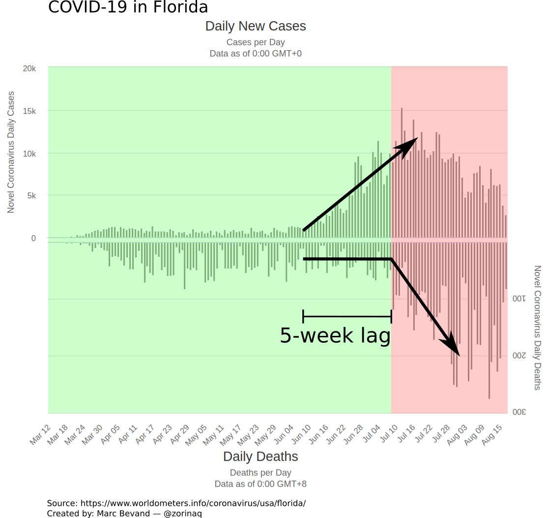
For example the summer COVID spike in Florida had a case-to-death lag of only 5 weeks. But with a retrospective observation of 1 week, it means 6 weeks were needed to show the #casedemic folks a chart of rising deaths.
18/n
For example the summer COVID spike in Florida had a case-to-death lag of only 5 weeks. But with a retrospective observation of 1 week, it means 6 weeks were needed to show the #casedemic folks a chart of rising deaths.
18/n
I actually did build a model to predict this lag.
It forecast the timing of deaths in Florida by taking into account the 3 causes of lag:
19/n
It forecast the timing of deaths in Florida by taking into account the 3 causes of lag:
https://twitter.com/zorinaq/status/1279934357323386880And it has been very successful. It predicted the 5-week lag with great accuracy:
https://twitter.com/zorinaq/status/1286541949642539009
19/n
This model was super-accurate because Florida is one of the few states that publish full line list information, including the age of every COVID case, which is required to account for lag #3 (age prevalence.)
You can read more about my model here: github.com/mbevand/florid…
20/n
You can read more about my model here: github.com/mbevand/florid…
20/n
Without age information, we can still build decent guesstimates.
For example I also accurately predicted by how much deaths would rise in Spain, when many (such as @JamesTodaroMD) were wrongly claiming deaths wouldn't rise:
21/n
For example I also accurately predicted by how much deaths would rise in Spain, when many (such as @JamesTodaroMD) were wrongly claiming deaths wouldn't rise:
https://twitter.com/zorinaq/status/1308257465767571462
21/n
Having said all that, there are (only) two scenarios where increasing cases will NOT lead to increasing deaths:
22/n
22/n
Scenario #1: increasing case ascertainment rate.
Sometimes more tests are performed and catch more milder cases. But the epidemic is otherwise not growing. This occurred in Spring in Sweden. A reliable indicator of this is when the share of positive tests decreases
23/n
Sometimes more tests are performed and catch more milder cases. But the epidemic is otherwise not growing. This occurred in Spring in Sweden. A reliable indicator of this is when the share of positive tests decreases
23/n

Scenario #2: when an outbreak grows among young age groups, but never propagates to the elderly.
This is uncommon. But it happened in September in Florida:
24/n
This is uncommon. But it happened in September in Florida:
https://twitter.com/zorinaq/status/1313220868902772736
24/n
Bottom line, the case-to-death lag is real. It can be accurately predicted with the right data (age information)
It is certainly not on the order of 2-3 weeks, but can be up to 9 weeks or more, as I demonstrated.
25/n
It is certainly not on the order of 2-3 weeks, but can be up to 9 weeks or more, as I demonstrated.
25/n
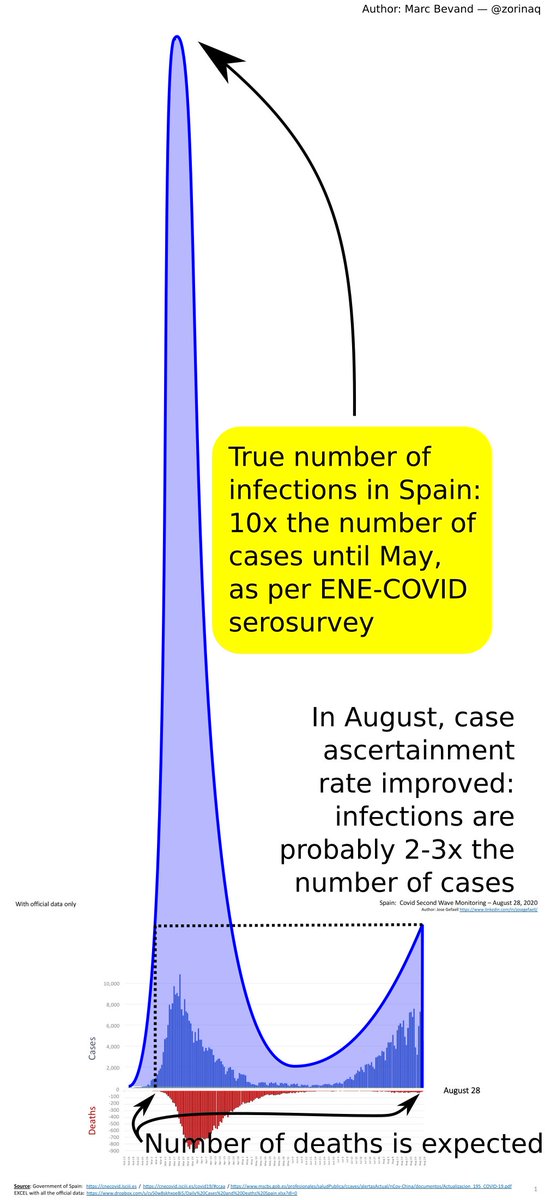
Another very important point: the case ascertainment rate has changed dramatically between March-April and October.
In March-April many countries detected around 1 in 10 cases.
In October they detect 1 in 2, or 1 in 3.
What does this mean for cases and deaths?
26/n
In March-April many countries detected around 1 in 10 cases.
In October they detect 1 in 2, or 1 in 3.
What does this mean for cases and deaths?
26/n
This means a naive comparison of deaths per case, between March-April and today is going to be widely misleading.
Spain is a good example.
In October cases are spiking higher than March-April, but deaths are lower, so COVID has become less severe? Wrong.
27/n
Spain is a good example.
In October cases are spiking higher than March-April, but deaths are lower, so COVID has become less severe? Wrong.
27/n
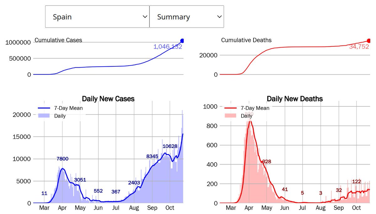
The reality is that because the case ascertainment rate was terrible (1 in 10) in March-April, the peak of infections was truly much worse then.
That's why deaths were higher in March-April.
28/n
That's why deaths were higher in March-April.
28/n
COVID has not become "less severe" over time.
Yes, treatments have gotten somewhat better at keeping people alive (
29/n
Yes, treatments have gotten somewhat better at keeping people alive (
https://twitter.com/ScottGottliebMD/status/1318656252835209217), but the improving case ascertainment rate is, by far, the biggest factor.
29/n
Back to the topic of lag between cases and hospitalizations, or between cases and deaths.
In Sweden the lag also appears to be 5 weeks, as ICU admissions and deaths have just now started increasing:
30/n
In Sweden the lag also appears to be 5 weeks, as ICU admissions and deaths have just now started increasing:
https://twitter.com/zorinaq/status/1320106267214401536
30/n
Small correction: in Sweden, the case-to-death lag for the current Sep-Oct 2020 wave is about 4 weeks (not 5)
And the case-to-ICU admissions lag is about 3 weeks
See more details at
31/n
And the case-to-ICU admissions lag is about 3 weeks
See more details at
https://twitter.com/zorinaq/status/1320628173856403457
31/n
• • •
Missing some Tweet in this thread? You can try to
force a refresh


