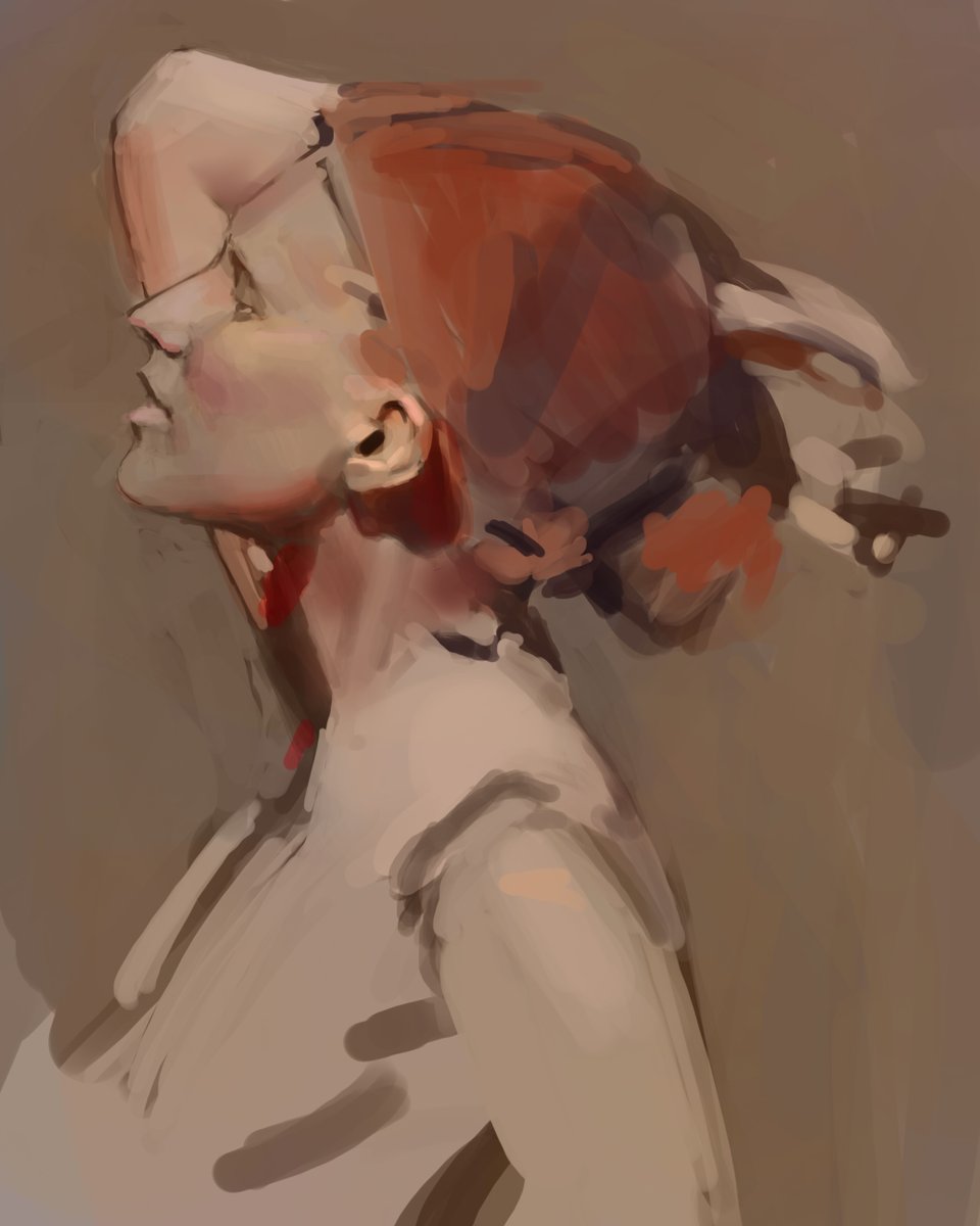
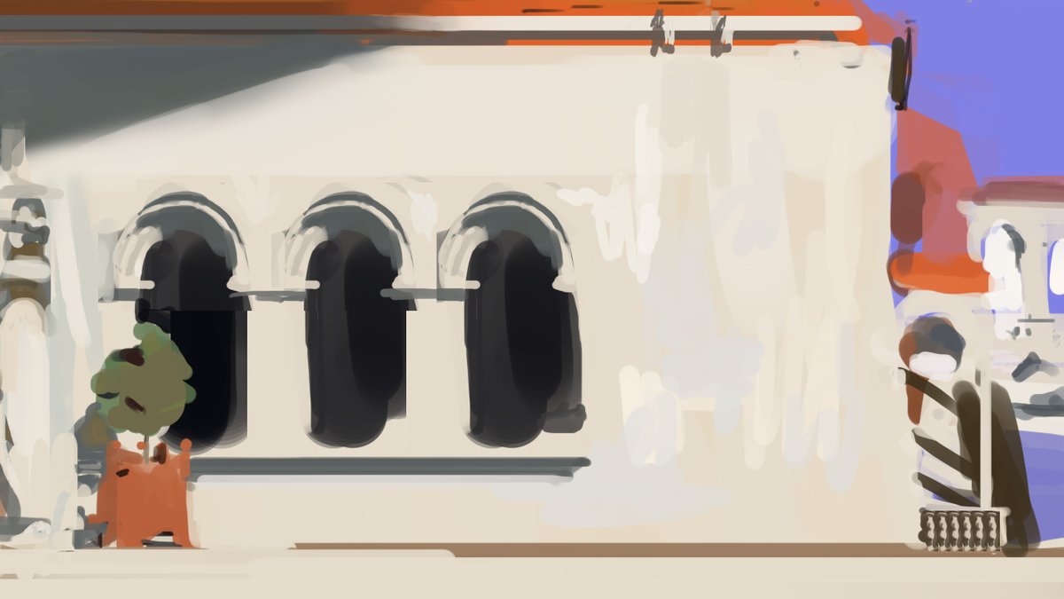
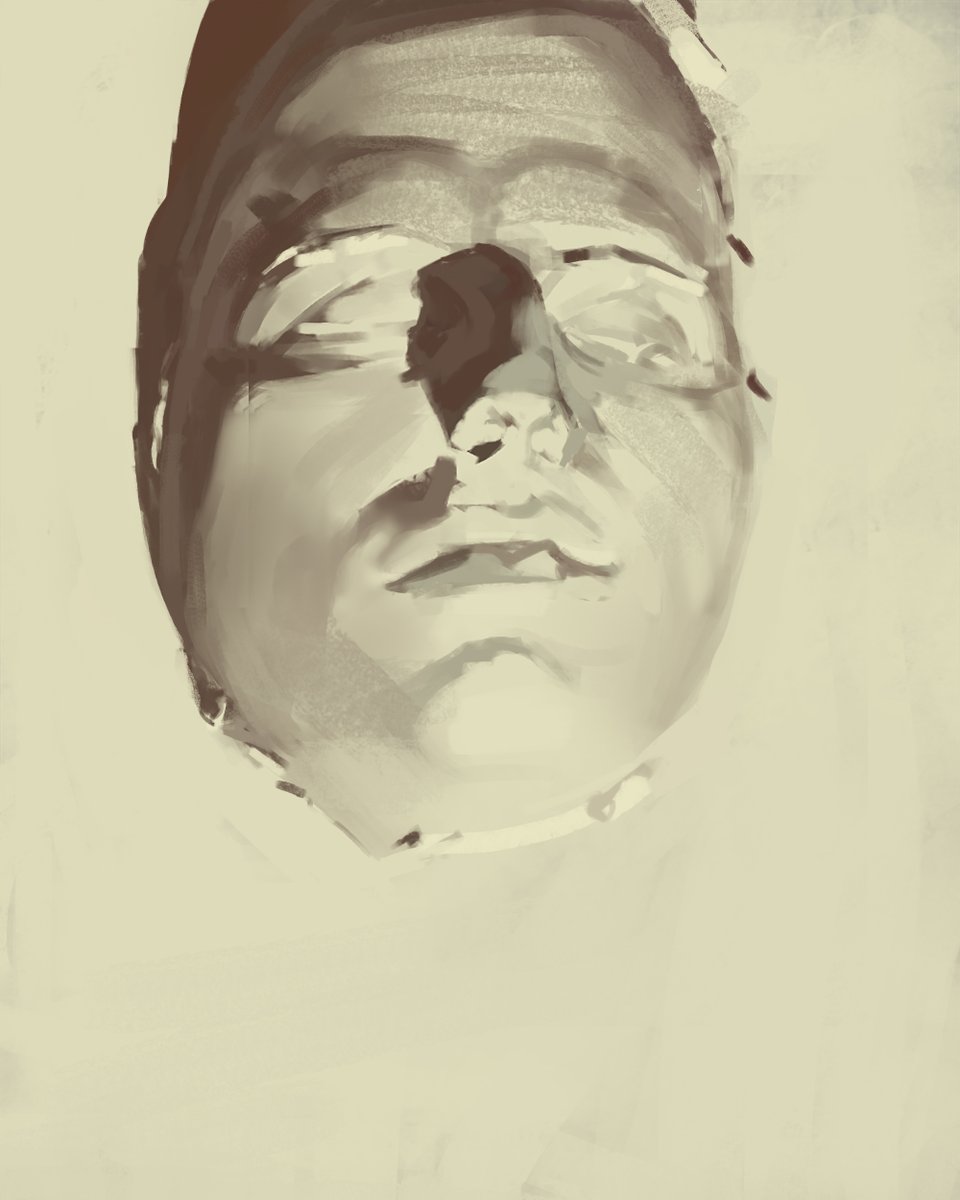
Thread on values! Have you ever had to rely on tweaking levels in Photoshop in order to get your painting to have enough contrast? Here’s how to confidently control values from the very beginning!
Values (and color, and edges, and drawing) are all about relationships. Let’s use this scene as an example. The cloud definitely reads against the sky, but it is just a temperature change, not a value change. We want to look for the big similarities and differences first.
When looking at this scene in real life, the goal is to compress a lot of information into groups while keeping the relationships consistent. This makes it easier to paint and allows us to design. You will rarely ever need more than 4 groups to do this.
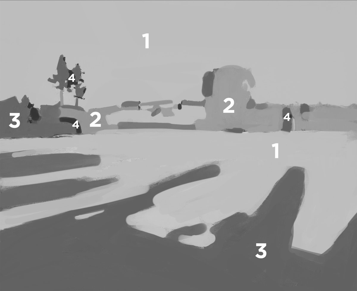
The information is compressed from what Levitan was seeing in real life. There’s one value for the sky, one darker value for the light trees, one dark grey for the dark trees and the shadow of the light grass, and a very dark value for the shadow of the dark trees.
Pretend like you have 4 stacks of construction paper and you can only cut them out into different shapes. Decide what values you make the paper. You don’t want to buy off the shelf, instead custom order those 4 stacks. The difference between is the first thing to think about.
Compare across the scene and values and other relationships will naturally compress. Look for areas where the value is the same across different objects and compare to that. Here are some more examples of areas like that too look for!
Notice how this grey is the same value for both the shadows on the ground on the very light grass, and also the very dark trees in direct sunlight. They always need to be the same, if we change the value that they both are then everything else would need to change in proportion.
Here we can see the same scene compressed into two values instead of four, but it is the same relationships. Practice compressing to varying degrees!
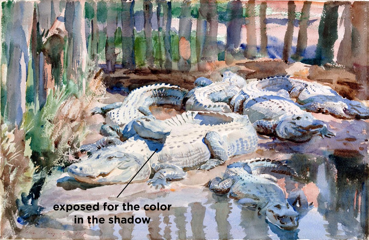
Once you have your value relationships all set, you can compare the colors. We already have the values, so we can find the temperature of the grass in light and the temperature of the sky. Remember, we already know they are the same value.
Once we have the temperature of the grass in light, we can compare the temperature of the grass in shadow to that. Again, we already know the value, so all we need to do is find the right temperature relationship from light to shade.
In this example, it shows how you should compare across everything to see the big picture. This is how you learn to see! By thinking this way, you will wind up with a picture with accurate contrasts, and using levels will adjust those already accurate relationships!
Painting from life and analyzing master work like this will help build an intuition about relationships that you can take to work from imagination. It works for any style of painting!
If you've enjoyed this, check out my ebook! Together with the sequel, it has all of my previous tutorials greatly expanded upon and with lots of bonuses like a glossary, recommended reading, and all the artists names right there with the examples! gumroad.com/l/YPtf
And here is the sequel, which breaks down everything I wish I knew when I started painting. gumroad.com/l/cfv2
Artist Credit: Isaac Levitan, Dmitri Belyukin
• • •
Missing some Tweet in this thread? You can try to
force a refresh
Thread on how to do composition studies! The secret is to look for the big relationships. We are not painting objects, but rather designing an abstract composition that has the feeling we want. Zoom way out, look for big value shapes, and compare across the whole painting!
After we have our black and white study, then add temperature information on top. Don’t use layer modes like color or overlay, but rather paint directly and opaquely right on top. This will help us gain an understanding of how color relates to value.
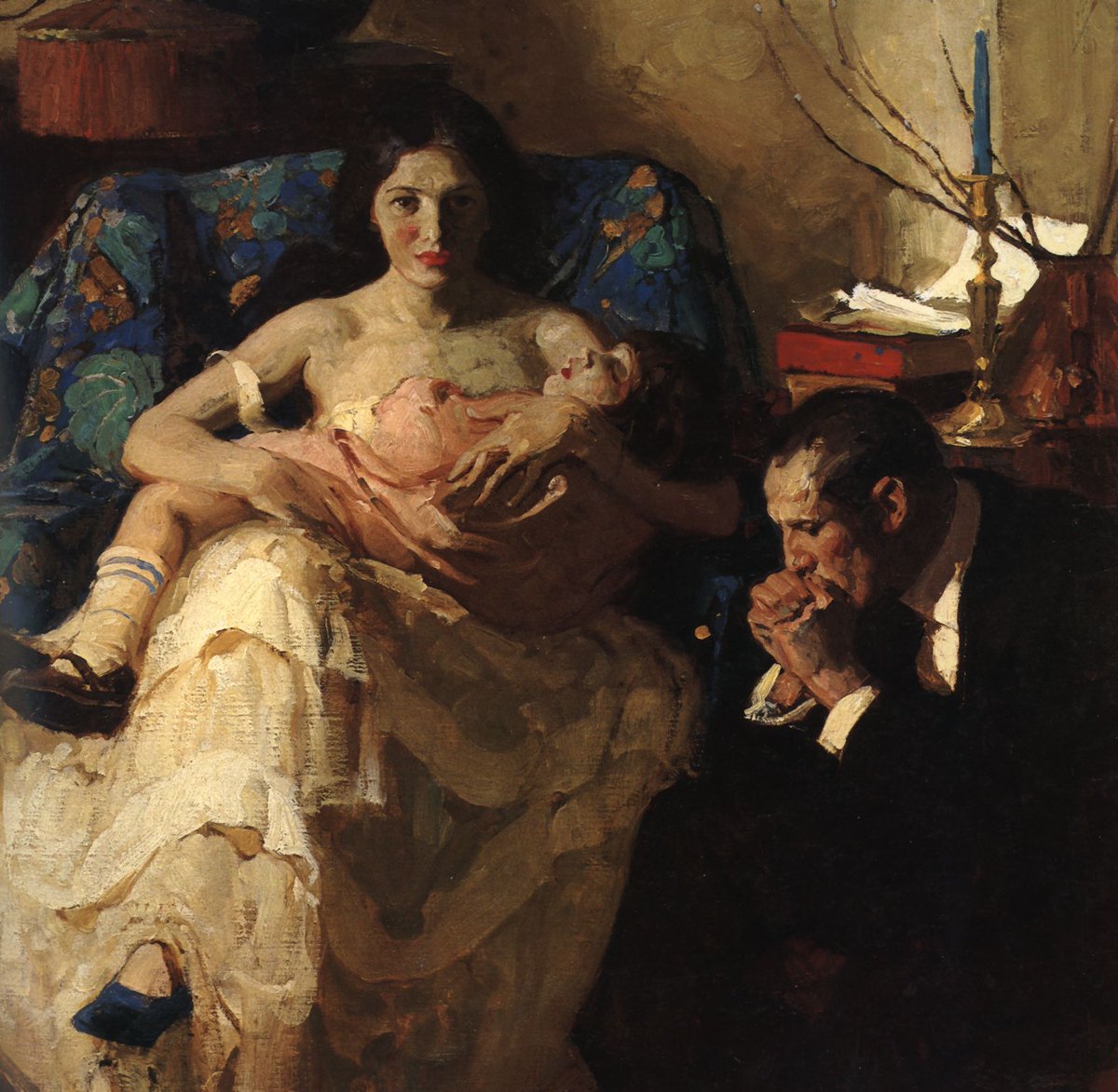
Dean Cornwell is great to study for this because we can see his decision making. Look how the value of the dark blue cloth is the same in light as the white dress is in shadow. These are the big relationships to look for, and then naturally the small differences group themselves.
Thread on color part 3! We've gone over a lot of the science, but how do we use all of this creatively in our paintings? How do we make a black and white image look natural? The secret and key to the whole thing is in a property of color called Chroma.
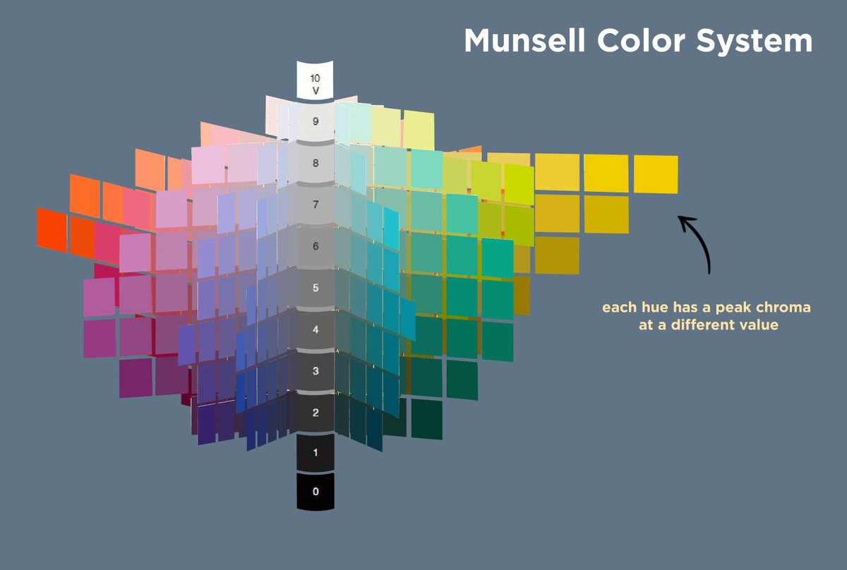
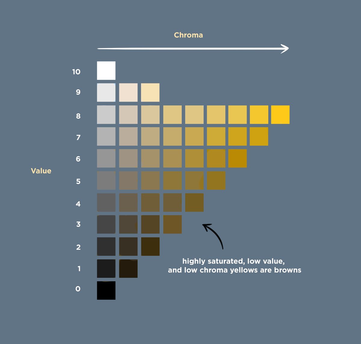
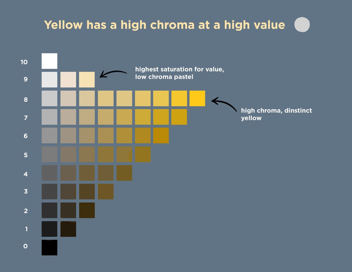
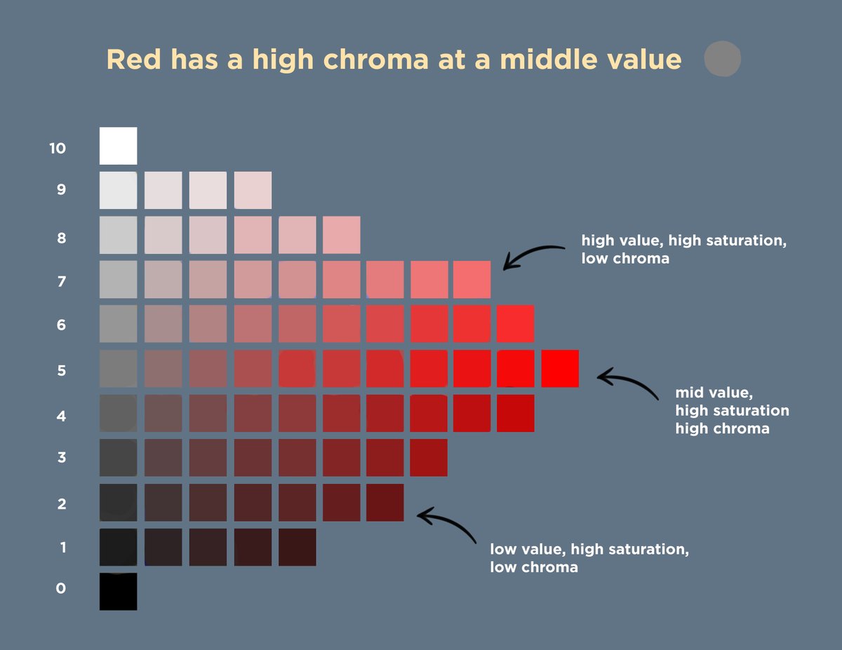
Chroma is distinct from, but related to, saturation. You can have a highly saturated yellow hue at a dark value. This would mean that it is a pure color, but at a low intensity. That color is not high chroma, because it appears brown and not what we would describe as yellow.
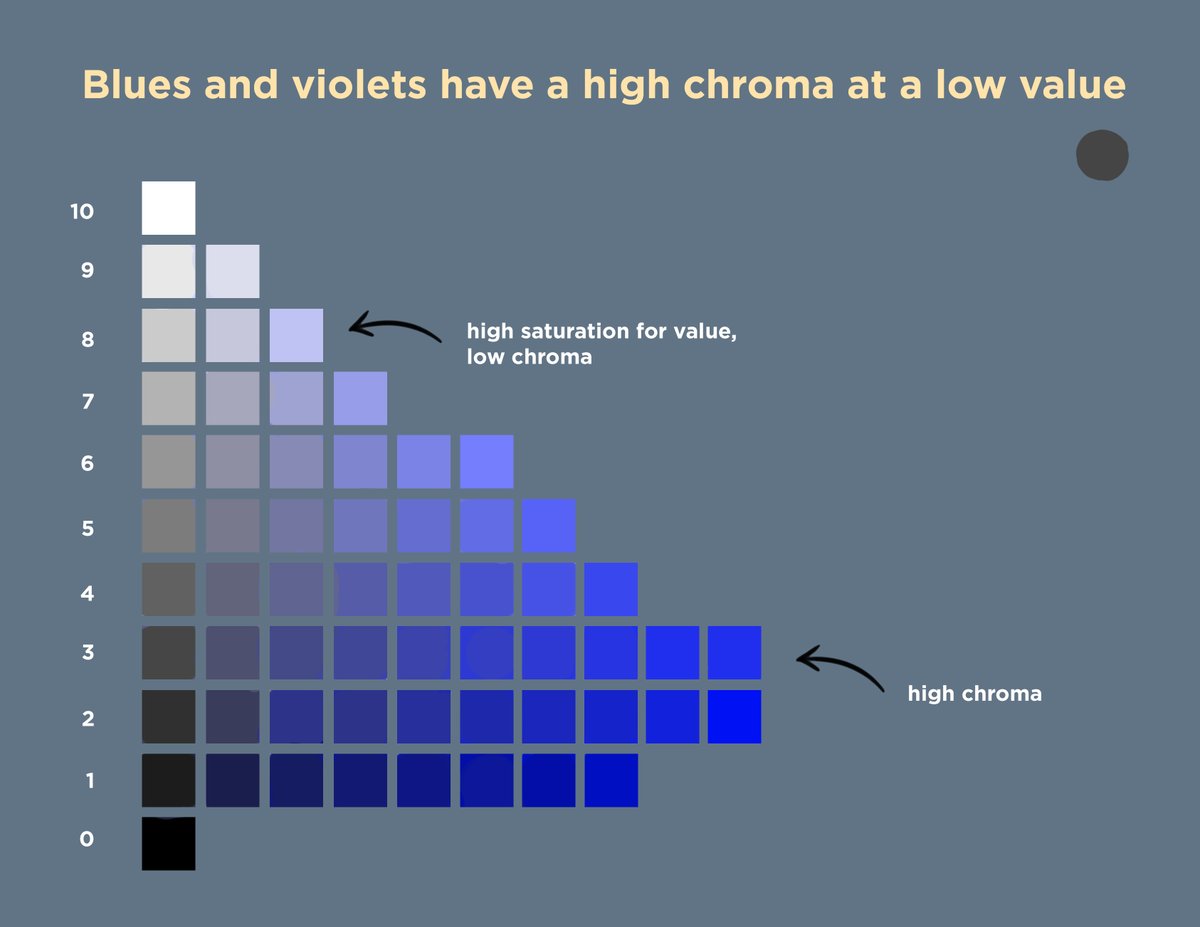
Yellows have a high chroma at bright values, reds at middle values, and blues and violets at dark values. At extreme values, it becomes harder to have a high chroma for any color. Instead of copying a scene without direction, we can control our values to show the colors we want.
Thread on color in painting part 2! How do we know how to confidently decide on colors in the infinite lighting situations that we can imagine? We’re going to dive deeper this time into how light works, and what determines the color we actually see when light reaches our eyes.
First, materials. They all reflect the scene, just differently. Diffuse materials absorb/scatter some wavelengths beneath the surface while reflecting the rest, some metals reflect all of the light, and others are colored due to uneven absorption and emission by their electrons.
The more pure and strong the reflection of the light source, the further the shift in color towards it. The direction of hue shifting depends on the material. A yellowy-green grass will travel through the greens when reflecting the blue sky, while skin will go through the pinks.
Thread on color in painting! This will be a 3-part series with everything you ever wanted to know about color. What actually is color, and how do we use it? How come it is so hard to make a painting look natural if we start in black and white and then add color after?
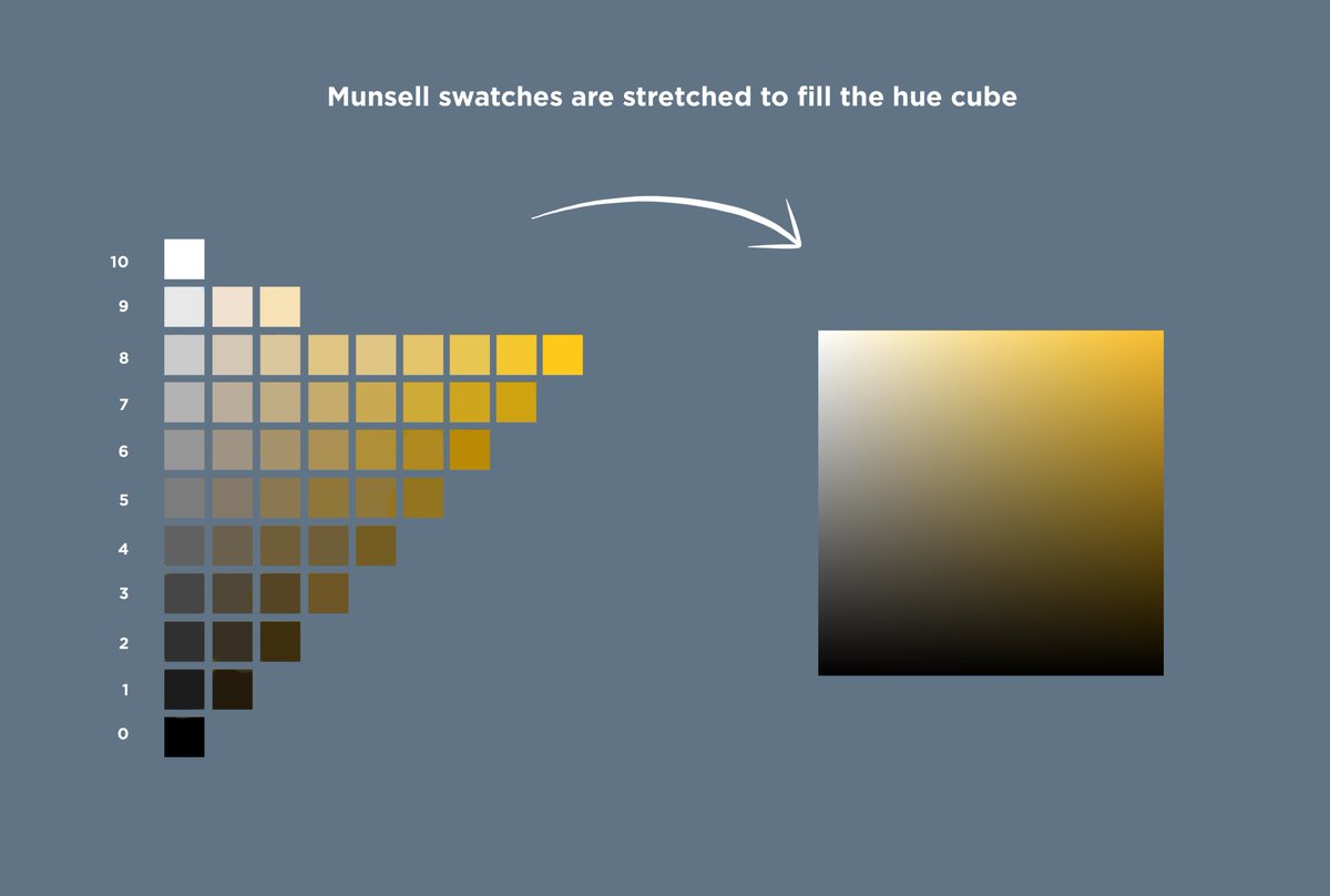
Let’s start at the beginning with the basics in this thread. First, color is a 3D space that you could imagine yourself walking around in. We know this because there are 3 variables. If we plot only 2 of them, for example value and saturation, we can easily see that this is 2D.
This 2D space is familiar to us, we see it in the Photoshop/Procreate color picker. Once we add a third variable, hue, we have depth to our graph. Value is the amount of light, saturation is the purity of the light, and hue is the wavelength of the light (more on this later).
I wanted to talk about inspiration and daily practice! Here is a thread of a few of my daily sketches from the past couple of weeks. Daily practice is important to keep up what I call a continuity, a narrative that evolves over time naturally with our interests.
By working every day, this narrative can take us places that we wouldn't have expected. By following this thread sincerely and without judgment, our work can take on a really interesting and personal quality.
While inspiration is exciting and can lead to great results, if we wait for it then we can find ourselves out of practice when it comes. With daily practice, you are already comfortable with the tools and can focus on higher level aspects of design when you are feeling inspired.
Thread on drawing in art! If drawing conjures images of line art, pencils, and sketchbooks, try thinking of it in a broader way. When I redefined this term for myself, it gave me a much clearer idea of how to study art and allowed real breakthroughs to happen while practicing.
Drawing has nothing to do with any particular medium or style, so when we practice our drawing, we are practicing all of the topics that fall under that umbrella: perspective, anatomy, structure, how light falls on a subject, the value of each plane in relation to the light, etc.
Craig Mullins describes drawing as “organization and expression of relationships.” This definition includes composition. By relating the previous concepts with abstract ones like that, It’s clear that they are all related to design, and that when you paint you are designing.