I talked a bit in the comments here about how I distinguish between thumbnails, wireframes, and mockups but I figured it might be worth it to make a little thread for anyone interested
https://twitter.com/celechii/status/1327102799587446784
I basically always start out with thumbnail doodles. These are usually inscrutable to anyone but me. They are entirely about problem solving, a quick and dirty way to help get ideas out of my head and into a space where I can see what really works and where the problems are 


sometimes I start out with writing things down, usually a list of everything that needs to be on a screen. From there, I can figure out how things should be grouped, split up, and arranged 

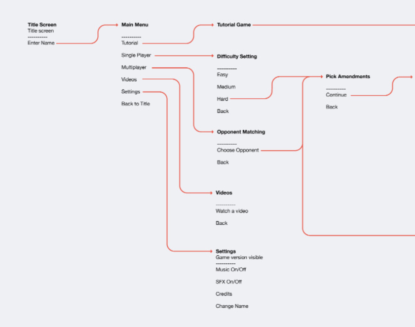
I'll usually draw out a user flow diagram, especially if there's a menu system that is even a bit deep. I use this shorthand based off an old signal v. noise blogpost signalvnoise.com/posts/1926-a-s… 

basically, this shows every screen with a list of the actions users can take on that screen and where it takes them. I make these pretty for clients but they are much messier in my own notebooks 

from there, I move onto wireframes, which are basically sketches that try to answer the question "How does it work?" These can be helpful for problem solving, but are mostly about communication with a team. 


these are ultimately disposable, so they shouldn't be pretty, and should purposefully have NO style, especially if you've got a client who might get hung up on stuff. These need to be FAST to make because they should be REALLY granular. Every step should be spelled out
I've done these in a few different ways, but I usually use black and white with blue for important elements and red for highlighting the current user interaction 

(side note: flash was really great for doing these because everything was organized on a timeline, making elements into movieclips and reusing them was dead simple, drawing stuff into the frame was cake, and you could export all the frames as images in a sequence no problem)
So wireframes are super important as a communication tool when you're getting a team of game designers, programmers, artists, etc. on the same page, but honestly, I usually skip them when I'm doing a solo project because all those people are me
A separate question from "How does it work?" is "How does it look?" That's what mockups convey. Those are the high-fidelity screens that show the visual style of the game, and is usually where I start to design UI assets that I can export for the actual project 

obviously these things don't spring fully-formed from your brain and there's a lot of stuff like moodboards and sketches behind them, but that's kind of beyond the scope of this thread
ah i remembered another great thing about doing wireframes in flash was how easy it was to animate a complex interaction and export a gif. Everybody loves gifs. Nowadays the only time i get to make a gif is after i've built the whole thing
• • •
Missing some Tweet in this thread? You can try to
force a refresh


