OK, I'll bite.
PHATE (nature.com/articles/s4158…) from @KrishnaswamyLab is like Isomap meeting Diffusion Maps: MDS on geo distances obtained via diffusion. Cool paper!
So let's test it on: (1) MNIST, (2) Tasic2018, (3) n=1.3mln from 10x. Does it work as well as promised? 🧐 [1/7]
PHATE (nature.com/articles/s4158…) from @KrishnaswamyLab is like Isomap meeting Diffusion Maps: MDS on geo distances obtained via diffusion. Cool paper!
So let's test it on: (1) MNIST, (2) Tasic2018, (3) n=1.3mln from 10x. Does it work as well as promised? 🧐 [1/7]
https://twitter.com/KrishnaswamyLab/status/1346302977712254976
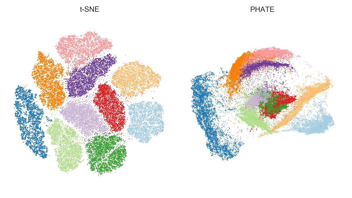
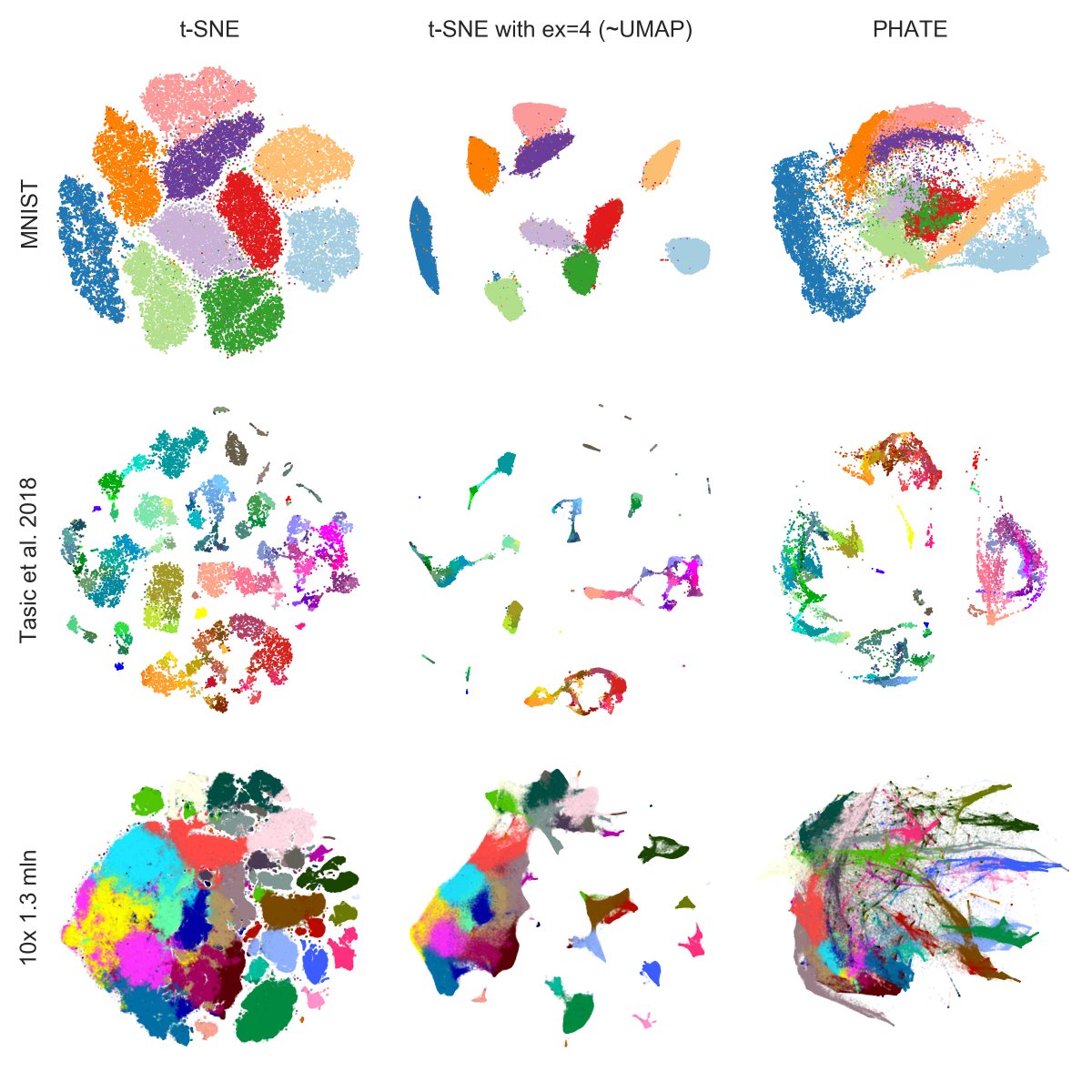
Here is MNIST.
PHATE finds the same 4/7/9 and 8/5/3 mega-clusters that are also emphasized by UMAP, but fails to separate some of the digits within mega-clusters, e.g. green & red (3 and 5) overlap a lot.
IMHO that's a clearly worse performance than t-SNE or UMAP. [2/7]
PHATE finds the same 4/7/9 and 8/5/3 mega-clusters that are also emphasized by UMAP, but fails to separate some of the digits within mega-clusters, e.g. green & red (3 and 5) overlap a lot.
IMHO that's a clearly worse performance than t-SNE or UMAP. [2/7]
Of course PHATE was designed for continuous data and that's where it's supposed to shine. But the original paper and tweets like this one and the one above make it look as if it hands-down outperforms t-SNE/UMAP for clustered data.
I'm unconvinced. [3/7]
I'm unconvinced. [3/7]
https://twitter.com/KrishnaswamyLab/status/1201937339574050822
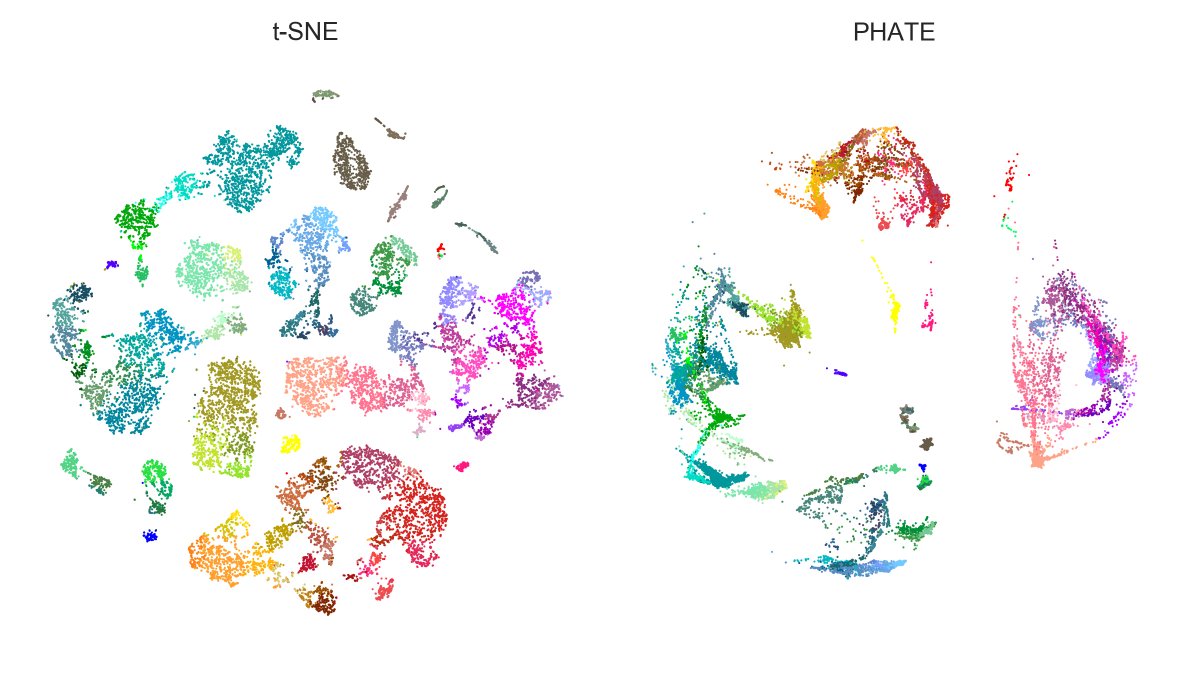
Here is Tasic et al. 2018 dataset. Here again, PHATE isolates large families (excitatory neurons, Sst+Pvalb interneurons, Lamp5+Vip interneurons, etc.) clearer than t-SNE, but messes up within-family structures. E.g. Vip (purple) gets wrongly entangled with Lamp5 (salmon)! [4/7]
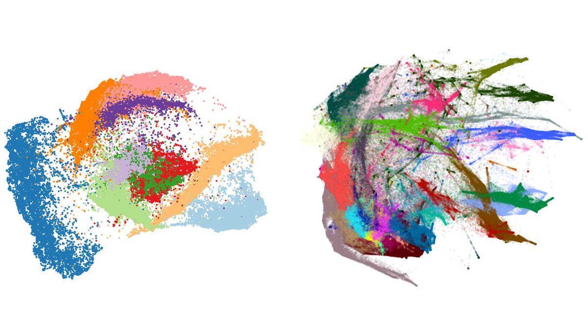
And here is n=1.3mln dataset: t-SNE with exaggeration 4 (which is basically UMAP) vs. PHATE. Judge for yourself.
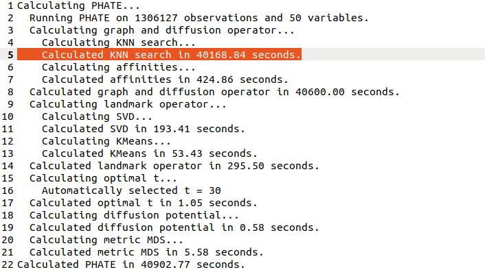
Note that PHATE needed 11 hours (!) to run (and crashed a 20-core 256Gb RAM computer until I used undocumented `knn_max` param as recommended by @scottgigante). [5/7]
Note that PHATE needed 11 hours (!) to run (and crashed a 20-core 256Gb RAM computer until I used undocumented `knn_max` param as recommended by @scottgigante). [5/7]
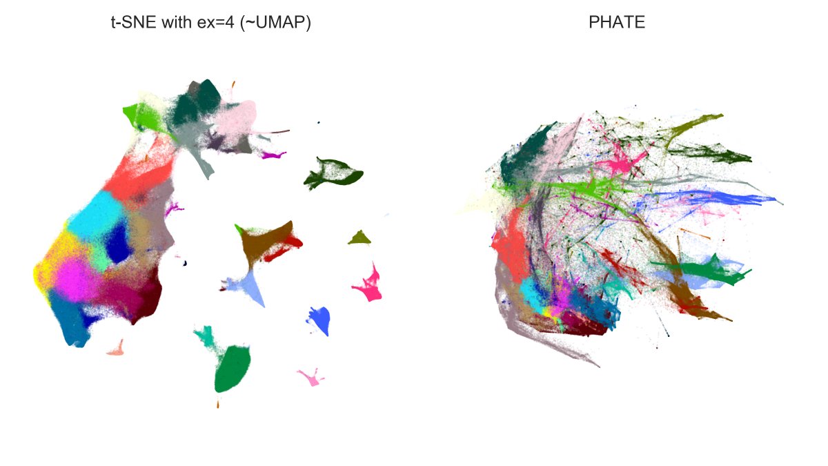
In comparison, t-SNE runs in like 15 minutes. The long runtime of PHATE is because it's constructing the exact (!) kNN graph and not an approximate one. I don't quite understand why they need the exact kNN.
After the graph is constructed, PHATE uses landmarks for MDS. [6/7]
After the graph is constructed, PHATE uses landmarks for MDS. [6/7]
Here is a summary for all three datasets.
As I said, I think the PHATE paper is interesting, and there are some nice ideas in there, and the method might very well work fine for some developmental datasets -- but I certainly cannot agree that one should "ditch" t-SNE/UMAP. [7/7]
As I said, I think the PHATE paper is interesting, and there are some nice ideas in there, and the method might very well work fine for some developmental datasets -- but I certainly cannot agree that one should "ditch" t-SNE/UMAP. [7/7]
• • •
Missing some Tweet in this thread? You can try to
force a refresh