
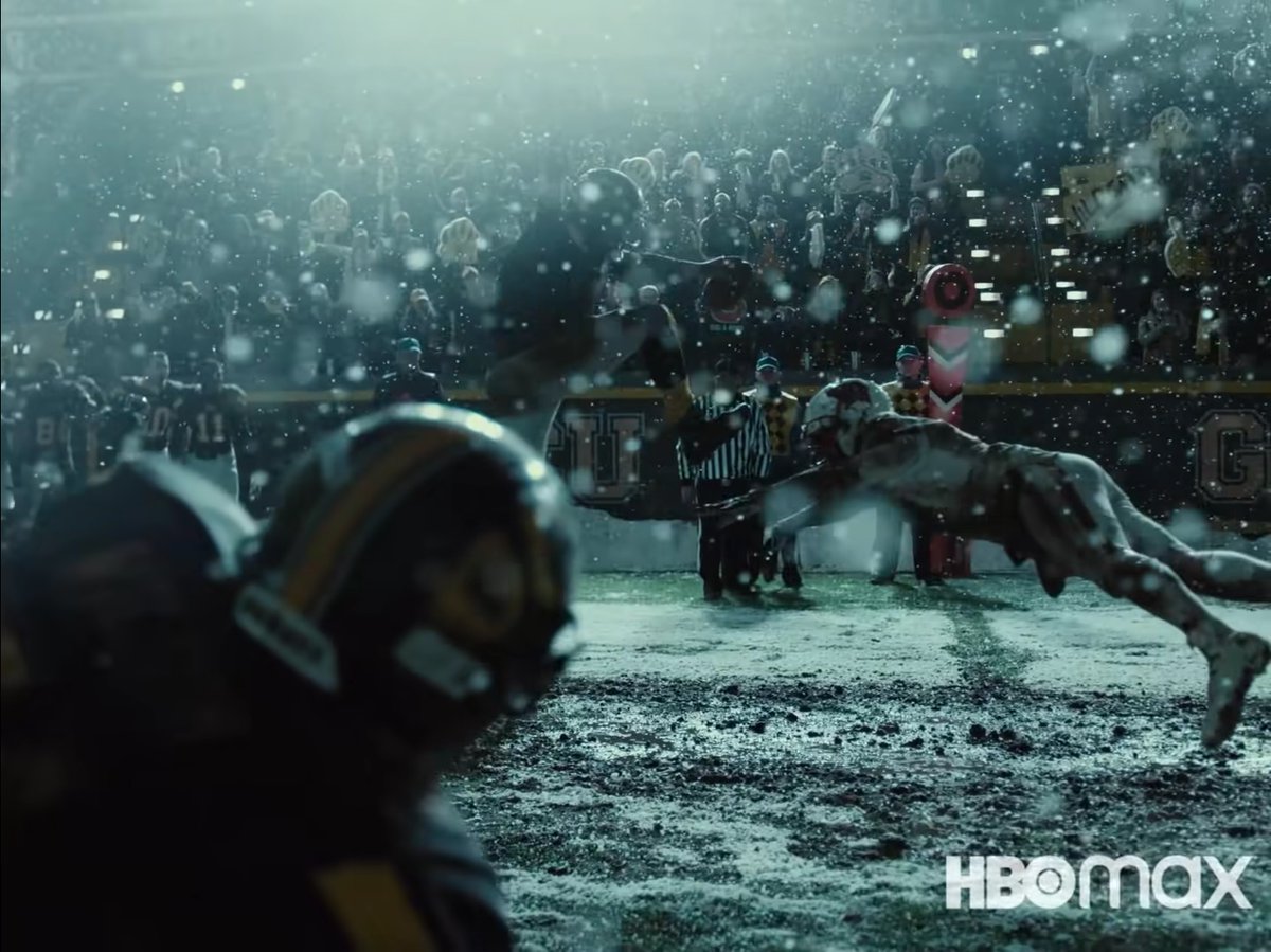
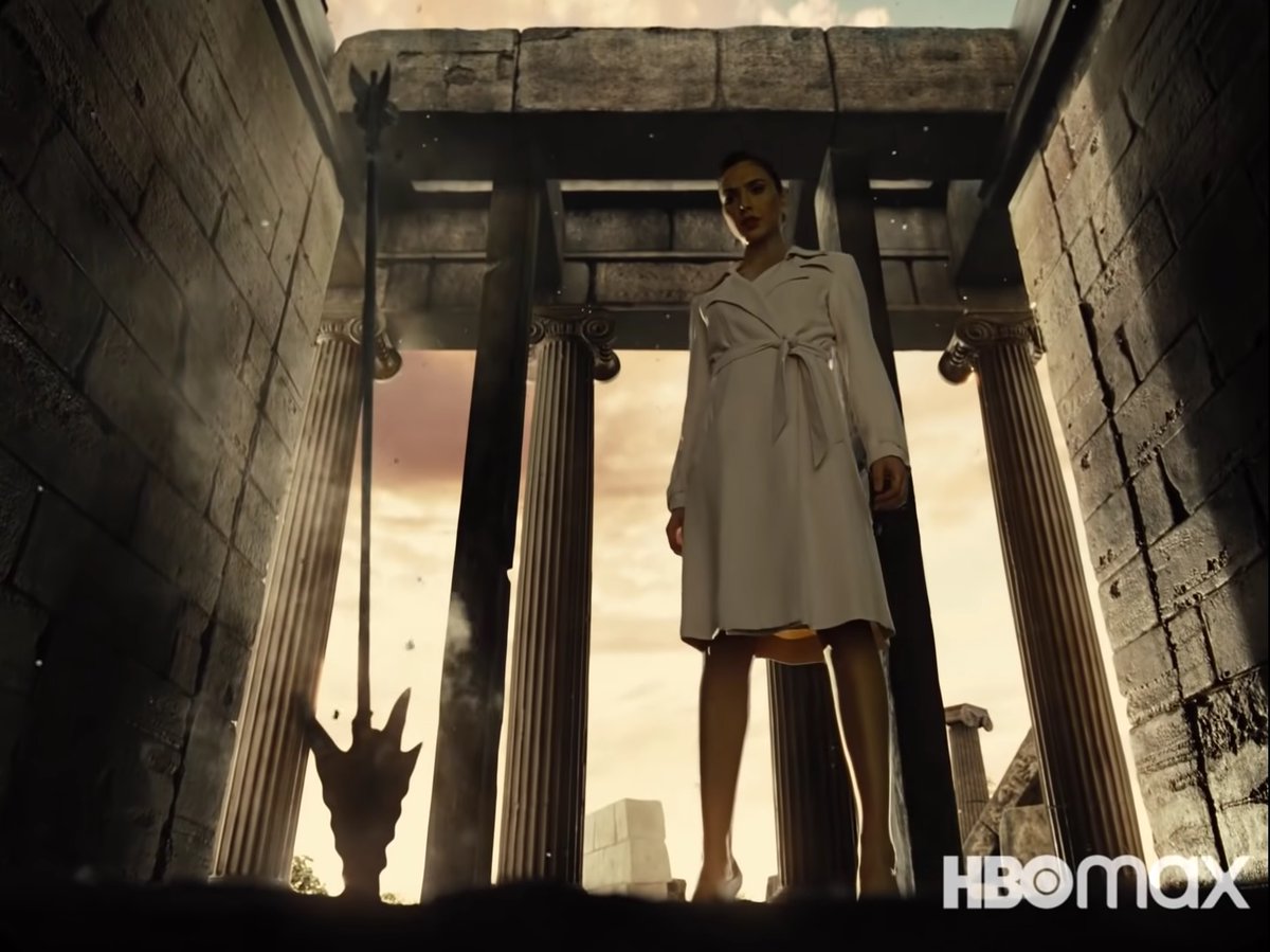
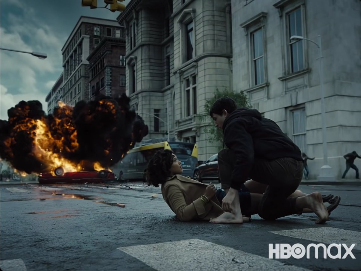
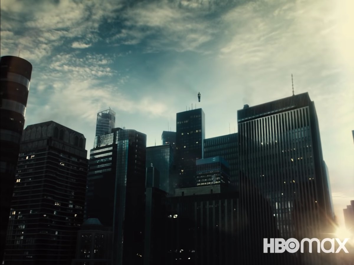
One of #ZackSnyder's undeniable strong points are a very solid sense of composition. Coupled with hard light sources and a bold contrast ratio, the "non action" heavy visuals in the #ZackSnydersJusticeLeague trailer are stunning. (thread)
Pic 1: wonderful left to right movement
Pic 1: wonderful left to right movement
The verticals along with @GalGadot's towering presence emphasize her "God" like status. Also, her underlit face and that beautiful kicker (strong rim light on the camera left side of her face and right leg) wonderfully outline her. 
Simple composition but so well done. Strong verticals, a diagonal created between Barry and Iris and the explosion as well as the framing...and that explosion of course. Interestingly the explosion is relatively small in the frame, emphasizing the meet cute moment. 
Simple verticals. The sun in the bottom right corner provides a nice highlight and also a contrasting color element in mostly blue/gray/black image. The vertically inclined aspect ratio shines (1.33) here and Superman's presence looks ominous but also divine. 
#GalGadot is lit from a low lying light source in the first image and is half lit in the second image. There's a weariness present in both which is amazing. Also, you can see a lot of texture on her skin, esp in the second image. Makes her look human and relatable. 

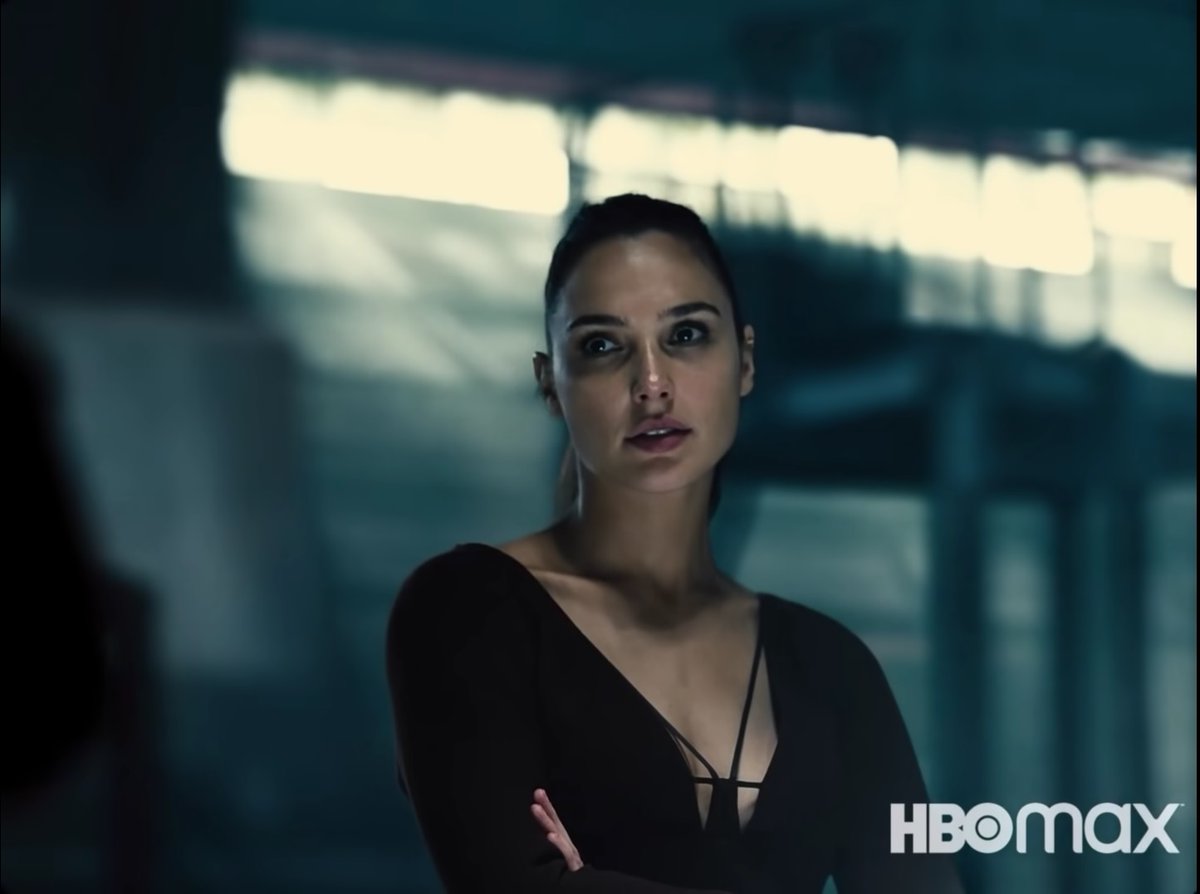
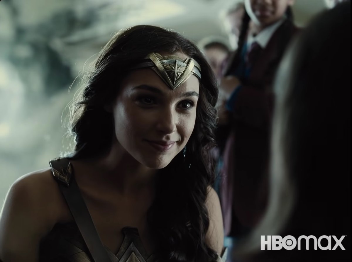
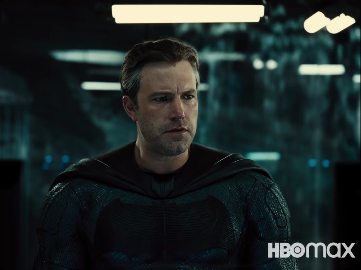
Best looking Batman so far. There's a stream of water falling in the background on the right and the vertical light tubes help build more depth and energy. A simple mid shot but the moving camera and compositional elements breathe so much life. 
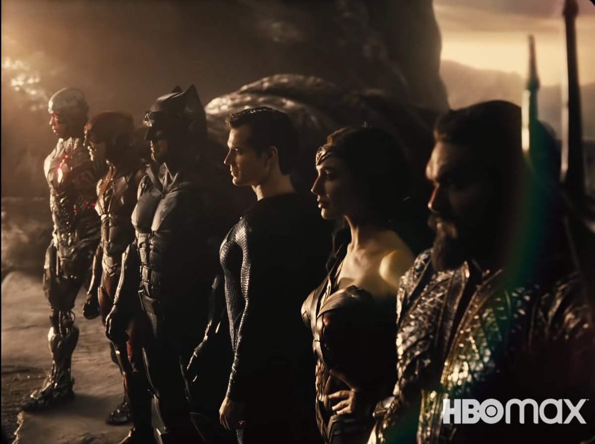
And yeah, this is how you do a heroic group shot. Far more memorable than....other heroic group shots. Simple framing along a diagonal. The aspect ratio again works wonderfully here (going to look so good in IMAX) and the bold strength of the shadows make it epic!
(end)
(end)
• • •
Missing some Tweet in this thread? You can try to
force a refresh


