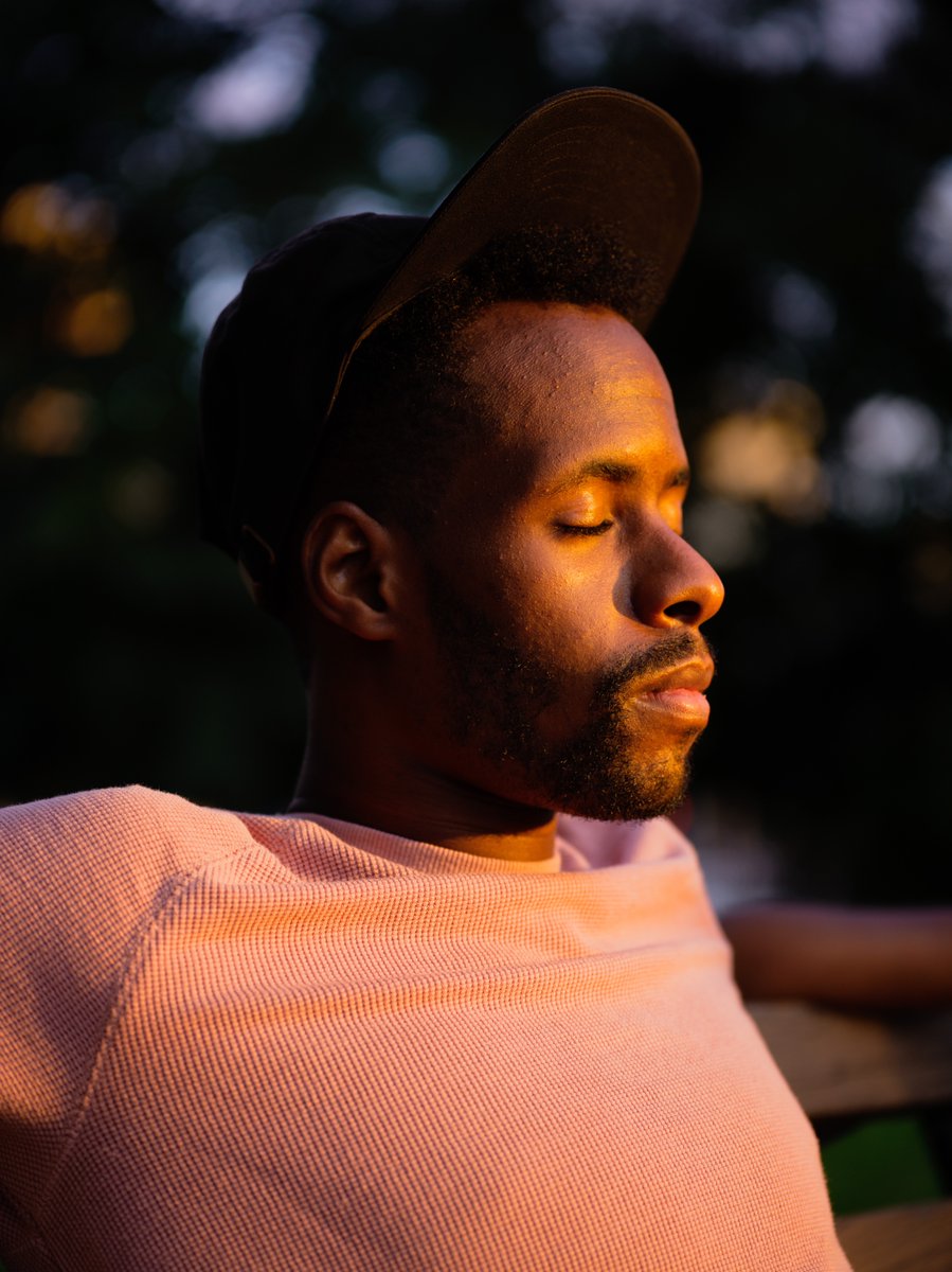
I’m tired of badly edited images of black and brown people. Poorly exposed frames with recycled presets slapped on has got to stop. It doesn’t help tell the stories of black and brown folks. #equitythroughediting #madewithlightroom 

what sort of action is needed?
I could go on forever. But what I want to focus on how bad editing has robbed so many black and brown subjects of being truly seen.
I could go on forever. But what I want to focus on how bad editing has robbed so many black and brown subjects of being truly seen.

my solution, a new initiative called greater equity through editing. sponsored by @Lightroom, taught by me (for now).
it's a start.
it's a start.

As creators, we abuse presets and profiles without paying attention to how they alter skin tones.
Remember presets are supposed to be a saved edit that helps with a specific situation. Specific lighting, specific skin tones, specific colors.
#equitythroughediting
Remember presets are supposed to be a saved edit that helps with a specific situation. Specific lighting, specific skin tones, specific colors.
#equitythroughediting

let's say you like a preset. How can you maintain the mood but fix the impact on skintone?
Try the color mix tool.
#madewithlightroom
Try the color mix tool.
#madewithlightroom

These 4 presets I chose are very popular ones that many of us use.
Notice how they are completely wrong for this subject, wrong for this image.


Notice how they are completely wrong for this subject, wrong for this image.


Swipe between the edits, this one has all the soft tones of the past preset based edit, but her skin looks like her skin.
What did I change?
What did I change?
I increased the saturation of orange in the image, warming her skin and upped the luminance which brightened the orange tones. Together she looks less lifeless but the orange isn’t overwhelming.
#madewithlightroom

#madewithlightroom


first, we make a reference.
Think of the color card as the ultimate reference guide. no matter the light, white balance or conditions a color card allows you to accurate reference the colors of the moment.
Think of the color card as the ultimate reference guide. no matter the light, white balance or conditions a color card allows you to accurate reference the colors of the moment.

Take a photo on both your phone and your camera so you have a second reference point to capture the most accurate colors. Remember every camera has it’s own distinct color profile. 

open @Lightroom on your phone, tablet or computer.
we learning about HSL:
Hue is essentially another word for color, saturation is the intensity of a color, and luminance is the brightness of a color. These are your *best* tools to edit skin tones.
we learning about HSL:
Hue is essentially another word for color, saturation is the intensity of a color, and luminance is the brightness of a color. These are your *best* tools to edit skin tones.

my ethos behind color mix.
*turn your sound on.
*turn your sound on.
I believe in luminance more than anything.
the brightness of orange, red and yellow can help you get a more accurate skin tone.
do not, I repeat do not rely too heavily on saturation. it'll just make it worse.
the brightness of orange, red and yellow can help you get a more accurate skin tone.
do not, I repeat do not rely too heavily on saturation. it'll just make it worse.

• • •
Missing some Tweet in this thread? You can try to
force a refresh


