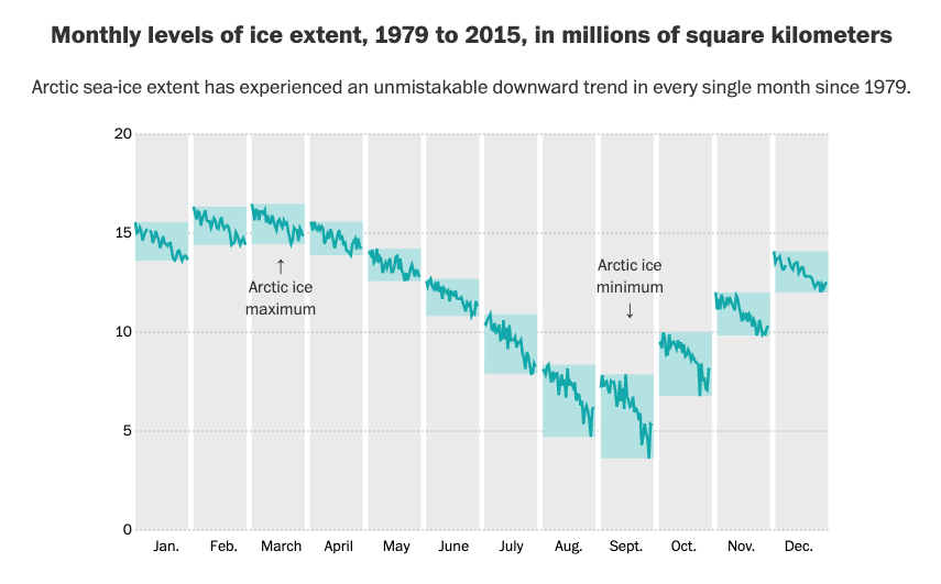
Let's do one more: the connected scatterplot. The CS shows two time series simultaneously—one each along horizontal and vertical axes—and are connected by a line to show relationships of the points over time. It's a great possible alternative to the dreaded dual axis chart. 
(The connected scatterplot in the previous tweet was from @hfairfield at @NYTScience.)
In general, I find that the connected scatterplot is 🎇awesome🎇 about 2/10 times--the rest of the time, I either get a straight line (e.g., spending and participation) or a hairball mess. But, there are lovely cases where it just works out.
There's some great research on the CS by @sharoz, @SteveFranconeri, & @eagereyes here: steveharoz.com/research/conne…. You can also play around with the little widgets to create your own!
Just a couple of other good examples.
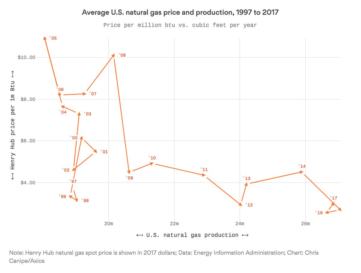
-@axios on the left axios.com/americas-natur…
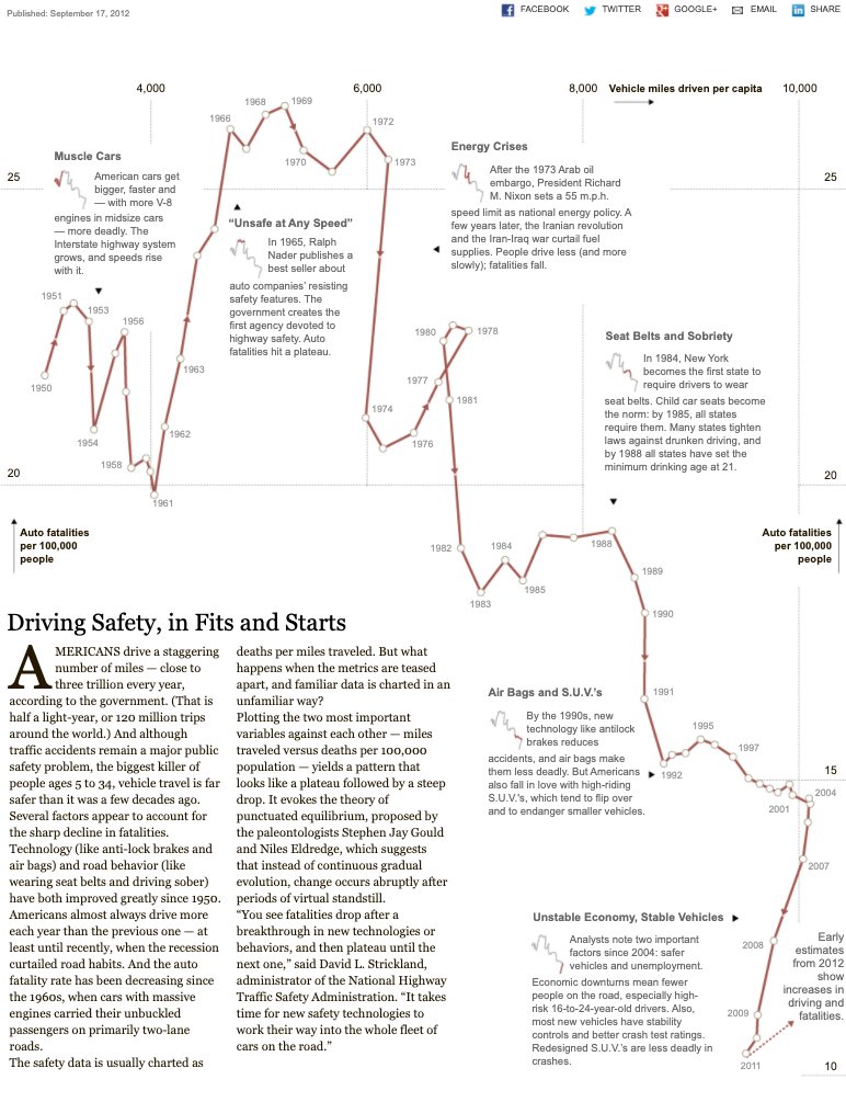
-@wisevis on the right (though I no longer see it there): excelcharts.com/redraw-troops-…
-@axios on the left axios.com/americas-natur…
-@wisevis on the right (though I no longer see it there): excelcharts.com/redraw-troops-…
• • •
Missing some Tweet in this thread? You can try to
force a refresh