The trailer for "Too Lazy to Read the Paper" is out. The podcast features informal conversations with scientists, young and old, about their most important papers.
Season 1 starts this April!
And do keep the self-nominations + suggestions for scientists to interview coming!
Hey Danes! We just put together a comprehensive (and beautiful) visualization of mobility during the COVID-19 crisis. This thing is amazing, and I'll explain why in the thread.
Well, for a start, the data set is insane. It's transitions between municipalities from all Danish operators. Let me say that again: ALL the operators. That means that every trip is included. (And it's just transitions, no individual trajectories were used, so no privacy issues)
Secondly the visualization itself is a rare beauty, hand crafted for you by @ulfaslak. So in spite of containing lots of data it's super fast & responsive. Using the brush, you can choose which period to display. Anything from a single day to the entire period.
Very excited about this brand new preprint arxiv.org/abs/2007.05035 with @jonassjuul et al. We argue that most current epidemiological predictions do not appropriately capture the uncertainty related to their predictions. Specifically, they tend to underestimate peaks!(thread)
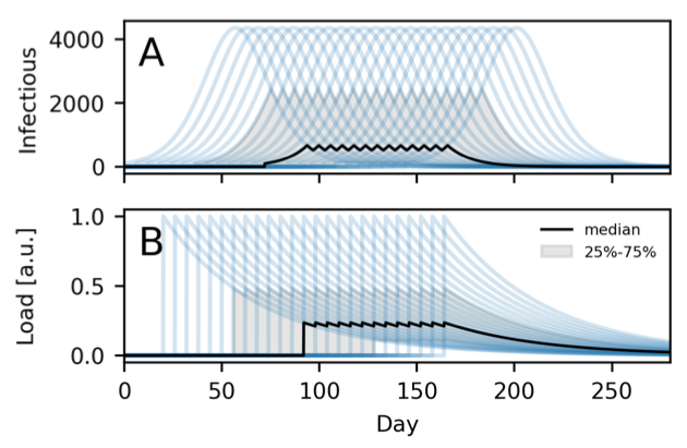
Essentially the problem is that - even though the models produce ensembles of curves - each time step is treated separately in the typical state-of-the-art statistical analysis.
It's easy, for example, to construct examples where 100% of peaks lie outside the confidence intervals calculated in this way (25-75% shown in gray below).