It's tempting to soften the edge of every shadow with hatching. Stark edges force us to commit to shadow shapes which might be wrong, and we don't want to risk being wrong; we want to waffle.

However, undue hatching looks noisy and lacks clarity. Choose carefully when to hatch.
When should you soften the edge of a shadow? When not doing so would mislead the reader about the shape of the portrayed object.
Had I not hatched Tinkerbell's ribcage, it would likely have appeared too flat; the tortion would not be evident.

Had I not hatched the fog beyond Nightwing, it would not have read clearly as fog; the building beyond him might look like a floating object, its distance unclear.
Conversely, had I softened ALL the shadows' edges in each drawing, the art would have less punch, requiring more attention than necessary to absorb.

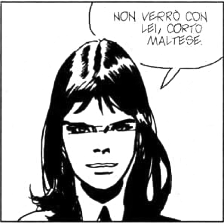
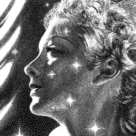
Note how much more quickly we absorb Hugo Pratt's art (left) than Virgil Finlay's (right). Fitting for the brisk pace of comics.

• • •

Missing some Tweet in this thread? You can try to force a refresh
 

Keep Current with Tips from Jesse Hamm

Tips from Jesse Hamm Profile picture

Stay in touch and get notified when new unrolls are available from this author!

Read all threads

This Thread may be Removed Anytime!

PDF

Twitter may remove this content at anytime! Save it as PDF for later use!

Try unrolling a thread yourself!

how to unroll video
  1. Follow @ThreadReaderApp to mention us!

  2. From a Twitter thread mention us with a keyword "unroll"
@threadreaderapp unroll

Practice here first or read more on our help page!

More from @Hamm_Tips

4 Oct 20
When laying out a complex page, I leave a template open to show possible panel arrangements (6-panel grid, 8-panel grid, etc).

I draw each panel in the center, using as much space as I want, then size and position the panel in the grid according to how it fits best. ImageImageImageImage
This way, I'm free to visualize each panel the way I see it best, rather than feeling inhibited by some predetermined size and shape. After arranging the panels, I may squeeze and stretch them into different sizes or shapes. Finally, I collapse the layers and pencil over that.
Here are other approaches I could have taken with Panel 6, depending how the other panels are sized and arranged, and what kind of pacing or emphasis I want. ImageImageImageImage
Read 4 tweets
18 Sep 20
When drawing repeating objects that overlap, don't draw one and then two halves of the other; this encourages unevenness.(1)
Draw all the foreground objects, or all that lean one way, then draw all the remaining objects on a second layer.(2)
Erase the overlap, merge layers.(3) ImageImageImage
Related tip: when drawing repeated objects of similar shape, size, or angle, draw them all at once, rather than alternating with other local objects. This gets your hand in a rhythm that can bang out a lot of objects quickly. Alternating with other objects will slow you up.
So: if there are several small stones, a few flowers, more stones, more flowers...don't draw stones then flowers then stones. Draw all the stones first, leaving space for the flowers, then go back and draw all the flowers. The rhythm of each will increase your speed and accuracy.
Read 4 tweets
19 Jun 20
There's a type of person who is smart and gifted, and learns from early childhood to aim for the stars, because "nothing is impossible."

When life's constraints prove otherwise, this person is crushed. Unable to bend and accept flaws, they break.

Comics attract this person.
I see so much heartbreak among young people who were taught they can achieve EVERYTHING, if only they work hard enough. When their dreams don't come true, they reach the inescapable conclusion: they didn't work hard enough. Their elders overestimated them. They must be failures.
As children, they enjoyed creating. No longer. Now creation is a drudgery and they enjoy *having created*, if at all. Nothing they do meets their high expectations. The happiness of their early efforts is a dangling carrot that their arms will never reach again.
Read 9 tweets
4 Jan 19
It's 2019!
Draw your signature legibly and attractively, along with the year, about the size of a playing card, and save it in your harddrive. Then you can resize it and drop it into any art you do in the coming year. Faster than signing every piece. Guaranteed legibility!
A TIFF of your signature can be moved around a piece of art until it looks right. You can squeeze or stretch it, or even change the color to suit the picture's color scheme (inverting it to white-on-black is also handy, for art with a lot of black).
Include the date so people can see that your recent work is better than your old work. Including the date also demonstrates to potential clients that you're productive. "Oh, she did all these this year!" Makes recent pieces look fresh, current.
Read 4 tweets
9 Sep 17
The history of American comics is a mystery to many cartoonists, and unfortunately there's no one, comprehensive book to point people to.
Various books covers certain areas well, such as RC Harvey's ART OF THE FUNNIES and Sean Howe's MARVEL COMICS: THE UNTOLD HISTORY.
But those cover specific areas. So...THREAD! Tonight, as I work, I'll summarize the broad strokes, recommend key cartoonists. Crash course.
Read 180 tweets

Did Thread Reader help you today?

Support us! We are indie developers!


This site is made by just two indie developers on a laptop doing marketing, support and development! Read more about the story.

Become a Premium Member ($3/month or $30/year) and get exclusive features!

Become Premium

Too expensive? Make a small donation by buying us coffee ($5) or help with server cost ($10)

Donate via Paypal Become our Patreon

Thank you for your support!

Follow Us on Twitter!