Steve Milloy Profile picture
Apr 1, 2021 11 tweets 5 min read Read on X
The Biden EPA reversed a key anti-corruption policy adopted by the Trump EPA.

EPA research grantees can now review and rubber-stamp their own EPA-funded work while posing as 'independent outside science advisers.'

Corrupt!

junkscience.com/2021/03/biden-…

washingtonpost.com/climate-enviro…
Batting away some BS:

1. 'Too heavily' means 'any.' Before Trump, industry had essentially zero representation on EPA science advisory boards.

2. There is no such thing as 'consensus' in science.
Batting away more BS.

1. The Biden EPA move is a reversal of a Trump EPA anti-corruption policy. The Biden EPA is returning to science fraud, not scientific integrity.

2. EPA does no climate research. The policy change was implemented 2 years before coronavirus.
Before the Trump EPA implemented its anti-corruption policy, Obama-era EPA 'independent science advisers' had received $200+ million in research grants from the agency... guaranteeing they saw the science just the way EPA wanted them to.

Now, a return to corruption.
Still more BS to bat away.

The Trump anti-corruption policy was not illegal.

The key litigation had been remanded by the DC Circuit back to federal district court for review... and then COVID and the 'election' struck.
1. Tony Cox was one of seven CASAC board members... all with equal votes.

2. Before Cox led EPA's CASAC board, 96% of its members we're EPA grantees.

3. They were paid $200+ million to do research that helped EPA's agenda. Then were allowed to 'peer review' their own work.
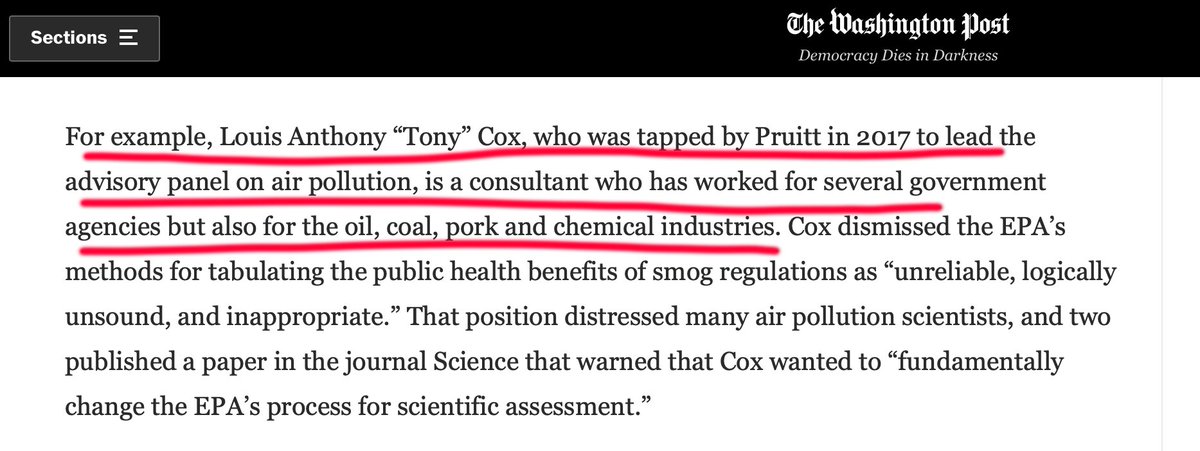
Not only appointed by Regan, but purchased via EPA grants (i.e., taxpayer money).

The Biden EPA is returning to the good old days of total science fraud.
Continuing to bat away the BS:

There is no evidence that current levels of ground-level ozone cause any healthe effects whatsoever, including minorities.

Though all EPA-funded clinical research showed this, the corrupt Obama EPA 'independent science advisers' ignored it.
The BS never ends.

There is no scientific evidence that air quality has any effect on COVID outcomes.

Debunked: junkscience.com/2020/07/harvar…
This bolster's @chris_c_horner's work showing that EPA might try to backdoor regulate fossil fuel use not by climate regulation but by air quality regulation.
junkscience.com/2021/03/epa-ma…
The Biden EPA reversal of the Trump EPA's anti-corruption rule on independent science advisers is the most insidious move the Biden EPA will make.

All Biden EPA 'science' is now guaranteed to be 100% corrupt. @dino_grandoni.

• • •

Missing some Tweet in this thread? You can try to force a refresh
 

Keep Current with Steve Milloy

Steve Milloy Profile picture

Stay in touch and get notified when new unrolls are available from this author!

Read all threads

This Thread may be Removed Anytime!

PDF

Twitter may remove this content at anytime! Save it as PDF for later use!

Try unrolling a thread yourself!

how to unroll video
  1. Follow @ThreadReaderApp to mention us!

  2. From a Twitter thread mention us with a keyword "unroll"
@threadreaderapp unroll

Practice here first or read more on our help page!

More from @JunkScience

Mar 7
America is running out of power because of the climate hoax and anti-fossil fuel policies of @BarackObama and @JoeBiden. 1/

washingtonpost.com/business/2024/…
Image
New electricity demand has more than doubled since 2017. 2/ Image
Data center demand for electricity is projected to increase 50% by the end of the decade.

10 large nuclear plants would be required to meet this demand. 3/ Image
Read 6 tweets
Jan 7
This and all similar global temperature graphs are meaningless.

The great former MIT physics professor Walter Lewin explains why. 1/ Image
Former MIT physics professor Walter Lewin explains why NOAA temperature graphs are "meaningless." 2/
A few more points:

1. Less than 8% of NOAA temperature stations are accurate to within 1°C.

2. In 1885, for example, not much of the globe was covered by surface temperature stations.

3. Even today, much of the Earth's surface its not covered by temperature stations.

That's just some of the uncertainty omitted from NOAA's "global temperature" graph. 3/junkscience.com/2016/01/only-7…Image
Image
Image
Read 4 tweets
Oct 21, 2023
Norwegian statistics bureau throws cold water on emissions-driven global warming hysteria.

"We find that the effect of man-made CO2 emissions does not appear to be strong enough to cause systematic changes in the temperature fluctuations during the last 200 years."


Image
More from the Norwegian statistics bureau:

All four previous interglacial periods were warmer than today, while CO2 at pre-industrial levels.

2/ ssb.no/en/natur-og-mi…
Image
More from the Norwegian statistics bureau:

- Current Greenland temperatures have not exceeded natural variability of the past 4,000 years.

- Long periods over the past 10,000 years were warmer than today.

3/ ssb.no/en/natur-og-mi…
Image
Read 8 tweets
Oct 4, 2023
The Red Pope swings and misses at the origin of warming and emissions:

1. The current warming trend began at the bottom of the Little Ice Age in the late 1600s.

2. Recent warming began with the series of El Ninos that began in 1980.

3. We are in an El Nino year now.

4. As to emissions, warming precedes emissions. It gooses the natural carbon cycle. See Vostok ice cores and this -

5. Only 12% or so of atmospheric CO2 is manmade. 8/
Image
The Red Pope just makes it up:

1. There is no way to say that the temperature rise since the 1970s is the fastest in 2,000 years.

2. There was little if any urban heat island effect 2,000 years ago and no satellites.

3. Then there's this: "Dansgaard-Oeschger events are rapid N. Hemisphere temp jumps of up to 15°C in Greenland that repeatedly occurred w/i a few decades during the last ice age."

4. Climategate revealed that temperature targets like 1.5°C are just 'plucked out of thin air' and are not science.

5. No one knows what the global temperature in 1850 was.

6. 'Ocean acidification' is a myth. The oceans may have become slightly less basic, but that is not more acidic. Two is not more negative than three.'

7. There is no evidence of any effects from any ocean pH change.

8. Norther Hemisphere snow cover is trending up. 9/
Image
The Red Pope imagines the fake 97% 'climate consensus' is science and attacks capitalism.

1. Recent warming correlates with El Ninos, not emissions.

2. Consensus is not science. And the 97% consensus is bogus.

3. Capitalism and emissions have taken humanity from less than 1 billion to over 8 billion people. You'd think the Pope would be praising both. 10/junkscience.com/2023/01/milloy…
wattsupwiththat.com/2023/08/30/97-…

Image
Read 9 tweets
Aug 8, 2023
USA Today doesn't like my tweet from last month👇and tries to 'fact check' it.

Let's walk through USA Today fact-checker Kate Petersen's effort. 1/ https://t.co/8QbMtAiebpusatoday.com/story/news/fac…
Image
USA Today's 'fact check' is dishonest from the start.

Although the 'fact check' presents several images, the tweet being attacked is not one of them. The tweet is merely linked and quoted.

The tweet's graph, of course, is what made it 1.9 million views-compelling. 2/
Image
Image
The USA Today 'fact check' reports that the satellite data among NOAA and NASA program vary.

First, all satellite temps are processed estimates and not direct measurements. So different processing ill produce different estimates.

I like the NASA data processed by the University… https://t.co/hTW9IAPaAgtwitter.com/i/web/status/1…
Image
Read 5 tweets
Jul 25, 2023
Climate deception exposed in a short thread:

@USAToday recently ran this opinion piece raving about deaths from heat waves.

Note the cite to the Lancet Planetary Health🙄 study. 1/
Image
Image
Here's a chart from the Lancet Planetary Health🙄 study.

Note how the chart is made to look as if heat deaths are as big or even a bigger problem than deaths from cold in some countries.

Can you spot the deception? Even I initially missed it. 2/ Image
Now here's the Lancet Planetary Health🙄chart (A) vs. the chart re-made by the @CO2Coalition (B) with the same death rate (X-axis) scale for cold and hot.

Look at how the Lancet chart misleads viewers by barring out cold deaths in units of 50 vs. only 10 for heat deaths...… https://t.co/7W8C8H3oFUtwitter.com/i/web/status/1…
Image
Read 4 tweets

Did Thread Reader help you today?

Support us! We are indie developers!


This site is made by just two indie developers on a laptop doing marketing, support and development! Read more about the story.

Become a Premium Member ($3/month or $30/year) and get exclusive features!

Become Premium

Don't want to be a Premium member but still want to support us?

Make a small donation by buying us coffee ($5) or help with server cost ($10)

Donate via Paypal

Or Donate anonymously using crypto!

Ethereum

0xfe58350B80634f60Fa6Dc149a72b4DFbc17D341E copy

Bitcoin

3ATGMxNzCUFzxpMCHL5sWSt4DVtS8UqXpi copy

Thank you for your support!

Follow Us!

:(