1/? I'm trying to come up with a good way to display notes with large titles for the graph view we're building. The graph view shows you connections you've made between your notes. The purpose of this view is to help you discover patterns in your thinking and create new ideas.
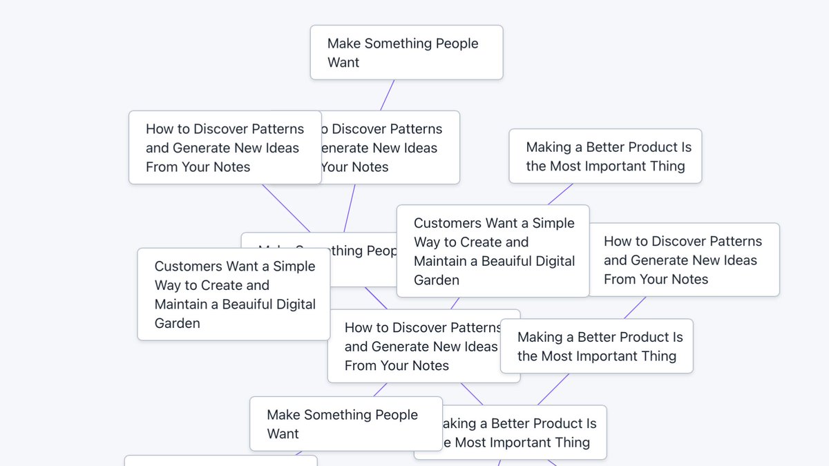
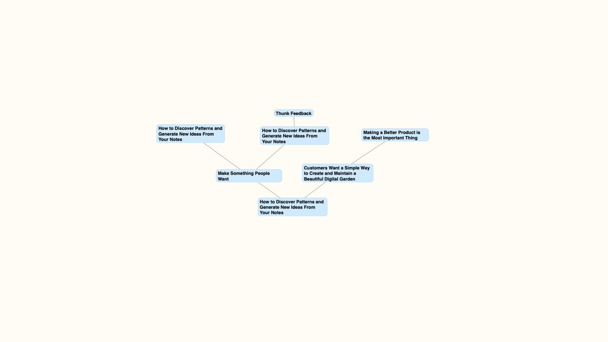
Here's how the first version of our graph view looks in Thunk with and without titles. You can probably already see the problem here. More on this later. :) 


2/? I want to support longer titles because of a discussion on @ness_labs about making the titles of your notes full sentences. In the discussion @marco_giancotti and @thoresson mentioned @andy_matuschak's concept about using full sentences as the title of your notes.
3/? You can read Andy's thoughts here: notes.andymatuschak.org/z3KmNj3oKKSTJf…
Andy says it can be helpful to make your note title a declarative statement or a question.
Andy says it can be helpful to make your note title a declarative statement or a question.
4/? Why do this?
1. The note title can summarize the content, making it easier to understand.
2. Making the title a claim forces you to support that claim in the body of your note.
3. You can start with a question, and develop it into a declarative statement as you write.
1. The note title can summarize the content, making it easier to understand.
2. Making the title a claim forces you to support that claim in the body of your note.
3. You can start with a question, and develop it into a declarative statement as you write.
5/? Creating a graph view that supports these longer titles presents a few design challenges. Here's the one I'm working on now:
Titles that float underneath your notes in the graph view can overlap each other, and become impossible to read.
Titles that float underneath your notes in the graph view can overlap each other, and become impossible to read.

6/? How might we solve this? I'll be updating this thread today (and maybe later) as I try to come up with an answer.
7/? I want to see if having larger cards and making them farther apart makes a difference. It certainly seems to help. 

9/? This is actually getting somewhere. If we prevent the cards from overlapping this might be the best option. 

10/? Much better. I noticed while doing this that I didn't have to mess to much with the y coordinates. Just moving the cards horizontally was enough to get them out of each other's way. 

11/? We get more room with a smaller text size, but things get a little less readable. I can imagine people wanting to adjust the text size of their cards in the graph view to get them to find the right balance between readability and seeing enough information. 

12/? I'm trying out mocking this up in a different tool. As I zoom in and out, I want the text size to adjust automagically so that everything always remains readable. In one of these images, the text gets too small to be readable. 


13/? There seems to be an upper limit for how much you might want to zoom in. The image on the left is getting in so close that you can't really see the connections. The image on the right feels about as far as I might want to zoom in. 


• • •
Missing some Tweet in this thread? You can try to
force a refresh


