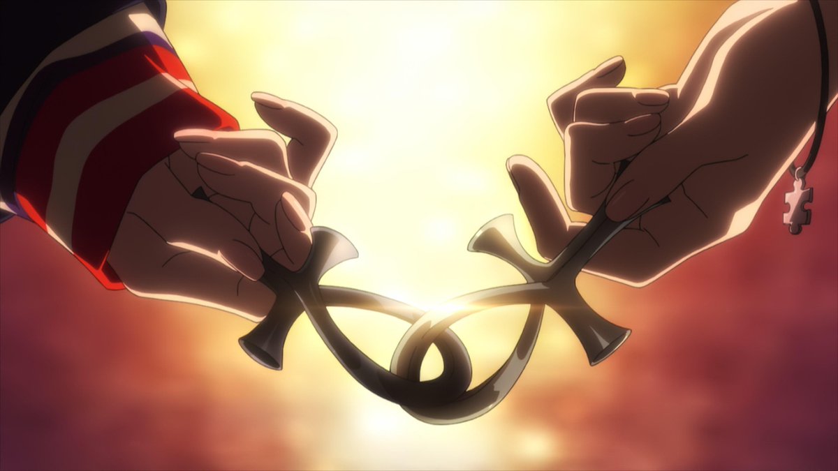
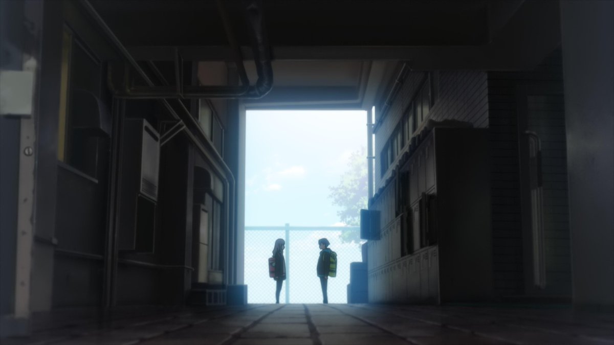
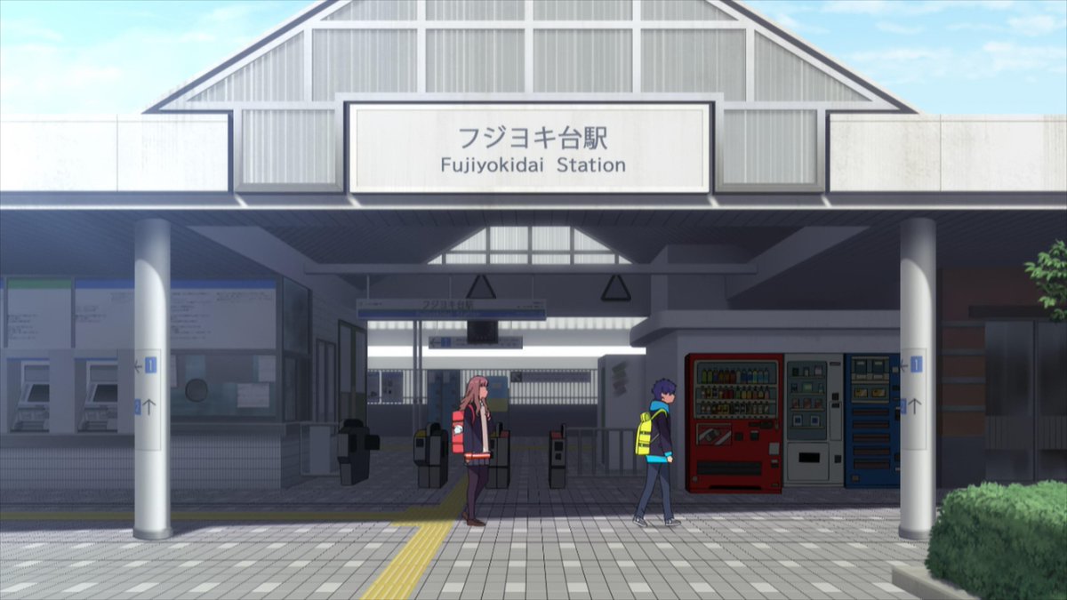
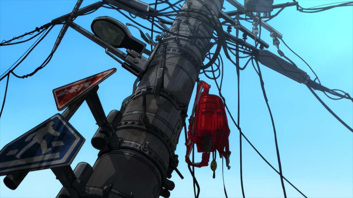
Dynazenon is still a very good standalone show on a moment to moment basis, and even more intriguing within the larger context of the franchise & all the toku and mecha properties it pays loving homages to. So easy to get drawn into it from either (or both!) angles
The first episode of Dynazenon was full of mirrored layouts from Gridman. The 2nd one takes it a step further, with half the locations being slightly more down to earth (no one playing god) versions of Gridman settings. Are we in Akane's original world? Are they playing us again?
Trigger is no stranger to the idea of recycling assets through different titles, but given details like Dynazenon's nods to Gridman the Hyper Agent, the "Gridman Universe" subtitle in the logo itself might be a very literal one
By itself, Dynazenon #02 is a reminder of how well this team's pieces click together. Hasegawa's scripts are witty, but they wouldn't hit so hard without pointed direction - the smash cuts getting faster every time Gauma says he doesn't want to impose too much is the funniest bit
Reframing the first episode's climactic battle from Yomogi's helpless, confused POV also manages to turn a heroic scene into an amusing recap
And Amecchi sure knows how to hold a silent shot. No need for a witty punchline here for these to be amusing moments
Gags aside, the show's as sharp as ever. Amemiya's cel propensity makes the consequences of the fight against kaiju feel palpable. It's one thing to hear about the impact on transport or to see an explosion in the background, and a very different one seeing destruction this real
To Yume, who already feels like she failed to protect someone, this tangible destruction is the best way to push Yomogi forward. If this mess is the lesser evil, there's no way they should disregard the kaiju
Whether they end up having an explicit purpose hinting something about the narrative or not, I also really like how packed with information the nearly full cel shots of the households are. They always feel like they tell you so much about each family
The animation in the second episode actually feels like a step up from the first one when it comes to making the world feel alive, while staying pretty efficient. Constant well constructed layered shots where there's always something going on, but without going overboard
No better example of the layouts being great than the one water drop leaking when Gauma steps down to continue hiding his kaiju tamer. This is true cinema
Also, cool robots! AsaGen's sharp flat effects have a raw ferocity to them that contrasts strongly with the intricate metallic polish of the mechs in the whole show, which we can thank Mutaguchi for. They have a good balance going as the two major figures in the show's robo front
• • •
Missing some Tweet in this thread? You can try to
force a refresh
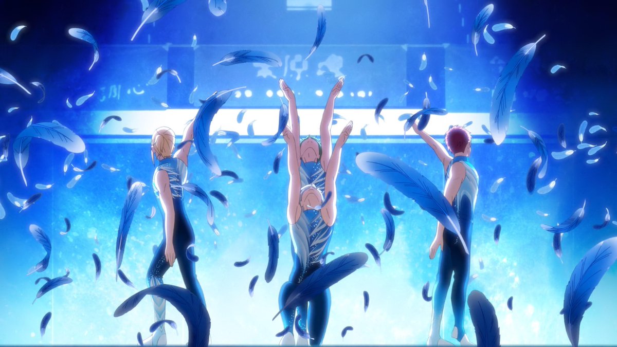
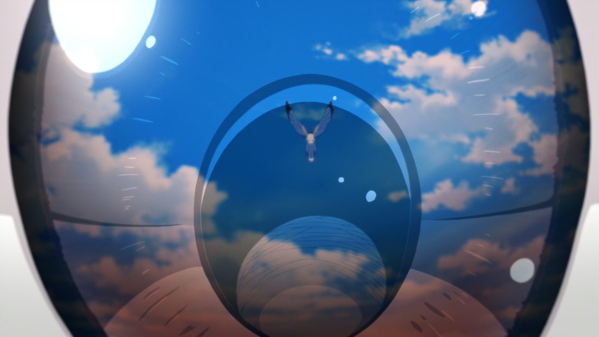
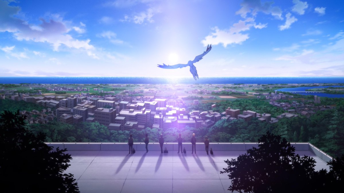
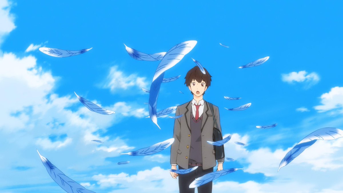
And like all good anime, it's actually Liz and the Blue Bird
But back to the somewhat worrying part of Bakuten's goodness. Toshimasa Kuroyanagi is a director who leans strongly towards realism, especially when it comes to the articulation of character acting, and the show's AniP is notoriously ambitious too. Which is to say, it moves A LOT
Fairy Ranmaru's a spiritual successor to Boueibu with 10x the confidence. Rather than constantly signaling that it's doing a bit, it's an earnest magical girl show where the cast happens to be lightly dressed dudes. Perfect fit for Masakazu Hishida & his Kinpri/Pretty series pals
Before watching the episode I saw that Tetsuya Ishikawa, an artist with a notoriously bold style who's acting as the action supervisor, was credited for something along the lines of Heavens Space Animation and had no idea what it was
After watching, I still dunno, but it's good
Another neat detail is that the normal and transformed forms don't just have different designers, but also different chief animation directors supervising them across the whole show. Character-specific supervision is unusual in anime but with differences this stark, it's sensible
Ousama Ranking looking great! Studio WIT gathered a pretty diverse all-stars team with a noticeable Doraemon flavor, which makes sense given the style. Worthy of being WIT's 10th anniversary celebration work (even though it comes out way before that?!)
Yousuke Hatta's been steadily progressing since he stood out as one of the last exceptional storyboarders emerging from Madhouse. He has experience with whimsical, almost fairytale-esque works, and so does Yuji Kaneko, who's always welcome as art director. Love this world already
Stunning background art in Super Cub #01's introduction. Toshiro Fujii's austere direction at its best, matching the extreme restraint of the writing and even audio with these muted yet beautiful photorealistic backgrounds
The BG work mostly handled by studio Kusanagi folks is good in general, but it's the first few scenes that really stand out with every element clicking together. It simply screams cold morning atmosphere
Fujii's always strongly leaned towards muted palettes, but this takes it to the next level since he's got the thematic justification of a protagonist leading a monotone empty life. Finding a new passion lights it up somewhat
Tremendous character development across Mewkledreamy. They started dumb, had to face the conflict of being dumb, persevered dumbly, and in the end, they found faith thanks to their dumbs
But really, Mewkledreamy owned! Funny, cute, always pleasant, and heartfelt when it had to be, with peaks of actual insanity that often coincided with Hiroaki Takagi's episodes - the highlight in what was already JC Staff's most solid production in ages. Full force Sanrio magic
The finale was nicely directed as expected. Using the background to subtly anticipate the change, then the foreground to elegantly hide him springing to action. Silly cartoon can be romantic too
Today's KyoAni staff blog post is a simple example of the importance of in-betweening. First you have the same keyframes both finished versions use. In red you have the "wrong" in-betweening the writer drew as a newbie, in blue their own fixed version kyotoanimation.co.jp/diary/archives…
The nuance of the movement is rather different, even for something this basic. And it's not simply a matter of smoothness: the relative wrongness of the red version is in introducing unnatural jerkiness *not intended* by the key animation (and thus presumably not by the director)
Had they meant to represent a more violent erratic wind in this hypothetical situation, then something closer to the red example would have been the correct approach. While in-betweening in anime is technically just filling the gaps, its effect on what you see on screen is huge