Weekly Canada and US COVID-19 Update
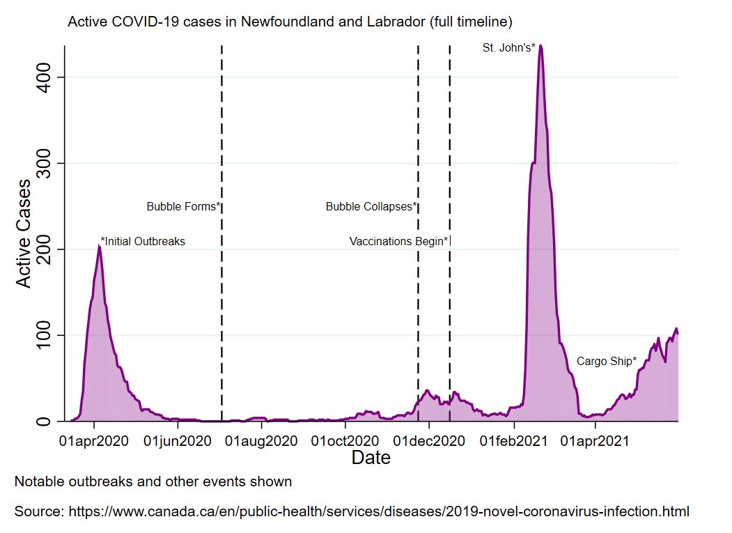
Cases up in most of Canada, with several provinces having case rates similar to or exceeding those seen in the US (Alberta is 11th, Ontario 14th, Saskatchewan 17th, BC 23rd, Quebec 26th.

Cases up in most of Canada, with several provinces having case rates similar to or exceeding those seen in the US (Alberta is 11th, Ontario 14th, Saskatchewan 17th, BC 23rd, Quebec 26th.


You can see the geographic distribution (by US Census region) of cases across the entire pandemic timeline in this animation.
Here's the equivalent animation for deaths per capita.
There's an uptick in some US states, notably in the northern-most ones.
Here are case split by non-northern and northern states, and Canadian provinces.
Here are case split by non-northern and northern states, and Canadian provinces.
You can see the entire pandemic timeline for the two countries in this animation.
Canada's 3rd wave is now plainly visible.
Canada's 3rd wave is now plainly visible.
• • •
Missing some Tweet in this thread? You can try to
force a refresh


