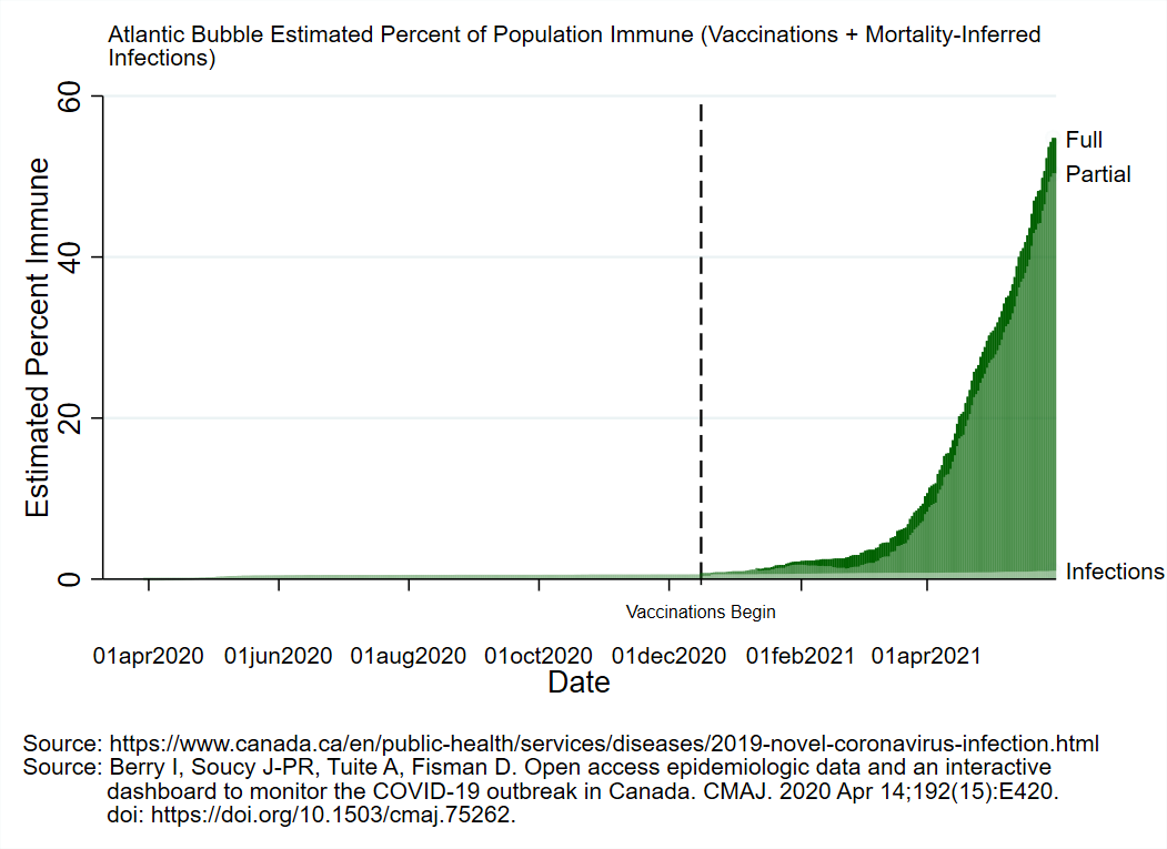
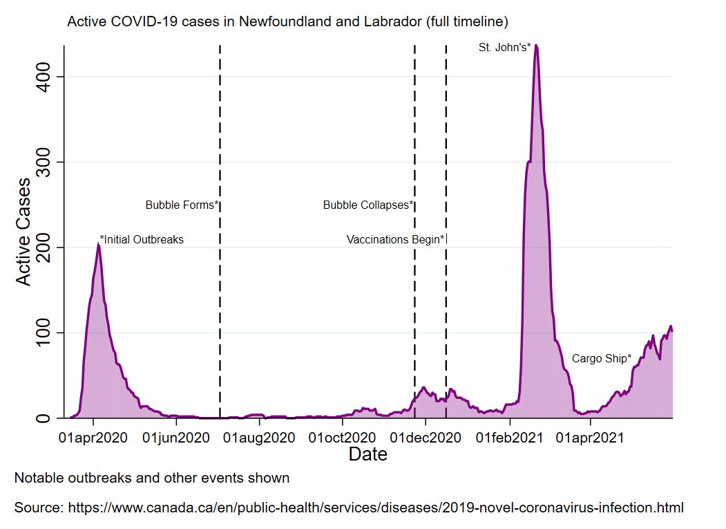
Today in the #AtlanticBubble
19 new cases were reported in the region today: 8 in Nova Scotia and 11 in New Brunswick.
All but one was successfully traced at the time of reporting (part of the Edmundston outbreak).
There are now 219 known, active cases in Atlantic Canada.


19 new cases were reported in the region today: 8 in Nova Scotia and 11 in New Brunswick.
All but one was successfully traced at the time of reporting (part of the Edmundston outbreak).
There are now 219 known, active cases in Atlantic Canada.


NB reported 11 new cases today:
1 in Moncton (close contact)
3 in Saint John (1 travel and 2 close contacts)
7 in Edmundston (5 close contacts, 1 travel, and 1 still under investigation)
There are now 150 known, active cases in NB.


1 in Moncton (close contact)
3 in Saint John (1 travel and 2 close contacts)
7 in Edmundston (5 close contacts, 1 travel, and 1 still under investigation)
There are now 150 known, active cases in NB.


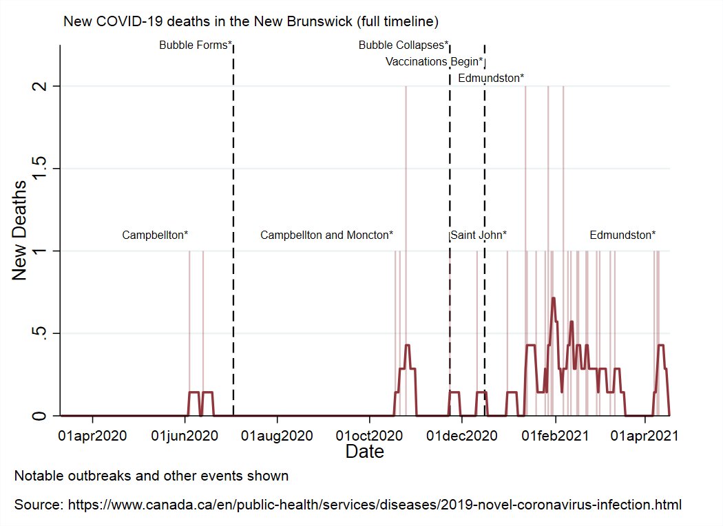

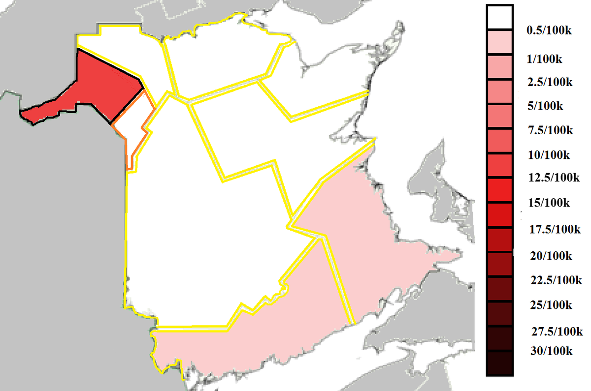
Updated restrictions/case level map and case timeline with the Edmundston region emphasized.
Pretty good week for contact tracing in NB.

Pretty good week for contact tracing in NB.

NS reported 8 new cases today:
1 in the Western zone (travel related)
5 in the Eastern zone (4 travel and 1 close contact)
2 in the Halifax area (1 travel and 1 close contact)
There are now 44 known, active cases in NS.


1 in the Western zone (travel related)
5 in the Eastern zone (4 travel and 1 close contact)
2 in the Halifax area (1 travel and 1 close contact)
There are now 44 known, active cases in NS.


Here's what the region looks like today. Basically everything shaded in the Atlantic region that's not Edmundston is travel related (and close contacts thereof)
Absolutely wild the volume of travel cases we're getting from the rest of the country right now
Hurray for quarantine
Absolutely wild the volume of travel cases we're getting from the rest of the country right now
Hurray for quarantine

You can see the entire pandemic timeline for the Atlantic region and surrounding areas in this animation.
Each tick is a week since the beginning of March last year.
Each tick is a week since the beginning of March last year.
Vaccine Roll-Out Ribbon Graphs.
Top of the ribbon is doses per capita distributed, bottom is doses used.
Top of the ribbon is doses per capita distributed, bottom is doses used.
Vaccine Roll-Out Metrics
By a hair, NS is currently the fastest* vaccinating province.
*This position changes constantly but NS has historically been the slowest, so it's a bit of a big deal


By a hair, NS is currently the fastest* vaccinating province.
*This position changes constantly but NS has historically been the slowest, so it's a bit of a big deal


Here's the pacing graph. Most are approaching a solid pace for hitting target.
Here is the percent of the eligible population of each province covered by at least one dose (Territories in the 2nd graph). 


I'm not going to type out the vaccination percentages on my phone because it would be annoying.
If twitter stops sucking I'll cover test data tomorrow and update my national maps too.
Have a great rest of the night!
If twitter stops sucking I'll cover test data tomorrow and update my national maps too.
Have a great rest of the night!
• • •
Missing some Tweet in this thread? You can try to
force a refresh


