Two months ago India confirmed 11,300 cases per day.
This shows the rise of confirmed cases since then.
A straight line on a logarithmic axis tells you that you are looking at exponential growth with a constant growth rate.
Now India confirms more than 200,000 cases a day.
This shows the rise of confirmed cases since then.
A straight line on a logarithmic axis tells you that you are looking at exponential growth with a constant growth rate.
Now India confirms more than 200,000 cases a day.

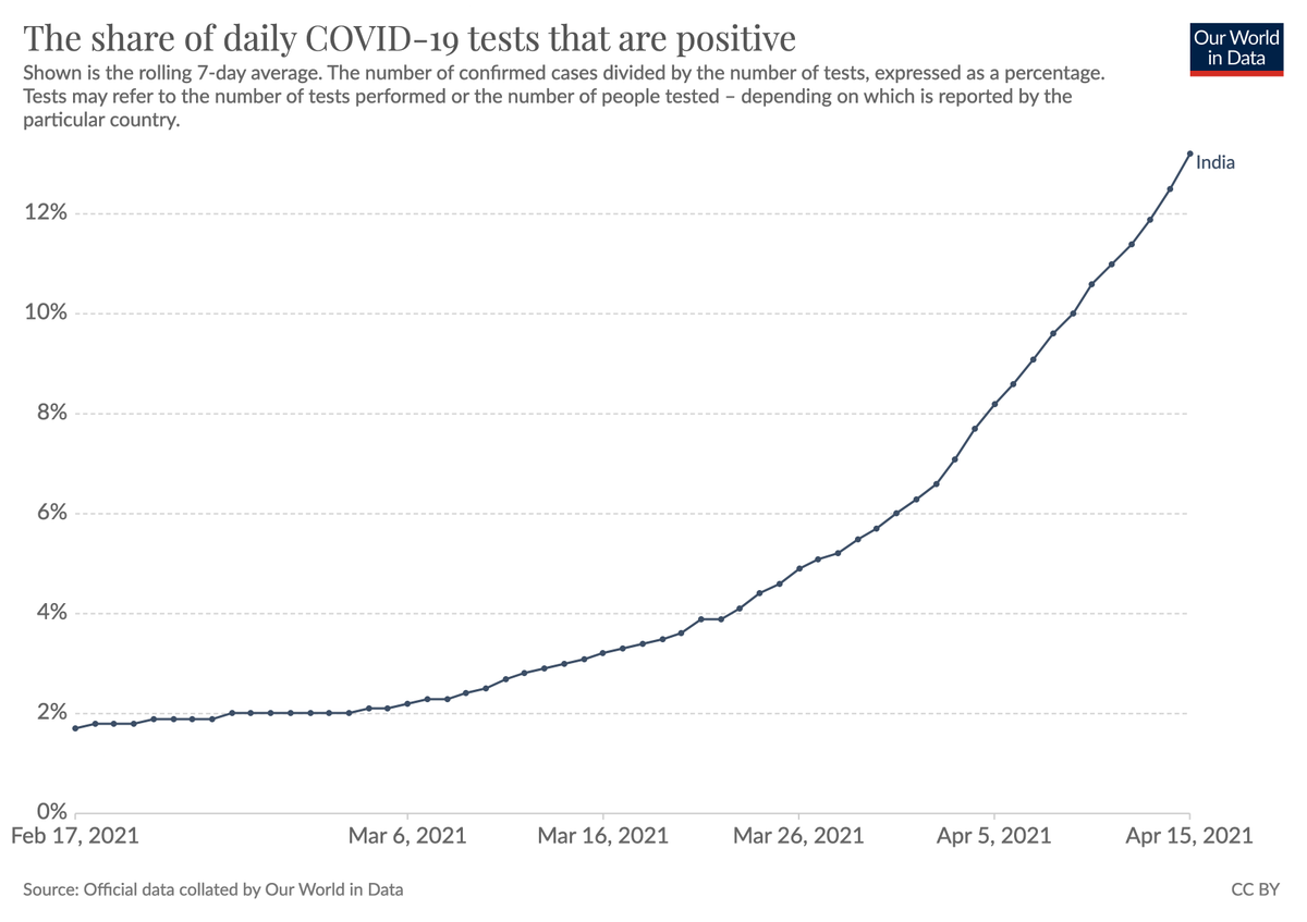
This is how the rate of positive tests changed in that same period.
A strongly rising positive rate tells us that the testing efforts are not keeping up with the size of the outbreak.
(here is all the data: ourworldindata.org/explorers/coro…)
A strongly rising positive rate tells us that the testing efforts are not keeping up with the size of the outbreak.
(here is all the data: ourworldindata.org/explorers/coro…)
COVID deaths in India have now surpassed the previous peak from last September.
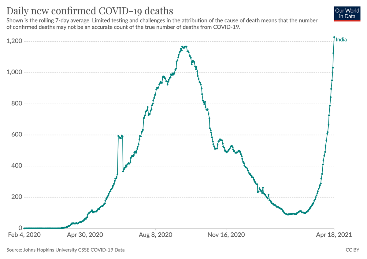
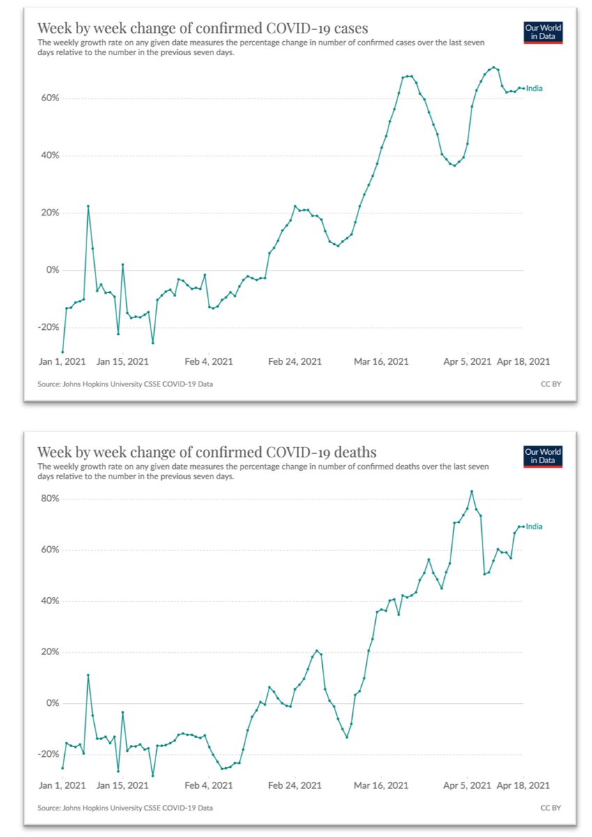
Both, confirmed cases and confirmed deaths are increasing at a rate of about 60% per week.
The growth rate of cases at the top and of deaths below.
All the data is here: ourworldindata.org/explorers/coro…
The growth rate of cases at the top and of deaths below.
All the data is here: ourworldindata.org/explorers/coro…
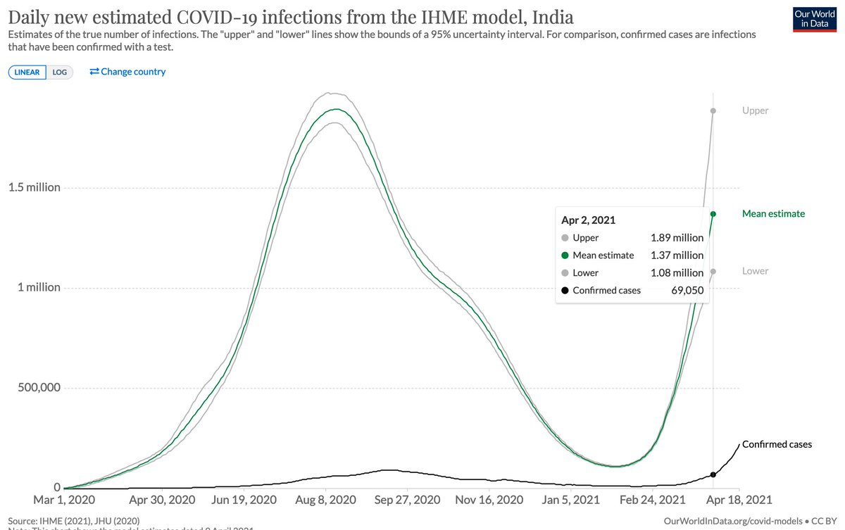
One crucial question is by how much confirmed cases differ from the actual true number of cases.
The IHME estimates the true number of cases and this is how their estimates compare with the reported number of cases in India.
[we publish it here ourworldindata.org/covid-models]
The IHME estimates the true number of cases and this is how their estimates compare with the reported number of cases in India.
[we publish it here ourworldindata.org/covid-models]
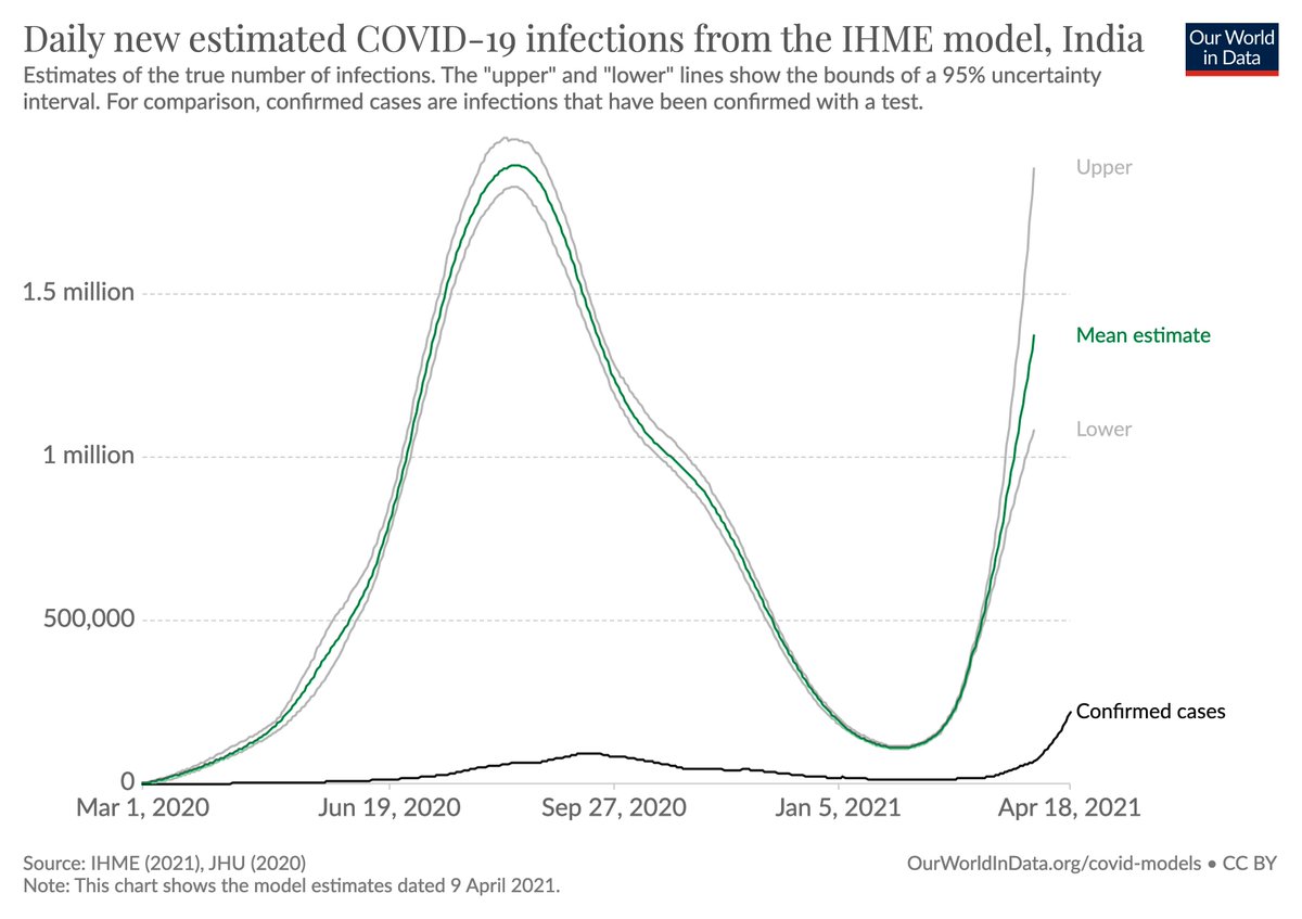
On April 2 the ratio between confirmed cases to true cases was estimated to be about 20.
(i.e. 5% of cases are detected)
If this is accurate, then the current number of infections in India is about 4.4 million per day.
(220,000 confirmed cases times 20)
(i.e. 5% of cases are detected)
If this is accurate, then the current number of infections in India is about 4.4 million per day.
(220,000 confirmed cases times 20)
• • •
Missing some Tweet in this thread? You can try to
force a refresh