
@stellensatz @Ashutos61 @Sandeep_1966 @shekhar_mande Starting a new thread for India. I updated India curve last on 14th with suggested peak at ~190K. Past few days have breached this value massively. This led to a discussion amongst us (me, Prof Sagar, and Gen Kanitkar).
The problem is that parameters of our model for current phase are continuously drifting, and so it is hard to get their value right. We decided to switch to predicting "active" instead of "new" infections. Former is about 10x of latter and hence less prone to fluctuations.
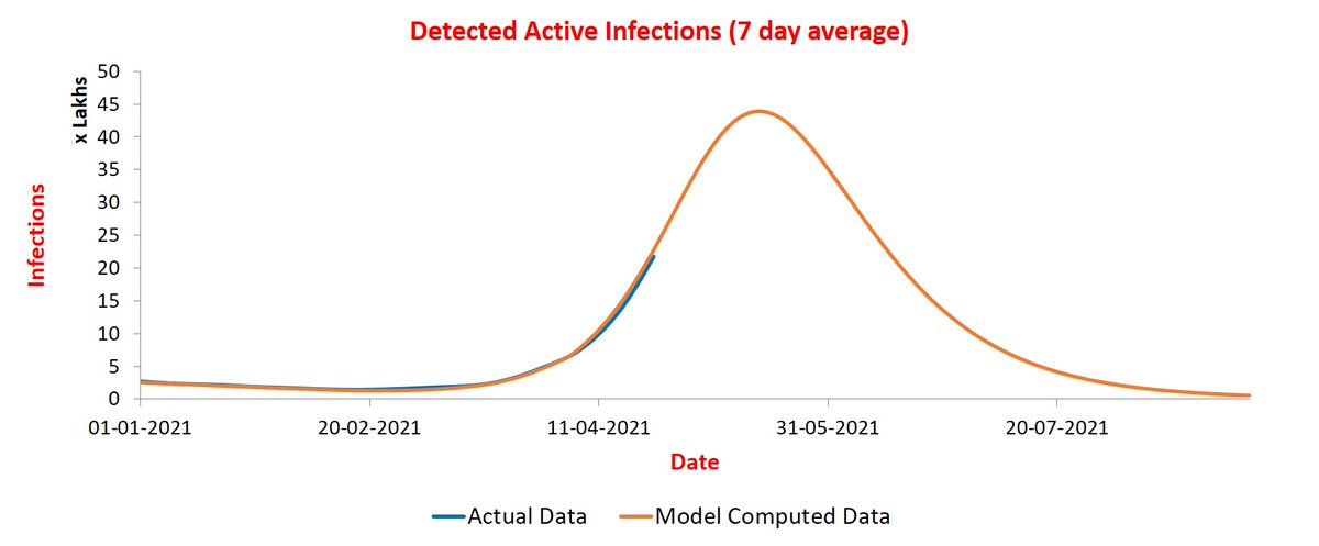
Indeed, it turned out that the trajectories are better matched. See plot below for the entire timeline. 
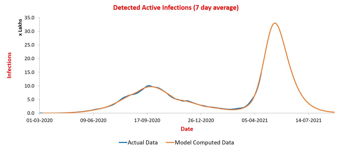
Now let us blow it up and see trajectories since 1st Jan. Match continues to be excellent! So this is expected to give better projection of trajectory of blue curve. Orange curve is peaking between May 11-15 at ~33 Lakh active infections (currently 7-day average is ~15 Lakhs).
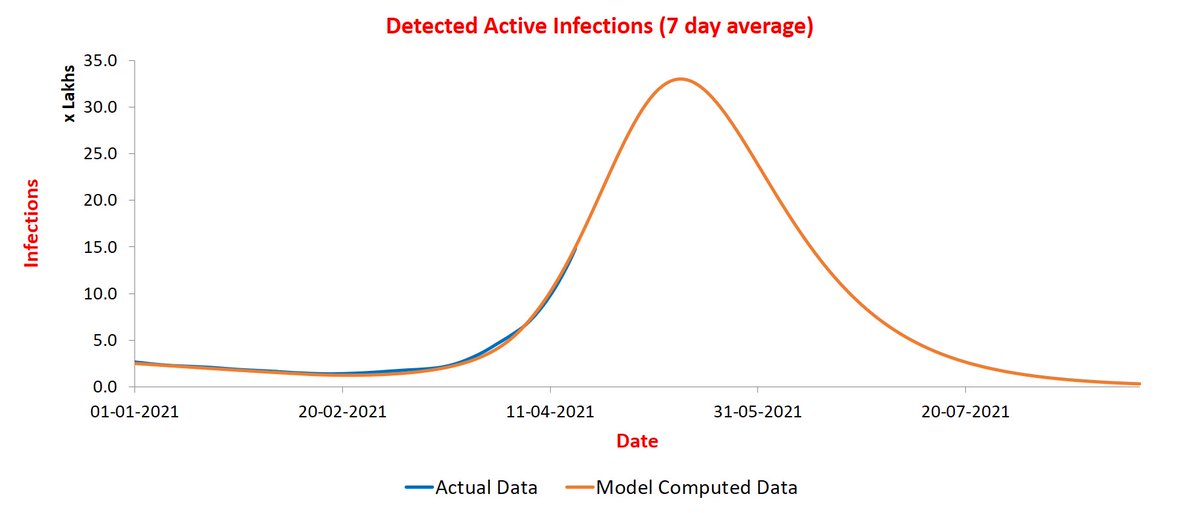
New infections peak about ten days before peak of active infections. Hence, the peak for new infections is expected during May 1-5. This was earlier projected to be between April 20-25. So we may have another two weeks of rise ahead of us.😐
Above also illustrates the pitfalls of modeling. One makes predictions based on imperfect information, and so has to be ready to accept failures... I will be tracking curve for India in this thread.
<Update on 20/4> @stellensatz India curves remain in sync. Peak value has gone up a bit to ~35 lakhs active infections. Peak location remains the same. New infections slated to peak during May 1-5 as before at ~3.3 lakh infections/day.
Note that peak value will keep going up and down a bit due to steepness of slope.
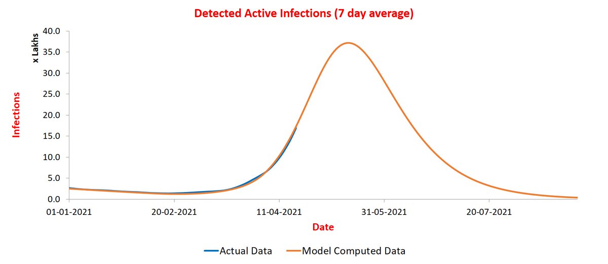
<Update on 22/4> @stellensatz India curves are moving in perfect sync for active infections. Peak value has gone up to ~37 lakhs which translates to ~3.7 lakh new infections. Peak timings remain the same.
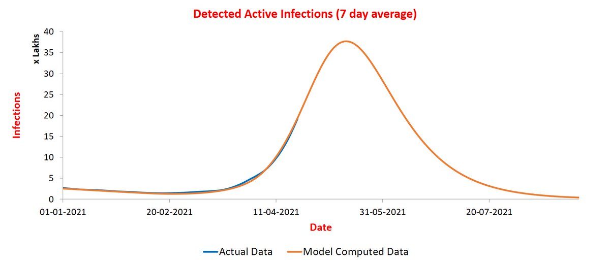
<Update on 24/4> @stellensatz India curves continue to move in sync. I have now computed a range of values for peak value and timing and the final numbers should be within this range. Reason for this uncertainly is that the parameter values for last phase continue to drift.
So it is not clear what will the final values be.
Peak timing: May 14-18 for active infections and May 4-8 for new infections.
Peak value: 38-48 lakhs for active infections and 3.4 to 4.4 lakhs for new infections.
Peak timing: May 14-18 for active infections and May 4-8 for new infections.
Peak value: 38-48 lakhs for active infections and 3.4 to 4.4 lakhs for new infections.
India curves continues on the same trajectory.

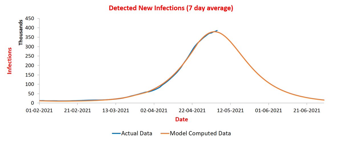
<Update on 29/4> @stellensatz Some good news about India from SUTRA's perspective. The trajectory has stabilized now and so I can switch back to predicting daily new infections instead of active infections. As predicted earlier, peak expected to arrive during May 4-8.

Peak value expected to be around 3.9 lakhs. It is 7-day average value, so highest daily value may cross 4 lakhs.
It is as good time as any to explain a bit the "stabilizing" of curve/parameters that I keep mentioning. Those who have gone through our paper would recall that our model predicts a linear relationship between three known quantities. Let me explain in some details.
Let T be the number of active infections, N be the number of new infections, and C be the cumulative number of people infected so far. All vary with time. The central "sutra" of our model is: T = b * N + e * T * C, where b and e are constants related to parameters of the model.
Above equation holds as long as parameter values remain stable. If parameter values change, the equation break down. Since time series of all the three quantities, T, N, and C are available, we can use this observation to detect during which periods the equation holds.
This allows us to split the entire timeline into phases with equation holding during each phase except an initial part when the equation does not hold and parameter values are "drifting" or "unstable".
In addition, using the period when equation holds in a phase, we can estimate values of constants b and e as well. This, along with another idea, allows us to compute the values of all parameters of the model. There are three main ones.
First is beta, the contact rate, measuring number of persons an infected person infects in a day. Beta is roughly 1/b. Second is rho, the reach, measuring the fraction of population covered by the pandemic. Third is epsilon, measuring ratio of detected and total infections.
epsilon * rho is roughly 1/e. So when I say parameters have not stabilized, it means we are in the initial part of a phase where the equation is not yet holding. So it is hard to estimate values of parameters. In fact, every new data point changes their values significantly.
We can represent a phase pictorially. Let me give example of India first. Below is a plot of values T - 6.3*N versus T*C values during June 21-August 21 for India. Red points correspond to drift period. Blue points are nicely lined up on a straight line, as predicted by model.
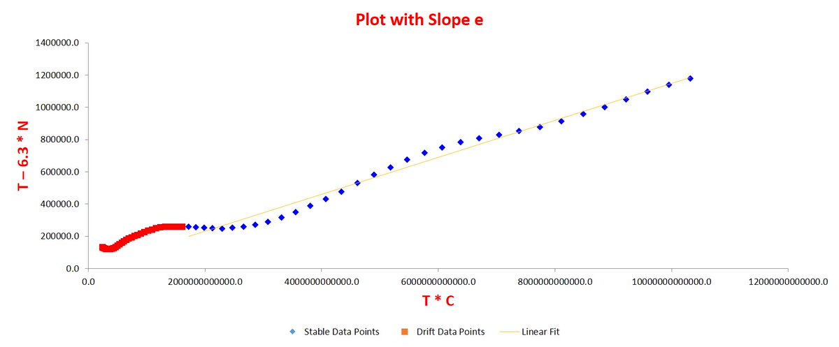
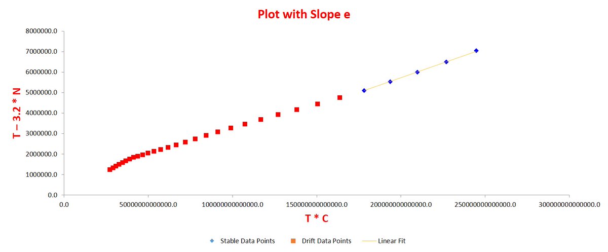
For those familiar with regression, the R^2 value of the fit is 0.999! Let us see the present phase plot now. Points of past five days are all lined up nicely. Before that, points were "drifting" and not lining up. That is why parameter values could not be predicted accurately.
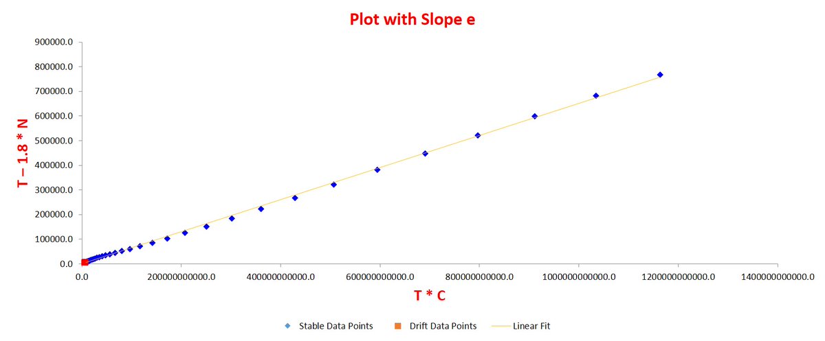
For many states and districts, current phase has been stable for long. For them, reasonably accurate predictions could be made very early. For example, below is current phase for UP. It is stable for past one month now!
Hope above explains the usage of "drifting" and "stabilized". Also, why one needs to continuously redo the plots for some places!
<Update on 1/5> @stellensatz I have been exceptionally busy past few days, so not able to update as many plots as I would have liked to. In any case, India curve is the most anticipated one. And it is on track! Peak seems just around the corner!!
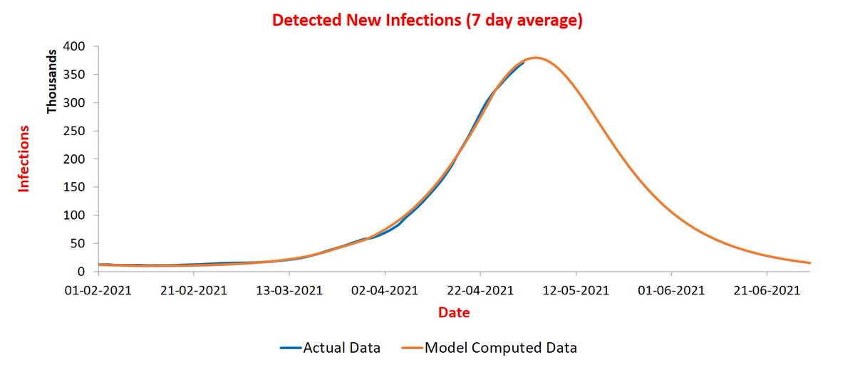
<Update on 4/5> @stellensatz India curve continues in sync with predictions. If it does not suddenly decide to deviate, peak will be either today or tomorrow. Received an excellent suggestion to pin the latest India curve tweet, at least for next few days.

<Update on 5/5> @stellensatz Adding yesterday's data. Is that the peak?🤔We will know when today's data comes...
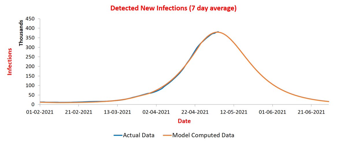
<Update on 6/5> @stellensatz So yesterday was a record-breaking one! 7-day average has gone up to 3.8 lakhs. The updated plot is below.
• • •
Missing some Tweet in this thread? You can try to
force a refresh


