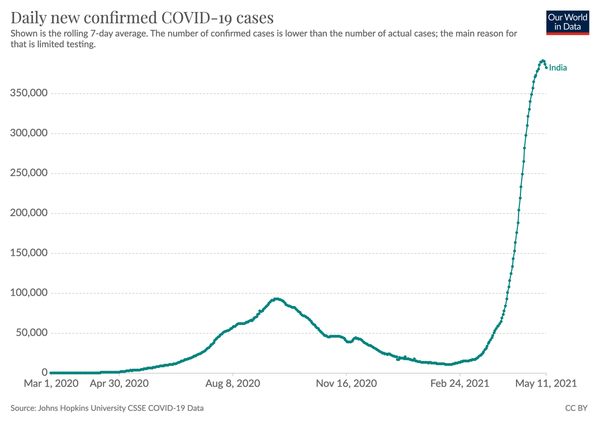
Finally an update from India that shows that things started to change in a positive direction.
Confirmed cases peaked and started to come down.
Cases are still high and insufficient testing means that many cases are missed, but I think it's actually the peak (see next tweets).
Confirmed cases peaked and started to come down.
Cases are still high and insufficient testing means that many cases are missed, but I think it's actually the peak (see next tweets).
https://twitter.com/MaxCRoser/status/1390586368070410240
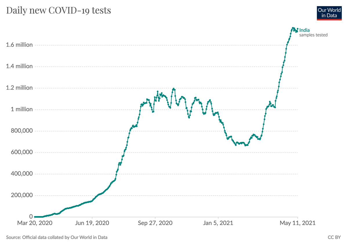
Testing in India has not declined.
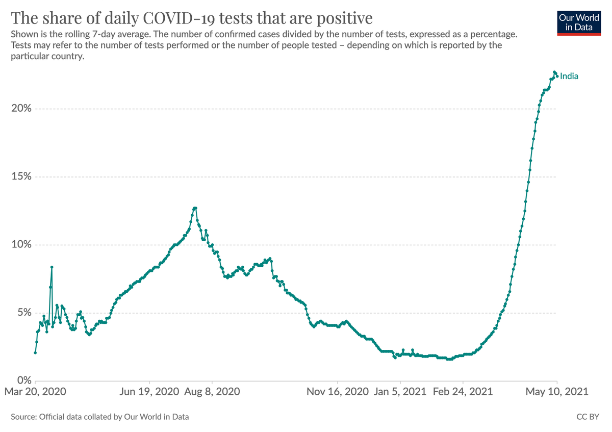
During the rapid outbreak the test positivitiy rate also increased rapidly. This has now largely stopped.
I'd interpret this as suggesting that the gap between confirmed cases and total cases was increasing for a long time, but that this isn't continuing anymore.
I'd interpret this as suggesting that the gap between confirmed cases and total cases was increasing for a long time, but that this isn't continuing anymore.
As we all have now seen many times during the pandemic there is a large delay between changes in cases and changes in deaths.
People get sick before they die.
We should therefore expect that the number of deaths continues to increase before it follows the decline of cases.
People get sick before they die.
We should therefore expect that the number of deaths continues to increase before it follows the decline of cases.
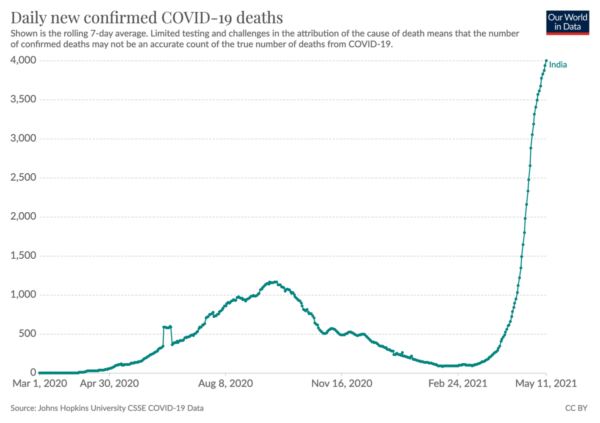
It's a very long way down. It's hard to know large the gap between confirmed and total cases is, but estimates for that ratio are commonly much higher than 10.
This means that many millions are getting infected daily and that means that the situation can reverse quickly.
This means that many millions are getting infected daily and that means that the situation can reverse quickly.
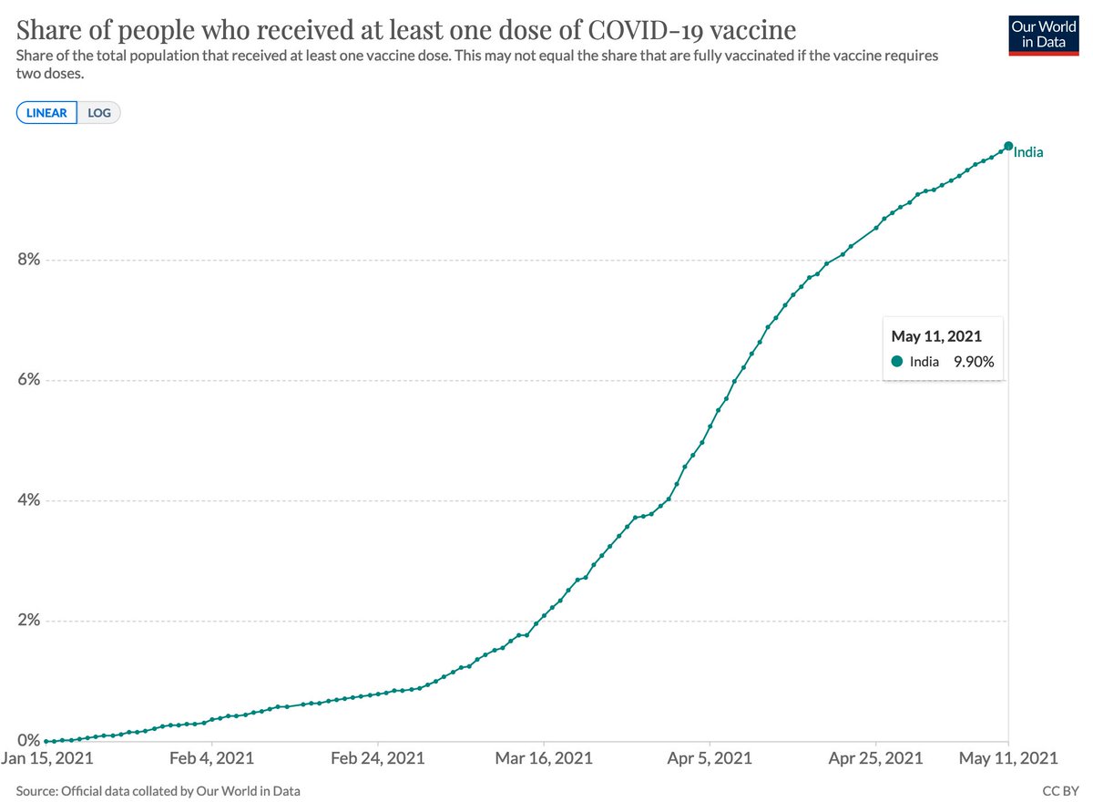
Every tenth person in India has received a first dose of the COVID vaccine and so it's also still a long way until everyone in the population is protected.
–
In our Data Explorer you find all of the above data (and the same for countries around the world): ourworldindata.org/explorers/coro…
–
In our Data Explorer you find all of the above data (and the same for countries around the world): ourworldindata.org/explorers/coro…
• • •
Missing some Tweet in this thread? You can try to
force a refresh