The latest @ICNARC report on intensive care activity is out. With the situation now much improved now it enables a good comparison of the two waves (W1/2). A thread here on behalf of @COVID19actuary.
W2 patient admissions of 25,543 were well over twice that of W1 (10,951).
1/
W2 patient admissions of 25,543 were well over twice that of W1 (10,951).
1/

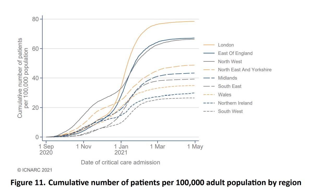
Despite starting W2 much more slowly, London rapidly accelerated and ended up being the worst affected again in terms of population size, contrary to those who early on were suggesting that herd immunity from the first wave was protecting it.
2/
2/
W2 developed more slowly, and extended over a longer period so the peak bed occupancy for W2 was not much greater than W1, but high volumes (and thus pressure on staff and resources) were sustained for a much greater period.
Recent levels were higher than last summer too.
3/
Recent levels were higher than last summer too.
3/

In W2, peak occupancy in London by pop'n size was between around twice and four times as high in as in other regions.
4/
4/

We can see here how the surge in excess of normal levels (even during winter) was much higher than in the first wave. Note how non-elective care beds reduced dramatically again, as many urgent operations were postponed because CC beds were just not available.
5/
5/

As an aside, on that subject, this week's #BBCHospital focuses on the very difficult decisions needed as rationing of CC beds became necessary, and the serious impact on patient care beyond the COVID figures I'm reviewing here. Well worth watching.
6/
bbc.co.uk/iplayer/episod…
6/
bbc.co.uk/iplayer/episod…
You can also see this from the increase in inter-hospital transfers during the peak, as the NHS sought to maximise capacity across the country. A quarter of these were outside the local area in W2.
7/
7/


COVID admissions at the peak were six times winter levels for pneumonia, and twenty times the 2019 level for flu (which itself was the worst in the last few years).
Note also how NPIs have helped to eliminate flu this year, which has meant some offsetting mortality benefit.
8/
Note also how NPIs have helped to eliminate flu this year, which has meant some offsetting mortality benefit.
8/


Demographic characteristics next. The skew towards males was very slightly reduced in W2. For ethnicity, there was a reduction in the BAME prop'n, driven by a near halving in the % of black lives.
By deprivation the skew was greater though, with the most deprived up to 30%.
9/
By deprivation the skew was greater though, with the most deprived up to 30%.
9/

The proportion of those with a BMI in excess of 30 increased from 39% to 49%. This compares with 32% of the population, so around 50% higher. (32% x 1.5 = 48%).
10/
10/


The age distribution is similar to the first wave, with a much greater proportion of younger lives than for death or general admission. So it's only as vaccination has progressed well below age 70 that the majority of those being admitted to ICUs have become protected.
11/
11/

The report explores the impact of vaccination further. You can see here how the proportion of G1-4 admissions has gradually reduced, and more recently too for G5-9. That's meant a recent increase in the prop'n coming from the rest of the pop'n.
12/
12/

Outcomes next.
41% (10,561) of those who entered intensive care sadly died, with 54% discharged from hospital. Around 5% remain in hospital, either in CC or general wards.
For W1 the figures were 42% died, 57% discharged, 1% remain, so very little difference.
13/
41% (10,561) of those who entered intensive care sadly died, with 54% discharged from hospital. Around 5% remain in hospital, either in CC or general wards.
For W1 the figures were 42% died, 57% discharged, 1% remain, so very little difference.
13/

The 28 day survival curve for W2 is slightly better than we saw in W1, although earlier on in the wave the improvement was greater. That may reflect the pressure units were under in the peak, or a change in the severity of patients admitted as the wave progressed.
14/
14/

By demographic it's noticeable that black lives showed a much improved outcome. By age and sex there are more variable improvements.
15/
15/

The 90 day outcomes for the two waves are much closer though, consistent with the overall figures reported in tweet 13.
So there was still broadly a 4 in 10 likelihood of dying for anyone entering intensive care.
16/
So there was still broadly a 4 in 10 likelihood of dying for anyone entering intensive care.
16/

Here we see survival rates based on date of admission. There was a clear improvement last summer with lower volumes, but a reversion once W2 took off.
With outcomes improving again, that pattern could suggest a link between outcomes and the pressures units are under.
17/
With outcomes improving again, that pattern could suggest a link between outcomes and the pressures units are under.
17/

At over 100 pages there is much more than I can cover here, and I think all those involved in the gathering of data and production of these exceptional reports deserve a lot of praise for the insight it gives us. Thank you!
18/
icnarc.org/Our-Audit/Audi…
18/
icnarc.org/Our-Audit/Audi…
And of course, the thousands who have been at the sharp end of intensive care activity, and indeed more generally in hospitals and the wider health service, deserve all our gratitude for their tireless efforts to protect us and save so many lives. My sincere thanks to all.
19/END
19/END
• • •
Missing some Tweet in this thread? You can try to
force a refresh