Two years ago there were 65,000 sheets of paper containing hand-written measurements of rainfall taken all across the UK & Ireland before 1960. Virtually all of the 5.28 million observations on these sheets were unavailable to climate scientists as they had never been digitised.
Thanks to @metoffice archives, these sheets were scanned & made openly available, but how could the observations be extracted?
3.3 million observations have been quality controlled, and combined into time series from 8485 rain gauges from 6095 locations.
This data will be used by @markpmcc & @metoffice to improve UK rainfall reconstruction (called HadUK-Grid).
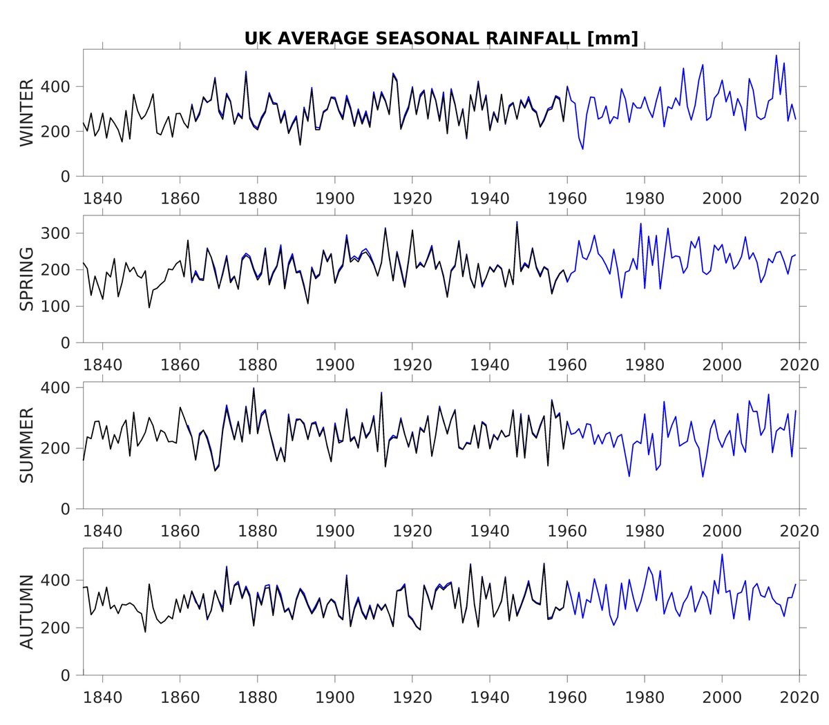
Currently the all-UK gridded reconstructions extend back to 1862. With the #rainfallrescue dataset it should be possible to go back to 1836, and earlier for some regions.
The extension back to 1836 means we can put recent UK rainfall changes into a longer-term context. The drier winters in the 1840s and 1850s will be of interest to water companies planning for worst-case drought scenarios, for example.
None of this would have been possible without the 16,000+ volunteers, and especially those who have stayed with the project the whole way (Gill, Ian, Jacqui, John B, John O, Mike, Richard, Tim). We also relied on the amazing @the_zooniverse as the citizen science web platform.
We can now map out rainfall for historical extreme months that has never been possible before. For example, the Decembers in 1852 and 1853 were one of the wettest and driest on record for Scotland respectively.
• • •
Missing some Tweet in this thread? You can try to
force a refresh
With current discussions in the UK about net-zero it is worth remembering that there is already a fair strategy to reach net-zero, agreed by a group of citizens representing the full range of people's values, views & experiences.
The UK Climate Assembly. 🧵climateassembly.uk
In early 2020, a representative group of UK citizens gathered over several weekends to discuss ways of reaching net-zero that could be broadly agreed on.
I was a minor participant, giving a 10min overview of climate science & answering questions from the assembly.
At the core of the agreed plans was a joined-up approach across society:
- Education & information is essential
- Fairness for all
- Freedom & choice where possible
- Take advantage of co-benefits
- Protect & restore the natural environment
- Strong & clear leadership
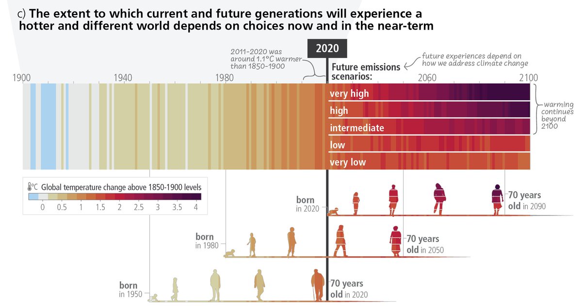
Yesterday the IPCC 6th Assessment published its Synthesis Report (SYR) which included this graphic (SYR.1c) which has been a popular way to discuss future warming in the context of different generations.
What were the inspirations for this graphic?
A thread... 🧵
Within the formal IPCC process there are (at least) two other relevant figures from the WGI report.
From the Technical Summary, Figure TS.6 used a similar concept but focussed the future projections component on communicating the time of reaching different global warming levels.
As an aside, here is Figure SYR.2 which also borrows some concepts from WGI TS.6 to discuss impacts at different global warming levels.
We are already experiencing the consequences of our warming world & are now at a climate crossroads.
The choices we make now will determine the future experiences of those already alive, and those yet to be born.
If we choose not to act,
Or fail to adapt,
Then suffer we will.
And, to everyone who thought the 'warming stripes' were just a gimmick, here they are used in the IPCC Synthesis Report Summary for Policymakers. They are an effective communication tool to start the critical climate conversations we all need to have. ShowYourStripes.info
The IPCC Synthesis Report highlights the severe risks that we face, but also that we have many of the solutions to tackling climate change, and that there are enormous benefits from cutting emissions. ipcc.ch/report/ar6/syr/
The Warming Stripes are a popular visual way of highlighting the observed rise in global temperatures since 1850. #ShowYourStripes
But, the concept can also be used in different ways for different purposes... a thread🧵
For those who want numbers and a timeline to go along with the stripes...
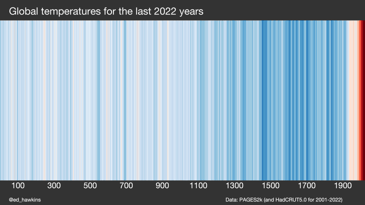
For those who want a longer timescale...
(This version uses the @PAGES_IPO proxy-based global temperature data for years 1-2000 and the observations for 2001-2022.)
"The data from 2022 is stark, however you look at it. Whether you view the raw figures, or look at the data as another red line added to the climate stripes, the message is clear. Excess heat is building up across the planet at a rate unprecedented in the history of humanity."
"The latest stripe added is the second-darkest red, but is very close to being in the darkest red category. This is remarkable, given that La Nina has helped to hold temperatures down. When we see a return of a warming phase of El Nino, the darkest red stripes will return."
Why are we still building housing developments with gas for heating, no solar panels on roofs and no cycling infrastructure?
This provoked a LOT of discussion!
Focussing on UK, there will be no gas boilers in newly built homes after 2025. Positive step but could have come much earlier & has locked-in expensive retrofitting. Heat pumps rather than hydrogen boilers are planned solution for most homes.
And, many commenters added other issues that could be improved in new housing developments: harvesting rainwater, improved biodiversity, avoiding floodplains, community infrastructure... would all need more regulations & joined-up planning.