Ed Hawkins Profile picture
Climate scientist, NCAS/University of Reading | IPCC AR6 Lead Author | MBE | Warming Stripes: https://t.co/RHRXsr7zE5 | Views own
Mark Trexler Profile picture 1 subscribed
Aug 16, 2023 7 tweets 2 min read
With current discussions in the UK about net-zero it is worth remembering that there is already a fair strategy to reach net-zero, agreed by a group of citizens representing the full range of people's values, views & experiences.
The UK Climate Assembly. 🧵climateassembly.uk In early 2020, a representative group of UK citizens gathered over several weekends to discuss ways of reaching net-zero that could be broadly agreed on.
I was a minor participant, giving a 10min overview of climate science & answering questions from the assembly.
Mar 21, 2023 12 tweets 6 min read
Yesterday the IPCC 6th Assessment published its Synthesis Report (SYR) which included this graphic (SYR.1c) which has been a popular way to discuss future warming in the context of different generations.
What were the inspirations for this graphic?
A thread... 🧵 
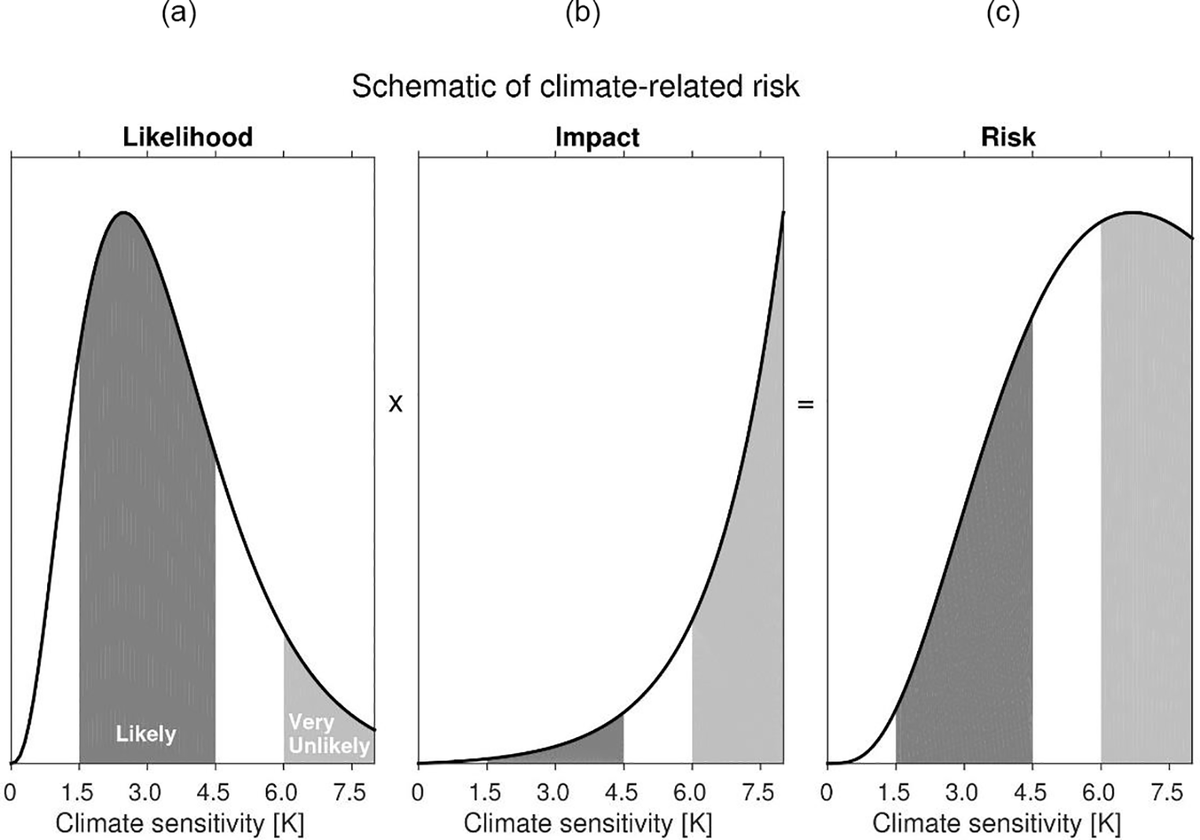
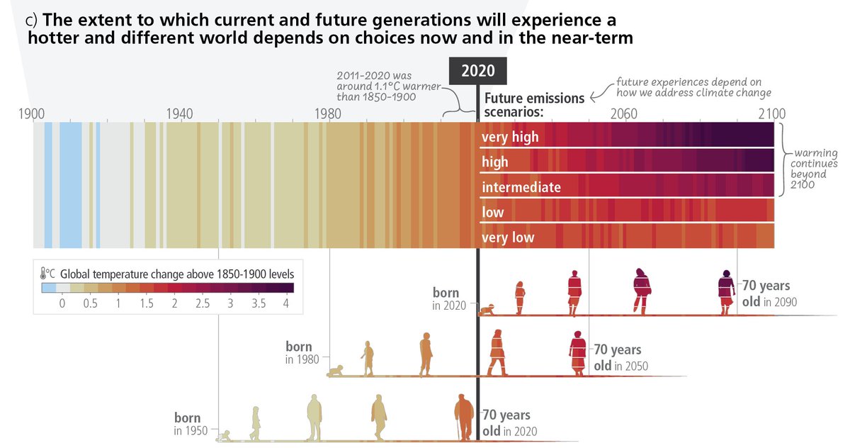
Within the formal IPCC process there are (at least) two other relevant figures from the WGI report.
From the Technical Summary, Figure TS.6 used a similar concept but focussed the future projections component on communicating the time of reaching different global warming levels.
Mar 20, 2023 4 tweets 2 min read
We are already experiencing the consequences of our warming world & are now at a climate crossroads.
The choices we make now will determine the future experiences of those already alive, and those yet to be born.

If we choose not to act,
Or fail to adapt,
Then suffer we will. And, to everyone who thought the 'warming stripes' were just a gimmick, here they are used in the IPCC Synthesis Report Summary for Policymakers. They are an effective communication tool to start the critical climate conversations we all need to have.
ShowYourStripes.info
Jan 13, 2023 5 tweets 2 min read
The Warming Stripes are a popular visual way of highlighting the observed rise in global temperatures since 1850. #ShowYourStripes
But, the concept can also be used in different ways for different purposes... a thread🧵 For those who want numbers and a timeline to go along with the stripes...
Jan 12, 2023 4 tweets 1 min read
Changes in global temperature (1850-2022) Image "The data from 2022 is stark, however you look at it. Whether you view the raw figures, or look at the data as another red line added to the climate stripes, the message is clear. Excess heat is building up across the planet at a rate unprecedented in the history of humanity."
Aug 30, 2022 5 tweets 1 min read
Why are we still building housing developments with gas for heating, no solar panels on roofs and no cycling infrastructure? This provoked a LOT of discussion!
Focussing on UK, there will be no gas boilers in newly built homes after 2025. Positive step but could have come much earlier & has locked-in expensive retrofitting. Heat pumps rather than hydrogen boilers are planned solution for most homes.
Jul 26, 2022 7 tweets 3 min read
As expected, the new #readingfc home kit has provoked some strong reactions!

- Love it!
- Like the idea but not the design
- Worst kit ever!

Whatever your view, the kit has started a conversation.

So, what do the sleeves represent and what does the science say? 
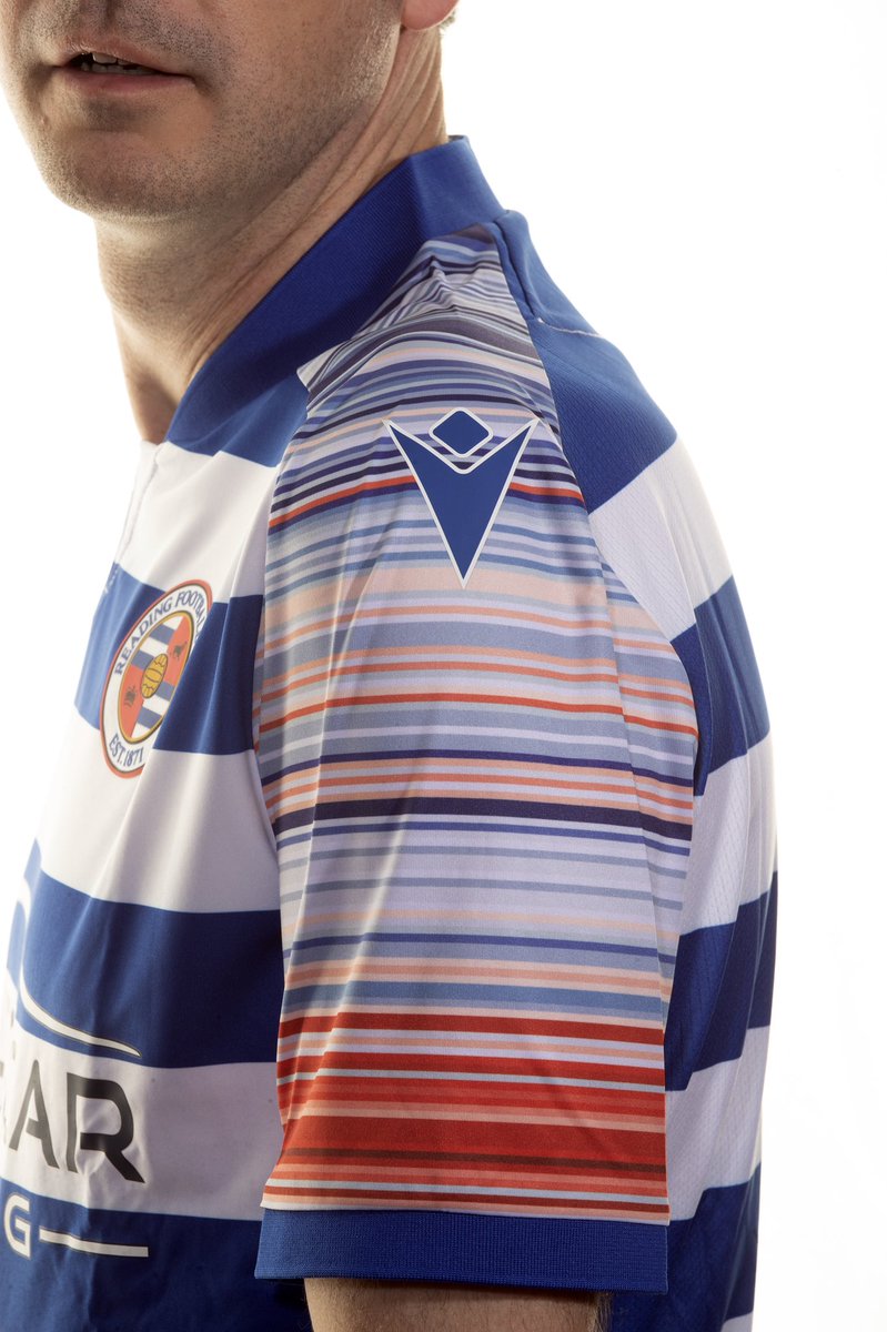
The sleeve colours represent the change in annual temperature in Reading, with one stripe per year. Red for hotter years.

Since the club was founded in 1871, temperatures in Berkshire have risen 1.5°C.

This is primarily due to us burning fossil fuels such as coal, oil & gas.
Jun 21, 2022 16 tweets 14 min read
How do the warming stripes start conversations about climate change? #ShowYourStripes
They are stark visuals which, with a single glance, instantly communicate the simple message that the climate is heating up.
Their strength is the innovative ways that people have adapted them. At London Fashion Week, @HouseOfTammam put on a catwalk show with dresses, accessories and a cape with the stripes as a theme, reaching a new audience and winning awards for sustainability engagement.
Jun 20, 2022 4 tweets 1 min read
Whenever climate change & UK heatwaves are discussed someone will always say: 'but what about 1976?', as if this was evidence that the climate has not changed.
And, yes, summer 1976 was hot in the UK. It may not be obvious which map is 1976 when comparing with the last 8 summers. But, taking a global view is important. Variations in the weather mean that locally some years are hotter & some cooler.
1976 clearly stands out as unusual. It was far cooler virtually everywhere when compared to the last 8 summers.
The UK happened to be an exception that year.
May 26, 2022 8 tweets 3 min read
Delighted that the Warming Stripes were chosen for the cover of @GretaThunberg's new book.
These 172 coloured stripes represent how global average temperatures have increased from 1850 to 2021. Billions of observations taken by many thousands of observers in one simple graphic. The graphic used for this book continues the stripes backwards in time on the spine & back cover. For the period before 1850, information from 'paleo' sources are used, i.e. data from tree rings, corals etc. Because of the dimensions of the book the back cover goes back to 1630s.
Dec 19, 2021 9 tweets 3 min read
How do scientists assess policy-relevant risks?

A short thread. When making policy decisions with uncertain information, the most likely outcome is usually not the most relevant.

This is because unlikely events do happen. And these unlikely events can have severe consequences.

Policy-makers need to avoid severe consequences occurring.
Aug 18, 2021 15 tweets 8 min read
Some figures from Chapter 1 of the new IPCC AR6 physical climate science report: ipcc.ch/report/ar6/wg1…

1/ Baselines and reference periods. Ever been confused about different climate baselines? Figures 1.11 and 1.12 may help, along with the discussion in Section 1.4.1. 
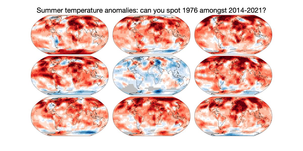
2/ Climate variability. Short term fluctuations in the climate can temporarily obscure or enhance longer term trends. The size of the fluctuations depends on the variable of interest and spatial scale.

Figure 1.13 and Section 1.4.2 may help explain this.
Jul 16, 2021 4 tweets 2 min read
Dear @BBCNews: this phrase, used in several recent articles, is not a fair representation of the science on extremes.

”Experts say that climate change is expected to increase the frequency of extreme weather events, but linking any single event to global warming is complicated.” How about “Experts say that climate change is already increasing the frequency of extreme weather events, and many single events have been shown to have been made worse by global warming.” instead?
Jun 21, 2021 6 tweets 5 min read
How have the #ShowYourStripes graphics been used to start conversations about climate change in the past? (1/n)

Worn by Senators during the 2020 State of the Union address in the US: bbc.co.uk/news/av/scienc… Displayed by @ENTERSHIKARI during Reading Festival to thousands of music fans. The lead singer @RouReynolds discusses what they mean and why they are important during the performance, stimulating new conversations. (2/n)
Jun 21, 2021 9 tweets 7 min read
The planet is warming due to human activities, primarily burning fossil fuels & deforestation.

Climate change is happening here & now, and is already affecting everyone. The consequences will get worse for each bit of further warming.

#ShowYourStripes ShowYourStripes.info 
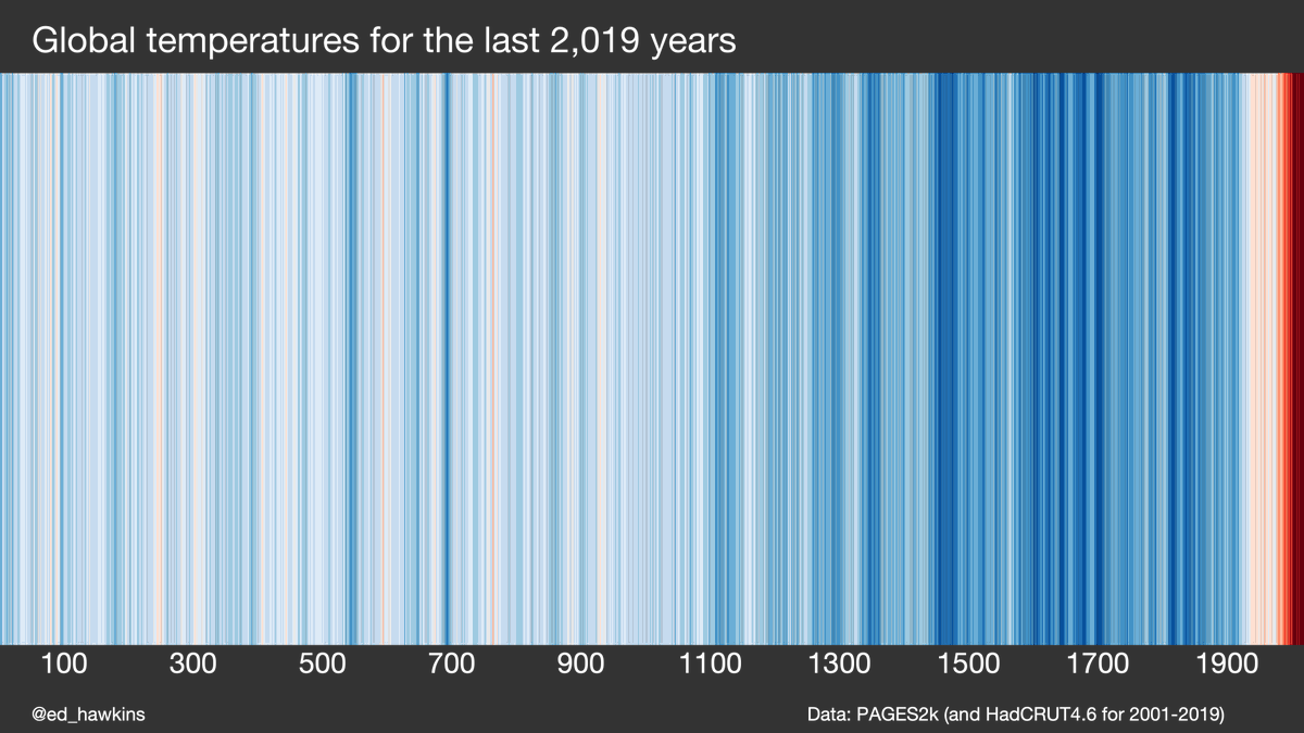
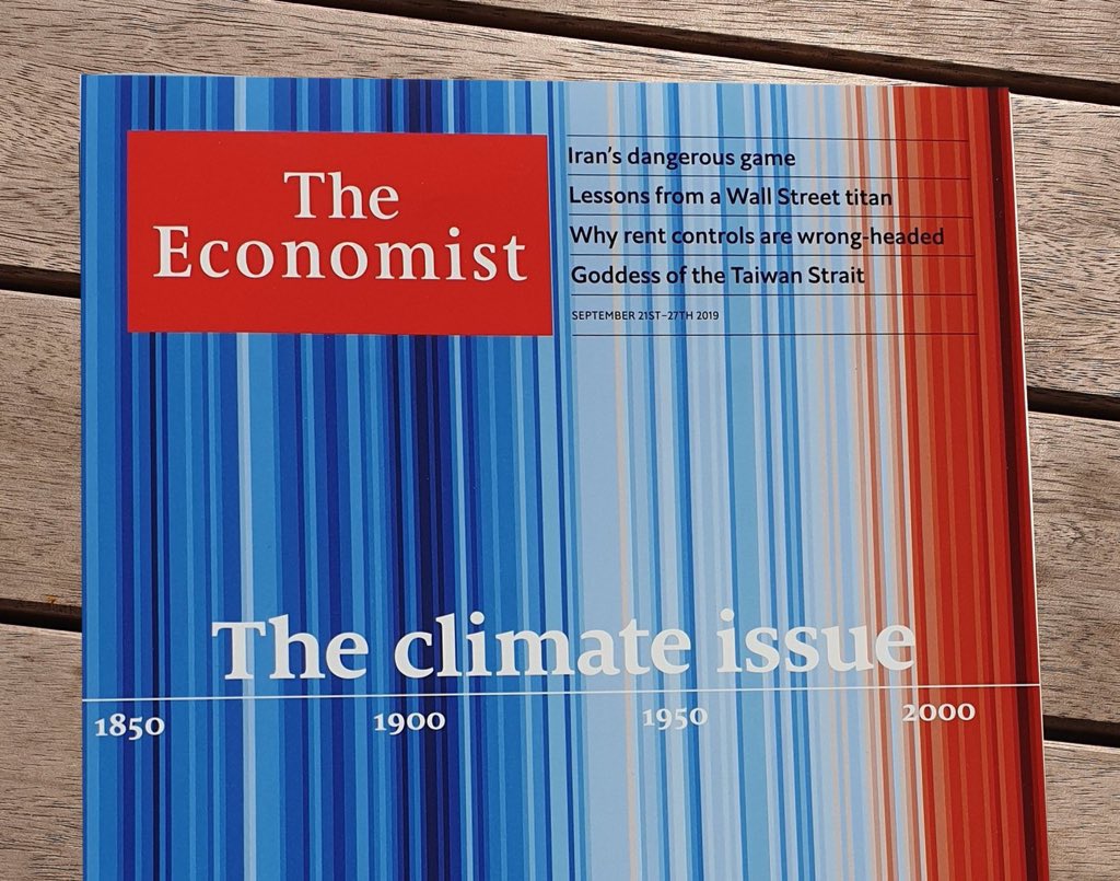
Today is #ShowYourStripes day, when people around the world share how the climate is changing where they live. These graphics start conversations about our changing climate and what we can do about it.

Here are my stripes. Download yours: ShowYourStripes.info
May 13, 2021 7 tweets 4 min read
Two years ago there were 65,000 sheets of paper containing hand-written measurements of rainfall taken all across the UK & Ireland before 1960. Virtually all of the 5.28 million observations on these sheets were unavailable to climate scientists as they had never been digitised. Thanks to @metoffice archives, these sheets were scanned & made openly available, but how could the observations be extracted?

The answer? Ask for help: bbc.co.uk/news/science-e…

16,000 volunteers stepped forward during the first UK COVID lockdown to transcribe every observation.
Jan 17, 2021 5 tweets 2 min read
Global temperature variations over the last 2020 years Image For those still replying ‘it’s been warmer before’, please rethink. (1) Yes, we know this, because of climate scientists. (2) It doesn’t mean what you think it means.
Apr 9, 2020 5 tweets 3 min read
The #RainfallRescue volunteers are now digitising the very earliest UK rainfall data, from the 1860s and earlier.

Some stretch back to 1677, or they might stumble across rainfall records taken by Luke Howard.

Will they finish the job today or tomorrow? rainfallrescue.org 
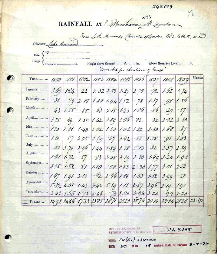
5 million observations rescued so far for the 1870s to 1950s. #RainfallRescue
Jan 20, 2020 8 tweets 3 min read
But what happened before 1850?

A THREAD
Earth's climate has changed before for reasons nothing to do with human activity. Changes in the position of the continents, the sun's output, the number of volcanic eruptions, and the Earth's orbit have all influenced our planet's climate. Climate scientists study these reasons.
Sep 20, 2019 6 tweets 6 min read
So, both @TheEconomist and @guardian feature the Warming Stripes on their front pages in print this morning!

Hopefully this will start a few conversations! #climatestrike 
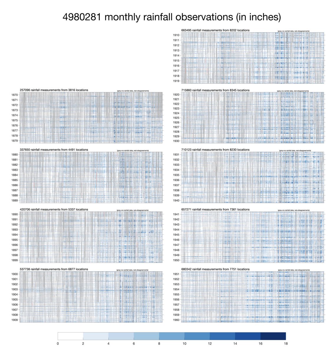
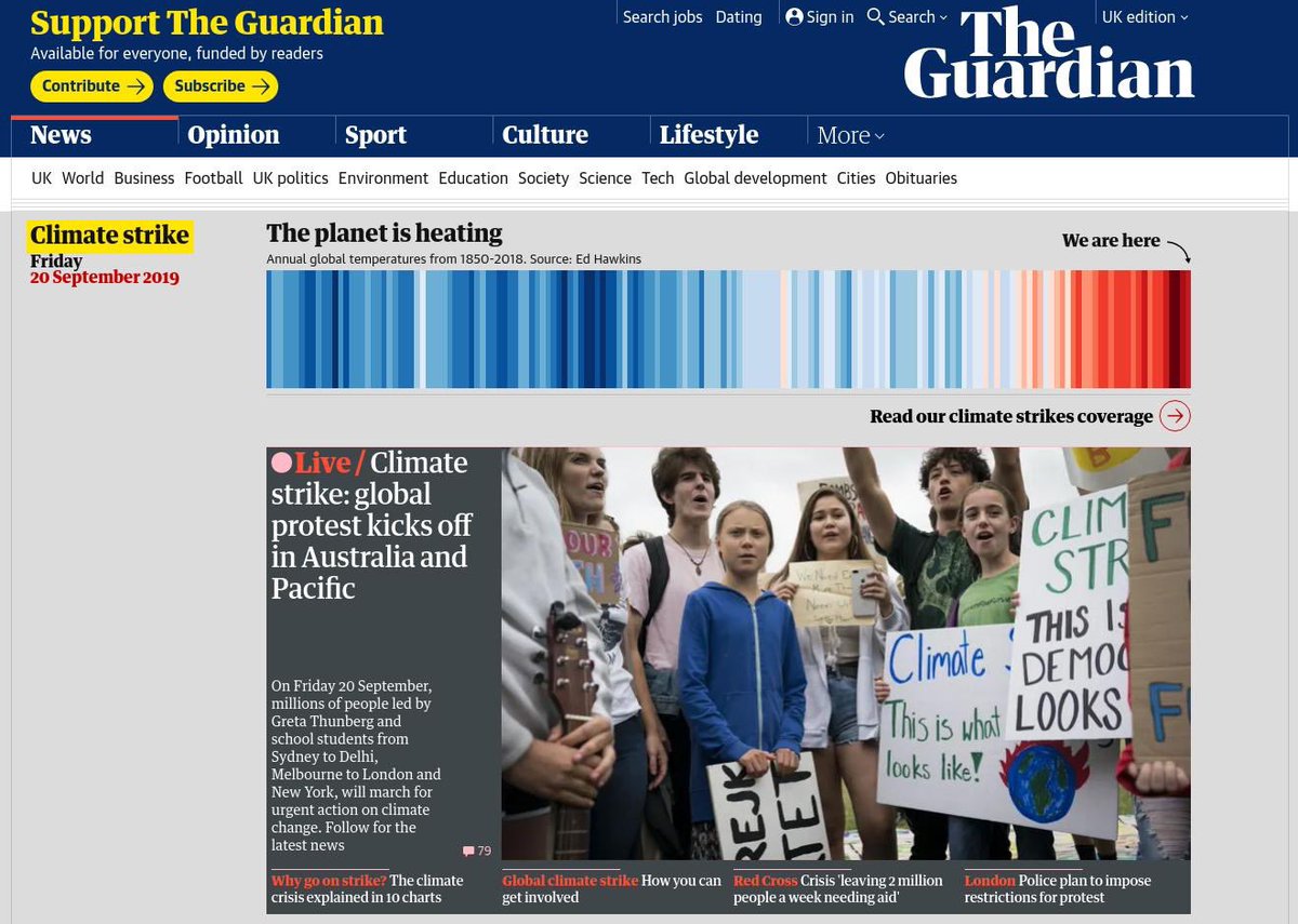
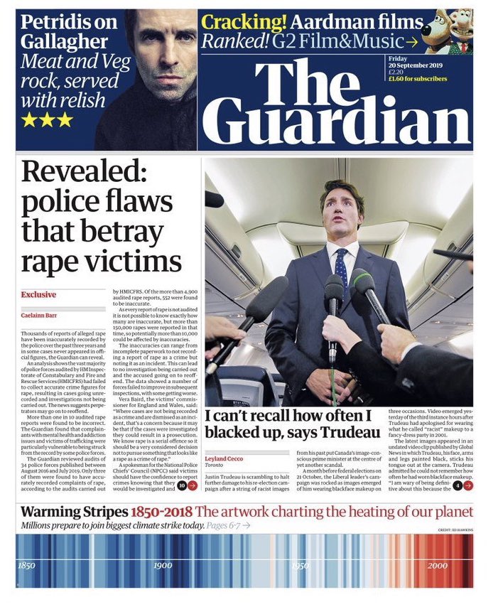
The @guardian have also decorated their website homepage with the Warming Stripes and a photo of @GretaThunberg for the #climatestrike: theguardian.com/uk
Apr 23, 2019 8 tweets 2 min read
"The climate has always changed" (or similar phrase) does not imply what many seem to think it implies. Let me explain. Since the 1830s scientists have known that the Earth's climate changes without any human influence, e.g. ice ages. Variations in the Earth's orbit, the location of the continents, the energy given off by the sun & the magnitude of volcanic eruptions can all affect the climate.