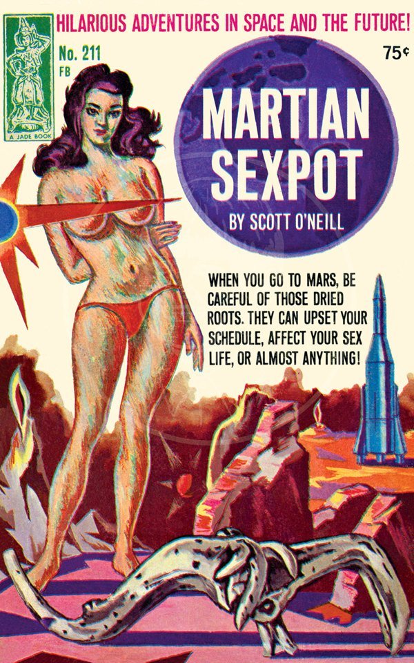
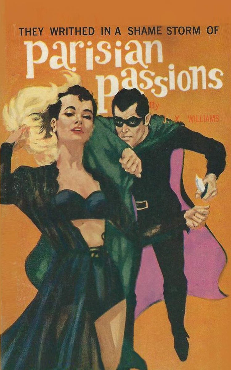
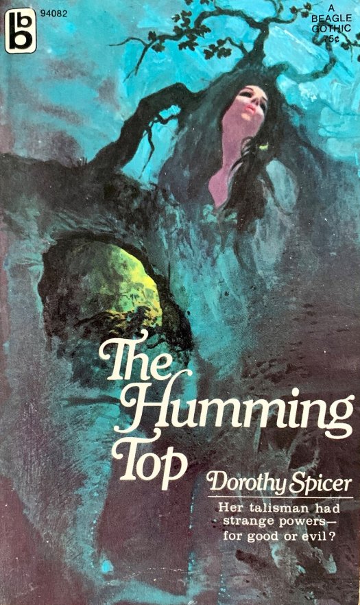
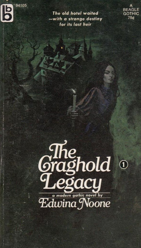
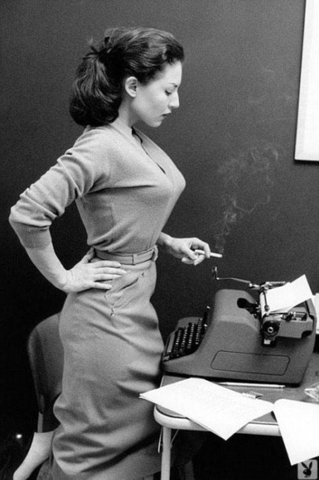
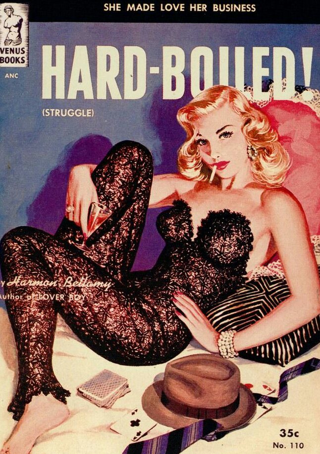
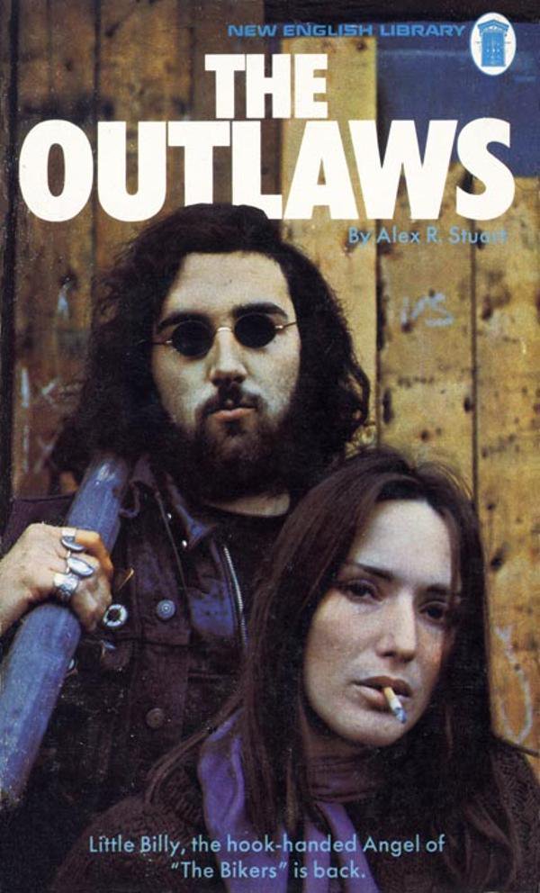
As we all know a good title is essential if you're trying to make a potential reader pick up your book. But in the world of pulp the title has to do a little more than this.
First it has to confirm the genre. Pulp is very much a genre-based business and readers need to know what kind of story they're getting into.
Secondly it has to tell the reader whether this is a character led novel or a plot led one.
Finally it needs to signal the author's tone of voice and attitude. Is the book serious or lighthearted for instance?
Having read several thousand pulp novels over the years (don't thank me, it's what I do) I've also noted several key words that frequently appear in the titles. Each is a sure sign that you are holding a pulp novel, rather than something long and unreadable by Jonathan Franzen.
Firstly does the title involve a sword? If it does then it's probably pulp.
Is any form of storm occurring? Again, this is a sure sign you are looking at a pulp novel rather than a weather forecast.
Is anyone or anything borne at all? Borne is a peculiar word that only appears in pulp literature or the occasional Seamus Heaney poem. Yes, those two things are different.
Common motifs from pulp plots also appear in their titles. For example the midnight hour...
...things being in webs...
...and brides of various descriptions.
Pulp titles also lean heavily on atmosphere and description. The world of pulp often involves shadows for instance.
And any mention of Satan is a sure giveaway that you have wandered into a pulp world.
Pulp colours are very basic. Things are either black...
...or they're golden.
Place names are populat in pulp titles: the more exotic the better.
Or if it's domestic pulp you can always just set it in the gutter.
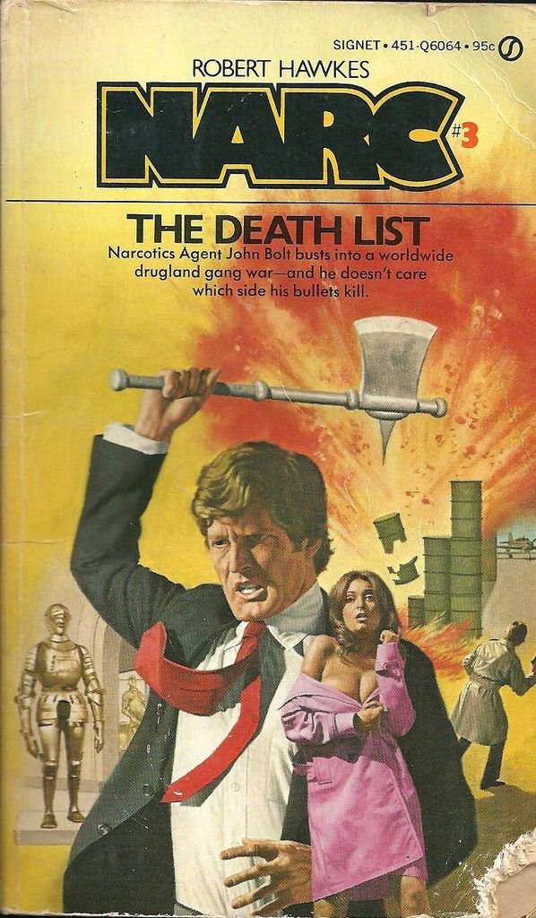
There are of course no prizes for guessing what the most popular word is for a pulp book title...
...but bonus pulp points if you get sex and witchcraft onto the same cover.
The most important point is this: don't be boring! People read pulp for thrills, excitement and weird kicks, so make sure your title lets them know that's your bag.
More writing tips another time...
• • •
Missing some Tweet in this thread? You can try to
force a refresh
It was a phenomenon, spawning a franchise that has lasted over fifty years. It's also a story with many surprising influences.
Today in pulp I look back at a sociological science-fiction classic, released today in 1968: Planet Of The Apes!
Pierre Boulle is probably best known for his 1952 novel Bridge On The River Kwai, based on his wartime experiences in Indochina. So it was possibly a surprise when 11 years later he authored a science fiction novel.
However Boulle had been a Free French secret agent during the war. He was captured in 1943 by Vichy forces in Vietnam and sentenced to hard labour. This experience of capture would shape his novel La Planète Des Singes.
Today I'm looking back at the work of British graphic designer Abram Games!
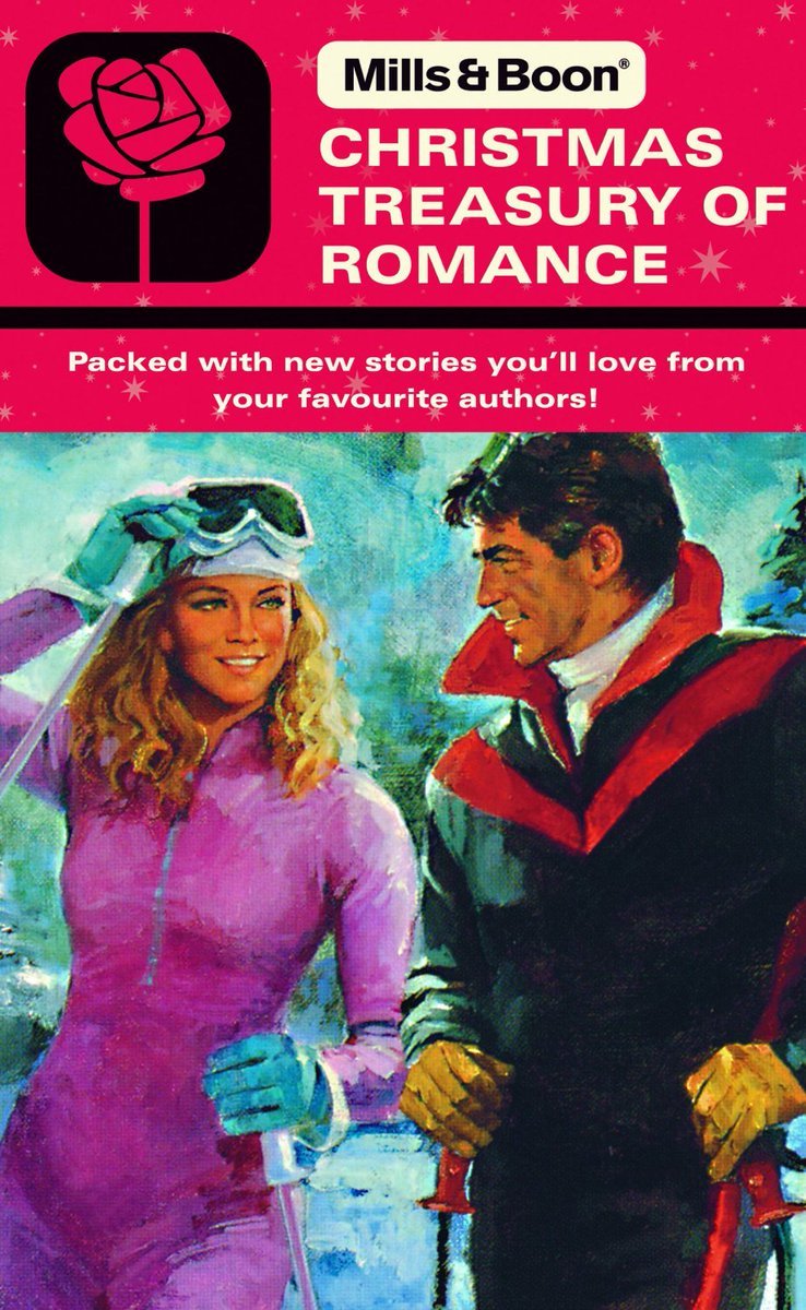
Abram Games was born in Whitechapel, London in 1914. His father, Joseph, was a photographer who taught him the art of colouring by airbrush.
Games attended Hackney Downs School before dropping out of Saint Martin’s School of Art after two terms. His design skills were mainly self-taught by working as his father’s assistant.
Today I'm looking back at the career of English painter, book illustrator and war artist Edward Ardizzone!
Edward Ardizzone was born in Vietnam in 1900 to Anglo-French parents. Aged 5 he moved to England, settling in Suffolk.
Whilst working as an office clerk in London Ardizzone began to take lessons at the Westminster School of Art in his spare time. In 1926 he gave up his office job to concentrate on becoming a professional artist.
Today in pulp I look back at the Witchploitation explosion of the late 1960s: black magic, bare bottoms and terrible, terrible curtains!
Come this way...
Mainstream occult magazines and books had been around since late Victorian times. These were mostly about spiritualism, with perhaps a bit of magic thrown in.
But it was the writings of Aleister Crowley in English and Maria de Naglowska in French and Russian that first popularised the idea of 'sex magick' in the 20th century - the use of sexual energy and ritual to achieve mystical outcomes.
Between 1960 and 1970 Penguin Books underwent several revolutions in cover layout, at a time when public tastes were rapidly changing.
Today in pulp I look back at 10 years that shook the Penguin!
Allen Lane founded Penguin Books in 1935, aiming to bring high-quality paperbacks to the masses for the same price as a packet of cigarettes. Lane began by snapping up publishing rights for inexpensive mid-market novels and packaging them expertly for book lovers.
From the start Penguins were consciously designed; Lane wanted to distinguish his paperbacks from pulp novels. Edward Young created the first cover grid, using three horizontal bands and the new-ish Gill Sans typeface for the text.
Today in pulp: a tale of an unintentionally radical publisher. It only produced 42 books between 1968-9, but it caught the hedonistic, solipsistic, free love mood of the West Coast freakout scene like no other.
This is the story of Essex House...
Essex House was an offshoot of Parliament Press, a California publishing company set up by pulp artist Milton Luros after the market for pulp magazines began to decline. It specialised in stag magazines sold through liquor stores, to skirt around US obscenity publishing laws.
By the 1960s Parliament Press was already selling pornographic novels through its Brandon House imprint, though these were mostly reprints or translations of existing work. Luros was interested in publishing new erotic authors, and set up Essex House to do just that.