CSS arts🎨are just crazy, aren't they..?
Fine, let's get started to make a simple but stunning CSS art, a pure CSS Doraemon 😍
I guess we all have been a fan of this cartoon (particularly Indians😂)..!!
A thread🧵👇
Fine, let's get started to make a simple but stunning CSS art, a pure CSS Doraemon 😍
I guess we all have been a fan of this cartoon (particularly Indians😂)..!!
A thread🧵👇

{1/11}
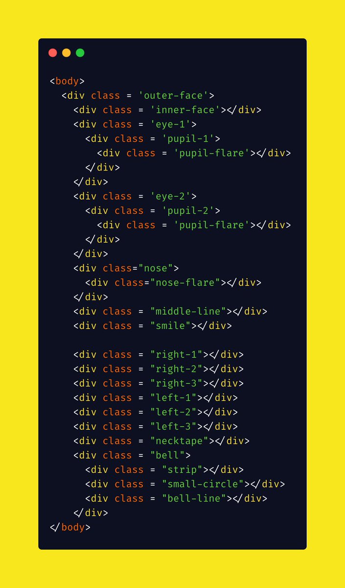
In the HTML section, create div(s) & mention the parts in their respective classes so that there is less confusion about which part of the HTML corresponds to what !!
NOTE: Take care of proper nesting since changing parent element may change the position of child element
In the HTML section, create div(s) & mention the parts in their respective classes so that there is less confusion about which part of the HTML corresponds to what !!
NOTE: Take care of proper nesting since changing parent element may change the position of child element
{2/11}
The first step is to create a circular shape head (or the main face).
Before that, if you wish you can give a gradient to the background for a better look (optional).
Center the face, give it a nice blue color & give it a small border of a bit darker color..!!
The first step is to create a circular shape head (or the main face).
Before that, if you wish you can give a gradient to the background for a better look (optional).
Center the face, give it a nice blue color & give it a small border of a bit darker color..!!


{3/11}
Now, create a smaller white circle with the same dark blue border and margin it such that it just touches the previous circle internally at the bottom.
The face is getting it's shape now😃
Now, create a smaller white circle with the same dark blue border and margin it such that it just touches the previous circle internally at the bottom.
The face is getting it's shape now😃


{4/11}
The next task is to create the eyes 👀
For simplicity, we create two eyes differently, otherwise we can also create clone shapes using box-shadow also..!!
Next, create pupils & the flare. An alternative is to use pseudo-classes 'before' and 'after'.
Mind the 'borders' !!
The next task is to create the eyes 👀
For simplicity, we create two eyes differently, otherwise we can also create clone shapes using box-shadow also..!!
Next, create pupils & the flare. An alternative is to use pseudo-classes 'before' and 'after'.
Mind the 'borders' !!


{5/11}
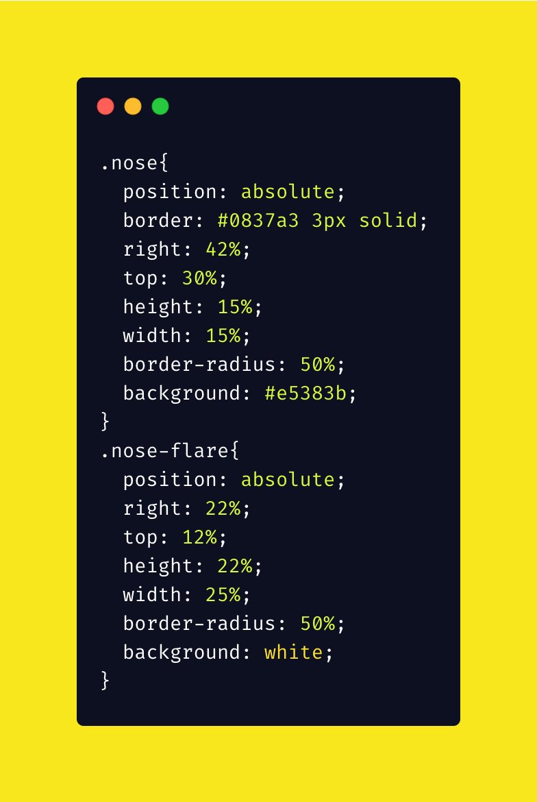
Next is 'Nose'👃
We also add a small white dot to create a shining effect ✨..!!
It is important to mention that since we are creating layers one by one, they are getting stacked over one another.
For more complex situations, we need z-index to mention its layer number.
Next is 'Nose'👃
We also add a small white dot to create a shining effect ✨..!!
It is important to mention that since we are creating layers one by one, they are getting stacked over one another.
For more complex situations, we need z-index to mention its layer number.

{6/11}
Next we add a few small elements like
1⃣ A line below the nose
2⃣ Smile
3⃣ Whiskers
Next we add a few small elements like
1⃣ A line below the nose
2⃣ Smile
3⃣ Whiskers
{7/11}
'The Line'
'The Line'


{8/11}
The Smile
Let's use a simple trick here to create semicircle.
Create a circle whose background is transparent and make two adjacent borders of one color and other two transparent.
Now rotate them by 45° and the tilted semicircle becomes straight.
And here is your SMILE🙂
The Smile
Let's use a simple trick here to create semicircle.
Create a circle whose background is transparent and make two adjacent borders of one color and other two transparent.
Now rotate them by 45° and the tilted semicircle becomes straight.
And here is your SMILE🙂


{9/11}
Next we create the whiskers !!
Use the same trick but instead here give color to only one side of the border and let the other three be transparent.
Give a bit of border radius to curve them..
Now, using transform function rotate them to adjust !!
This should be a DIY !!
Next we create the whiskers !!
Use the same trick but instead here give color to only one side of the border and let the other three be transparent.
Give a bit of border radius to curve them..
Now, using transform function rotate them to adjust !!
This should be a DIY !!


Make three whiskers on either side & note that they are of different lengths..!!
Shortcut:
To copy the same whisker from left to right, just change the left-margin to right-margin and vice-versa & rotate them accordingly..!!
This makes it symmetrical, so I don't suggest it.
Shortcut:
To copy the same whisker from left to right, just change the left-margin to right-margin and vice-versa & rotate them accordingly..!!
This makes it symmetrical, so I don't suggest it.
The better way is to individually adjust each whisker...
Though it will take a bit of time but it will create an amazing look at the end..!!😍
NOTE: The color of the line, smile & whiskers is same as that of the border color.
Though it will take a bit of time but it will create an amazing look at the end..!!😍
NOTE: The color of the line, smile & whiskers is same as that of the border color.
{10/11}
Now let's add some more elements to the figure.🌈
The red-line is a simple thing to create and place..!!👇
Now let's add some more elements to the figure.🌈
The red-line is a simple thing to create and place..!!👇


{11/11}
Next we create the Bell🔔
Steps:
1⃣ Create a circle with golden background & black border
2⃣ Add a horizontal strip with same background and border
3⃣ Create small circle which is filled black and a small vertical line below it..!!
Next we create the Bell🔔
Steps:
1⃣ Create a circle with golden background & black border
2⃣ Add a horizontal strip with same background and border
3⃣ Create small circle which is filled black and a small vertical line below it..!!


Yayy..!! We made a pure #CSS Doraemon..!!🎉
Do give your comments:
- Did I miss something ?🤔
- If I should add anything else in my upcoming threads..!!😊
- If you just simply liked it..!!😃
Hope you liked it..!!
#CSS
#DEVCommunity
#DEVCommunityIN
Do give your comments:
- Did I miss something ?🤔
- If I should add anything else in my upcoming threads..!!😊
- If you just simply liked it..!!😃
Hope you liked it..!!
#CSS
#DEVCommunity
#DEVCommunityIN
The whole source code is available here:
codepen.io/kandarpsolanki…
codepen.io/kandarpsolanki…
• • •
Missing some Tweet in this thread? You can try to
force a refresh