Today in the #AtlanticBubble
The home stretch
48 new cases were reported in the region: 6 in Newfoundland and Labrador, 9 in New Brunswick, and 33 in Nova Scotia.
13/15 outside of NS were traced at the time of reporting.
There are now 874 known, active cases in the region.


The home stretch
48 new cases were reported in the region: 6 in Newfoundland and Labrador, 9 in New Brunswick, and 33 in Nova Scotia.
13/15 outside of NS were traced at the time of reporting.
There are now 874 known, active cases in the region.


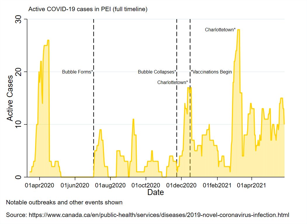
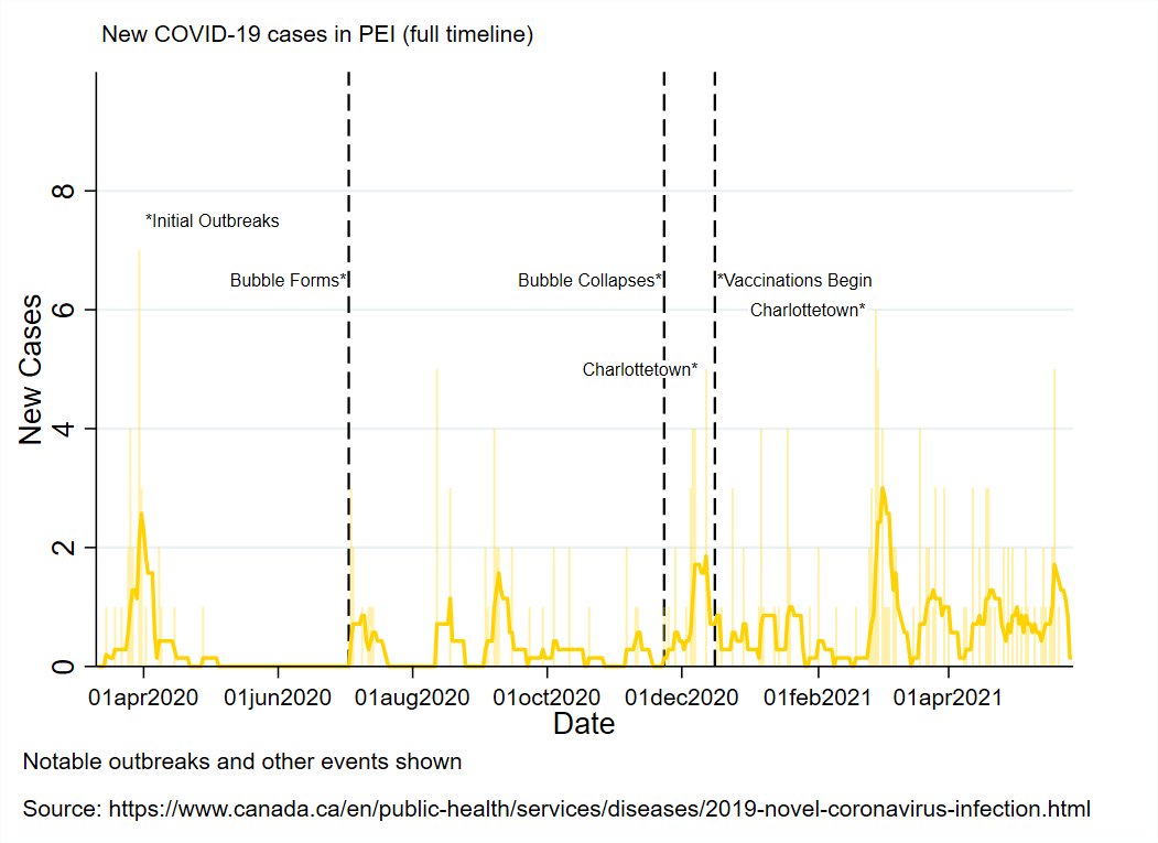
PEI reported now new cases today, but did announce their plan to wind-down their pandemic related restrictions in the coming weeks and months (more on that later).
There are now 10 known, active cases in PEI.


There are now 10 known, active cases in PEI.

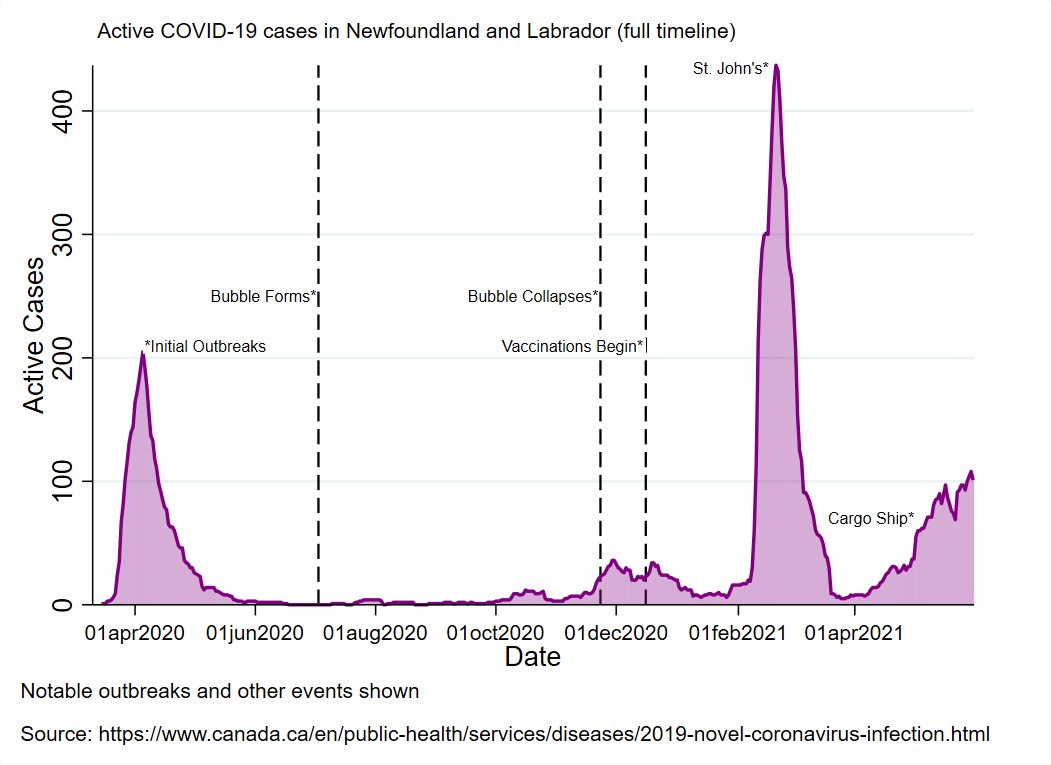
NL reported 6 new cases today:
1 in the Western health region (under investigation)
1 in the Eastern health region (travel-related)
4 in the Central health region (3 close contacts linked to the ongoing cluster, and 1 travel-related)
There are now 89 known, active cases in NL


1 in the Western health region (under investigation)
1 in the Eastern health region (travel-related)
4 in the Central health region (3 close contacts linked to the ongoing cluster, and 1 travel-related)
There are now 89 known, active cases in NL


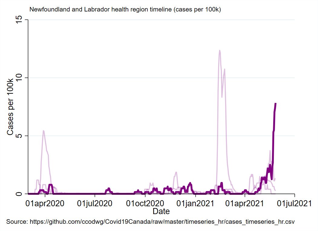
Updated cases per capita map with the Central health region emphasized.
Still going up, but I suspect this will bend in the near future (new and presumptive cases are drying up)
Still going up, but I suspect this will bend in the near future (new and presumptive cases are drying up)
NB reported 9 new cases:
3 in Moncton (2 close contacts, 1 travel-related)
5 in Fredericton (4 close contacts, 1 travel-related)
1 in Bathurst (under investigation)
There are now 137 known, active cases in NB.


3 in Moncton (2 close contacts, 1 travel-related)
5 in Fredericton (4 close contacts, 1 travel-related)
1 in Bathurst (under investigation)
There are now 137 known, active cases in NB.
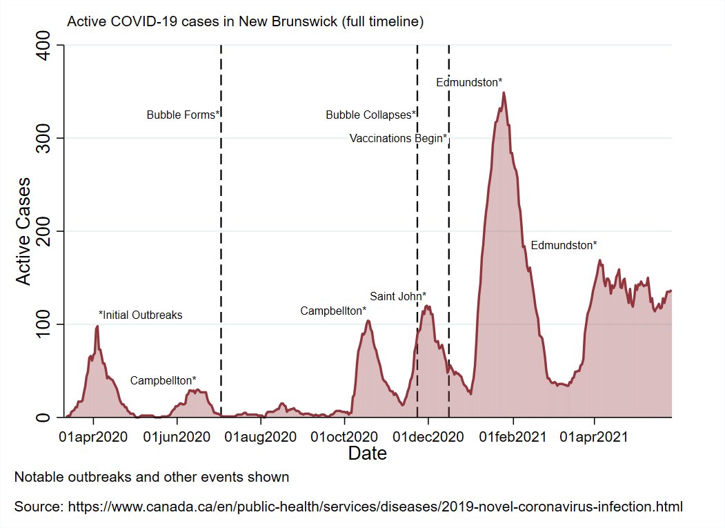


Updated cases per capita timeline with Fredericton emphasized.
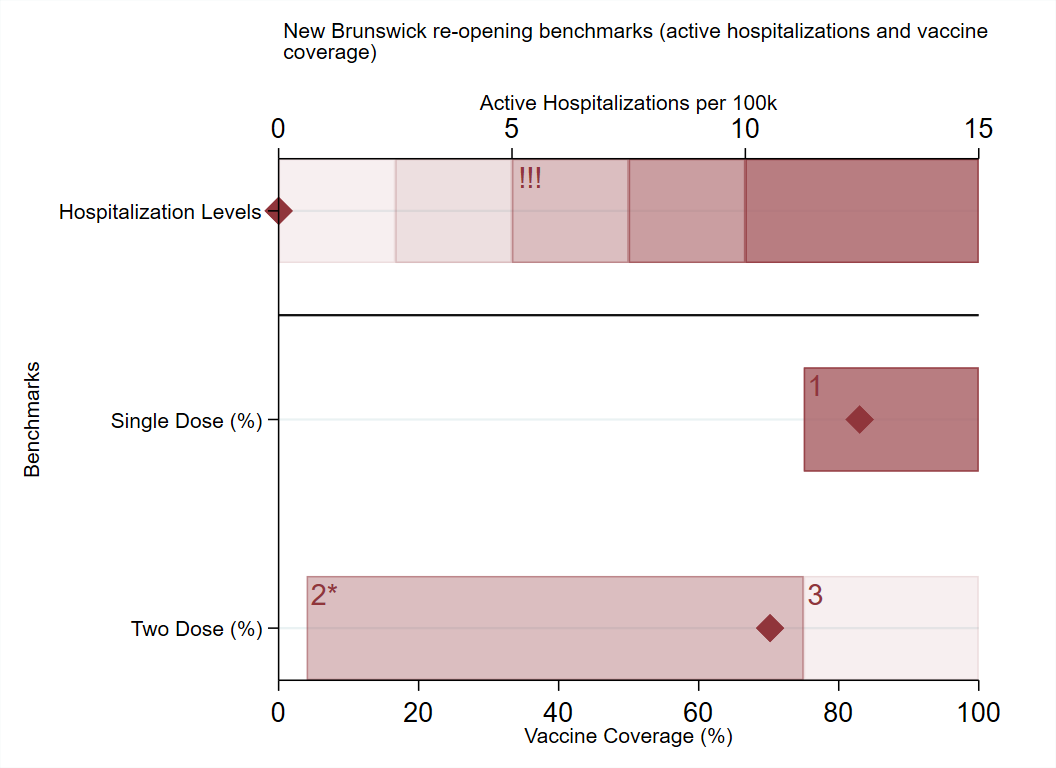
NB also announced it's end game timeline for the pandemic (more on that in a bit)
NB also announced it's end game timeline for the pandemic (more on that in a bit)

NS reported 33 new cases today:
None in the Western zone
1 in the Northern zone
18 in the Eastern zone
14 in the Halifax area (Central zone)
There are now 638 known, active cases in NS.


None in the Western zone
1 in the Northern zone
18 in the Eastern zone
14 in the Halifax area (Central zone)
There are now 638 known, active cases in NS.

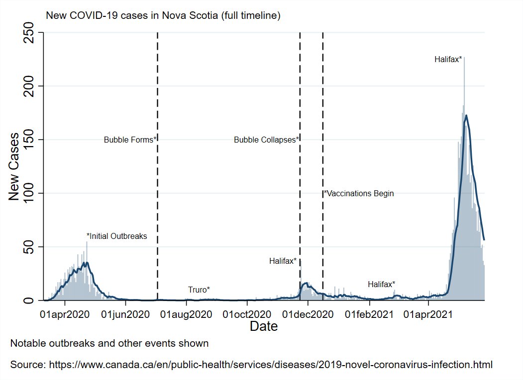


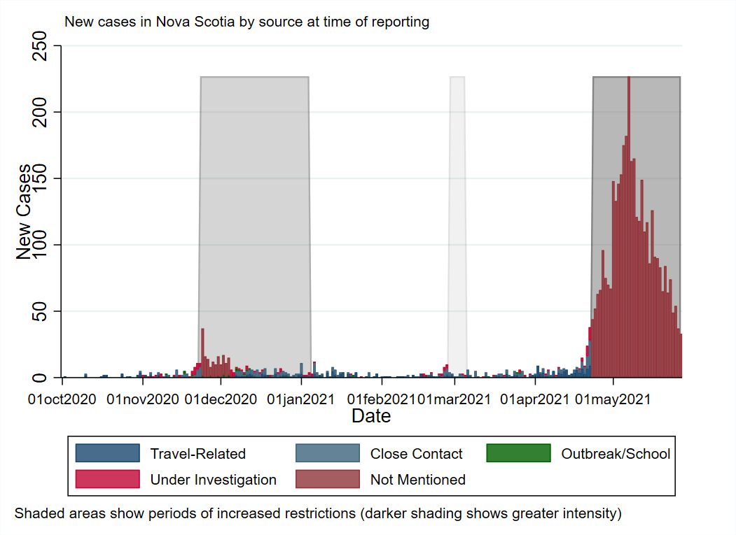
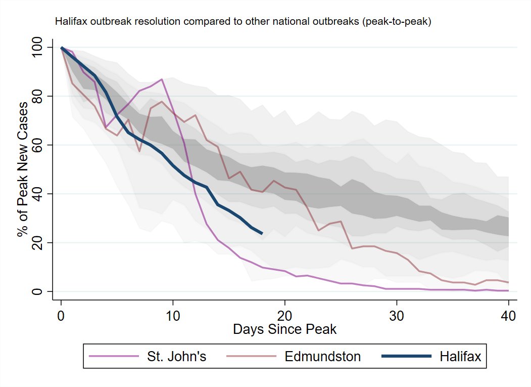
NS Outbreak Detailed:
Restrictions/case levels map
Case origins timeline
Cases per capita timeline with Halifax emphasized
Comparison of Halifax outbreak wind-down to the worst outbreak in each health region in the country (scaled peak-to-peak)


Restrictions/case levels map
Case origins timeline
Cases per capita timeline with Halifax emphasized
Comparison of Halifax outbreak wind-down to the worst outbreak in each health region in the country (scaled peak-to-peak)


No update in the map tonight.
By a narrow margin, The Halifax area is no longer the province's hotspot of cases (in per capita terms); The Eastern zone is.
Two and a half weeks out from the peak, cases are down nearly 80% in Halifax.
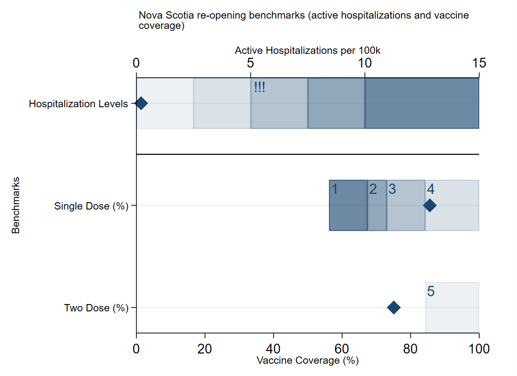
Provincial re-opening plan tomorrow.
By a narrow margin, The Halifax area is no longer the province's hotspot of cases (in per capita terms); The Eastern zone is.
Two and a half weeks out from the peak, cases are down nearly 80% in Halifax.
Provincial re-opening plan tomorrow.

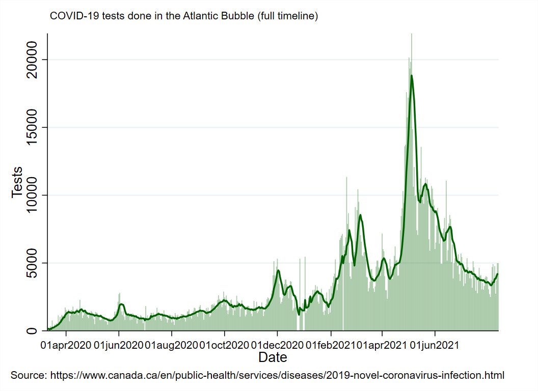
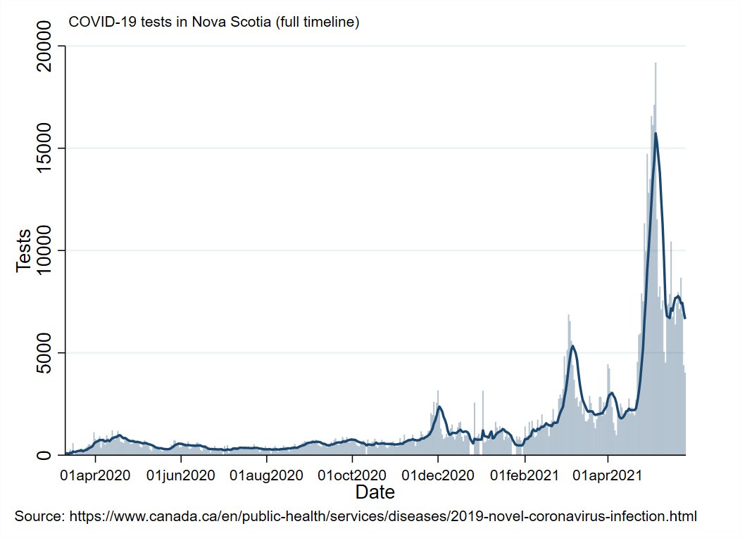
Updated test numbers for NS.
Let's bump these rookie numbers up and close out this outbreak the right way.


Let's bump these rookie numbers up and close out this outbreak the right way.


Regional Summary
NB: Fredericton seems generally controlled. Have announced end-of-pandemic plan.
NS: Rapid progress, announcing plan tomorrow.
NL: getting Central outbreak in hand.
PEI: All quiet, re-opening plan announced.
NB: Fredericton seems generally controlled. Have announced end-of-pandemic plan.
NS: Rapid progress, announcing plan tomorrow.
NL: getting Central outbreak in hand.
PEI: All quiet, re-opening plan announced.

You can read the NB plan summary here: www2.gnb.ca/content/gnb/en…
And the PEI one here: princeedwardisland.ca/en/news/provin…
My summary: both provinces are essentially following this trajectory
1) Lift internal restrictions
2) Lift Atlantic travel restrictions
3) Lift more travel restrictions
And the PEI one here: princeedwardisland.ca/en/news/provin…
My summary: both provinces are essentially following this trajectory
1) Lift internal restrictions
2) Lift Atlantic travel restrictions
3) Lift more travel restrictions
That's a gross over-simplification, just read the plan summaries.
Modified travel restrictions (testing, shorter isolation) seem like they will be in place for unvaccinated travellers through to the end of the summer.
Modified travel restrictions (testing, shorter isolation) seem like they will be in place for unvaccinated travellers through to the end of the summer.
You can see the entire pandemic timeline for the Atlantic region and surrounding area in the animation.
Each tick is a week since the start of the pandemic in March of last year.
Each tick is a week since the start of the pandemic in March of last year.
Vaccine Roll-Out Metrics
1st graph shows how many days since each province had enough doses to cover their current usage.
2nd graph shows percent of eligible population that is newly vaccinated each day
3rd graph shows days ahead/behind versus national average


1st graph shows how many days since each province had enough doses to cover their current usage.
2nd graph shows percent of eligible population that is newly vaccinated each day
3rd graph shows days ahead/behind versus national average


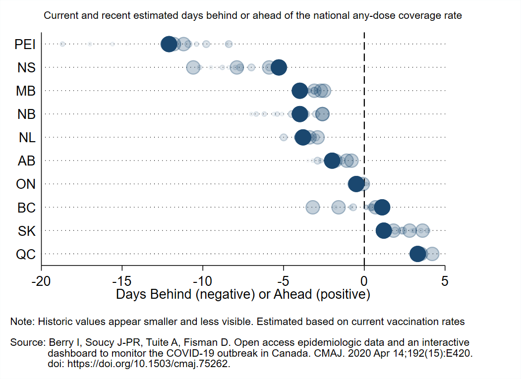
This animation shows each province's vaccination pace as a percent of the pace they need to each 80% first dose coverage by the end of June (based on how many they have already vaccinated and how much time is left).
Older data becomes less visible over time.
Older data becomes less visible over time.
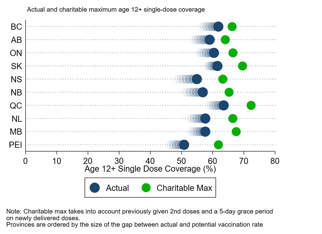
Here is the current percent of the eligible population of each province covered by at least one vaccine dose (Territories shown in the 2nd graph). 


Graph shows actual first dose coverage (blue) compared to a charitable maximum (green) that accounts for previously given 2nd doses and gives a 5-day grace period on deliveries.
Provinces are sorted from smallest (good) to largest (bad) gap between actual/potential coverage.
Provinces are sorted from smallest (good) to largest (bad) gap between actual/potential coverage.
Nightly quick look at how the rest of the country is doing.
NS hasn't quite caught up with Quebec in the great race to the bottom, but almost.
Manitoba may have found it's peak, but they've faked us out before.

NS hasn't quite caught up with Quebec in the great race to the bottom, but almost.
Manitoba may have found it's peak, but they've faked us out before.


This weekend (probably Sunday during the day) I'll be doing my usual monthly epi-summary for the whole country.
And as always there will be a bonus analysis; this time: looking at what predicts how many outbreak events a health region has had, and how long they take to resolve.

And as always there will be a bonus analysis; this time: looking at what predicts how many outbreak events a health region has had, and how long they take to resolve.


That's it for tonight's update.
Take care of one another and have a great night!
Take care of one another and have a great night!
• • •
Missing some Tweet in this thread? You can try to
force a refresh


