Today in the #AtlanticBubble
36 new cases were reported in the region: 7 in Newfoundland and Labrador, 9 in New Brunswick, and 20 in Nova Scotia.
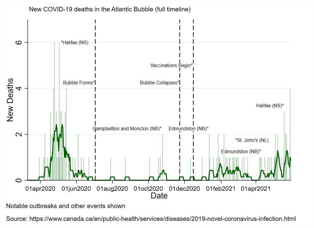
1 new death was reported, bringing the regional total to 134.
There are now 764 known, active cases in the region.


36 new cases were reported in the region: 7 in Newfoundland and Labrador, 9 in New Brunswick, and 20 in Nova Scotia.
1 new death was reported, bringing the regional total to 134.
There are now 764 known, active cases in the region.



NL reported 7 new cases today:
1 in the Central health region.
2 in the Eastern region.
4 in the Western region
All new cases are close contacts of existing cases.
There are now 104 known, active cases in NL.


1 in the Central health region.
2 in the Eastern region.
4 in the Western region
All new cases are close contacts of existing cases.
There are now 104 known, active cases in NL.
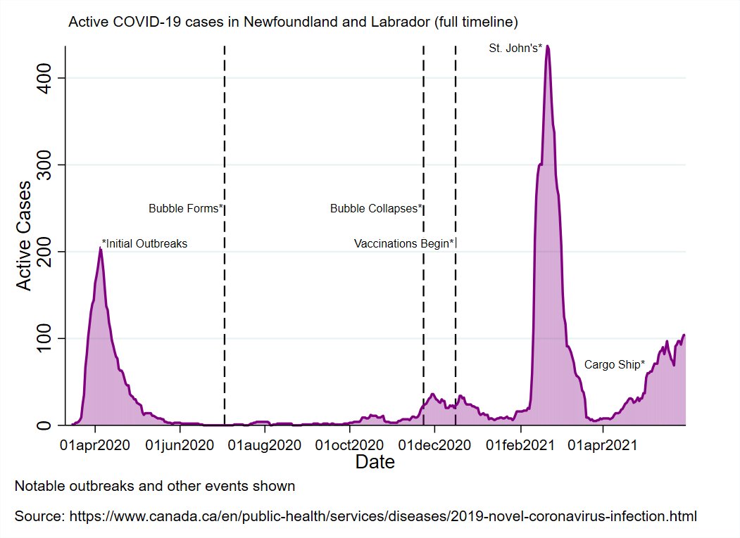
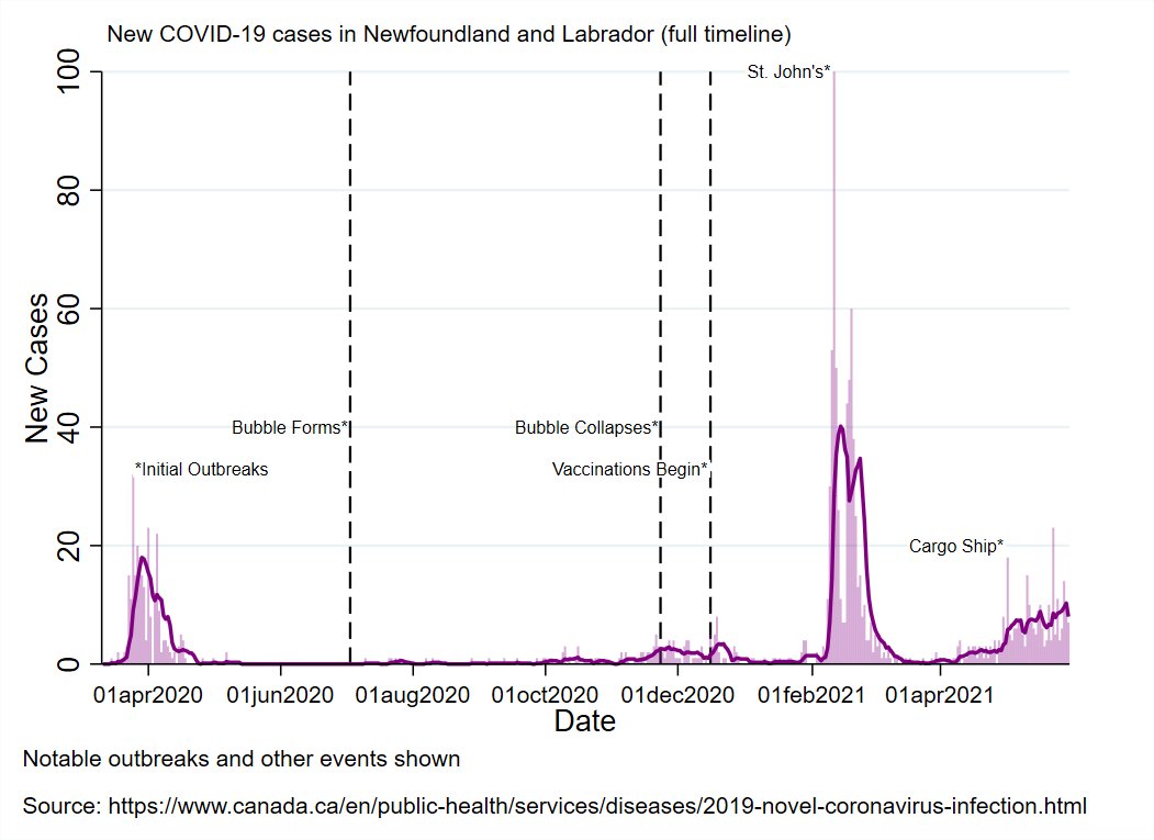


The Central region outbreak saw a lot of progress over the weekend.
There's an emerging cluster in the Western health region towards Stephenville, with increased restrictions being put in place in the immediate area.
Community testing is being rolled out.
There's an emerging cluster in the Western health region towards Stephenville, with increased restrictions being put in place in the immediate area.
Community testing is being rolled out.
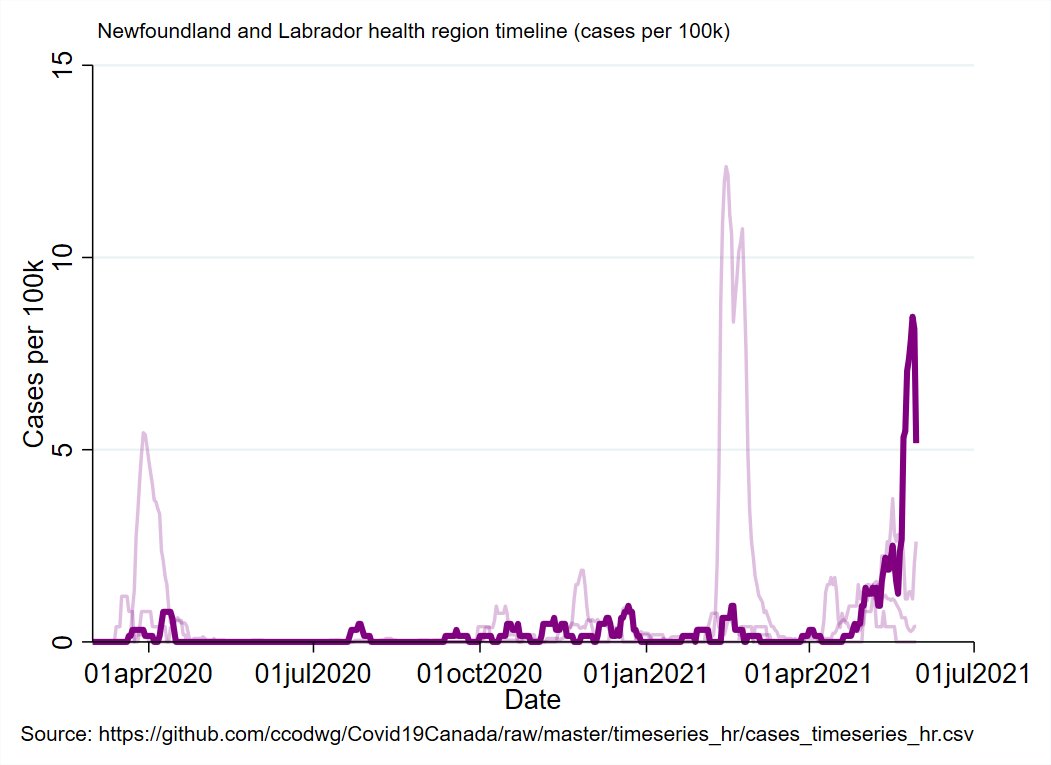
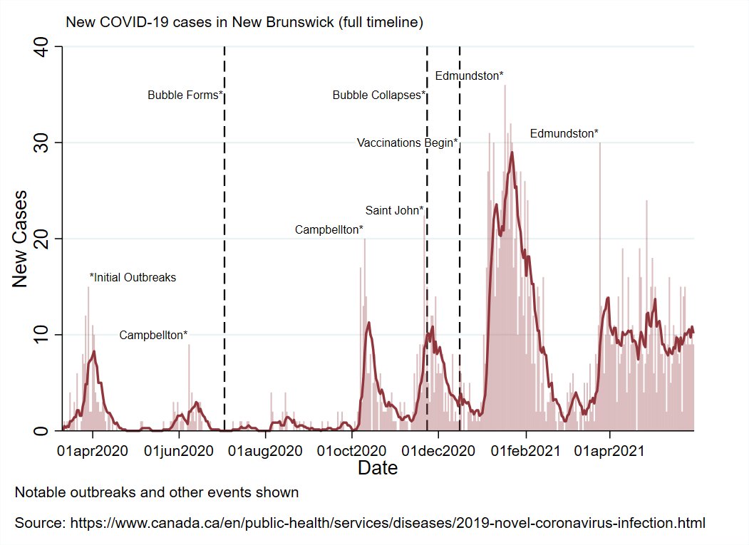
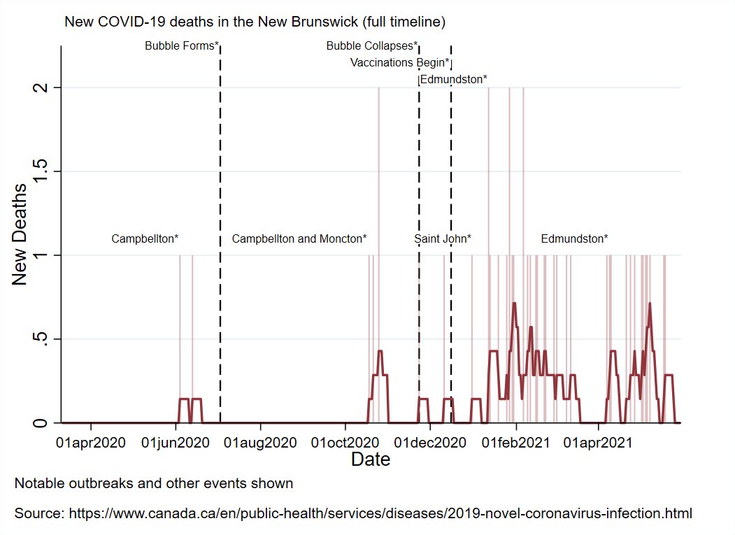
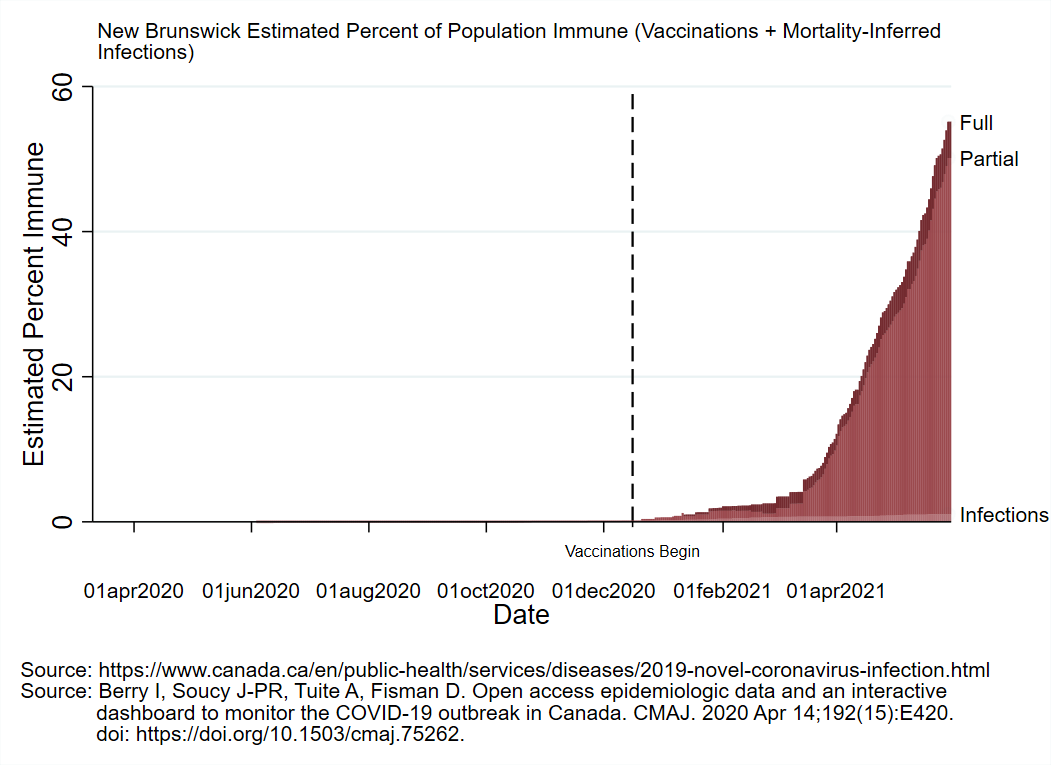
NB reported 9 new cases today:
5 in Moncton (4 close contacts, 1 under investigation)
1 in Saint John (under investigation)
2 in Fredericton (close contacts)
1 in Miramichi (close contact)
There are now 143 known, active cases in NB.


5 in Moncton (4 close contacts, 1 under investigation)
1 in Saint John (under investigation)
2 in Fredericton (close contacts)
1 in Miramichi (close contact)
There are now 143 known, active cases in NB.
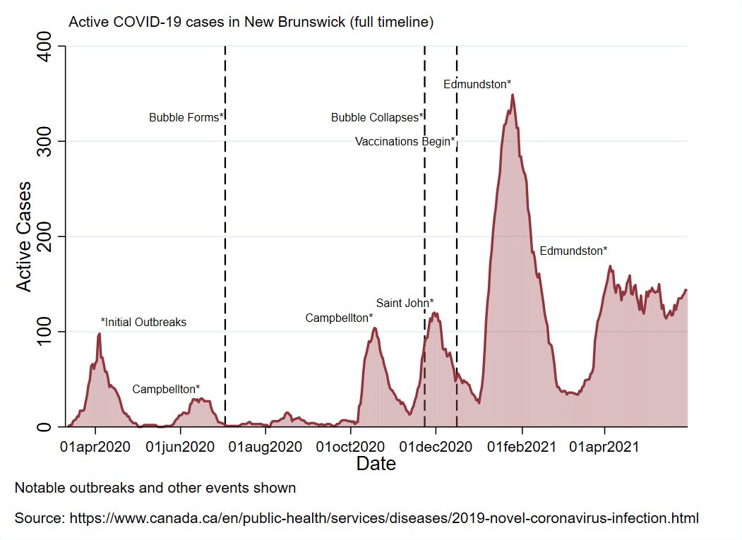
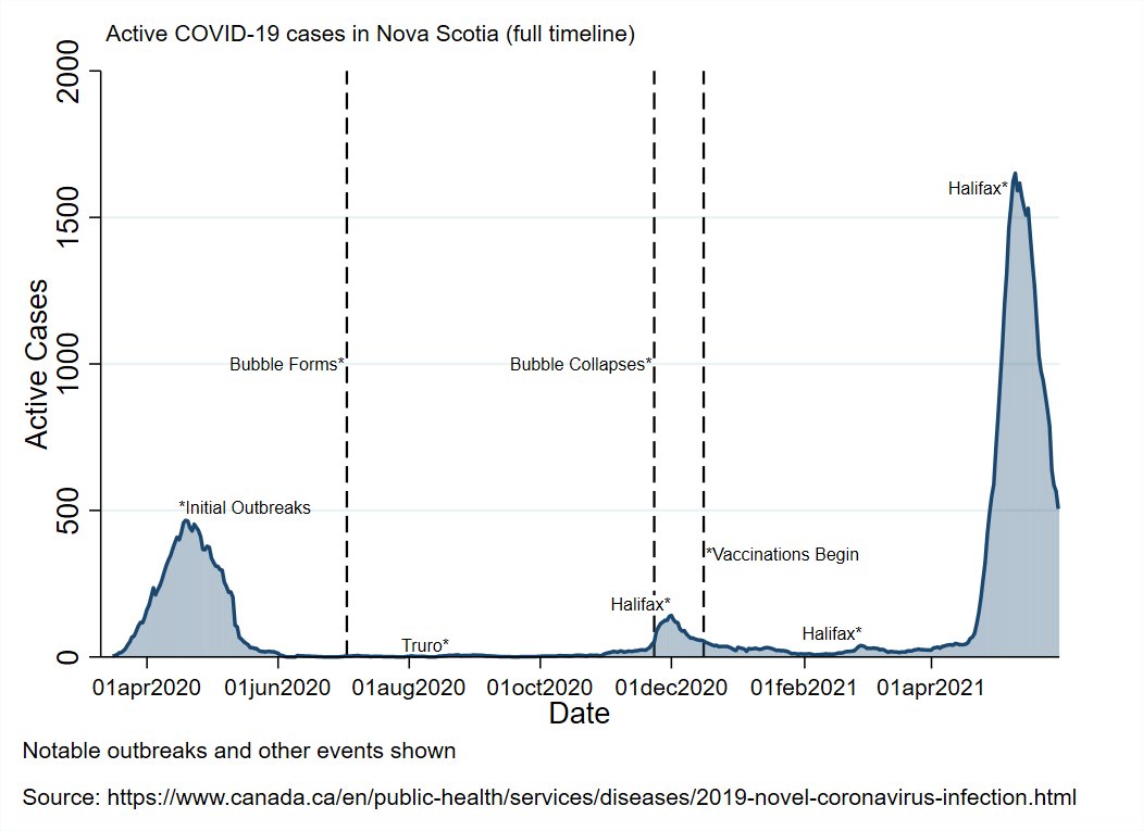
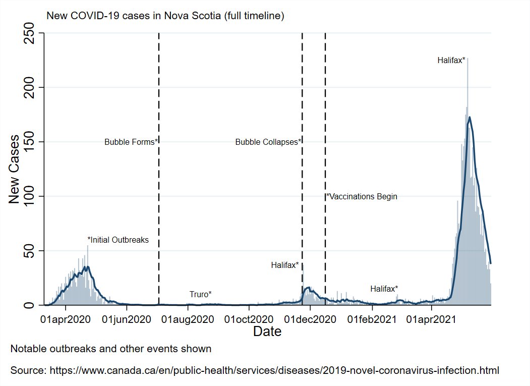
NS reported 20 new cases today:
1 in the Western zone
5 in the Eastern zone
14 in the Halifax area (Central zone)
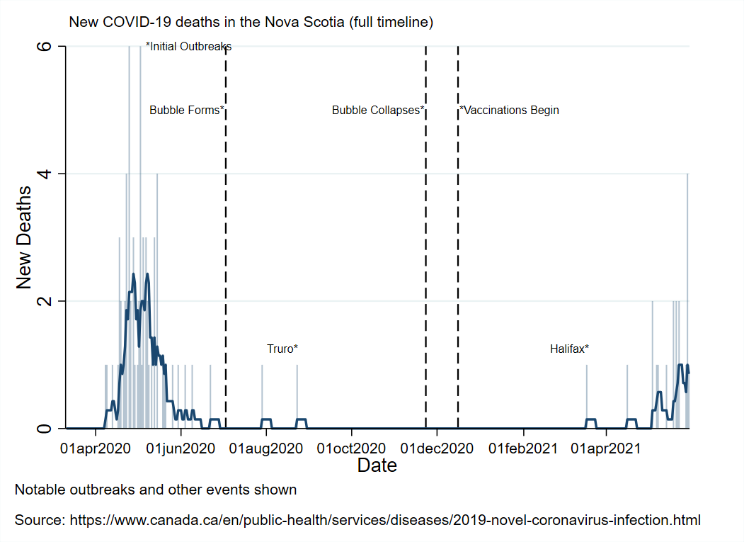
1 new death was reported in the Halifax area, making the provincial total 85.
There are now 505 known, active cases in NS.


1 in the Western zone
5 in the Eastern zone
14 in the Halifax area (Central zone)
1 new death was reported in the Halifax area, making the provincial total 85.
There are now 505 known, active cases in NS.
NS Outbreak Detailed:
Restrictions/case levels map
Case origins timeline
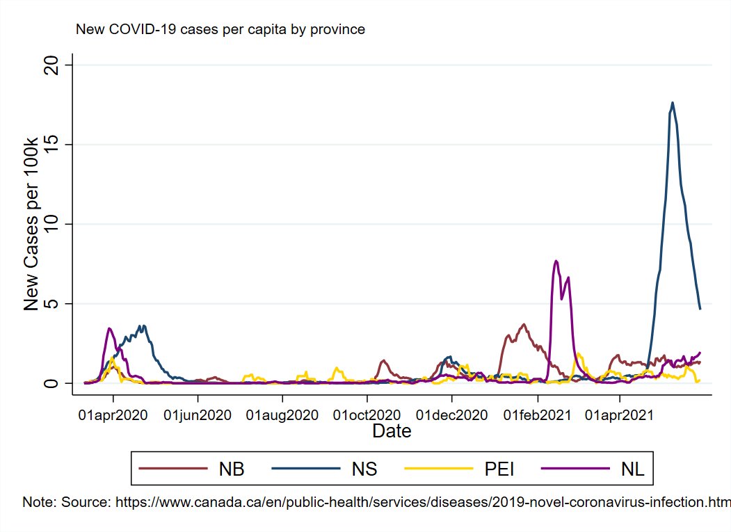
Cases per capita timeline with Halifax emphasized
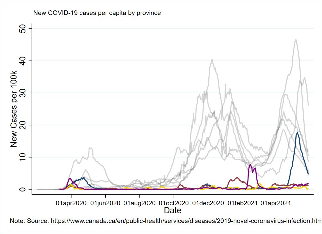
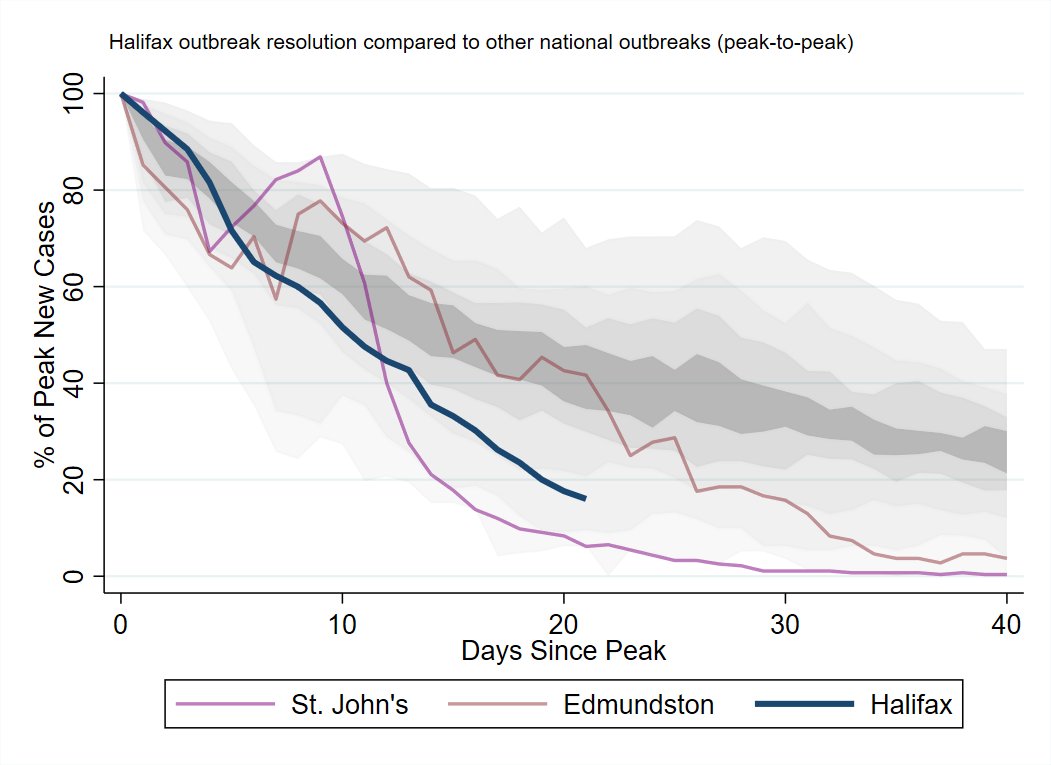
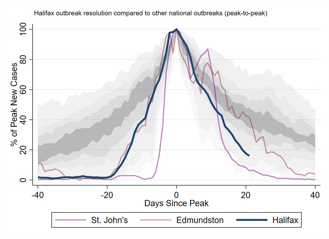
Comparison of Halifax outbreak wind-down to the worst outbreak in each health region in the country (scaled peak-to-peak)


Restrictions/case levels map
Case origins timeline
Cases per capita timeline with Halifax emphasized
Comparison of Halifax outbreak wind-down to the worst outbreak in each health region in the country (scaled peak-to-peak)
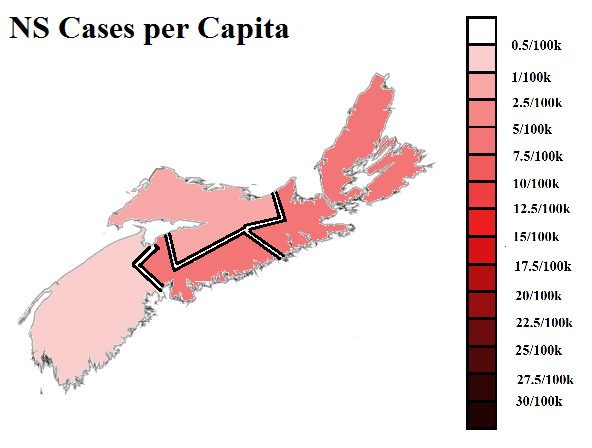
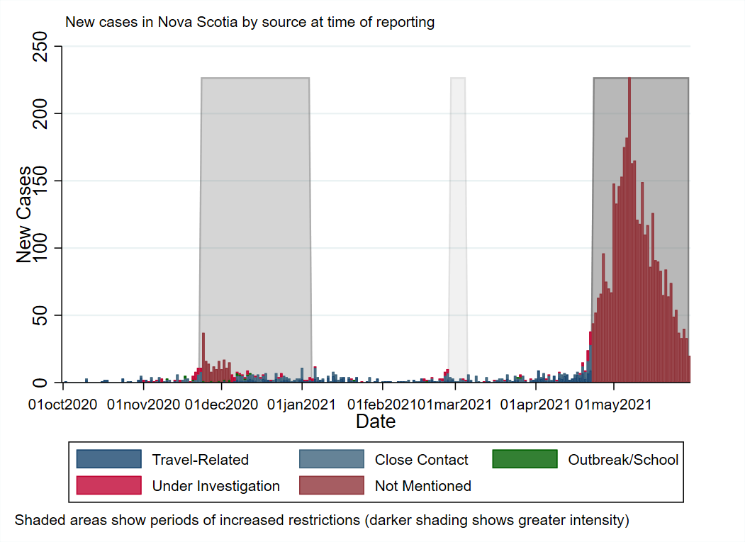
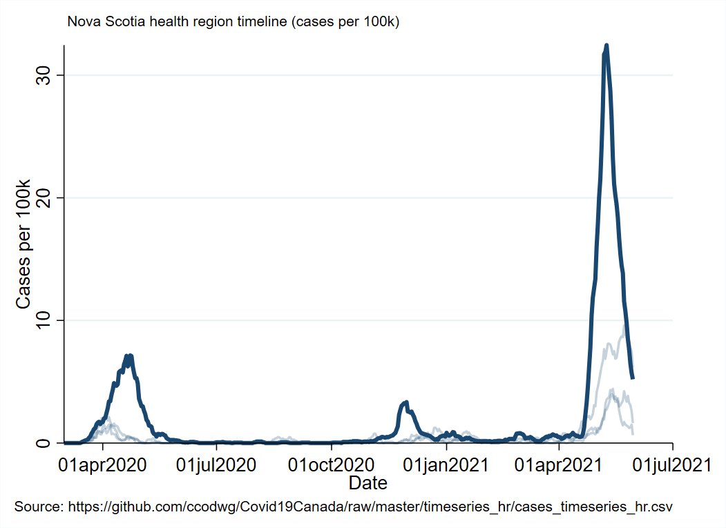
The Northern and Western zones both ticked down a level on the map. Halifax will probably do so tomorrow. Eastern zone is a few days behind that.
Halifax is now 3 weeks out from it's peak and cases are down ~85%
Halifax is now 3 weeks out from it's peak and cases are down ~85%
Regional Summary:
NB: Some untraced cases in Moncton/Fredericton areas. Hasn't gone anywhere yet.
NS: Ongoing progress, no setbacks yet.
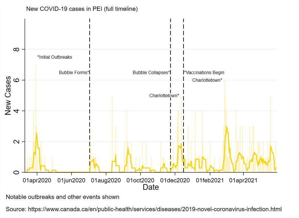
PEI: All quiet.
NL: Solid progress in Central region cluster, emerging Western region cluster (details TBD)
NB: Some untraced cases in Moncton/Fredericton areas. Hasn't gone anywhere yet.
NS: Ongoing progress, no setbacks yet.
PEI: All quiet.
NL: Solid progress in Central region cluster, emerging Western region cluster (details TBD)
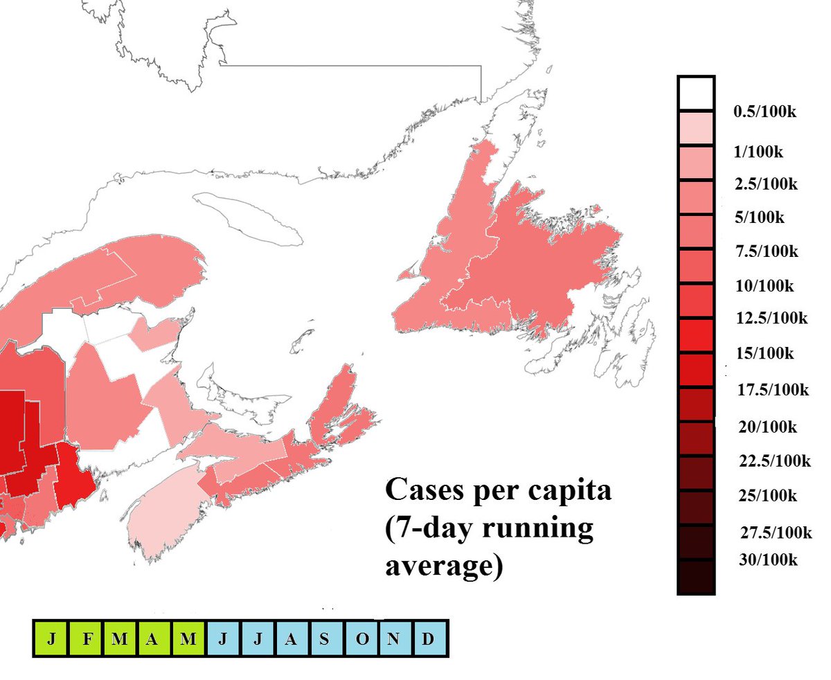
You can see the entire pandemic timeline for the Atlantic region and surrounding area in the animation.
Each tick is a week since the start of the pandemic in March of last year.
Each tick is a week since the start of the pandemic in March of last year.
Vaccine Roll-Out Metrics
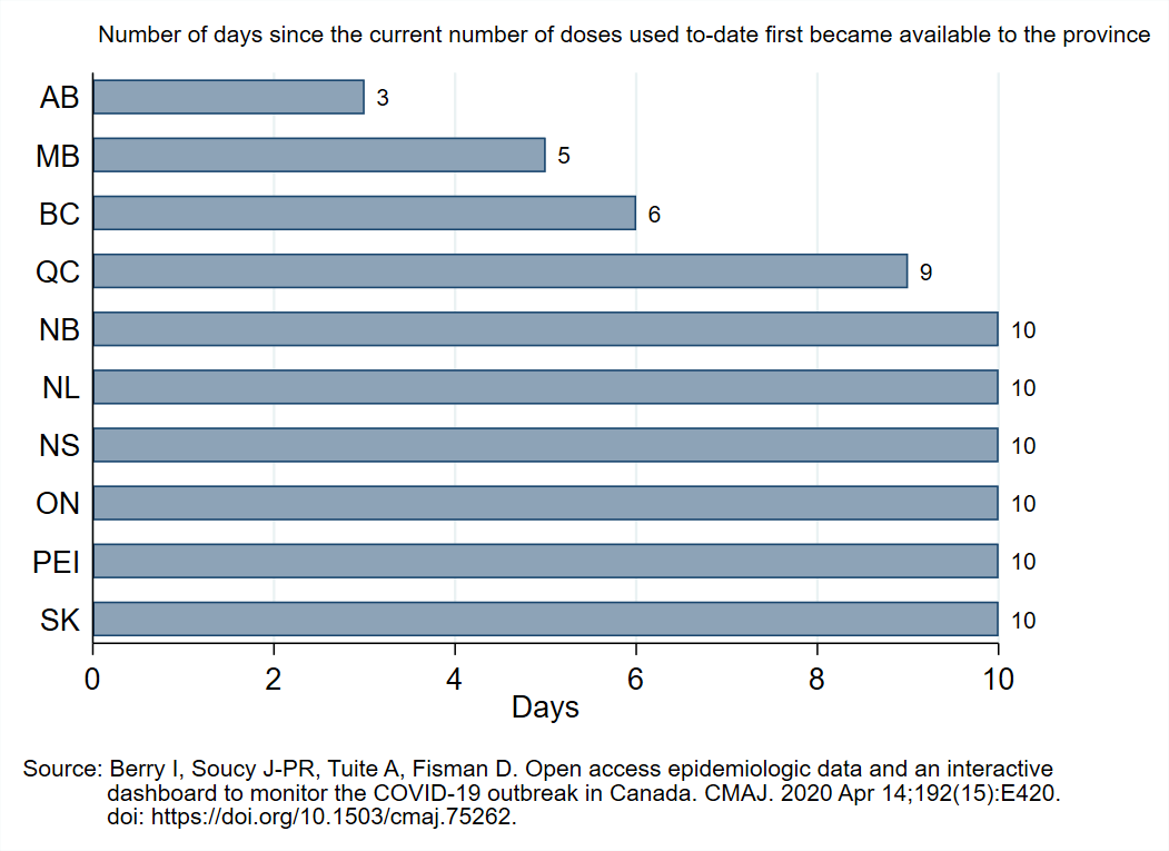
1st graph shows how many days since each province had enough doses to cover their current usage.
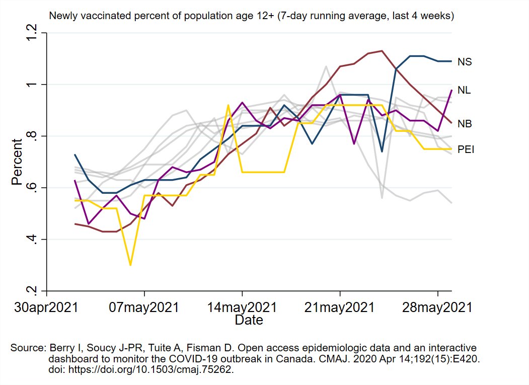
2nd graph shows percent of eligible population that is newly vaccinated each day
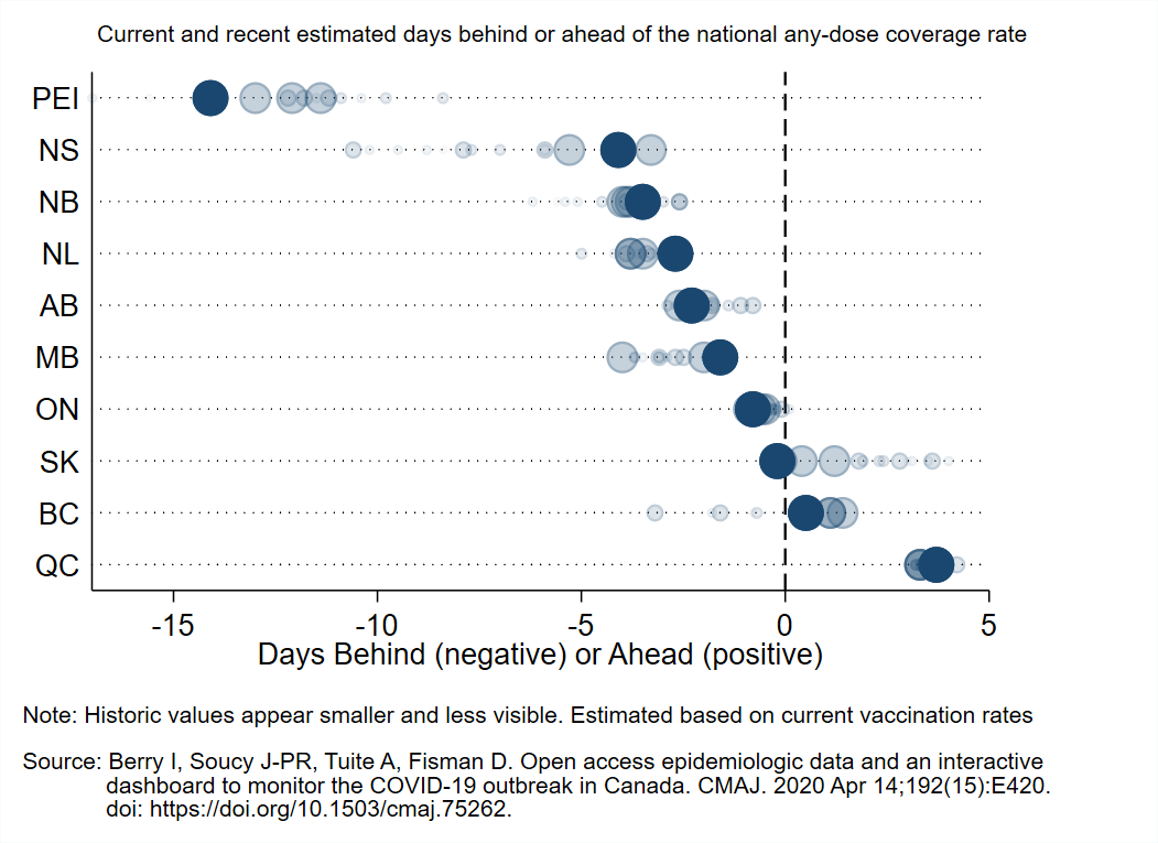
3rd graph shows days ahead/behind versus national average


1st graph shows how many days since each province had enough doses to cover their current usage.
2nd graph shows percent of eligible population that is newly vaccinated each day
3rd graph shows days ahead/behind versus national average
This animation shows each province's vaccination pace as a percent of the pace they need to each 80% first dose coverage by the end of June (based on how many they have already vaccinated and how much time is left).
Older data becomes less visible over time.
Older data becomes less visible over time.
Here is the current percent of the eligible population of each province covered by at least one vaccine dose (Territories shown in the 2nd graph). 

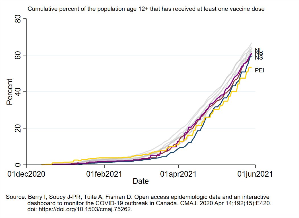
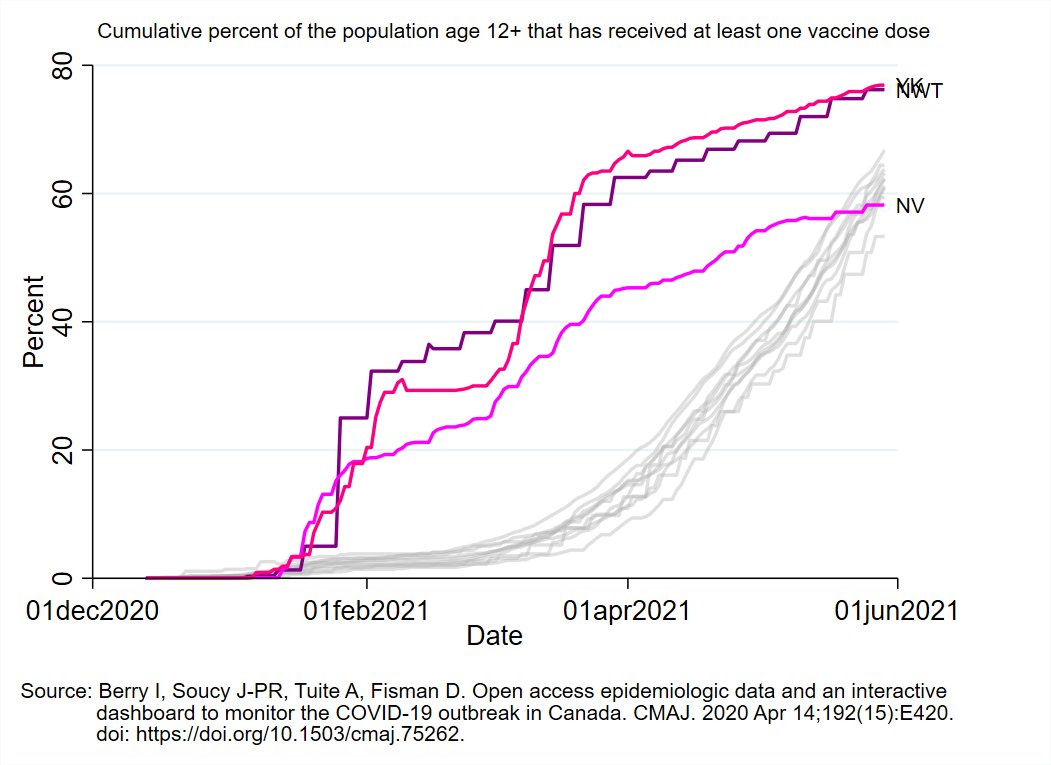
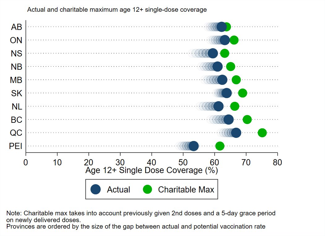
Graph shows actual first dose coverage (blue) compared to a charitable maximum (green) that accounts for previously given 2nd doses and gives a 5-day grace period on deliveries.
Provinces are sorted from smallest (good) to largest (bad) gap between actual/potential coverage.
Provinces are sorted from smallest (good) to largest (bad) gap between actual/potential coverage.
That's it for tonight's update.
Take care of one another and have a great rest of the weekend.
Take care of one another and have a great rest of the weekend.
• • •
Missing some Tweet in this thread? You can try to
force a refresh


