Here are some charts showing what is going on with Covid cases and hospitalizations in England.
A thread.
Firstly, cases. In order that the graph doesn't get too spiky, we smooth it by taking the average cases in the previous 7 days. Here it is.
A thread.
Firstly, cases. In order that the graph doesn't get too spiky, we smooth it by taking the average cases in the previous 7 days. Here it is.

We're only really interested in what's happening now (and in the future), so let's look at the right hand bit. Cases are rising exponentially. 

To show this, we can plot the case numbers on a logarithmic plot. If there's an exponential rise, this line should be straight. 

Actually, it's a bit worse than that. We can plot the rate at which cases are growing. If cases are growing at a constant rate (which is exponential growth), we would expect the growth rate to be the same (say doubling every 10 days). But the *rate* of growth is increasing. 

There are bank holiday effects plus Step 3 of the Roadmap which happened on 17 May which makes things a little confused, but basically, it's Not Good.
Let's put the case numbers and the growth rate on the same chart.
Let's put the case numbers and the growth rate on the same chart.

Now, you say, cases don't matter - it's all about hospitalizations. That's certainly what we've been told - hospitalizations 'decoupled' from cases. Not sure where that phrase came from, but there we go.
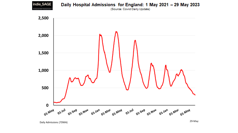
Here are 7 day average hospitalizations.
Here are 7 day average hospitalizations.

And here's the growth rate of weekly hospitalizations. It's growing at 19% per week and appears to be rising too. 

And that's why some people are concerned.
We already have a backlog of non-Covid hospitalizations. It doesn't take *that* many Covid hospitalizations to make things quite critical for the health system.
We need more data, but the data we have so far isn't encouraging.

We already have a backlog of non-Covid hospitalizations. It doesn't take *that* many Covid hospitalizations to make things quite critical for the health system.
We need more data, but the data we have so far isn't encouraging.


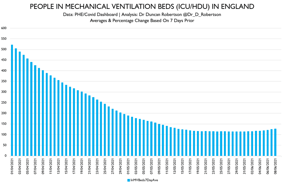
And one final point: the number of people in mechanical ventilation beds (ICU/HDU) is also increasing.
The chart below shows the number of people in these beds.
The chart below shows the number of people in these beds.

Here's the chart for the number of people in mechanical ventilation beds (ICU/HDU) from 1 April 2021.
A slow but definite increase.
A slow but definite increase.

• • •
Missing some Tweet in this thread? You can try to
force a refresh


