Make a log chart of U.S. mortality rates by age group going back to 1900, and something really disturbing stands out bloomberg.com/opinion/articl…
Mortality rates for older Americans had been headed mostly downward for a century until Covid-19 (although 55-to-64-year-olds had seen a slight mortality increase over the past decade)
Younger kids' mortality rates have plummeted, and kept declining right through the pandemic (although 5-to-14-year-olds haven't had a great decade) bloomberg.com/opinion/articl…
But young adults had a horrible 2020, a horrible 2010s, and a not exactly great last 60 years bloomberg.com/opinion/articl…
For 25-to-34-year-olds, it's been a succession of setbacks since the early 1960s, with the mortality increase since 2010 by far the worst bloomberg.com/opinion/articl…
What U.S. 25-to-34-year-olds have been dying of, 1999-2019 (the 2020 breakdown isn't available yet, but it looks like it will be less than 20% Covid-19) bloomberg.com/opinion/articl…
Young adults in other rich countries haven't had it nearly so bad. In recent years that's mainly because they've been spared the opioid epidemic (so far, at least; you can Canada is doing some catching up) ... bloomberg.com/opinion/articl…
... but the U.S. also has a lot more traffic deaths and homicides, big causes of death for young adults, than other rich countries (I left suicides off here because U.S. rates don't really stand out, although they've gotten worse) bloomberg.com/opinion/articl…
And yes, "accidental poisoning" mainly means drug overdoses
It's obviously not news that something had gone wrong with life expectancy and mortality in the U.S. in recent years (think Case and Deaton's "deaths of despair") but I really hadn't been aware of how bad things have been for young adults bloomberg.com/opinion/articl…
• • •
Missing some Tweet in this thread? You can try to
force a refresh
Every under-60 age group *except* early 20s and late 30s now has higher labor-force participation and employment rates than in summer 2019 (short🧵on today's column) bloomberg.com/opinion/articl…
Here it is for employment-population ratio. I did a summer-to-summer comparison because (1) most age-group labor stats aren't available seasonally adjusted and (2) they can jump around a lot from month to month
That 20-24 decline is really big! Surely has something to do with interrupted and delayed education, but I hope it goes away soon. The 35-39 drop seems like it should be due to child-care issues, although it's men in that age group who are driving it bloomberg.com/opinion/articl…
A few months ago, @alexschief pointed out that Minneapolis (population 425,336) was building more housing this year than San Jose, San Francisco, and Oakland combined (population 2.2 million). That's still true, and it's not the only one
These are all cities with less than 1 million people that are mostly building new apartments, not single-family houses. It's not an exhaustive list (Tampa, Miami, Arlington, TX, and others also meet the criteria)
Here are the top 10 jurisdictions for housing permits so far this year (permits are reported separately for each NYC borough but I combined them so sue me)
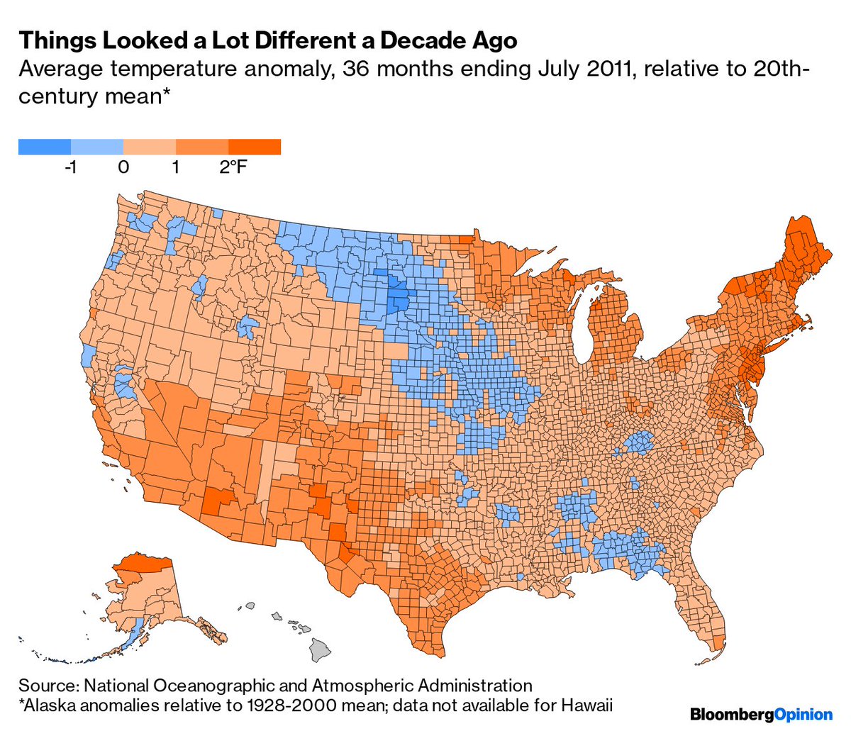
... which maybe helps explain why belief that climate change is happening fell in the U.S. in the early 2010s and has risen since bloomberg.com/opinion/articl…
Last week's GDP release included revisions back to 1999, so it's time for a new set of presidential growth comparisons! Starting with the basic version: annualized growth in real GDP from 1st quarter in office to last bloomberg.com/opinion/articl…
Official quarterly GDP numbers start in 1947, but using annual numbers growth was -7.4% under Hoover, +9.1% FDR and +1.8% Truman. So yes, by this metric Trump has the worst growth record since Hoover bloomberg.com/opinion/articl…
Still, there are other legit ways to measure growth. One would be to shift the GDP measurement forward or back by a quarter. Do the former and Trump pulls ahead of George W. Bush bloomberg.com/opinion/articl…